A Restaurant Logo Makes Our Top Three Logos
A creative restaurant logo should showcase all of the unique strengths of what the restaurant offers. When we create a restaurant logo, we first take a deep dive into the heart of your business. Once we feel like we have a good grasp on what makes you unique, then we start designing.
Because we are a branding agency, this is our specialty. Our passion is using strategy to craft unique icons and pairing them with logo type in colors that will best represent you in one little mark.
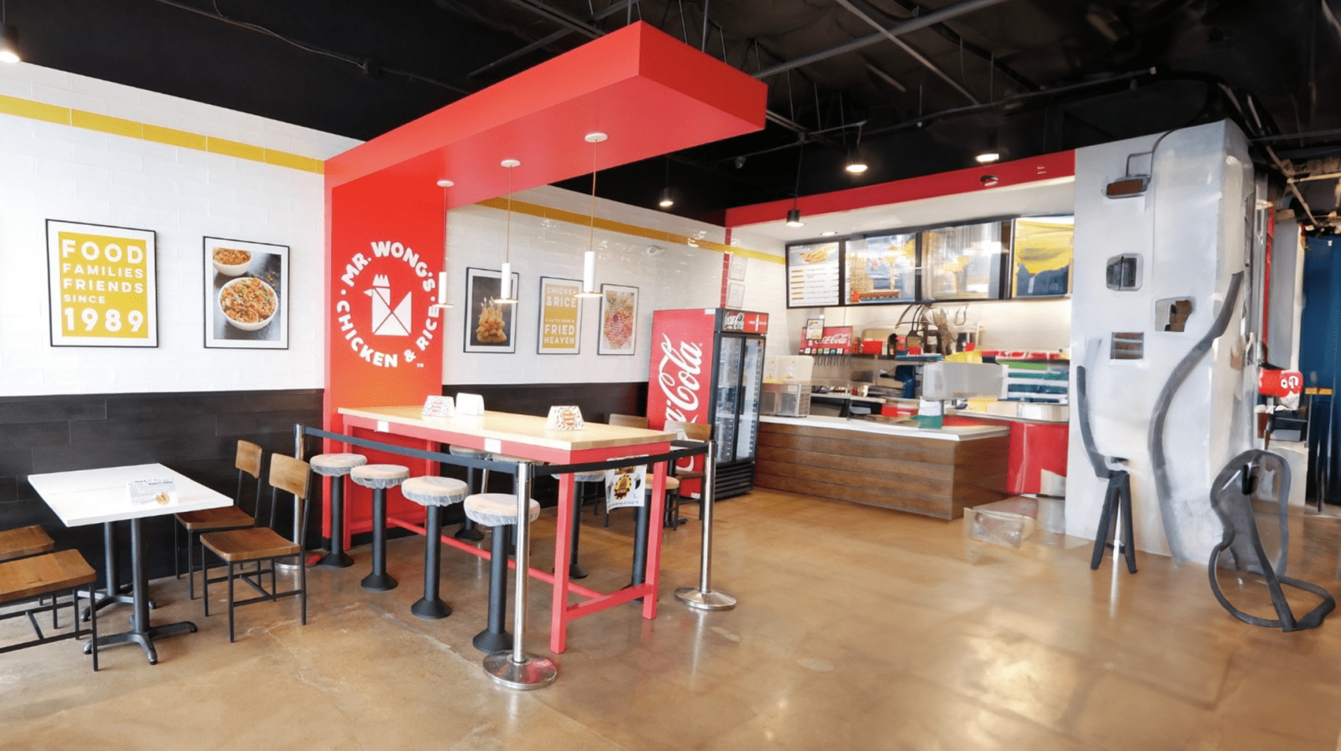
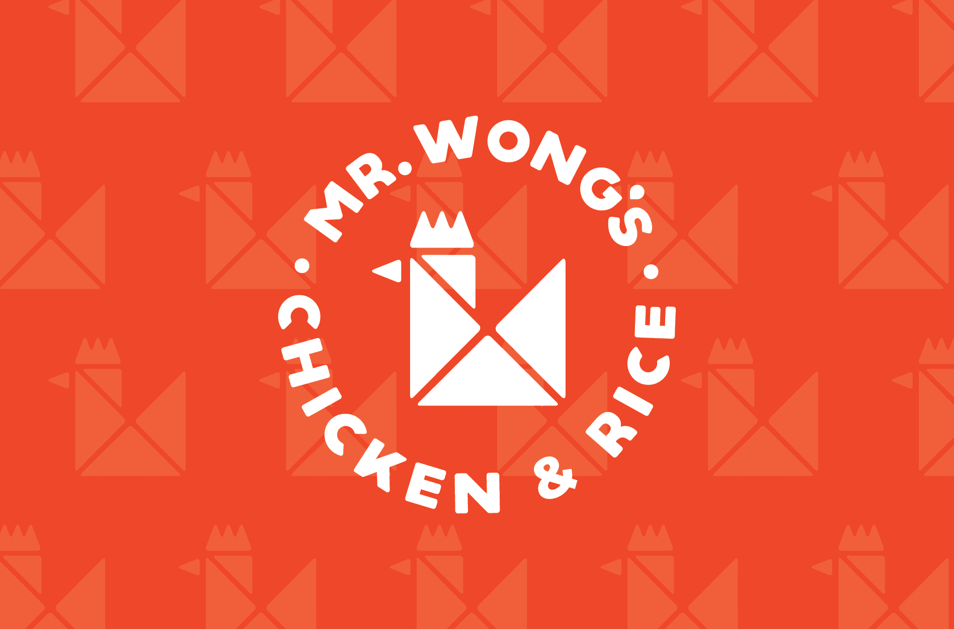
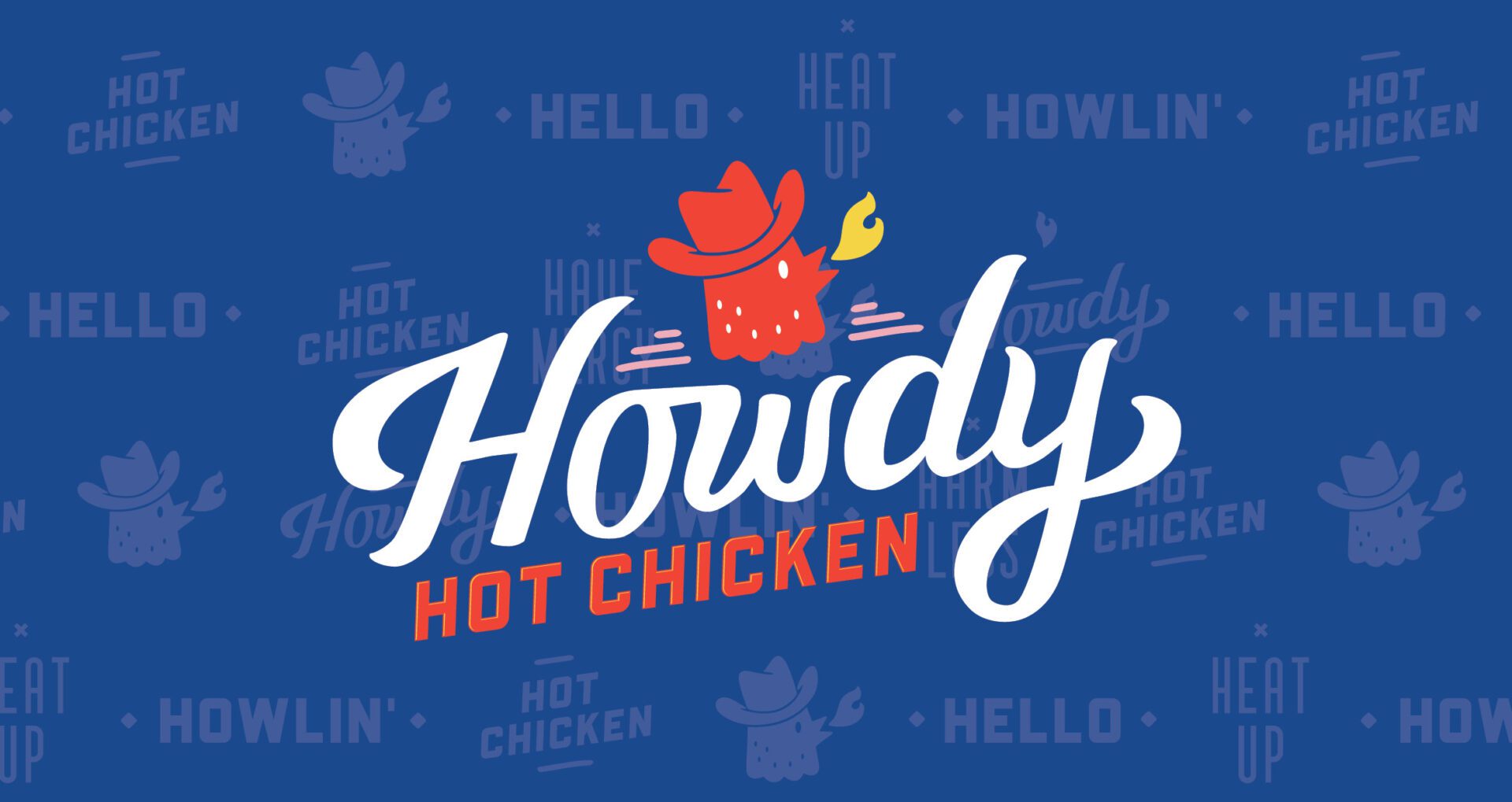
Here, we're showcasing some of our favorite logos we've created. We are walking through our process to show how a restaurant logo is created from start to finish, and how it can actually represent who you are.
The ES Global Logo
ES Global is a San Francisco-based company that builds connections between the US and Korean markets. Basically, they are the connection that brings family-focused US brands into the Korean market. They have a global identity with huge potential for growth and a massive client list. They represent dozens of brands.
Capturing what they do into a smart, effective logo was a super fun challenge. When they reached out to us to produce their brand mark, here's the information we gathered to inspire our design.
ES Global is unique because they are located in San Francisco, a great location to connect the US and the Korean markets. At the time, they primarily worked with brands that offer family-friendly products. Their strategic location and niche market set them apart. We knew their logo needed to highlight these things, but we didn't want to pigeon-hole them into a logo that would prevent them from being able to move into different markets or represent other kinds of products.
The final design features a reference to the Golden Gate Bridge, paying homage to the iconic San Francisco symbol. The shape of the bridge also creates a shape of a smile, and the tallest points of the bridge also appear to be the outline of two people holding hands.
For this icon, we used happy colors in bright hues that depicted the happy vibe of the ES Global brand.
The logo type includes a symbol that looks like the caret icon in place of the "A" in "Global." This forms an arrow visually that indicates the upward movement of the company and emphasizes the logo icon.
The final design creates an ideal visual representation of their company because it aligns with their business. While it represents their San Francisco origins and family-friendly products, it doesn't prevent them from expanding into other markets or moving their headquarters in the future.
Masala Wok Restaurant Logo
Masala Wok is a restaurant that combines both Indian and Asian cuisine and brings it into the American fast-casual market. To bring this unique new restaurant into the world, we knew they needed a logo that would highlight their modern feel and the unique way they combined Indian and Asian flair. We wanted customers to connect with and remember Masala Wok through their branding.
So, we got to work. We started by working on a logo icon design that would combine both Asian and Indian culture. We created an elephant that would end up becoming Masala Wok's mascot of sorts. We chose an elephant because of their strong association with Indian culture. We tied in the Asian component through the flame icon, which is indicative of the wok, a traditional preparation method for Asian food.
The color palette we chose was rich and bold, just like the flavors of the food Masala Wok offers. Warm, inviting tones were organized into different color palettes to differentiate the Indian and Asian food offerings on the menu. Yellow and red indicate the Asian choices, whereas blue and orange showcase the Indian options.
Corporate Logo Design: Alltrust
To show off our serious side, we're showcasing a more corporate logo we've created for Alltrust. Alltrust is an insurance agency that specializes in employee benefits. Their company culture places a huge emphasis on people, and they felt that this wasn't coming across in their branding when they reached out to us to rebrand them.
As we started their logo project, we realized their people-first perspective was what really set them apart. We researched their goals, competitors, and industry common practices and developed a new mantra for Alltrust: “People. Our People. Your People. Their People.”

Next, we got to work representing their culture through their logo design. To do this, we made a design out of fingerprints in different colors to form a cohesive icon. The final icon emphasizes the "people" focus of Alltrust and the collaborative nature of their business. The design also resembles a treetop, which represents Alltrust's deep roots of knowledge and experience in their industry.
Your restaurant logo is a foundational element of your business. You truly need a team of branding experts to take the unique aspects of your business and turn them into a memorable, effective brand mark. If you're ready to start a restaurant logo design project, give us a call. We would love to work with you.
