Stay’d

restaurant brand design

Meal delivery service is nothing new. You place your order, get your ingredients delivered to your doorstep, then you do the cooking. But imagine if all the hard work was done for you and all you had to do was sit back, relax, and enjoy restaurant-quality food at home with the ones you love.

Enter Stay’d.

Maadaadizi Investments developed an innovative concept for a meal delivery service that brings thoughtfully curated food experiences to your front door and frees you from the hardships of meal preparation and hosting. For help taking their concept to the next level, they came to the restaurant branding experts at Nice Branding Agency.

Restaurant Brand Identity Project Kickoff

Our restaurant brand identity creative process begins with discovery.

The client completes a Creative Questionnaire to educate our team about the project. We then have a kickoff call during which we get to know the client, their business goals and any vision they may have for their brand.

Naming

Our first challenge in developing a restaurant brand identity? Naming the business.

Note that Naming is not included in our standard restaurant branding packages; it is an add-on.

At the start of our Naming process, each of our team members independently immersed herself in the goals, history, positioning and “why” of the business, and then came up with a variety of potential names.

Next, we came together to share our ideas. After talking through the advantages and disadvantages of each name, we eliminated those options that wouldn’t be strong enough to serve as the first word in the brand’s story.

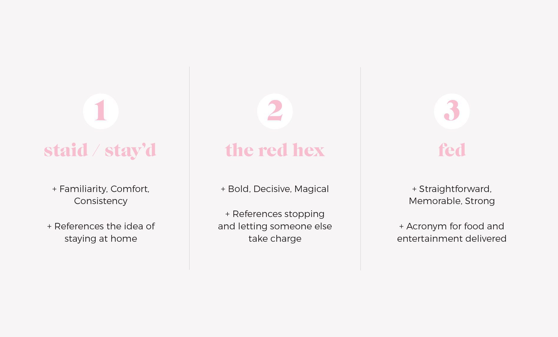
The remaining names were backed by reason and research: “staid / stay’d,” “the red hex,” and “fed.”

The first option was “Staid” or “Stay’d,” referring to the idea of staying at home. It makes you think of a date night in or an intimate meal with friends and family. The first spelling, “Staid,” implies steadiness, a sense of dignified respect that elevates the brand. Alternatively, “Stay’d” has a modern, youthful mood. Whichever you choose, the undertone of the name remains: familiarity, comfort, consistency.

The second option was “The Red Hex.” This name speaks to our current collective state through a symbol we all know well: A stop sign. We’re used to the hustle and bustle. But there’s no guilt in stopping and letting someone else take charge. Red is a bold, decisive color. The word “hex” has an air of magic to it. There’s a certain allure to the name which suits the act of ordering in.

Lastly, we presented “fed.” Food and entertainment delivered. The straightforward acronym evokes confidence. We are exactly what we say we are. It’s memorable: The past tense of a word we’ve known since we could barely walk. It’s strong: the word itself has only positive associations. It works well within a logomark and fits seamlessly into brand messaging.
meal delivery branding attributes

Upon presentation, our client selected “Stay’d” for the positive feelings it conjured and how it resonated with their vision for the brand.

The Starter Package: Restaurant Brand Identity

After completing the Naming process, we began working on The Starter Package.

We create two options for the restaurant brand identity, including a mood board, logo design, brand color palette, brand fonts, and supporting brand icons. The client selects one option and it becomes the basis for their brand.

Design Direction Brainstorm

Once we had a good understanding of the business goals, location, target market, offerings and competitive differentiators, we developed two restaurant brand identity concepts, each with a unique look and feel.

The first option had a retro, vintage feel and emphasized the comfort of being at home with loved ones. The second option had more vibrant colors and a fun, flavorful energy.

We dive into the details below. Follow along to find out which option won.

First Restaurant Brand Concept Development

Brand One is the more vintage of the two.

The overall aesthetic centers around the comfort of being at home. The enjoyment of Sunday supper with family and friends. Laughter accompanied by the sound of glassware clinking.

It’s reminiscent of the good ol’ days when you would savor every bite, read the newspaper, and be fully present in conversation. This is what Stay’d brings to the table. Friends, fellowship, and good food.

Mood Board

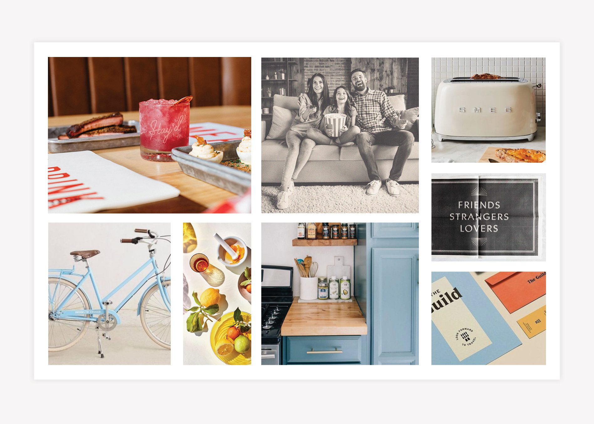
The Starter Package begins with the creation of a mood board to communicate the overall aesthetic of the restaurant brand identity.

For the first brand concept, we selected photography that shows modern-day experiences but in a retro-filtered application to align with the brand.

meal delivery branding mood board

Logo

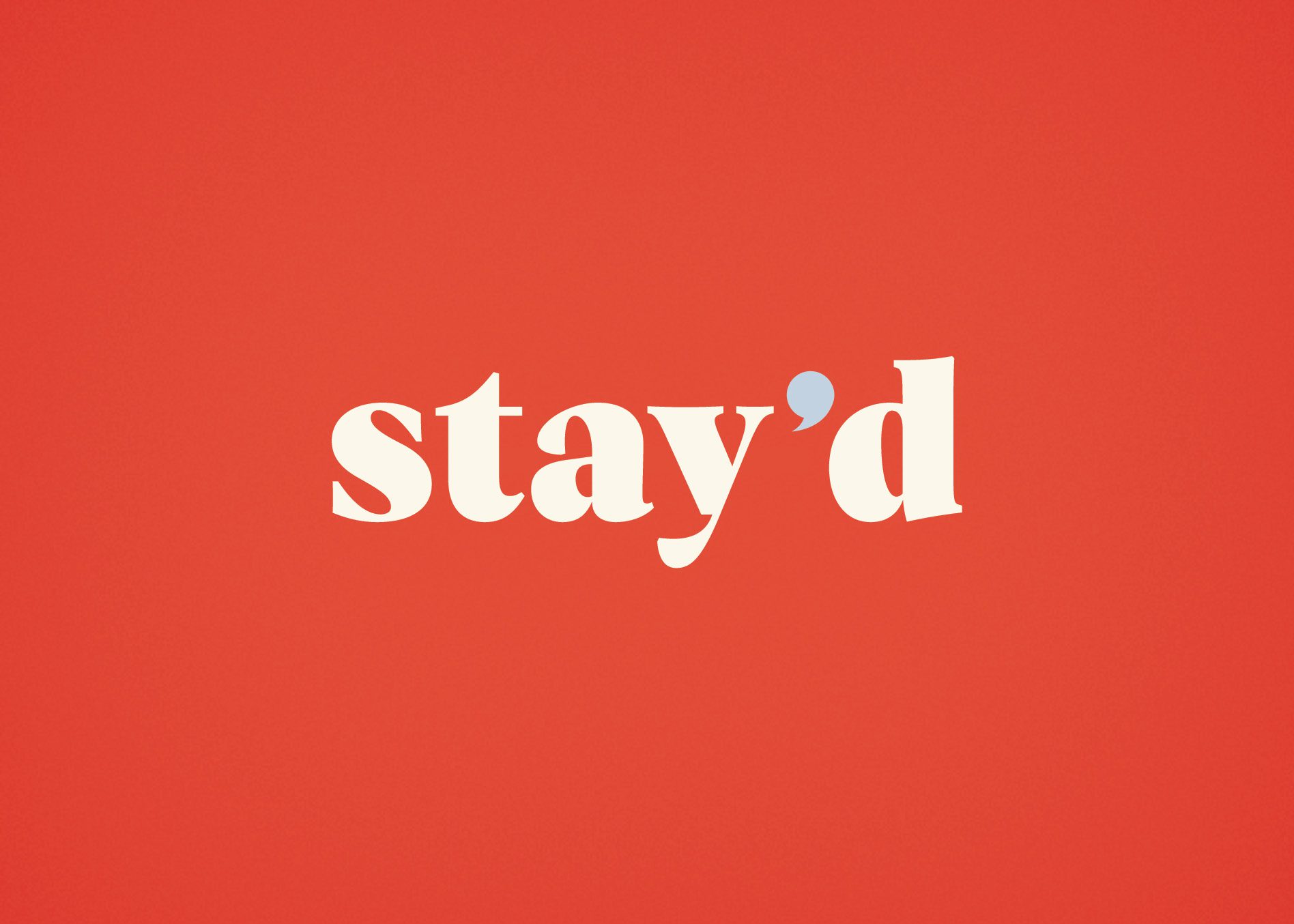
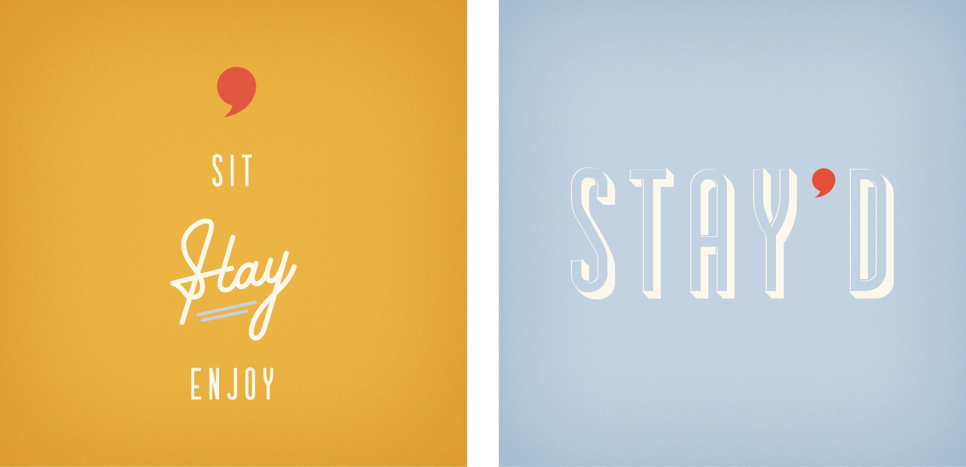
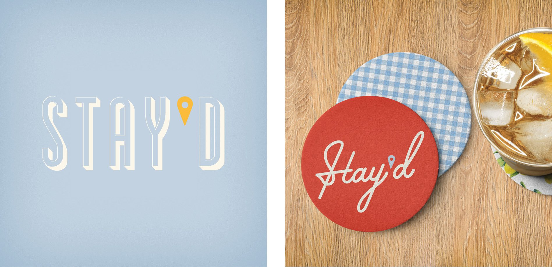
We chose a friendly serif face for the restaurant logo that is easy to read and comfortable to digest. We designed the apostrophe to double as a speech bubble.

This speech bubble represents the fellowship and conversation that takes place over good food. It can be implemented throughout the branding to drive home the conversation aspect.

The speech bubble can also be flipped to be a comma, indicating a pause.

design logo branding restaurant

Brand Colors

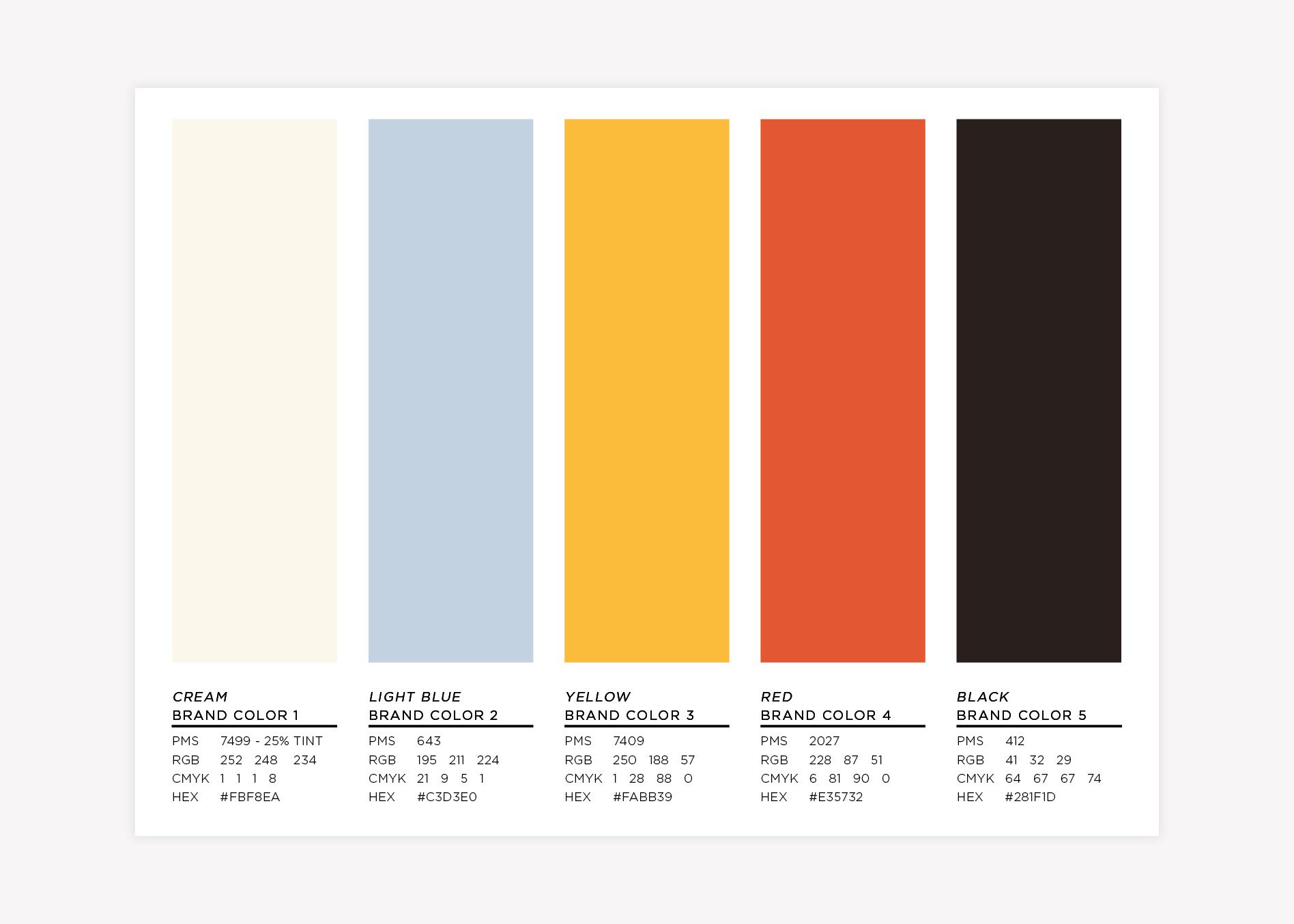
The colors for this brand direction are classic, comfortable, and reminiscent of ones you might have seen in a vintage kitchen.

restaurant industry brand colors

Brand Fonts

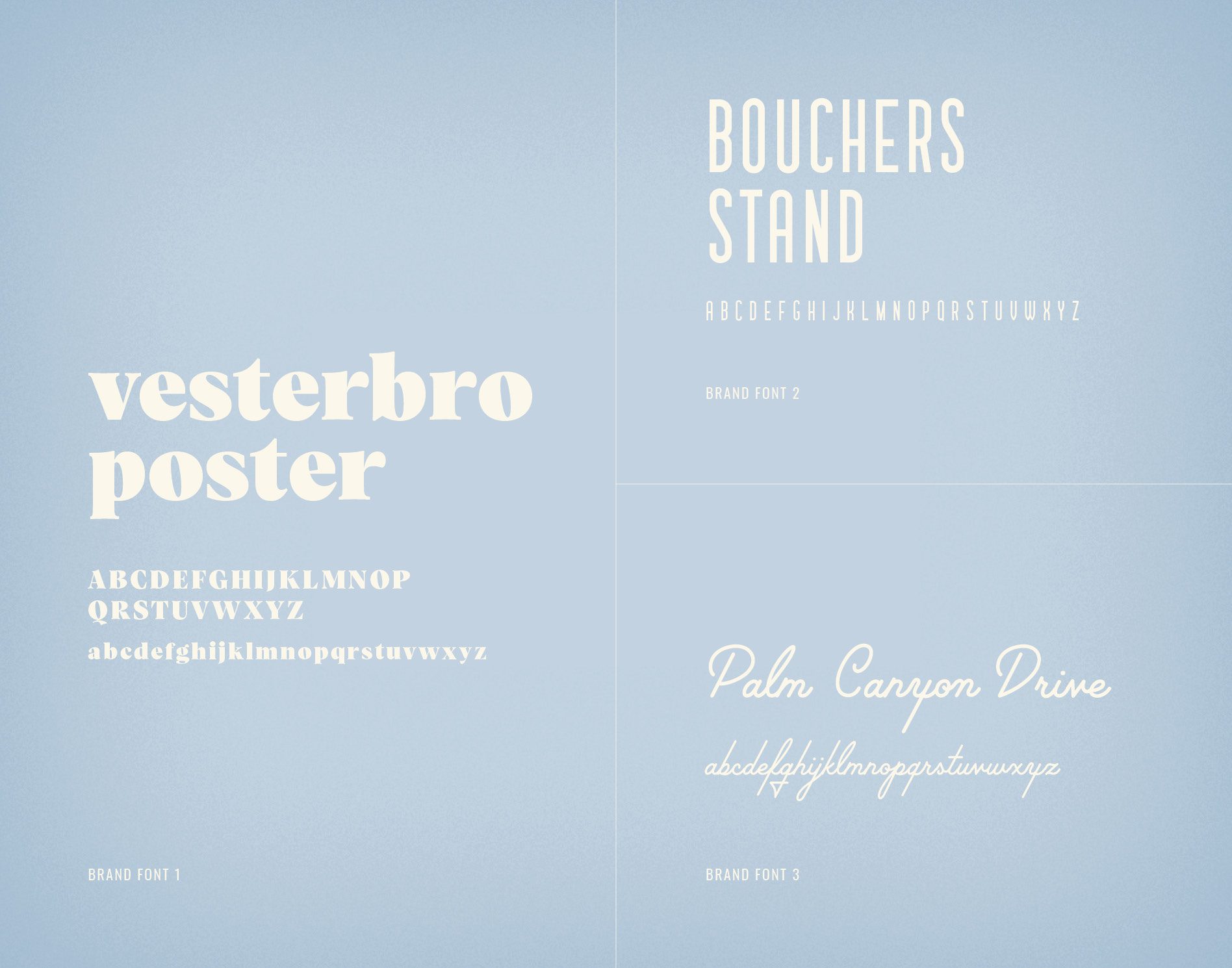
As mentioned, we settled on a friendly serif face for the restaurant logo that would be easy to read and comfortable to digest. We also identified supporting brand fonts outside of the logo font.

food industry brand fonts

Supporting Icons

We developed complimentary supporting brand icons that pair well with the classic retro feel of the brand. But you will see we carried the speech bubble apostrophe into these other supporting logos. This variation can represent the different markets, while keeping the recognizable mark of Stay’d throughout the branding.

The speech bubble apostrophe could also stand on its own as a brand icon.

food logos meal delivery branding

Second Restaurant Brand Concept Development

The overall aesthetic for Brand Two is fun, creative, and flavorful. It captures the energy and sounds of laughter between friends and family as they come together around the dinner table.

Mood Board

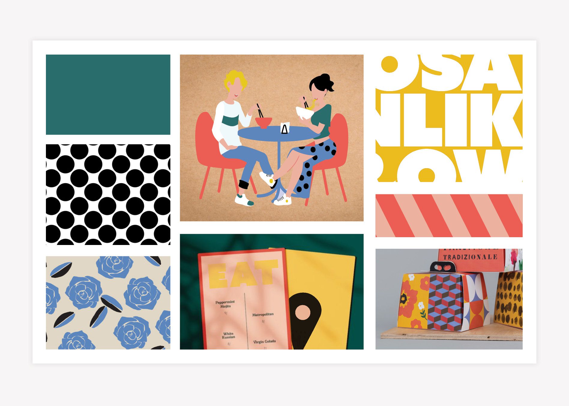
There are several patterns—from polka dots to stripes—in this brand and bright colors that vibrate off of each other but work seamlessly together. Custom brand patterns will be made from elements of the logo.


brand board meal delivery branding

Logo

We chose a carefully crafted display typeface for this logo that accurately depicts the careful curated meals from Stay’d. This logo is a mix of circles and diagonal shapes that play well off of each other.

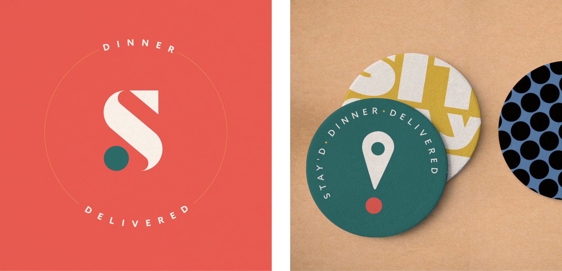
The circles represent people and the diagonal rectangular shapes represent the tables we sit around. Moving our focus to the apostrophe, you will see that it forms a location marker. The location marker represents staying home.

logo design nashville branding agency

Brand Colors

The colors for this brand direction bring a fun, energetic feel to the brand. The teal and yellow bring in warm tones that make you feel at home, and are paired with the lighter blue, peach, and red to bring energy and fun to the brand that ties into the experience.

restaurant brand colors tennessee

Brand Fonts

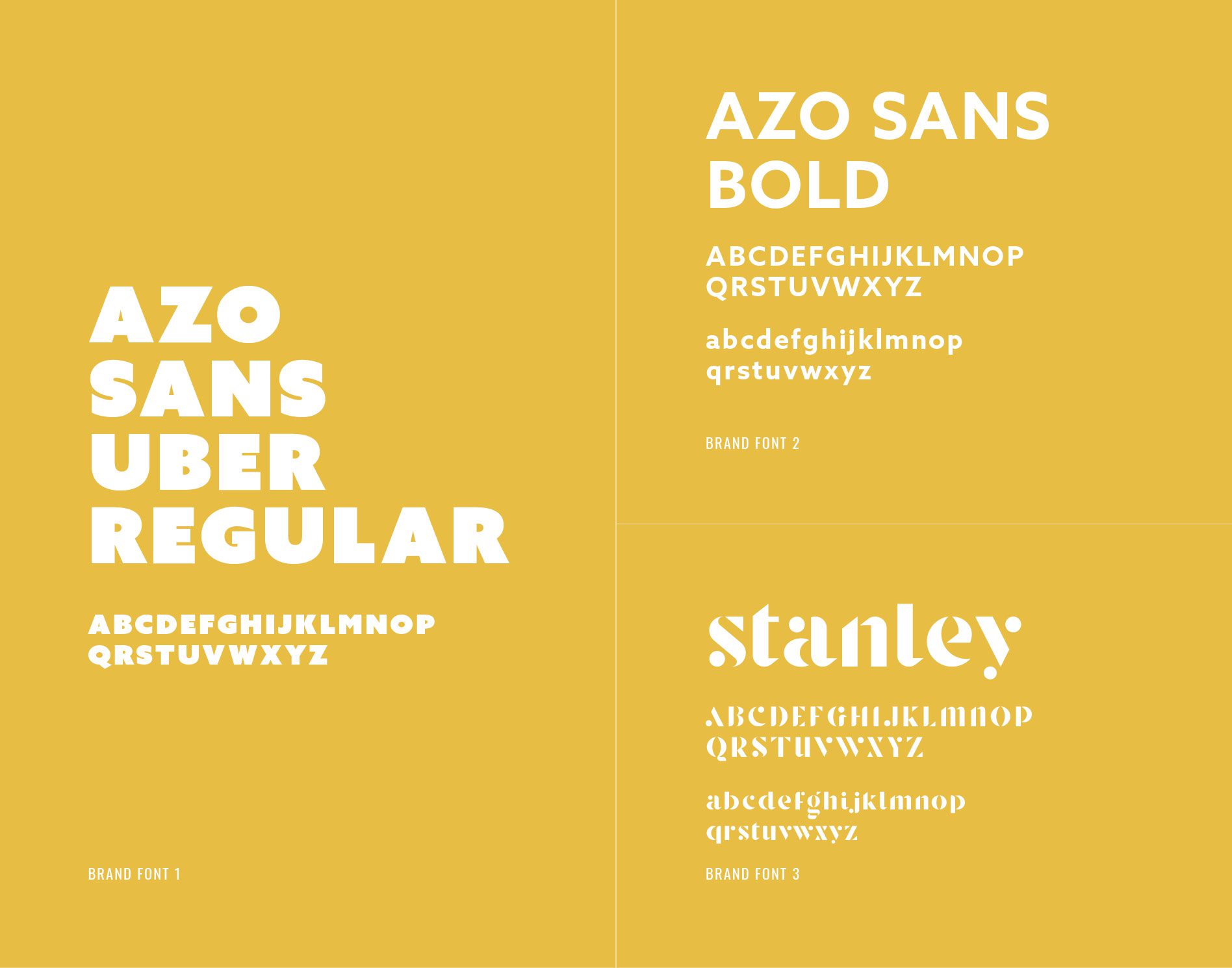
The main fonts are the uber-bold sans serif and the slightly less invasive bold version of the Azo Sans font family. We would also be able to use the logo font for support in the restaurant branding and marketing efforts.

food business brand fonts

Supporting Icons

For the icon itself, we moved the circle from the main logo under the location marker apostrophe, to form an exclamation point. This visually brings the action of excitement to the brand and the emotion of excitement to stay home, have dinner delivered, and spend time with loved ones.

There is also a supporting brand icon of the S from the main logo with supporting text surrounding it.

secondary logos food company

Presentation and Selection

We presented both brand options to Maadaadizi Investments. During the presentation, our team walked through the concepts, detailing our thought process behind the designs.

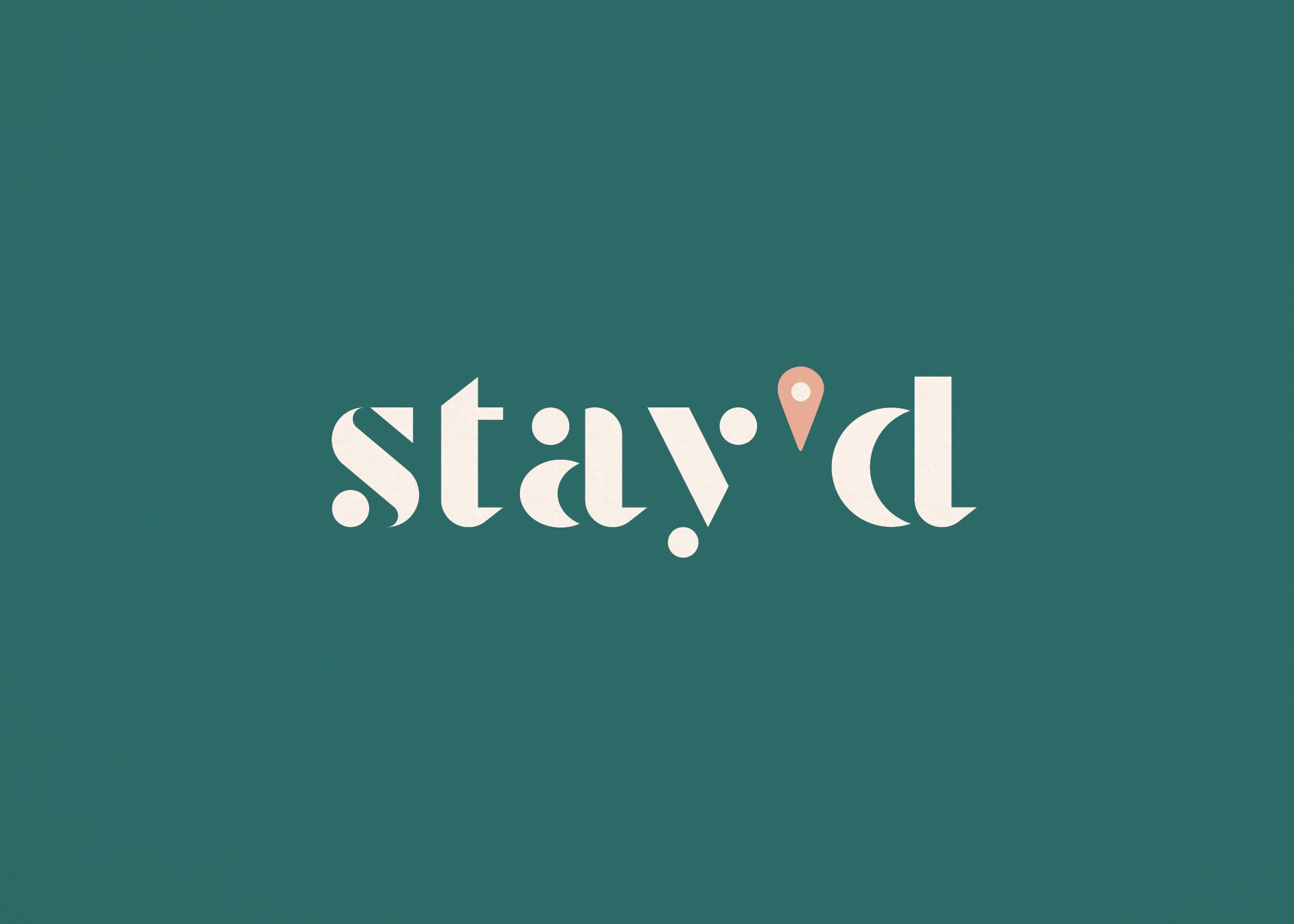
The client selected the first brand concept, but they liked the location marker used as the apostrophe in Brand Two. So, we revised Brand One to use the location marker as the apostrophe in the logo.

Picking and choosing elements from different concepts and combining them doesn’t always work. But, in this instance, the graphic style of the location marker complemented the overall aesthetic, so we happily made the change.

final logo meal delivery branding
final secondary logo designs branding

Logo Finalization

Upon selection and approval, we moved into finalizing the restaurant logo. We ensured that all elements of the logo were perfect and precisely spaced. Additionally, we selected exact logo colors in PMS, CMYK, and RGB codes.

We then created final logo files in JPEG, PNG, EPS, and PDF. We provided the logo files to the client, along with logo guidelines, in full color, black, and white.

Restaurant Brand Identity Guidebook

Our restaurant brand identity guidebook is essential in keeping the brand intact. We supplied Maadaadizi Investments with a booklet, including the mood board, the logo, supporting brand icons, brand colors, and brand fonts.

Restaurant Brand Identity Project Closeout

Maadaadizi Investments was pleased with our services and we have become a trusted partner of the company. We look forward to supporting them in future branding and marketing efforts.

Ready for a Nice Restaurant Brand? Contact us today.

Follow us on LinkedIn and Instagram to learn more about our services and see examples of our work.

are you ready to create something nice?