Hotel Restaurant Logo Designs by Nice Branding Agency
Our client — The Hotel Group — requested hotel restaurant logo designs for several establishments scattered across Montana, Washington, and Missouri.
In signature Nice fashion, each hotel restaurant logo needed to be bold, relevant, and incapable of being ignored. We needed to hammer out designs not once, not twice, but five different times. Ultimately, we love how these projects turned out, and we can’t wait to reveal the final versions.
Jump on board for a fast track through five restaurant logo development projects by our restaurant branding agency.
The Rail Bar & Bites | Kansas City, Missouri
Hotel Restaurant Logo Design
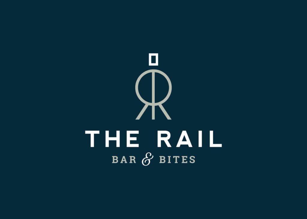
The Goal: Design an attractive, railroad-inspired hotel restaurant logo that pairs a modern concept with vintage typography.
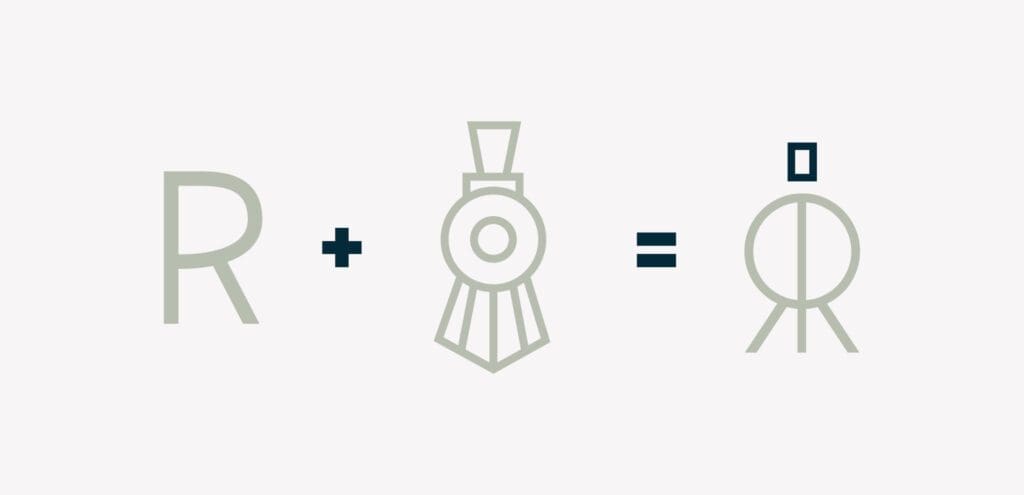
The Process: With the city’s Union Station clock as our muse, we sketched out several ideas that would appeal to both local residents and fast-moving commuters. The logo needed a classy and communal feel, such that high society and casual community members could converge in one space. Along the way, we tested out options with vintage typography and abstract icons.
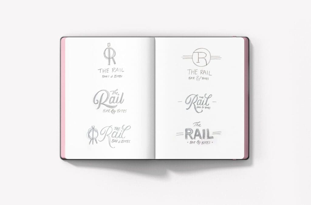
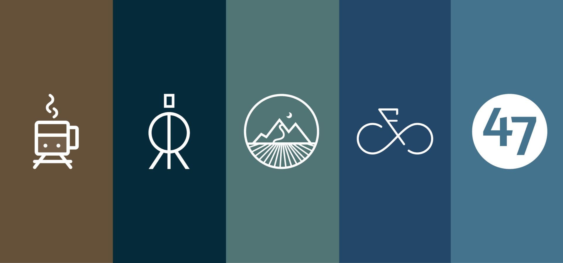
The Winning Hotel Restaurant Logo Design: In the end, the client selected an abstract, symmetrical logo built from a mirrored R. This version featured a full silhouette of an approaching train. At the project’s final destination, the client was equipped with a primary brandmark, secondary logo, stand-alone icon, font selections, and application guidelines.
Full Steam Coffee Shop | Kansas City, Missouri
Hotel Coffee Shop Logo Design
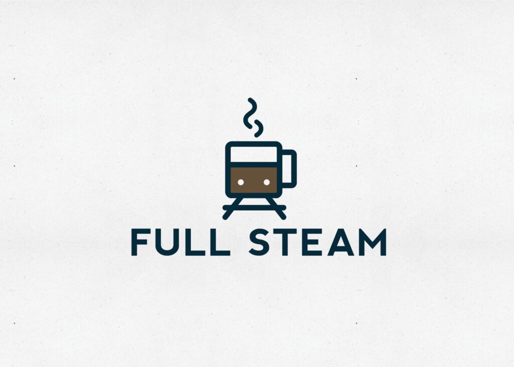
The Goal: Design a coffee shop logo that honors the local history, aligns with sister brands with the hotel, and charms busy commuters.
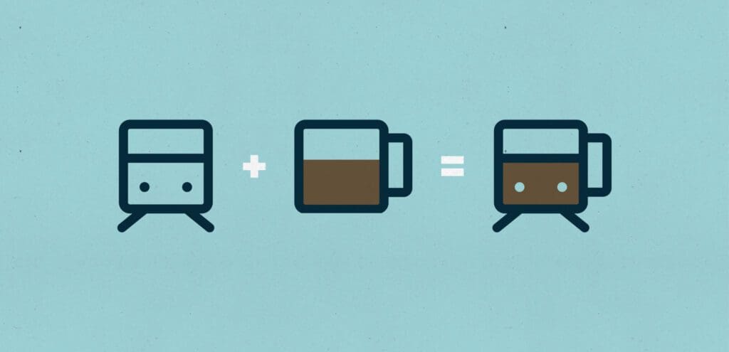
The Process: Like our morning coffee and the locomotives in Kansas City, this project chugged along quickly. Full Steam’s region is known for its major railroads and fast-moving business clientele, so we were determined to combine train station elements with major coffee identifiers.

The Winning Hotel Restaurant Logo Design: Through a unanimous vote, the Nice Branding Agency team and The Hotel Group selected a front-facing mug and custom train icon. The most modern of the options, this design ticked all the boxes for the contemporary coffee shop. Today, the Full Steam logo is splashed on exterior signage, interior hotel signage, coffee cups, and coffee sleeves.
The Trails Bar + Bites | Helena, Montana
Hotel Bar Logo Design
The Goal: Design a meaningful hotel bar logo that respects the region’s roots and followed an old-school aesthetic.
The Process: Through our research of the landscape of Helena, Montana, we learned the significance of the local bike trails. Considering the extensive nature of the trail system, we were not content to simply focus on a bike but rather to highlight the trails themselves. As a result, we sketched multiple logos that varied in iconography and typography.
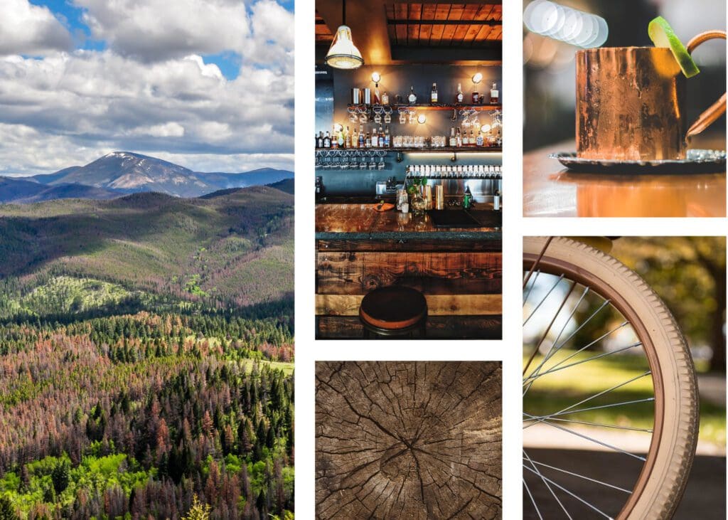
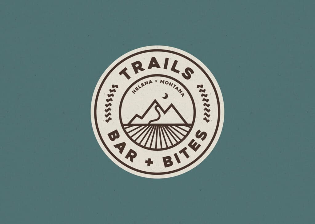
The Winning Hotel Restaurant Logo Design: In the end, we delivered a bold brand icon showcasing the topography of Helena. Using a color palette of natural tones and decorative elements representing tire tread and wheel spokes, the logo is weighty in impact and meaning for this mountainous town. Versatile and strong, this logo comes to life on menus, merch, and more.
Fork & Spoke | Redmond, Washington
Hotel Restaurant Logo Design
The Goal: Design an approachable hotel restaurant logo that appeals to cycling tourists and positions the business as a neighborhood favorite.
The Process: Knowing Redmond as the Bicycle Capital of the Northwest, the Nice Branding Agency team pedaled through many cycle-heavy ideas. Through all projects with The Hotel Group, the client prioritized maintaining community integrity and creating a space the locals love. This focus, combined with a restaurant location friendly to walkers and bikers fresh off the trail, kept the designs light and modern as opposed to formal and uppity.
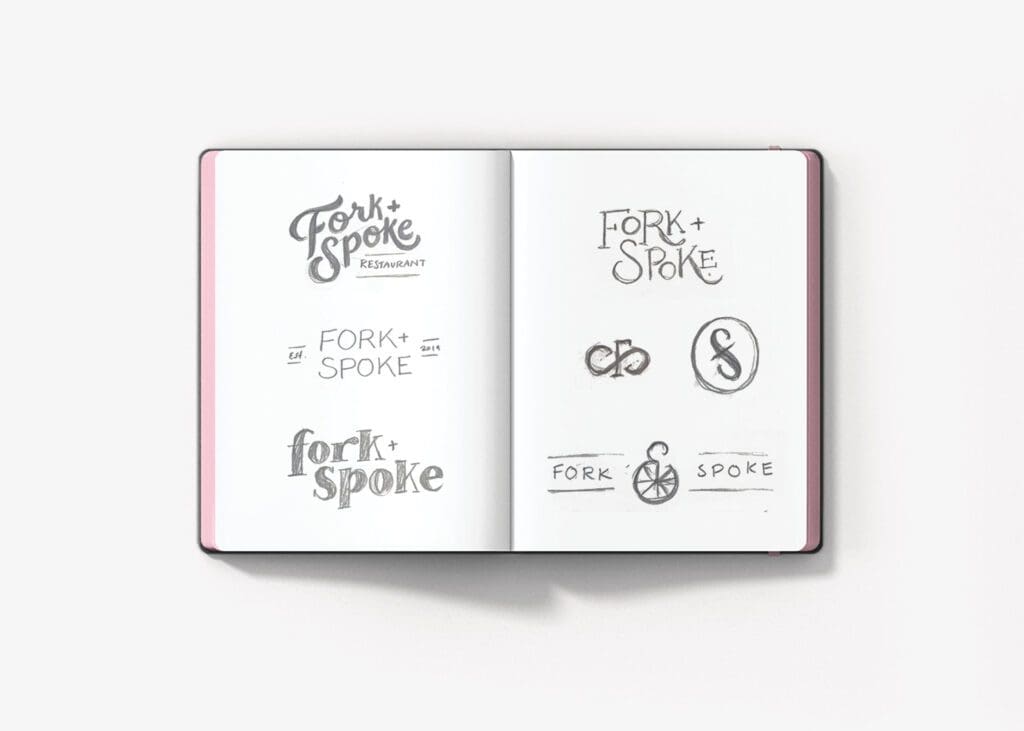
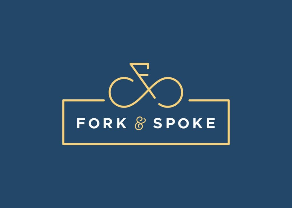
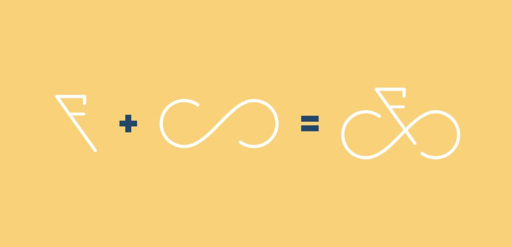
The Winning Hotel Restaurant Logo Design: By the project’s completion, Fork & Spoke’s brandmark evolved into a unique statement icon — a bicycle made out of the initials F and S. The F lays out the handlebars, with the S swirling into two tire shapes. To complement the casual but professional nature of the icon, we added a clean and modern sans-serif typeface and upped the ante with a stylized ampersand.
47 North Bar + Bistro | Bellevue, Washington
Hotel Restaurant Logo Design
The Goal: Design a strong, professional hotel restaurant logo that evokes confidence in fine dining and coordinates seamlessly with the interiors of both the hotel and restaurant.
The Process: To integrate 47 North with its reputable sister brands, we focused on colors and styles that matched hotel interiors and legitimized the business. Our design team primarily worked with typography, determined to create an eye-catching logo that called out the numeral in the name and showcased the professionalism of the bar and bistro.
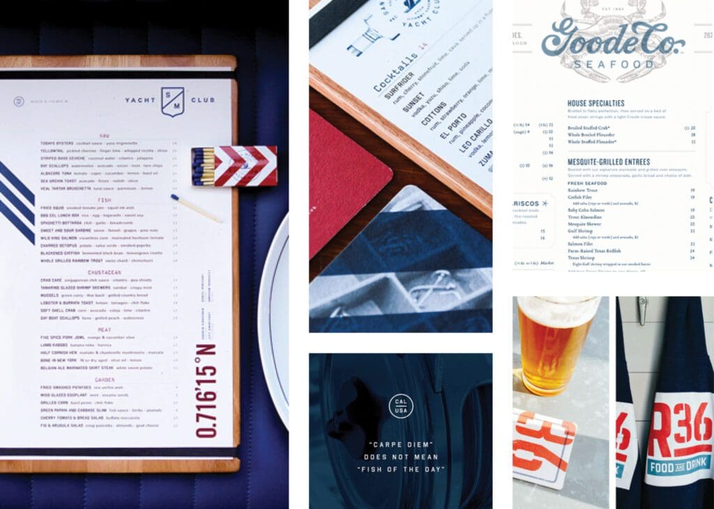
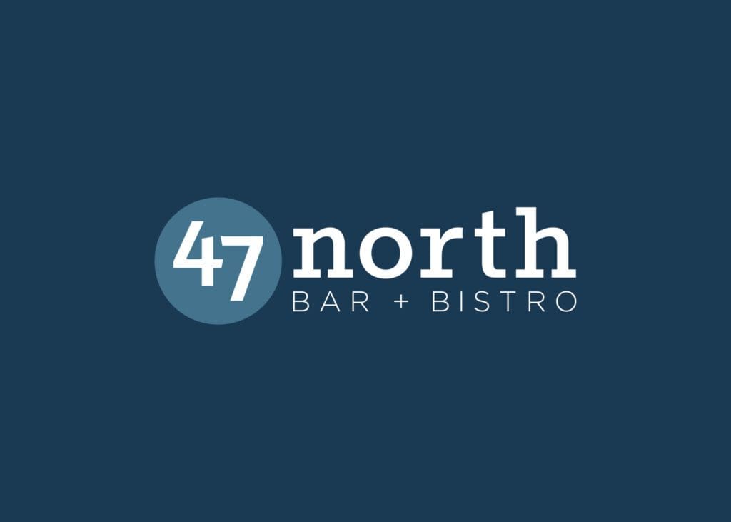
The Winning Hotel Restaurant Logo Design: When the results were tallied, the client selected a simple, straightforward typographic design. Contrasting the number with the rest of the name, Nice Branding Agency increased the likelihood of brand visuals imprinting in customers’ minds. The blue colors complement the environment of the hotel and restaurant and bring a calming and trustworthy emotion to visitors.
Ready for a Nice Hotel Restaurant Logo?
We loved those five courses, but our forks are ready for more. If you need help with restaurant branding, give us a call and we’ll dig right in.
For more examples of Nice projects, see what we’re serving up on Instagram and LinkedIn.
