Our Secrets to the Masala Wok Menu Design
At Nice Branding Agency, we believe that the menu design is one of the most important parts of restaurant branding. We move into menu design after we have set the foundation for a restaurant brand so that the final menu reflects the attributes of the established brand.
As a restaurant-menu design company, we focus much of our strategy on user-experience. For instance, our menu design project with Masala Wok was part of our restaurant rebrand for the Texas-based Indian-Asian restaurant concept. As we walk through the Masala Wok menu process, we want to shed some light on our secrets for menu design.
Understanding A Complicated Menu
Masala Wok has been part of the restaurant business for over a decade. They had established a following of people who already knew about their unique cuisines. Unfortunately, they struggled to bring new customers and attract the mainstream public. Additionally, the menu seemed to add a level of complication when new guests did enter the restaurant.
The Masala Wok Menu Design Project
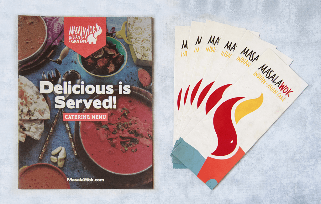
Masala Wok reached out to us for a restaurant rebrand that included a logo redesign, menu design, interior design, food photography, and design of other supporting brand elements to attract new, mainstream customers to their established chain.
We started with an in-depth strategy phase to uncover opportunities for improvement, the foundational branding strategy.
The Menu Design Research
We began by fully immersing ourselves in the current menu offerings. This helped us understand the options available and grasp the goals of the current menu from the Masala Wok owner’s perspective.
After that, we wanted to analyze the ordering process from the customer’s standpoint. Here, we found two issues with the menu. The first one was that the food names were unrecognizable to mainstream customers. Secondly, during the ordering process, the way the menu offerings were presented on the menu was confusing.
Setting The Menu Layout
With a goal to add clarification and simplicity to the ordering process, our strategists and designers worked hand-in-hand to reorganize the menu offerings and align the design with the newly established brand direction.

We made the ordering process for many Masala Wok menu items to require the customer to select from several options for protein, veggies, sauce, noodles, rice, etc. Previously, the customers were having trouble making a selection because they were inundated with information and confused about their options. In the end, this resulted in frustration for both the customer and the cashier.
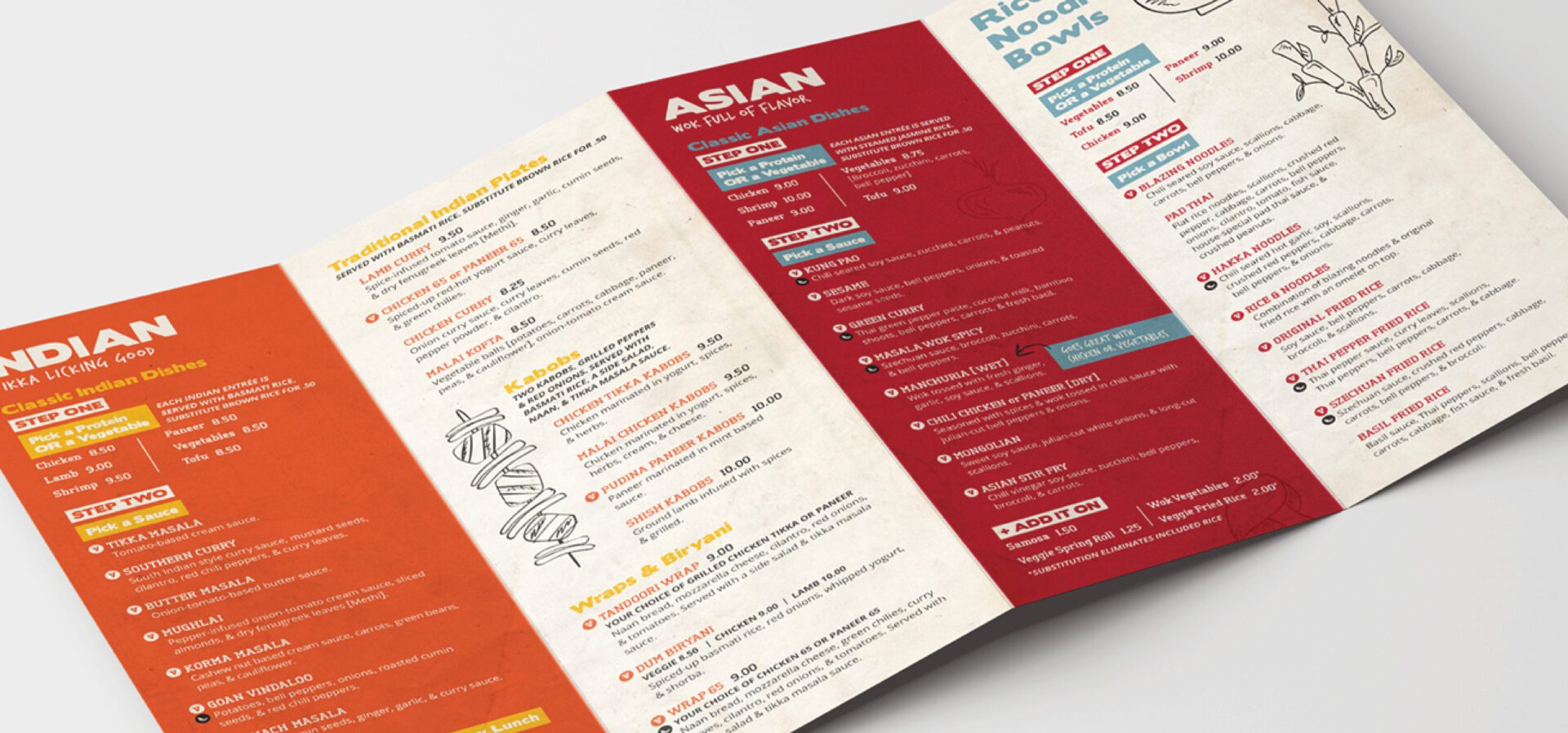
Unlike the previous menu, the new menu design set out a step-by-step approach that navigated the available options to build the perfect Indian or Asian dish. This allowed the customers to move through the menu with ease.
The Visual Hierarchy
Nice Branding Agency Nashville strategists and designers established a hierarchy of headers and subheaders in brand colors. These headings were used to draw the eye, systematically guiding the customer to select Indian, Asian, or Bowls, then to move vertically through the ordering process, starting with step one.
Additionally, we created an “add it on” section to allow the customer to further customize their selection after moving through the initial options. The add-ons also worked to upsell high-profit items that are an obvious and simple addition to the main dish.
As part of the larger rebrand, our team defined a specific color system and icon system to assist in the separation of the two regional cuisines. This system was carried through the menu design to help distinguish the difference between Indian offerings and Asian offerings.
We created icons for both vegetarian and spicy options, since some of the major challenges customers faced during the ordering process included identifying vegetarian and spicy options. We made sure to display that information in a manner that was cohesive with the brand and did not detract from the design and flow of the menu.
Showing Off the Brand
We curated a connection between the brand voice and the customer. As we sprinkled brand messaging such as “tikka licking good” and “wok full of flavor,” throughout the menu.
We wanted to keep the main focus on higher-selling dishes, so we placed the Apps, sides, salads, desserts, and the kids’ menu on the outer edges of the menu.
Additionally, the newly-designed menu was translated to to-go menus and menu boards, as well as an online menu for digital consumption on the website.

Overall, the restaurant rebranding and menu redesign for Masala Wok has resulted in increased sales at each location. Additionally, Masala Wok saw a 21% increase on average in opening revenue that have launched with newly-designed brand elements.
We hope this helped you understand how much of an impact a new menu design can make for your restaurant. If you’re ready to start a restaurant branding project with Nice Branding Agency, just drop us a line.
We would love to walk you through our process and help set you up for success.


