Matcha Magic Cafe Branding

Cafe Restaurant Brand Identity

Matcha Magic is a fun and playful matcha cafe based in Seattle that really bewitched the team at Nice Branding Agency. A new brick and mortar cafe, they serve a variety of matcha-based beverages. Matcha Magic is a lively place to meet a friend or colleague, do homework, or otherwise hang out.

The client’s main goal for this cafe branding project was to have the highest quality cafe concept and make the centuries-old matcha tradition more accessible to the average Joe or Jane. About 85% of the menu is matcha-specific products. Additional items include regular coffee-based drinks. Similar to Starbucks, customers order at the counter and can enjoy their matcha drinks in the cozy seating area.

Matcha Magic began with two locations and the owners plan to branch out to five or more locations as the company grows. In the future, the client would like to expand to wholesale and retail channels. Matcha Magic has a big vision for the future and we were excited to develop a Starter Package to help them on their journey to get there.

cafe restaurant branding design

PROJECT KICKOFF: CAFE BRANDING

As with every restaurant or cafe brand design process, we first begin with discovery activities to get our team acquainted with our client. In order to begin to deliver another amazing brand under a Starter Package, we first ask our clients to participate in a project kickoff call. This provides us with essential background information. Our strategists study the information and our notes from previous sales meetings before we begin the brainstorming process.

DESIGN DIRECTION BRAINSTORM

The owners are huge Harry Potter enthusiasts and “magic” in Matcha Magic stems from their fandom. They also drew inspiration from an ice cream shop with magic in its name. Colorwise, our client liked the idea of leveraging green to represent the matcha color and were open to additional ideas.

Matcha Magic signed on for a Starter Package service, so we planned to create two cafe brand design concepts and allow them to select the one they aligned with most. After speaking with the client about their preferences, location, and target audience, our creativity really started brewing. Expecto patronum!

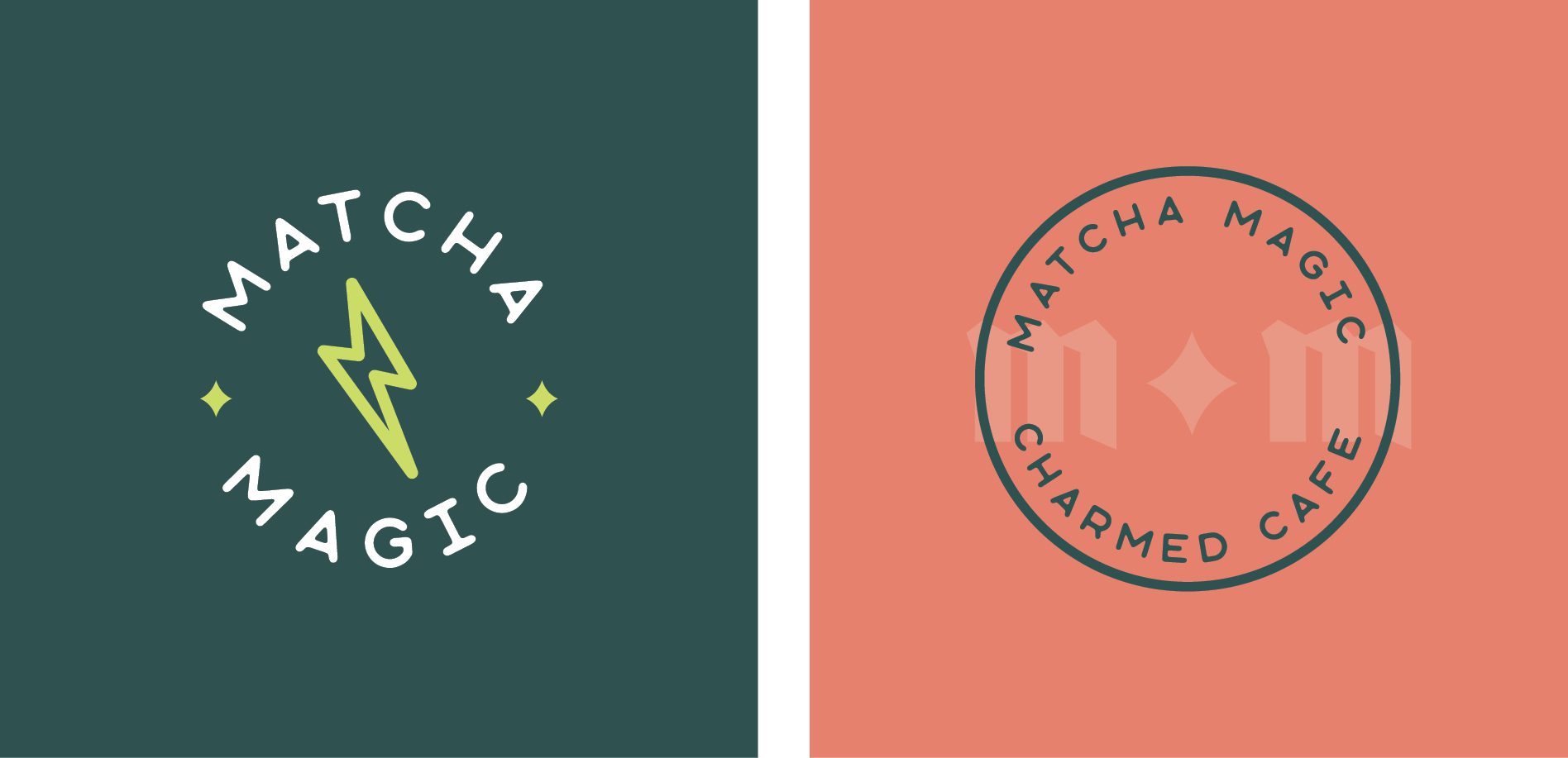
We knew that we wanted our brand concepts to be open, playful, inviting, and well, magical. Matcha Magic’s brand direction has a magically fresh, zen vibe and we ended up making one option that is vibrant and dramatic and another that is fresh, calm, and subdued. The client ultimately liked elements from both of the concepts we presented. Read on to find out which one enchanted them most.

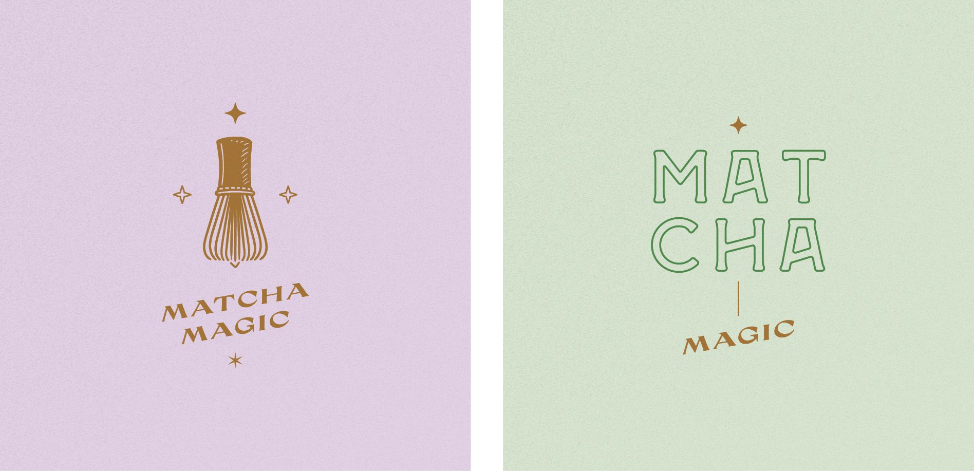
FIRST CAFE BRANDING CONCEPT DEVELOPMENT

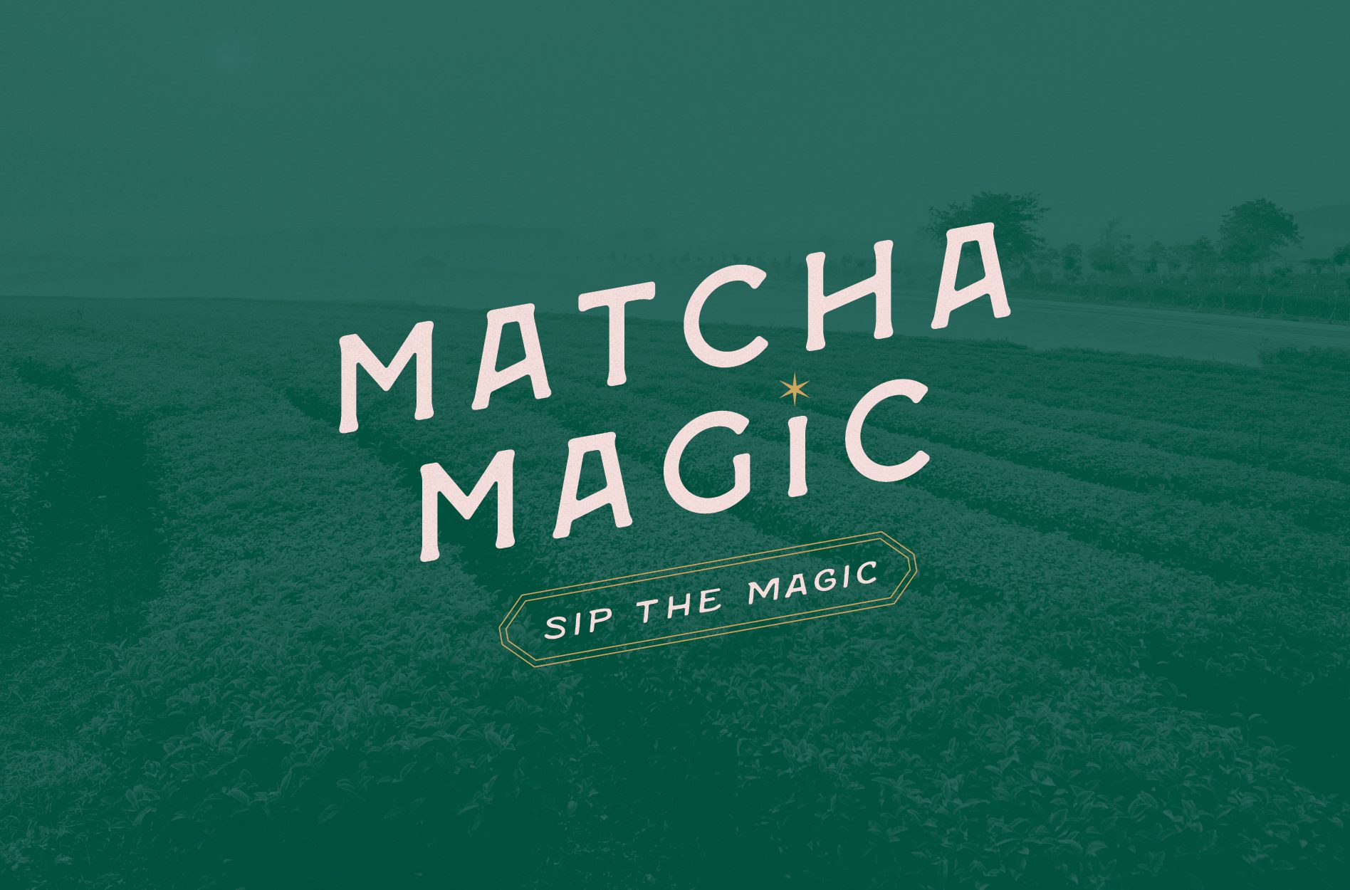
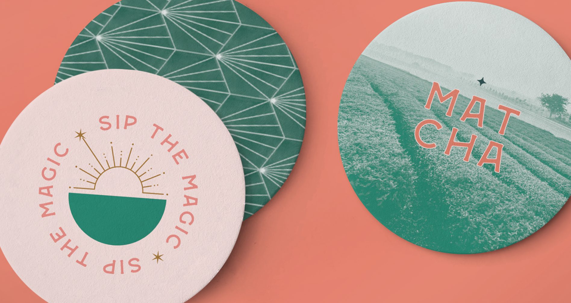
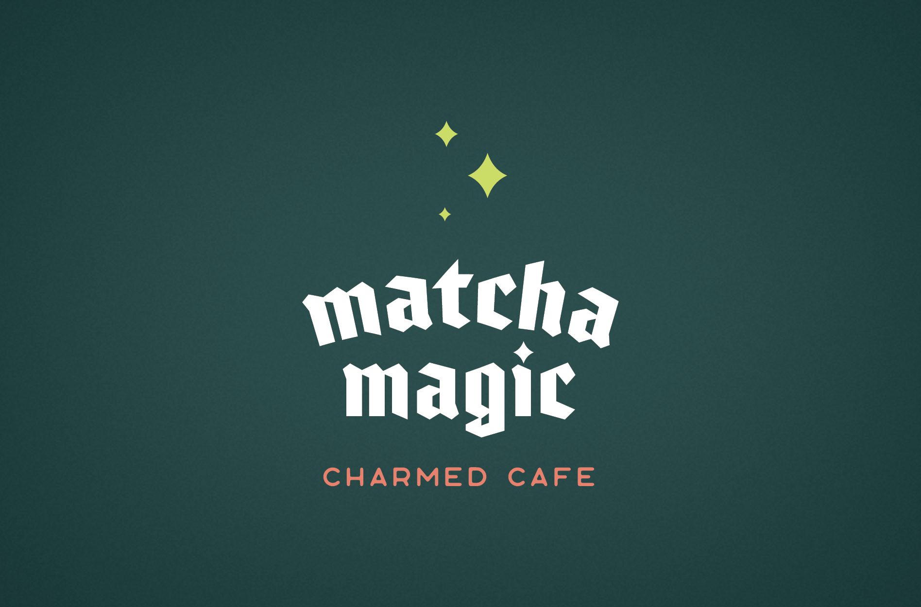
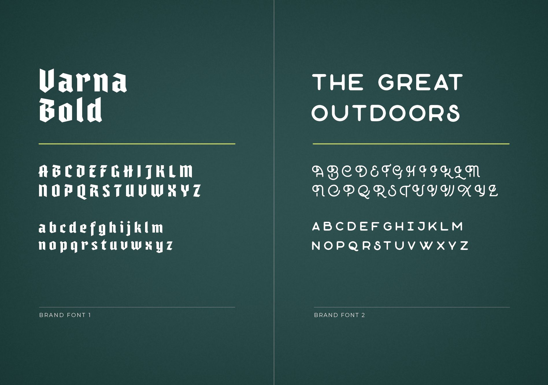
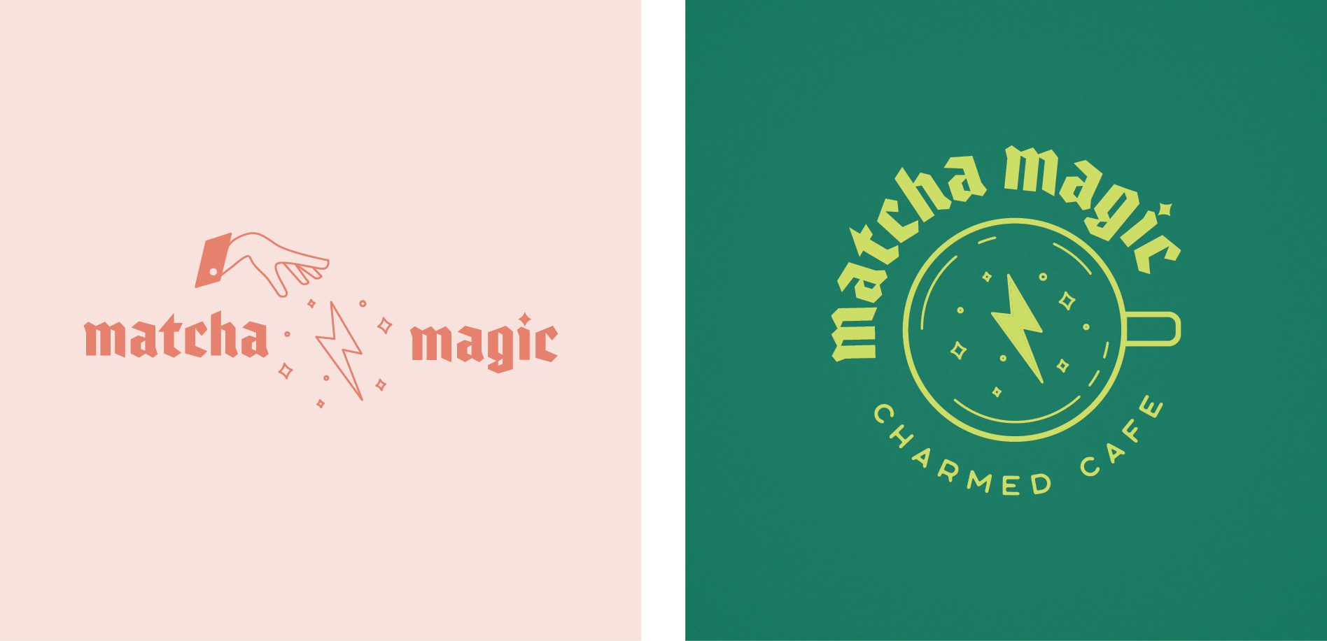
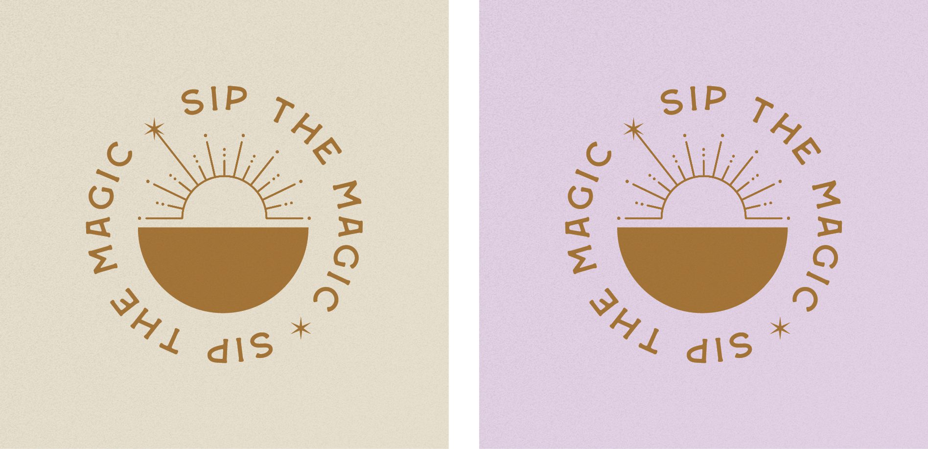
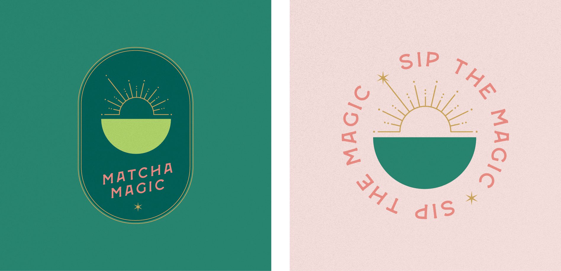
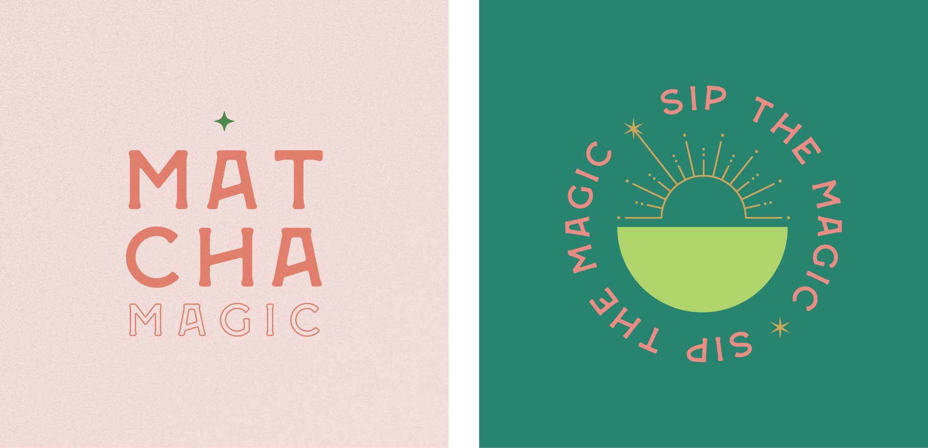
The first cafe brand design direction that we presented is something we call Charmed Cafe. This brand direction is characterized by a fun, whimsical tone with an electric vibe.

We used unique typography and a mischievous style to appeal to a variety of consumer age groups and personalities. The result is a lively, engaging brand that invites customers to experience matcha like never before.

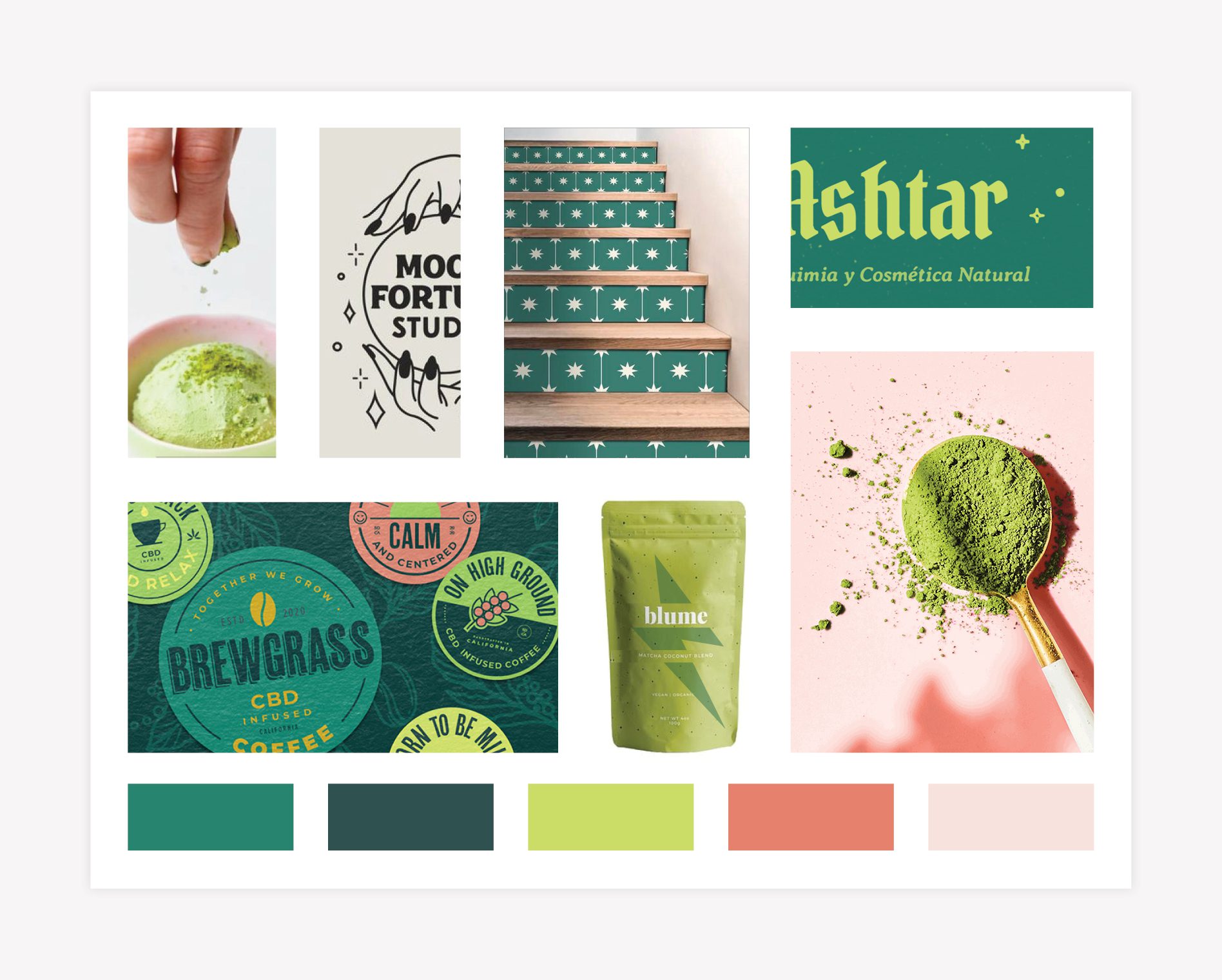
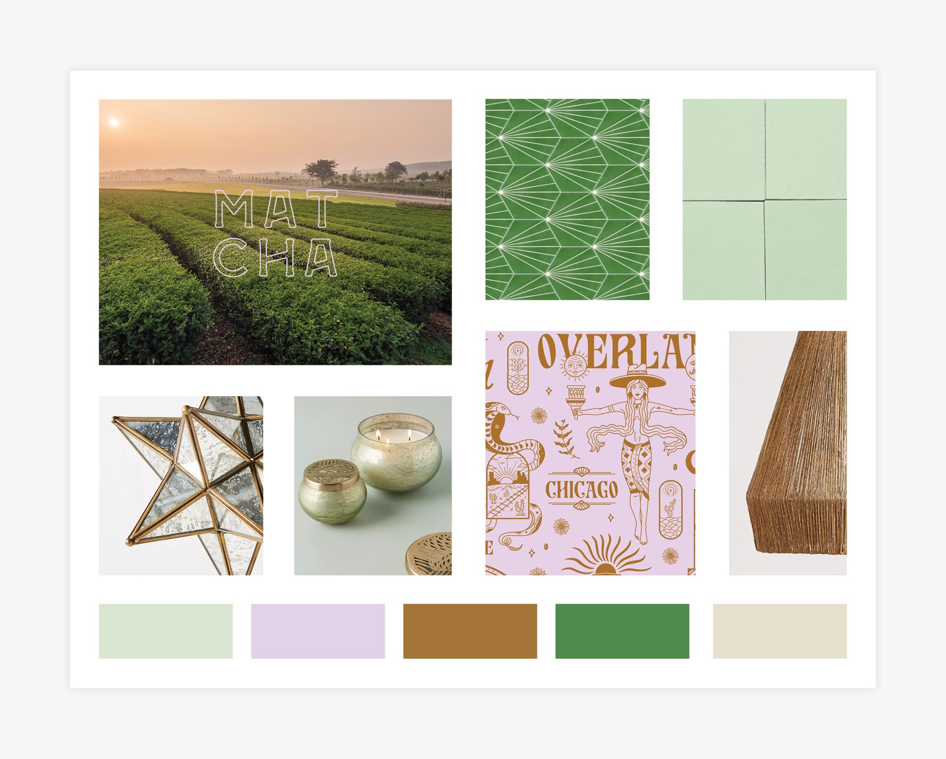
CAFE BRANDING MOOD BOARD

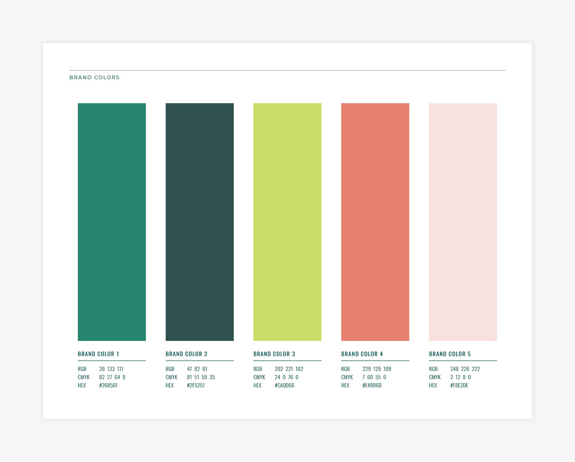
As part of our Starter Package, we developed a mood board that showcases six images to convey the overall artistry of the cafe brand design. For Matcha Magic, our experts opted to use custom illustrations to communicate magic along with sparkling green and dusty pinks.

Our mood board for this concept features imagery and typography that seeps into the rest of the brand. Our imagery incorporates the color pairing while also alludes to the dash of magic that matcha sprinkles to your life. We enjoyed playing with the “ashtar” imagery as a nod to the twinkle of magical charm that shines throughout the brand. The sticker image and matcha bag demonstrate this brand concept’s ability to expand easily in both color and design. Bright photography with subtle shadow juxtaposed with a messy and exciting work space help tease out the brand on a more visual level. Our branding experts created this concept with the idea that it could evolve alongside Matcha Magic’s business growth.

Matcha Magic Cafe - LOGO Branding Direction

CAFE BRANDING LOGO CONCEPT ONE

For our first concept, our branding experts created a logo that includes a font that goes along with the themes of whimsical energy and magical delight. Flecks of magic sparkle above the “i” carry this feeling over to the icon as well.

Matcha Magic Cafe - LOGO Branding Agency

CAFE BRANDING COLORS

The brand colors we selected exemplify both matcha and magic. We chose a vibrant lime-green hue to reflect the true appearance of matcha and integrate a supernatural feel. Next, we added soft shades of blissful pink to create the perfectly ethereal complement to the green tones and evoke the feeling of a smooth, frothy matcha latte. The supporting green tones offer depth and maturity to this brand concept while allowing more natural elements to balance the bright tones.

Matcha Magic Cafe - LOGO Branding Designer

BRAND FONTS

The selected fonts we chose take center stage in this cafe brand design. The spellbinding Varma Bold font is daring, eccentric, and definitely evokes a feeling of mystery and magic. The Great Outdoors is a modern, original sans serif font that communicates a hand crafted impression.

Matcha Magic Cafe - LOGO Branding Font

SUPPORTING BRAND ICONS

Cafe logos can appear on cups, napkins, bags, menus, signage, social media pages, and more. To expand Matcha Magic’s brand we created supporting brand icons with distinct illustrations. One illustration is a birds-eye view of a matcha latte overlaid with a fortune teller’s crystal ball. Our Nice team enjoyed playing with the idea of magic behind matcha.

We also developed a monogram that serves as a simplified icon for the brand that can be used in diverse applications. Another icon features a hand literally sprinkling matcha magic. This supporting element gives our client an opportunity to utilize visual variation throughout Matcha Magic’s marketing materials.

Matcha Magic Cafe - LOGO Design Nashville
Matcha Magic Cafe - LOGO Restaurant Branding

SECOND BRAND CONCEPT DEVELOPMENT

The second cafe brand design concept our team developed is called Zen Magic. This brand’s direction has a magically fresh, enlightening vibe.

MOOD BOARD

In regards to the design aspect, our team incorporated intentional elements in the mood board that can be used throughout the branding assets and interior selections that reflect the brand’s name, Matcha Magic.

For example, the modern patterned green tiles connect to the abstract star pattern. To further develop this concept, we chose to pair more natural elements aside gold and pale glass elements including the shape and material of the matcha bamboo whisk.

Modern, muted photography of tea and coffee fields appear as a backdrop for Matcha Magic’s typography to infuse life, color, and a mystical spark. Our mood board featured illustrations that exude that modern, hipster vibe celebrated among coffee and tea aficionados.

Matcha Magic Cafe - LOGO Brand Identity

CAFE LOGO CONCEPT TWO

For the main logo for brand concept two, we chose the Coconat Bold and Stranger Wide fonts that feature sharp edges reminiscent of the star shape. Both of the main logos our team developed easily translate to exterior signage for our client.

Matcha Magic Cafe - LOGO Branding Design

CAFE BRAND DESIGN COLORS

The brand colors we concocted in the color palette each carry their own meaning. We chose a mint green to reflect the superb quality of the matcha and paired it with a light purple color to weave in the magic and creativity themes. These lighter tones give off the zen, chill vibe similar to the way you feel when you drink matcha. We also selected a darker green to support the lighter colors and bring in some depth. This darker green reflects the rich color of the tea fields. Next we brought in the golden color to contribute a sense of magic coupled with warmth to reflect the coffee-based offerings of Matcha Magic.

Matcha Magic Cafe - LOGO Branding Colors

BRAND FONTS

For Matcha Magic’s second brand direction, typography would once again command attention. The striking Coconat Bold font features stylish flares while the vintage Stranger Wide font ties in apothecary elements. We liked the way the fonts feature sharp edges mimicking the star shape in our visuals.

Matcha Magic Cafe - LOGO Branding Fonts

SUPPORTING ICONS

To give the Matcha Magic brand weight, our branding experts crafted a couple of supporting brand icons through illustrations. A traditional bamboo whisk illustration serves as the “magic stick” in one illustration. We also developed another icon with the tagline “Sip the Magic” positioned around it. The icon itself is an abstract mug at the bottom with a sunbeam peeking over the top. The sunbeam represents the vitality and magic that matcha and coffee bring to our day.

We also included a stacked variation of the logo. Our team created these three elements to flow together along with additional illustrations to create a custom brand pattern. These supporting icons were designed to mix up the visuals throughout Matcha Magic’s marketing materials.

Matcha Magic Cafe - LOGO Restaurant Branding
restaurant-brand-identity

PRESENTATION AND SELECTION

Our Nice Branding Agency team of experts presented both cafe brand design options to Matcha Magic. During this brand presentation, we walked our client through each conceptualization and shared our thought process behind our selections and approach.

Overall, the client preferred the second option we developed. Since the name is playful, they thought the design concept lent more maturity to the brand name. They really liked the coaster image we created featuring the matcha cup and warm sunbeam.

At the same time, they were captivated by the color palette of the first option we presented —- the bright green color that reflects and complements the color of matcha. They felt that the colors in the second concept felt too muted. Ultimately, Matcha Magic liked different elements from each brand concept, so we combined them to create the final branding.

The end result features the brand name Matcha Magic in the Stranger Wide font in deep green and understated pink hues with the tagline “Sip the Magic” positioned underneath. The “i” in Magic sports a playful sparkle. The brand includes two more font options of Stranger Slim and the vintage-feeling Hand Crafted Slim. Our team kept the matcha cup sunbeam icon and the icon featuring the stacked treatment of the name.

An aside about mixing concepts: picking components from separate concepts and blending them together isn’t always effective. However, in this situation, the overall aesthetic works, and we were happy to make the change.

Logo Design Cafe
Matcha - Nashville Branding Logos
Matcha - Nashville Branding

CAFE LOGO FINALIZATION

After our client provided their feedback and approved the final logo concept, the Nice Girls moved into wrapping up the logo design. Our team inspected all elements of the logo for excellence and precision. We also determined the exact matching logo colors in PMS, CMYK, and RGB codes.

Next, we formatted the final logo files in full color and black and white in JPEG, PNG, EPS, and PDF. We delivered the logo files to Matcha Magic accompanied with handy brand guidelines.

CAFE BRAND GUIDEBOOK

Our cafe brand design guidebook is a must-have tool to preserve the integrity of the brand. We delivered a professional booklet that includes the mood board, logo, supporting brand icons, official brand colors, and final brand typography.

PROJECT CLOSEOUT

Our friends at Matcha Magic were thrilled with our branding services and our branding agency was delighted to have the opportunity to partner with this company. We look forward to serving as a branding and marketing resource to them as they continue to grow.

READY FOR A NICE CAFE BRAND DESIGN

Are you dreaming of a captivating brand design for your cafe? Give us a call at 615.905.9936 so we can chat over a good, strong cuppa. Our cafe branding professionals are ready to whisk up something especially just for you.

Connect with us on LinkedIn and Instagram to see more examples of our branding projects.

are you ready to create something nice?