Buns & Dums

asian restaurant logo branding

Nice Branding Agency was retained by a businessman turned restaurateur in Los Angeles to create a fast-casual restaurant brand that would compel people on the west coast to get their buns into the restaurant. The restaurant already had a name and a logo. It would be called Buns & Dums.

Also to note, our client had worked with us previously on business branding for another venture, so he already knew our processes and packages.

For this particular project, we recommended our Mighty Restaurant Branding Package. This would allow us to create a concept that would win over the hearts (and buns) of customers, and then to weave this look and feel through each and every customer touchpoint.

project type

Discovery

We started this fast-casual restaurant branding project with a discovery session. The session was a two-day, multi-city meeting that took our team members to San Francisco and Los Angeles. Not only did we meet with our clients to get an understanding of their desires for the brand, we also visited every dumpling house between SF and LA, tasting buns and dumplings, and gathering inspiration for the project.

During the discovery session, we learned that there is a disparity in the market for dumpling houses. There are some really old, been-there-forever, spots that have ah-mazing food and so, so environments. And then there are some super-slick spots with so, so food and up-to-date interiors.

There were also a couple of dine-in restaurants that were doing it all right, but were much larger in scale and sophisticated than what we were looking to create for our client.

Our findings from the cross-country trip were brought back to our team of branding experts, and we got to work on the fast-casual restaurant branding project.

Brand Direction + Story

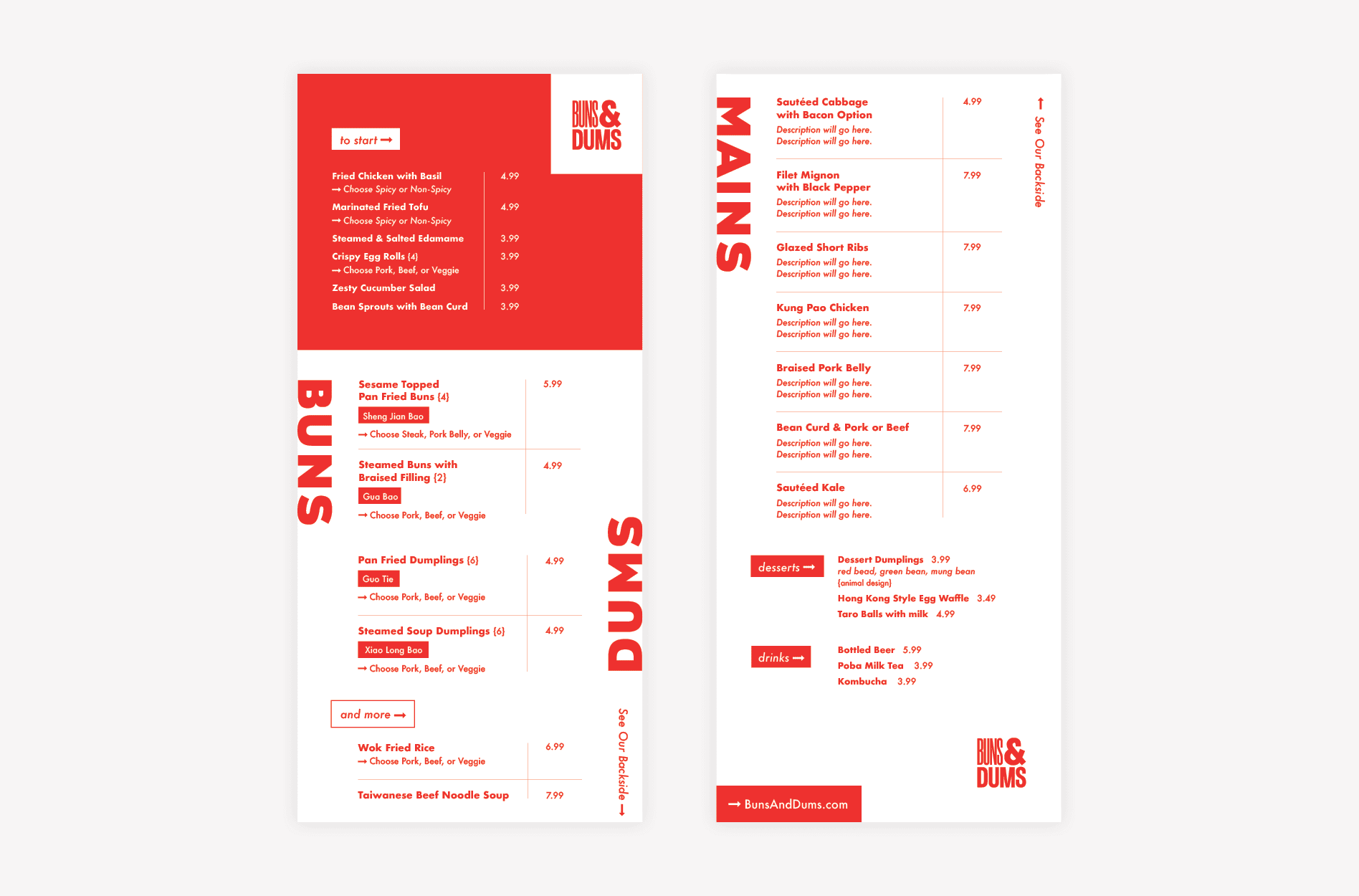
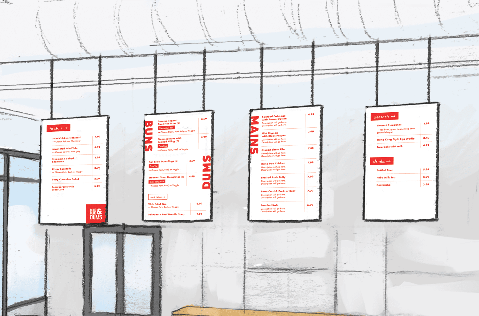
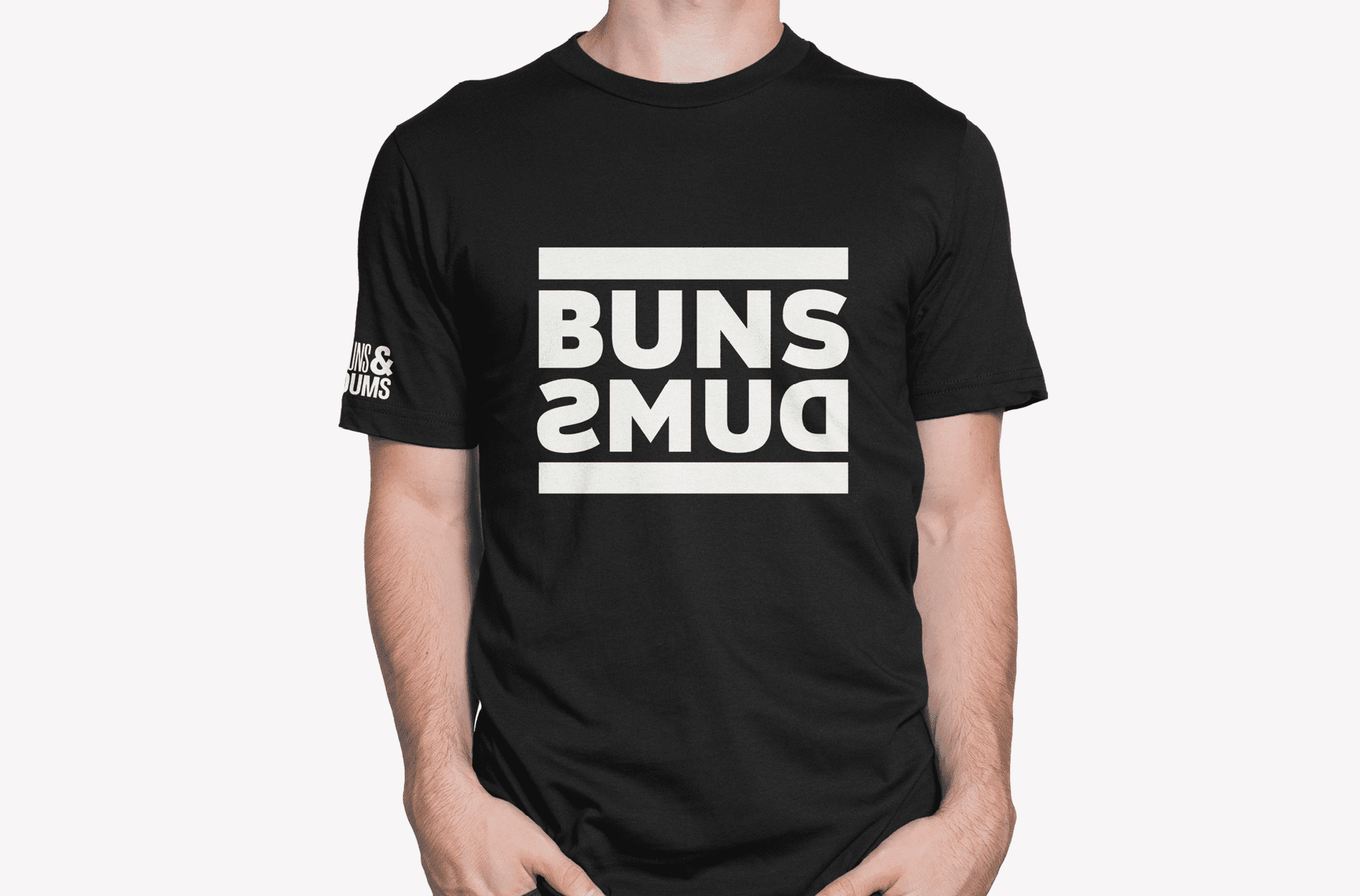
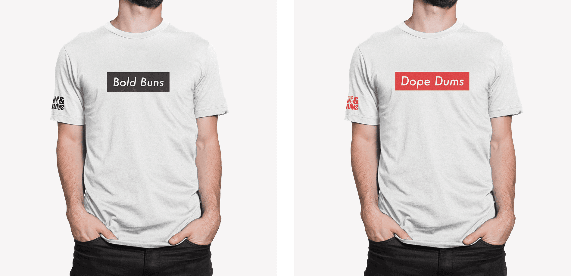
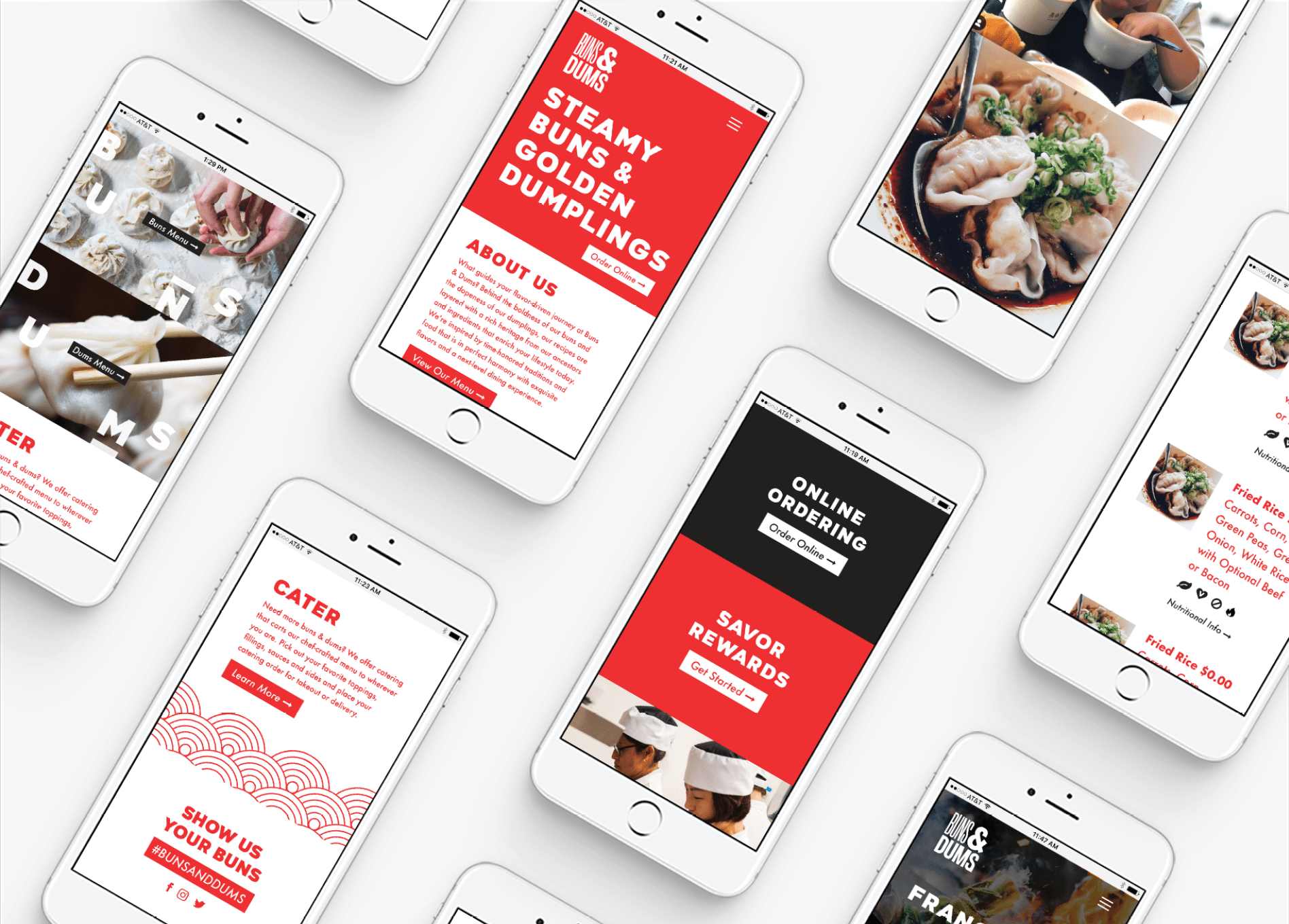
Our process for fast-casual restaurant branding starts with creating a visual brand direction and an accompanying brand narrative. When finalized, this brand direction becomes the basis for the fast-casual restaurant brand, and everything we create is held up to the brand direction to ensure consistency and cohesion.

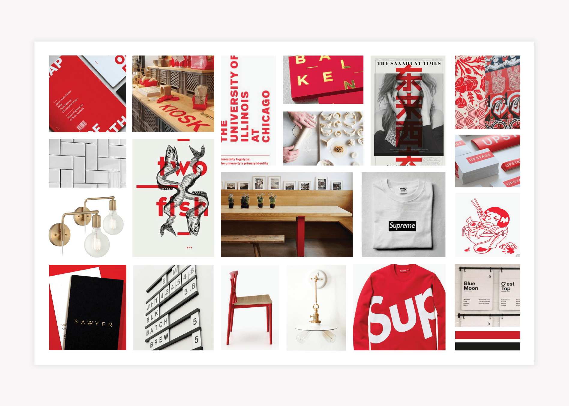
For Buns & Dums, we started by creating three distinct options for brand direction.

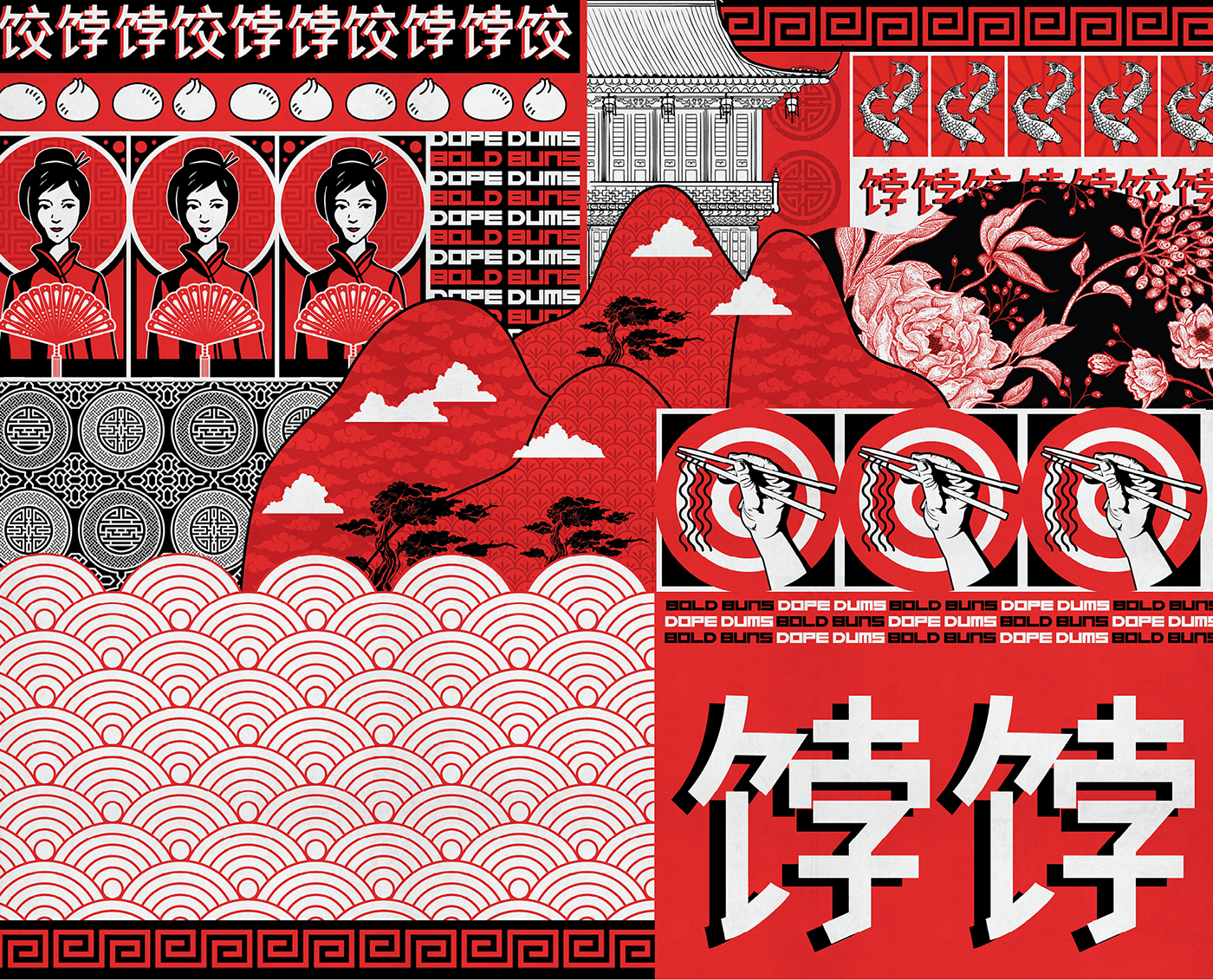
The first option was inspired by the streets of Chinatown and took on a bold, eclectic approach. Imagery indicative of street art was ever-present throughout the restaurant brand, and both furnishings and fonts took on a colorful, mismatched vibe.

For a second option, we created a zen, natural visual direction. This was comprised of light wood tones that took on the hue and texture of a bamboo bun basket. The light wood was complemented with natural orange and green shades. Black and white imagery was incorporated to showcase the beginnings of bun shops in urban environments, and large Chinese characters were interspersed with brush-stroke-style fonts and cleaner sans serifs.

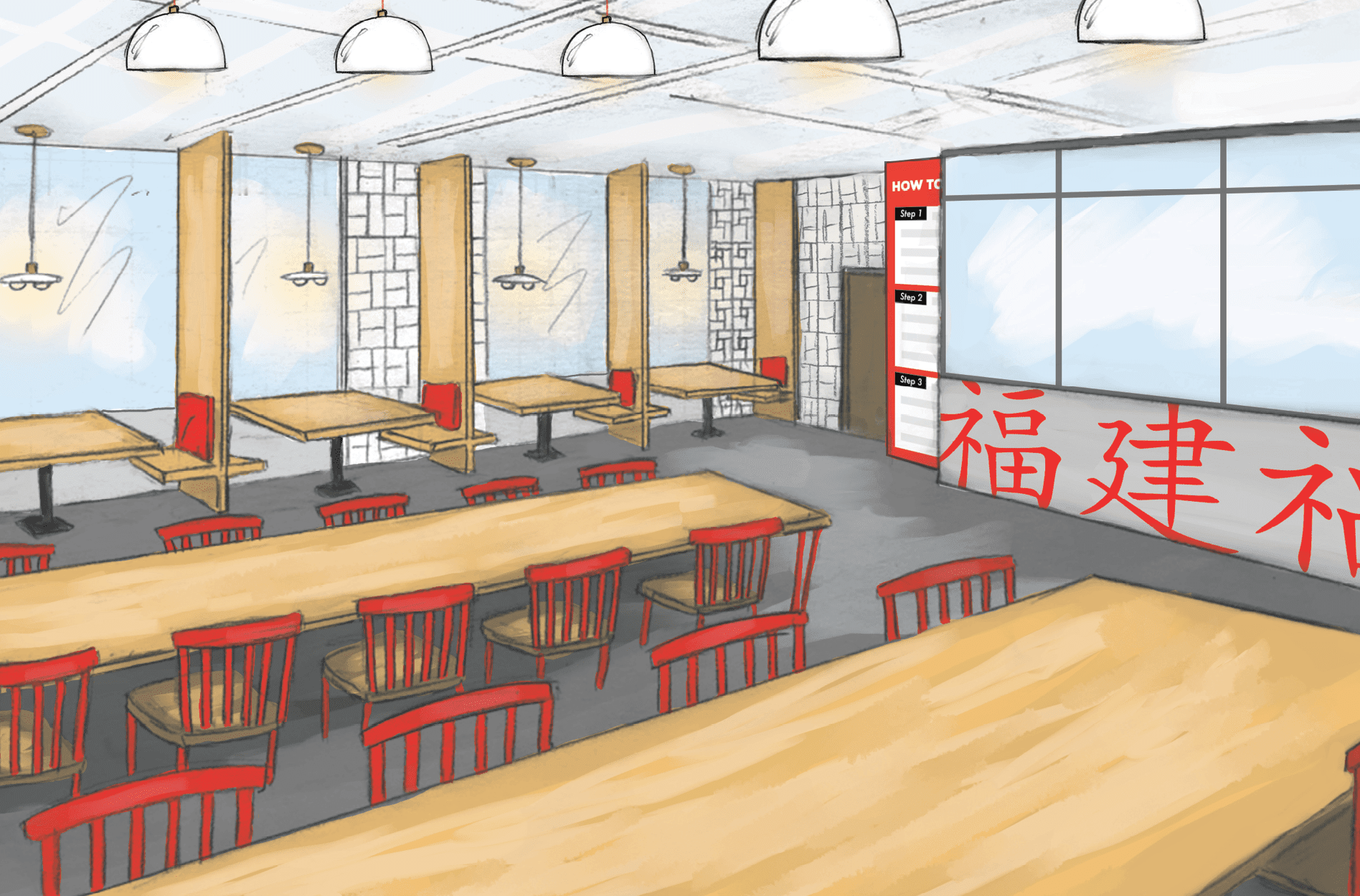
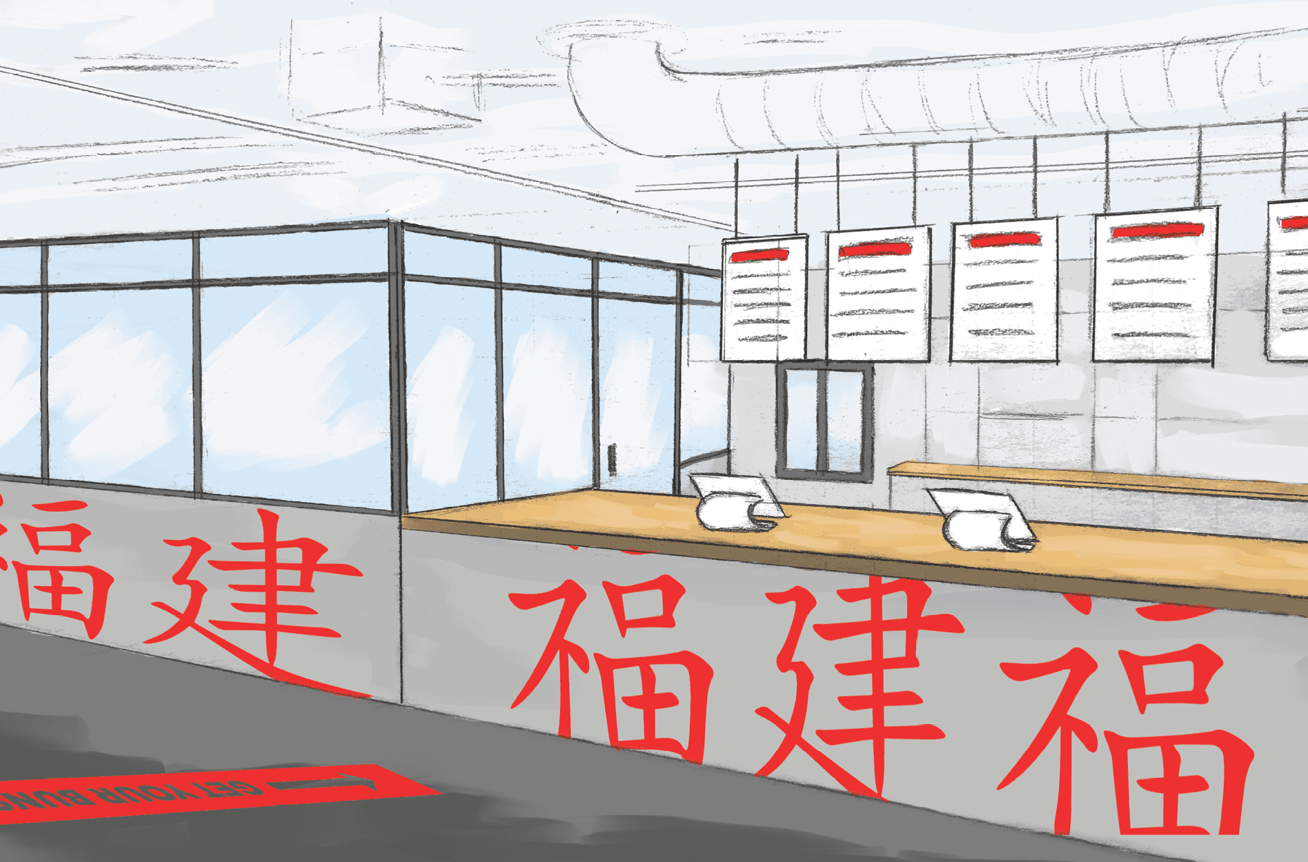
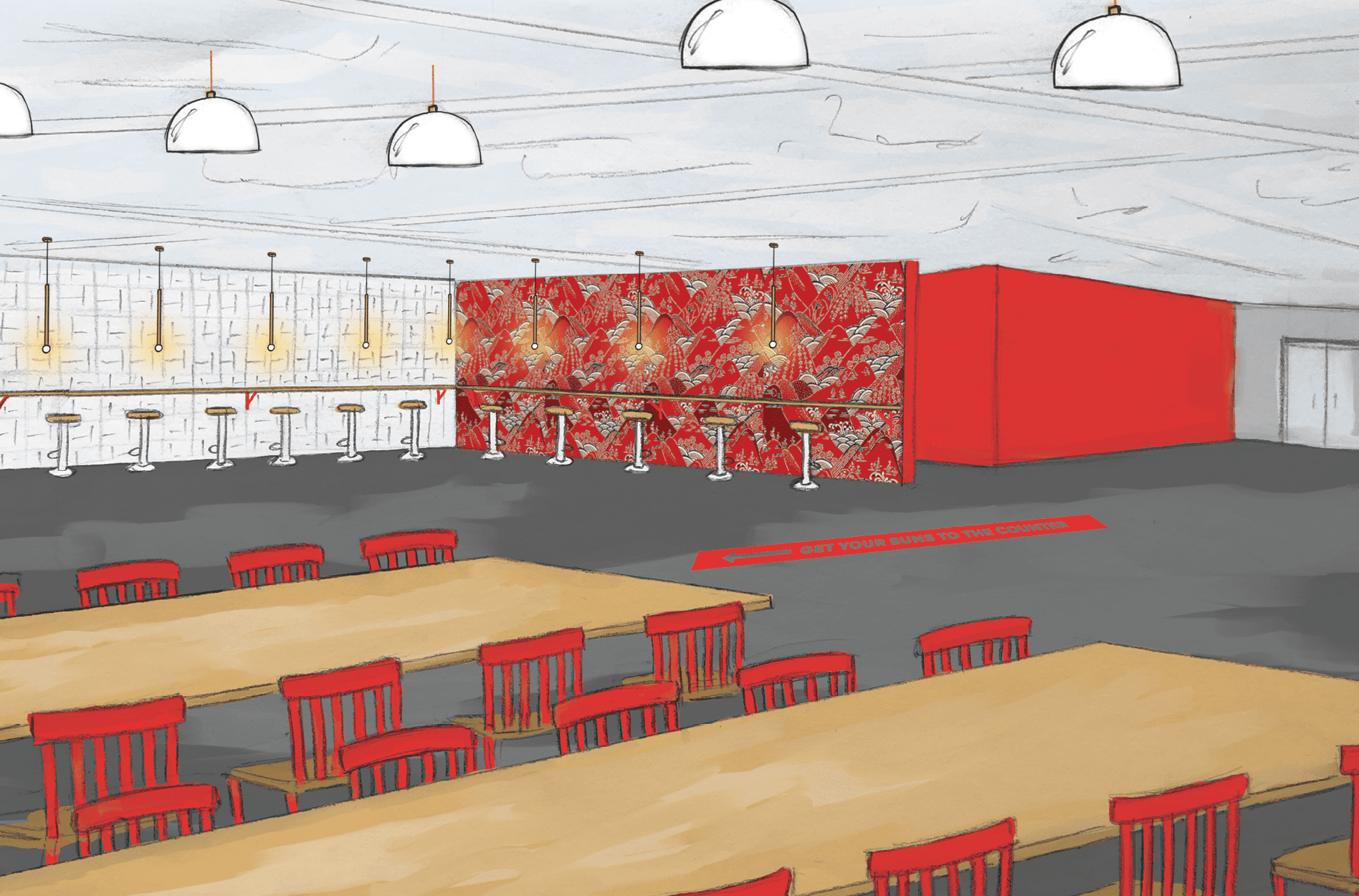
The third option, and the one selected by the client, incorporated the best elements of both of the other boards. The approach was bold, like the first option. However, it was also clean and modern with a natural element, like the second.

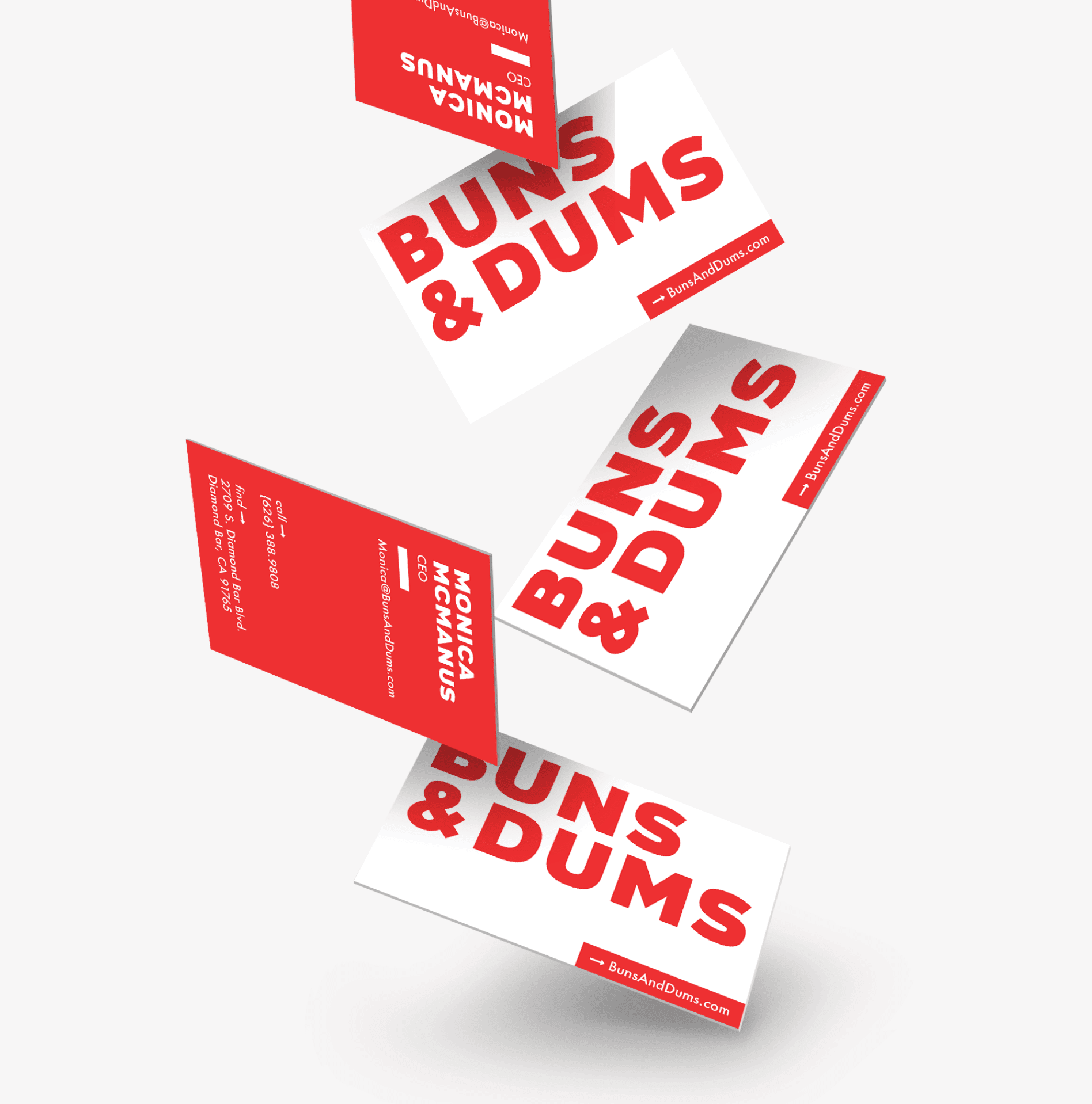
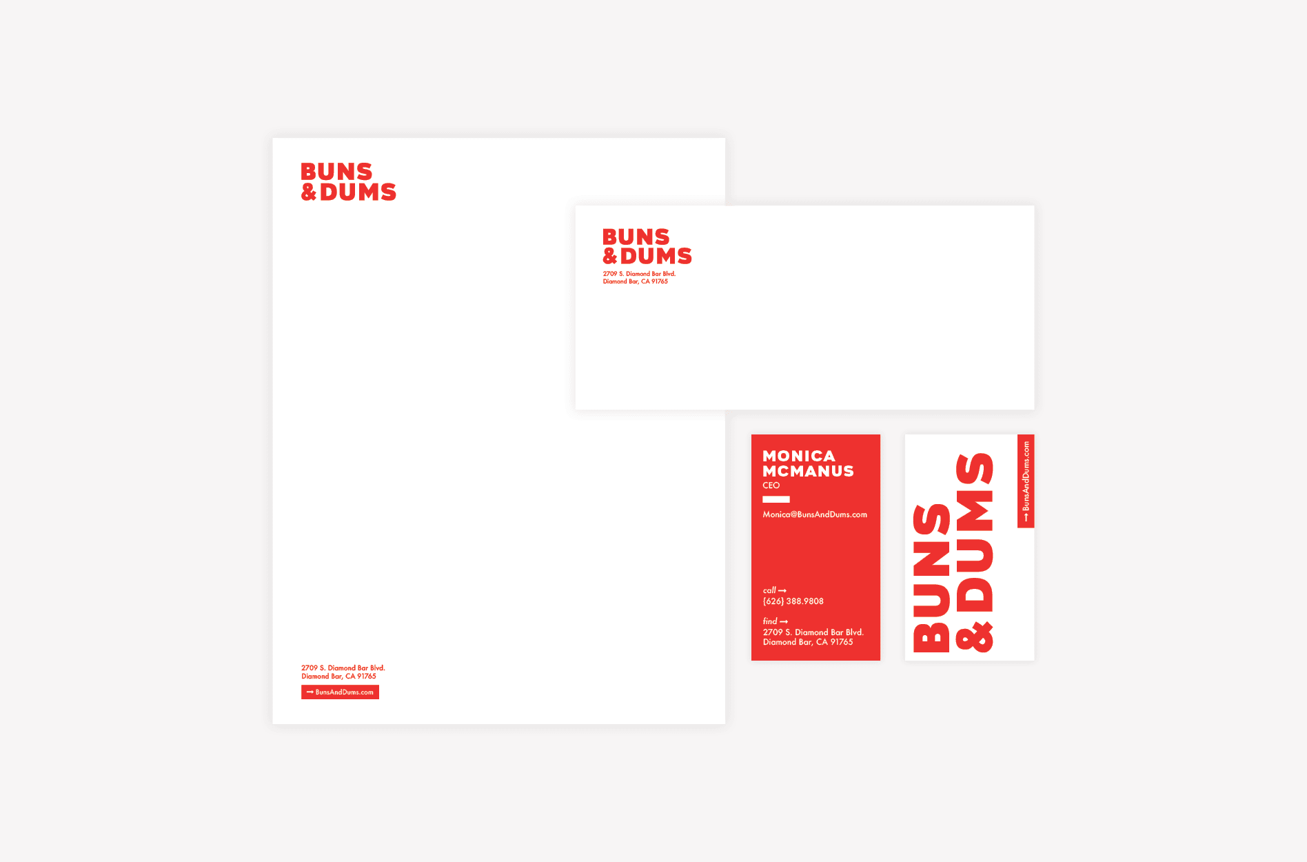
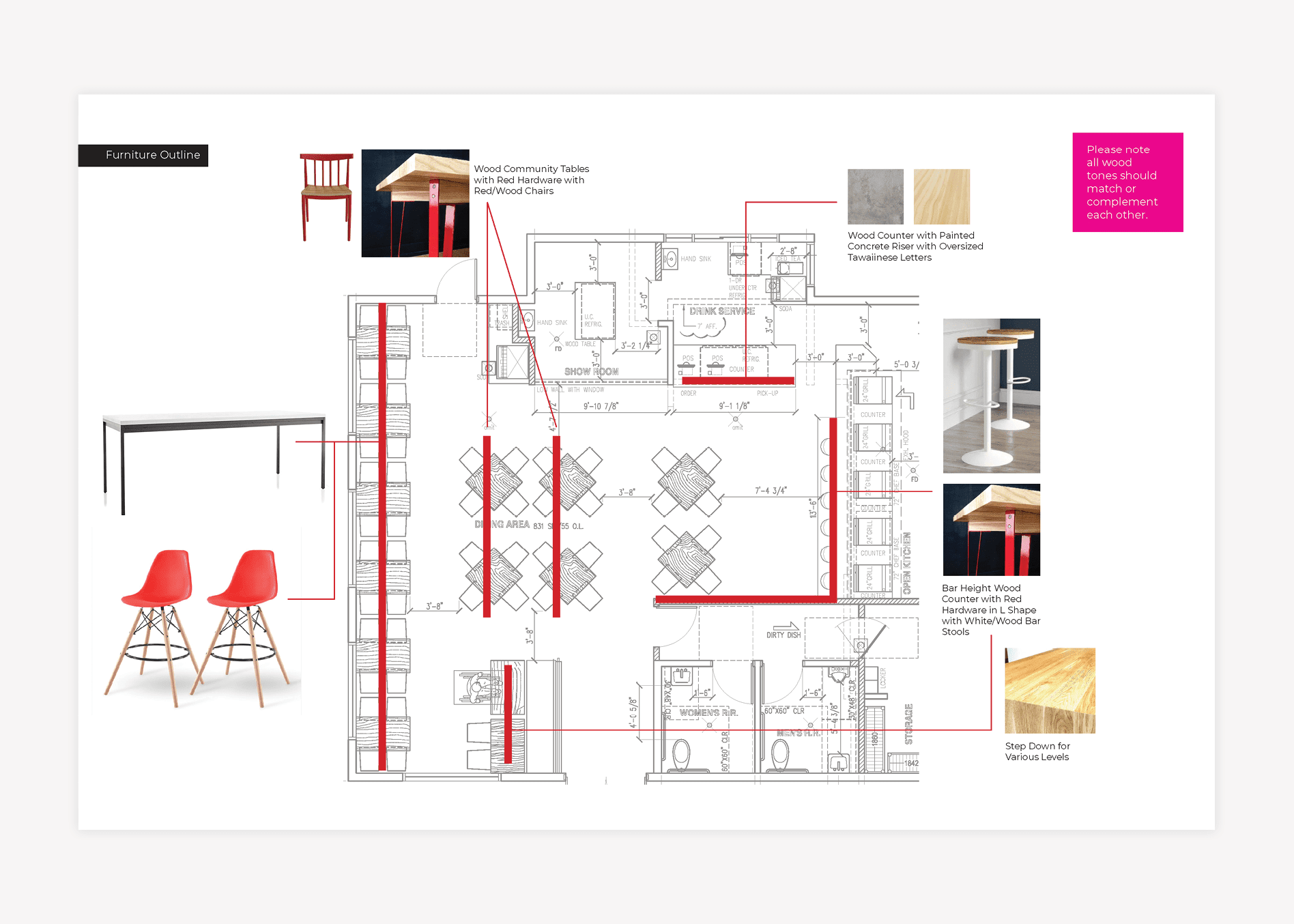
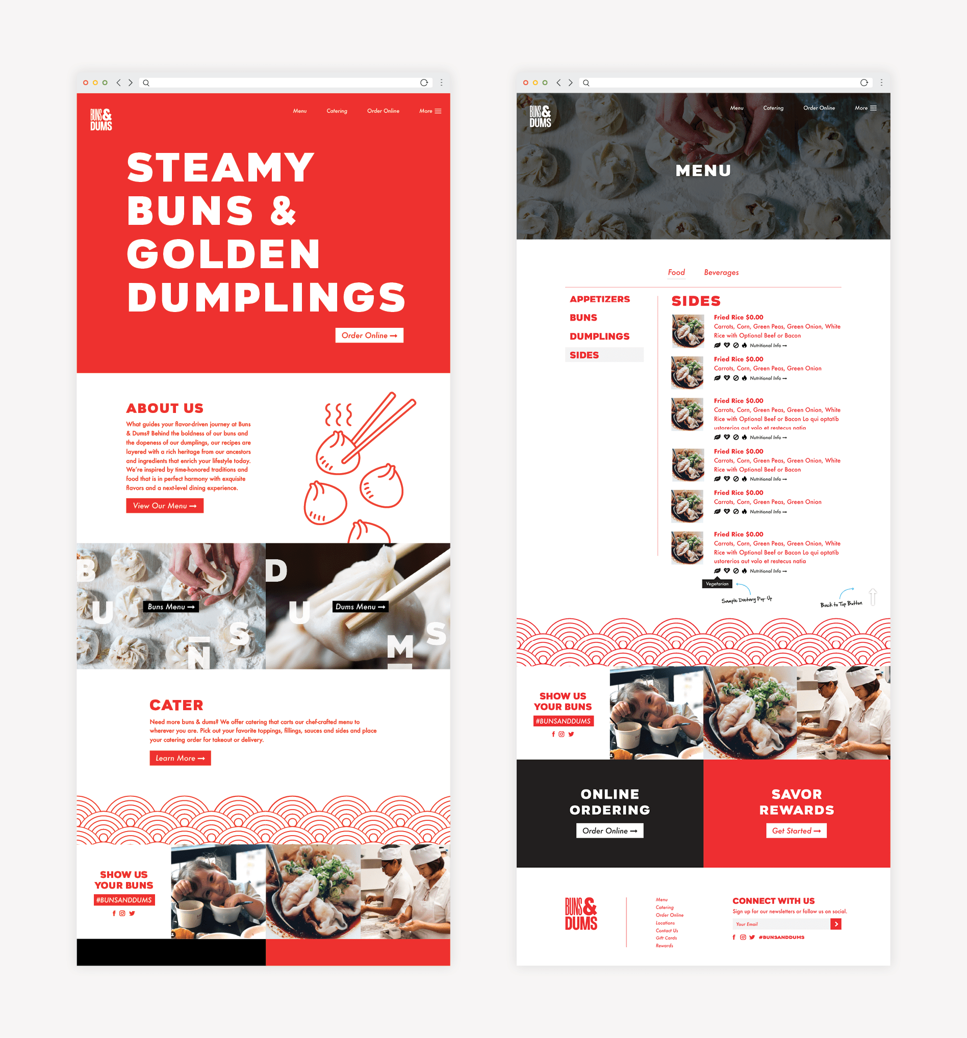
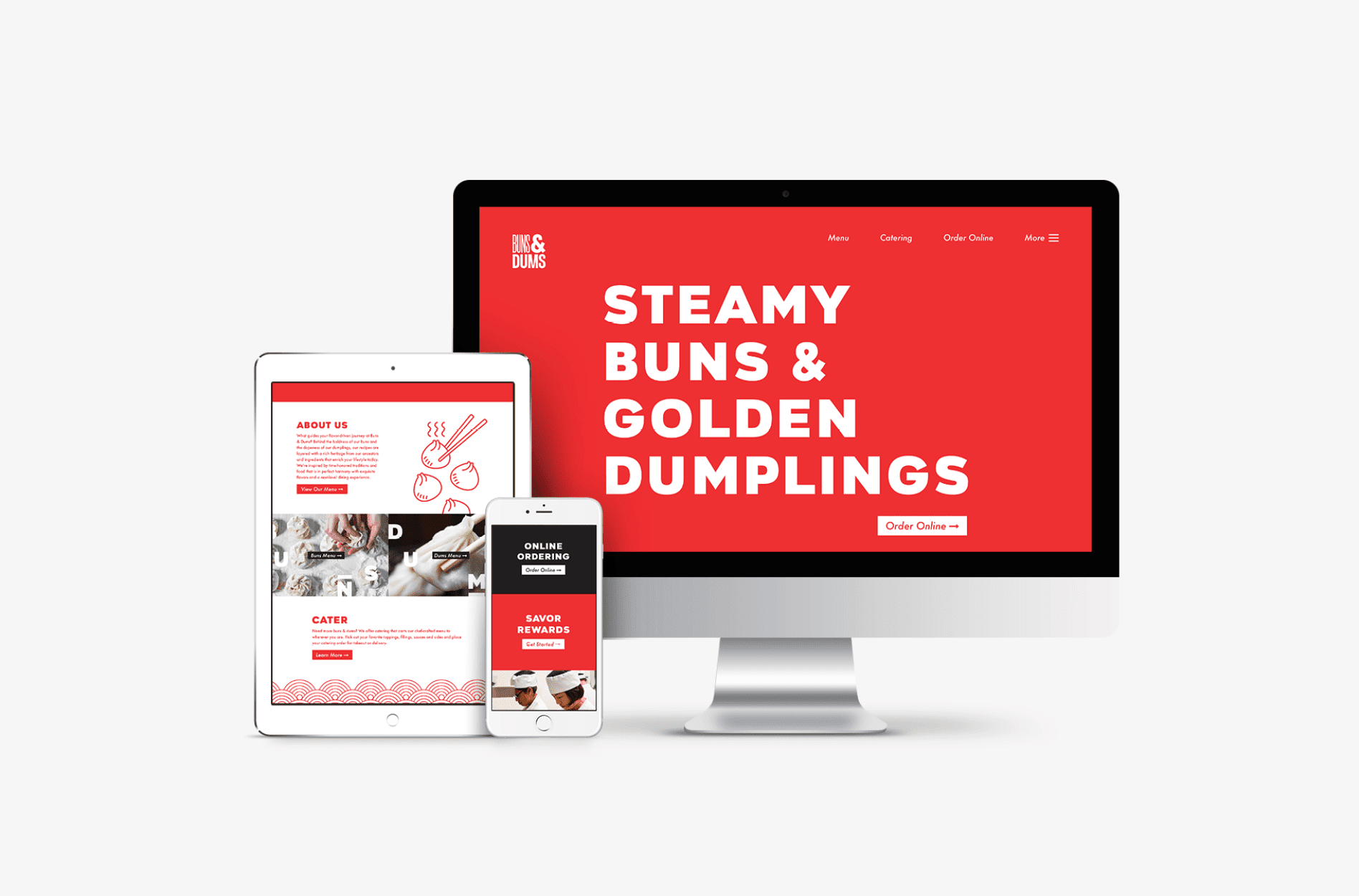
The chosen brand board for the based the visuals on a palette of vibrant red, natural wood, and clean white. The imagery included a juxtaposition of industrial, powder-coated piping against clean concrete flooring, and subway tile. However, an unexpected element was introduced through custom wall murals modeled after San Francisco Chinatown street art.

asian restaurant brand board design

Additionally, another custom piece would be introduced to showcase various patterns and art that had been created and curated for the brand. Fonts in this brand direction would be clean and uncomplicated, and the food would be served in stainless bun baskets.

Printed materials for the chosen brand direction would be created with floods of red and white, punctuated by bold, modern fonts in the reverse.

Fast-Casual Restaurant Branding: Logo Development

restaurant logo design

With the brand direction solidified, we met with our client to assess the existing restaurant logo design. Our expert logo design advice was that the restaurant logo needed to be refreshed to align with the new brand direction. The existing restaurant logo was comprised of graffiti-style fonts and a hand-drawn bun character icon.

While we thought that an illustrative icon would work, we wanted to clean up what was existing and provide a revised logo illustration. Additionally, we determined that the fonts incorporated in the logotype were not aligned with the brand board, and needed to be reselected and reset within the logo.

When the evidence was presented, our client determined that they would revise the restaurant logo themselves. We highly advise against leaving your logo up to those who are not restaurant branding experts. While we realize that your logo is not your entire brand, it does 100% set the tone, and it will be on almost 100% of all of the materials you produce for your brand.

So, word to the wise.

As you’re considering saving money by having someone other than a professional logo design agency create your logo, remember this: You may actually be costing yourself tens of thousands of dollars in the long run in printed materials and signage that will have to be replaced in just a few years time. Something to chew on.

Sitemap Presentation

We moved into the website phase of the fast-casual restaurant branding project, which starts with a sitemap. Here, we create a list of pages needed on the website, to ensure that we have our bases covered when we move into website wireframing.

For the Buns & Dums restaurant website, we knew that we would need the standard restaurant website pages, but that we would need to pay special attention to the structure of the locations page. The restaurant had plans for nationwide growth, so we wanted to make sure that the new website would support that growth.

Within the sitemap, we included a homepage, an about page, a contact page, a locations page, and a menu. All of these pages are standard for a restaurant website design project. However, we also included individual locations pages for each state. Additionally, we planned for external links for third-party restaurant delivery services and online ordering.

Website Hosting

We spoke with our client regarding website hosting. He determined that he would host the restaurant website with us for one year. We host our clients’ websites with the most robust WordPress hosting platform on the market. This allows us to ensure minimal website downtime, daily website backups, and fast page load speeds. Additionally, our website developer conducts monthly maintenance on the WordPress platform and plugins, which is necessary to ensure proper functionality.

Stationery Package Development

While the website was underway, we began working on the restaurant stationery. Our restaurant stationery package includes options for the business card design, and then a letterhead, envelope, and notecard design that all align with the selected business card.

We created versions of the Buns & Dums business card that included floods of red or white with red or white type in the brand fonts. Additionally, various options included the brand pattern. We showed our client square business cards, as well as standard business card sized designs.

asian restaurant business card design

Based on the selected option, we created the remainder of the stationery package to align. All of the final PDF files were provided to the client, along with our print pricing.

asian restaurant stationery package

Environmental Branding

One of the most impactful applications of the restaurant brand is in the restaurant’s physical environment.

As part of the fast-casual restaurant branding project, we worked on environmental branding for Buns & Dums that would transform the space (a former KFC restaurant) into a branded experience. Our team worked with images of the site and architectural drawings to weave the look and feel through each and every touchpoint within the restaurant.


asian restaurant environmental design

Custom wood booths were proposed for the space that would create cubbies within the expanse of the dining room. These would mirror the booths found along the walls within traditional dumpling houses, but would bring a more modern and natural aesthetic.

Subway tile would be laid in a custom pattern across the walls to mimic the pattern of the basketweave found in the steamer baskets used in traditional bun and dumpling eateries.


restaurant interior graphic design

The flooring would be polished concrete to keep with the minimal vibe and to allow the attention to be drawn to the other elements of the interior. Painted floor graphics would create impact and guide the customer through their dining experience.

Situated in the middle of the restaurant would be a large, glass enclosure, and this is where the dumplings would be handcrafted for hungry customers.

restaurant interior rendering design

Tables and chairs were constructed from the same natural wood tones found throughout. And furniture hardware would be powder coated red, industrial-style piping, as shown in the selected brand board.

The walls that were not claimed by pattern-laid subway tile would feature large-scale custom murals to bring the life the patterns and color traditionally found in the alleys throughout Chinatown.


restaurant environmental rendering design

Once the environmental aspects were pinpointed and approved by the client, we made ourselves available to review the environmental branding plan to the architect or general contractor.

From there, we worked to bring to life the elements within the interior. We created a mockup to guide the subway tile pattern, designed all of the wayfinding signage, consulted on exterior signage, and completed the graphic design and illustrations for the interior graphics.


asian restaurant mural design

Menu Design + Menu Board Design

As part of the fast-casual branding project, our graphic design team created an uber-simple menu design to make it easy for customers to pair menu items and create a meal. The handheld menu was designed to be printed on a rack card. Another strategic selection that would make the ordering process simple. Additionally, in this format, customers would be able to use the menu as a dine-in reference, or grab it and take it to go.

asian menu design

To align with the environmental branding within the restaurant, we proposed that the menu system be created from powder-coated piping with simple signs hung on clips. Each sign would display a menu section: starters, buns, dumplings, sides, drinks.

restaurant menu board design

Restaurant Brand Support

Our fast-casual restaurant branding process is designed to weave the brand direction, including visuals and voice, through every customer touchpoint. It’s this attention to detail and consistency that begins to create a perception about your restaurant in the minds of the consumer.

For Buns & Dums, the restaurant materials included the following: a take out bag design, cup design, pre-opening window graphics design, and t-shirt design.

restaurant shirt graphic design
restaurant apparel graphic design
restaurant cup design

The Website Wireframe

While the brand support was being created for the restaurant concept and approved by the client, our website design team moved forward into website user experience. We created a website wireframe for the Buns & Dums website that would prioritize the user’s experience on the site, and would continuously nudge the user to clear calls to action.

restaurant wireframe graphic design

The goal for users on this website was to get them to view the menu, get to the restaurant, or order online.

The wireframe was presented to the client via conference call. During the meeting, we walked through the restaurant website wireframe step-by-step, to ensure that our client was on board with our recommendations for structuring the website.

After all, the website wireframe will serve as the blueprint for the website, so it’s imperative to get it right before moving into design.

Website Design

With the website wireframe approved, we began to bring the restaurant brand into the pages. As indicated in the approved brand direction, floods of red and white were brought into the design. Over the bold color, we introduced clean, bold fonts in the reverse color.

restaurant website development

Patterns were introduced to draw interest and to align with the environmental branding, and space was left for professional food photography that would be provided by the client.

Website Development

The approved restaurant website design was then developed on WordPress. WordPress allows us the flexibility to bring to life a custom website design. It also provides our client with a simple backend editor, so that they can make changes to key content on-the-fly themselves.

We developed the Buns & Dums website to exactly mirror the approved design. Then, once the website was available on a staged link, we completed a thorough testing of all buttons and forms. Our team also completed a review of all pages, side-by-side against the design to confirm that all elements appeared as intended.

restaurant responsive website design
asian restaurant mobile web design

Website Launch

We presented the staged link to the client for review. Here, we make one final round of changes before we take the website live on the client’s domain.

However, in this case, our client made an internal decision to hold on the development of the restaurant.

Our team is proud of the work we did to create a bold brand for this fast-casual restaurant concept. We think this restaurant brand is all that and dim sum (dumpling reference, y’all).

Project Closeout

Upon final payment, we provided our client with the final files for the stationery package and restaurant materials. We also sent over the environmental branding plan and the final website files.

Are you looking for a bold brand for your fast-casual restaurant? Look no further. Contact us today and we’ll walk your buns through our packages.

are you ready to create something nice?