Gyro Republic

greek-restaurant-branding

Our team worked on a restaurant branding project to build a bold brand for a new Texas-based Gyro restaurant, later to be named Gyro Republic. The goal of the new restaurant brand was to create a fast-casual concept that could be quickly turned into franchises across the country.

project type
greek restaurant brand design

Greek Restaurant Branding Kickoff

To begin this greek restaurant branding project, we obtained pertinent information about plans for the restaurant and goals for the project. Details were officially provided to us by our client through the completion of a Creative Questionnaire. However, we also paired these details with notes we had gathered from our conversations with the client. This information was then compiled and communicated to the entire creative team during an internal project kickoff meeting.

Our client came to us with a restaurant name in hand. However, after some initial conversations and consultation, it was determined that engaging in the Nice Branding Agency restaurant naming process would be immensely beneficial to the success of the brand. So, naming was added on to the Mighty Restaurant Branding Project, and our project management team got to work setting a schedule.

The name and visual direction would provide our team with a basis for the creation of all other brand elements, so this is where we would start.

Then, restaurant brand support would be developed to include logo design and environmental branding, as well as menu design, business card and stationery design, take-out bag design, cup design, and T-shirt design.

Simultaneously, while restaurant brand support was being created, we would also work through website wireframing, website design, and website development.

From our first conversations with the client, we knew that the mission of the new restaurant was to bring street-food-inspired, halal, and Greek-style flavors made with fresh ingredients to their customers.

We also learned that the greek restaurant was going to be a build-your-own-meal concept, and the customer journey would be similar to that of Chipotle. Customers would be empowered to choose their base, protein, toppings, and sauce. All options were created to complement one another, so customers could trust that the entire meal would be built to their unique tastes and specifications.

Restaurant Naming

With the information from the client at the forefront of our minds, we got the team together for a naming session.

Independently, everyone on our team started by researching fast-casual market trends, halal-inspired restaurant trends, available domain names, and all of the information we had gathered from the client.

Then, the next step was a collaborative effort among our creative experts. Here, everyone brought their findings to the table, and we began to eliminate any options that wouldn’t be strong enough to be the first word in the brand’s story. The remaining restaurant names were strong options backed by reason and research that we would present to the client.

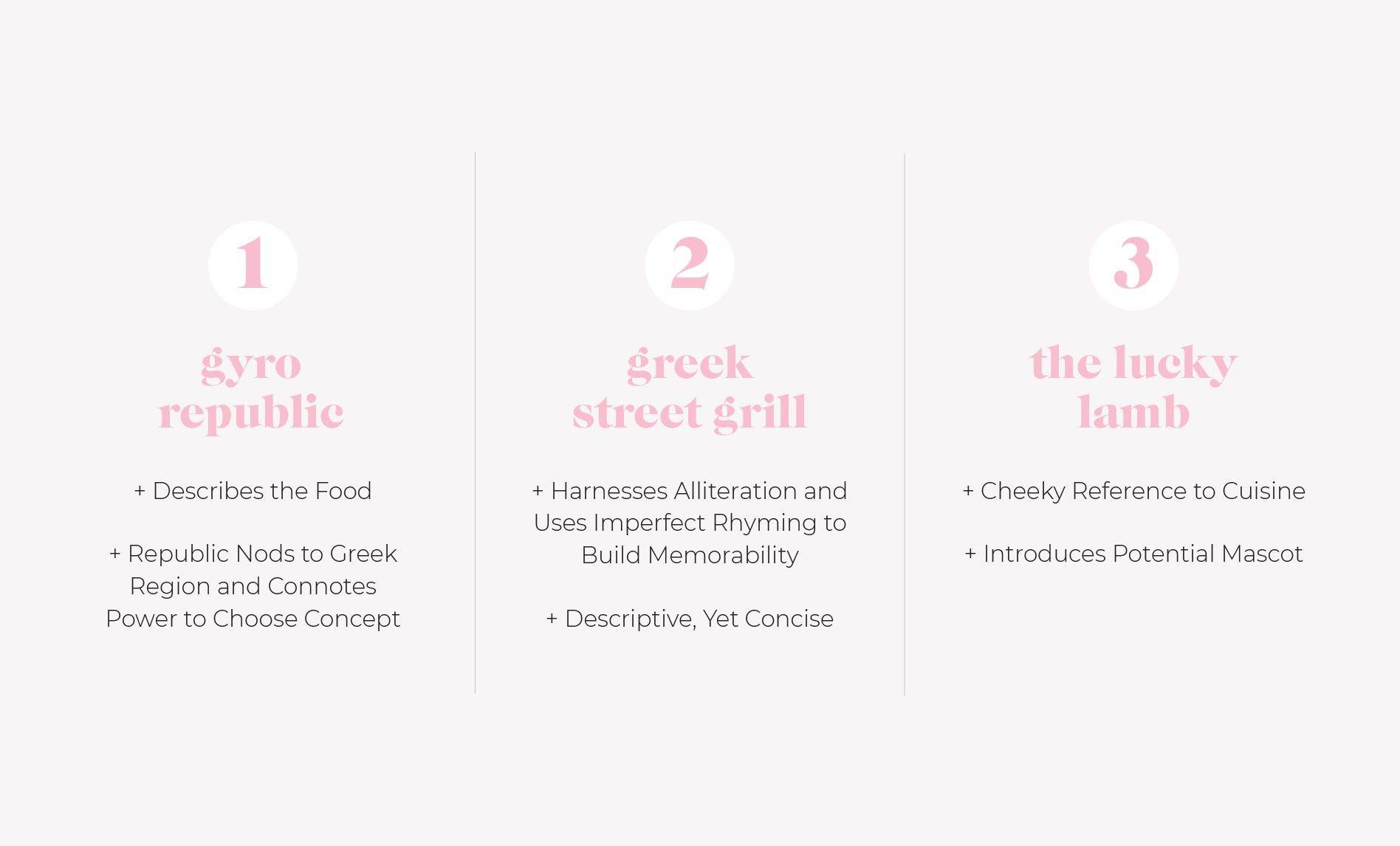
The names we presented were “Gyro Republic,” “Greek Street Grill,” and “The Lucky Lamb.”

Gyro Republic pairs the word ‘“gyro” with “republic” to nod to the traditional name for the Greek region from which the food comes — the Hellenic Republic. Additionally, the word “republic” means a government in which supreme power resides in a body of citizens. This aligns well with the build-your-own concept where people have the power to choose ingredients and customize their meal.

Greek Street Grillharnesses the alliteration between the words “Greek” and “grill,” as well as the imperfect, or near, rhyme of the words “Greek” and “street” to create a name that has a ring to it. While descriptive and concise, the name is also memorable and would resonate with the target market.

Finally, The Lucky Lamb provides a tongue-in-cheek reference to the most unlucky party in the creation of the gyro — the lamb. The name personifies the lamb in order to create a brand that would be both descriptive and memorable. The lamb would take on its own personality and would be brought to life throughout the brand.
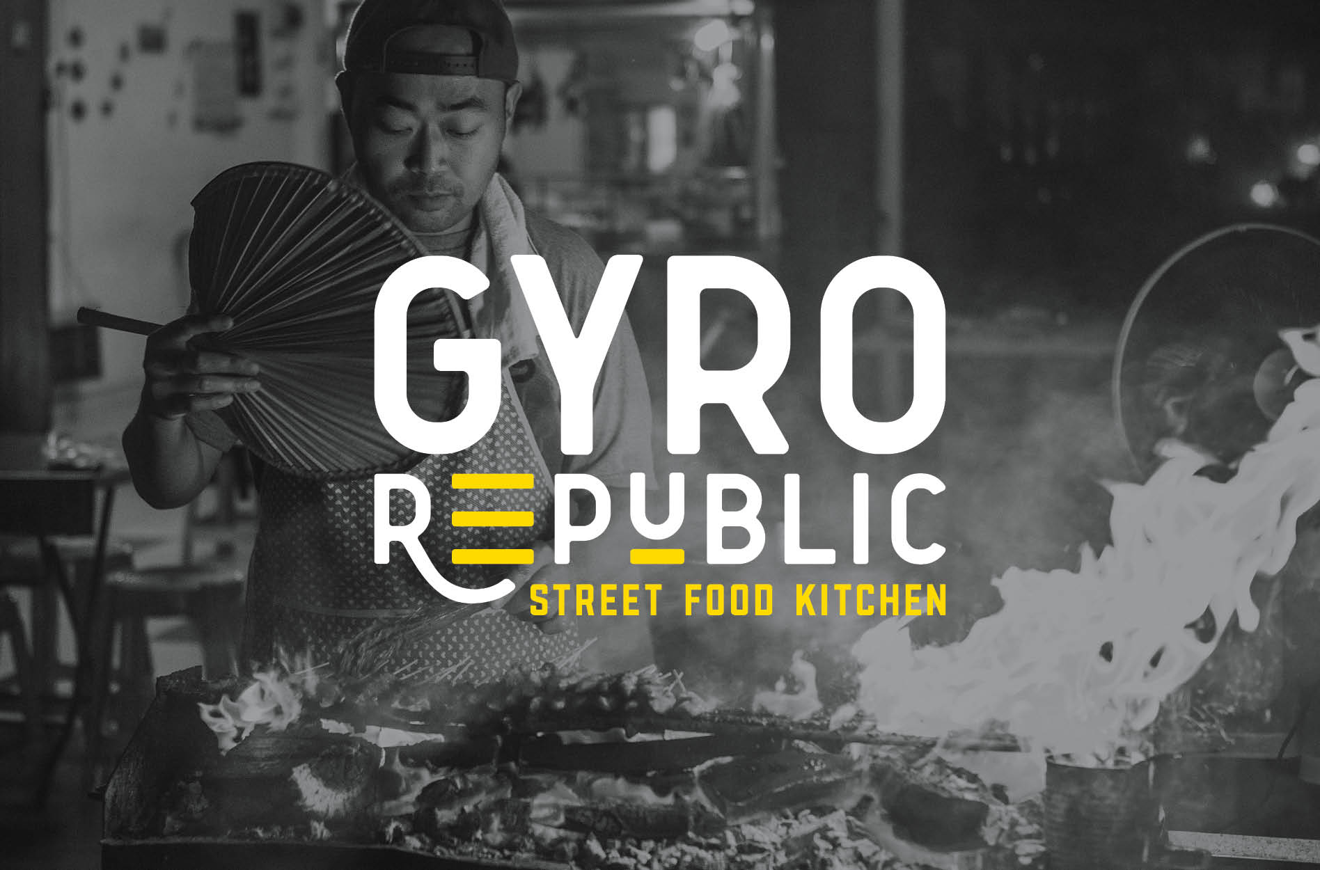
 

greek restaurant naming agency

Upon presentation, our client selected the name Gyro Republic.

He felt that the creative application of the word “Republic” highlighted the personal experience of choosing your meal, which would make the restaurant stand out.

Additionally, the word “Republic” conjures empowering feelings. It paints a picture of people. The picture is one of collaboration, and political change, and choice. It was the perfect word to associate these connotations with the restaurant brand.

Brand Direction

Next, we moved into the brand direction phase of the greek restaurant branding project.

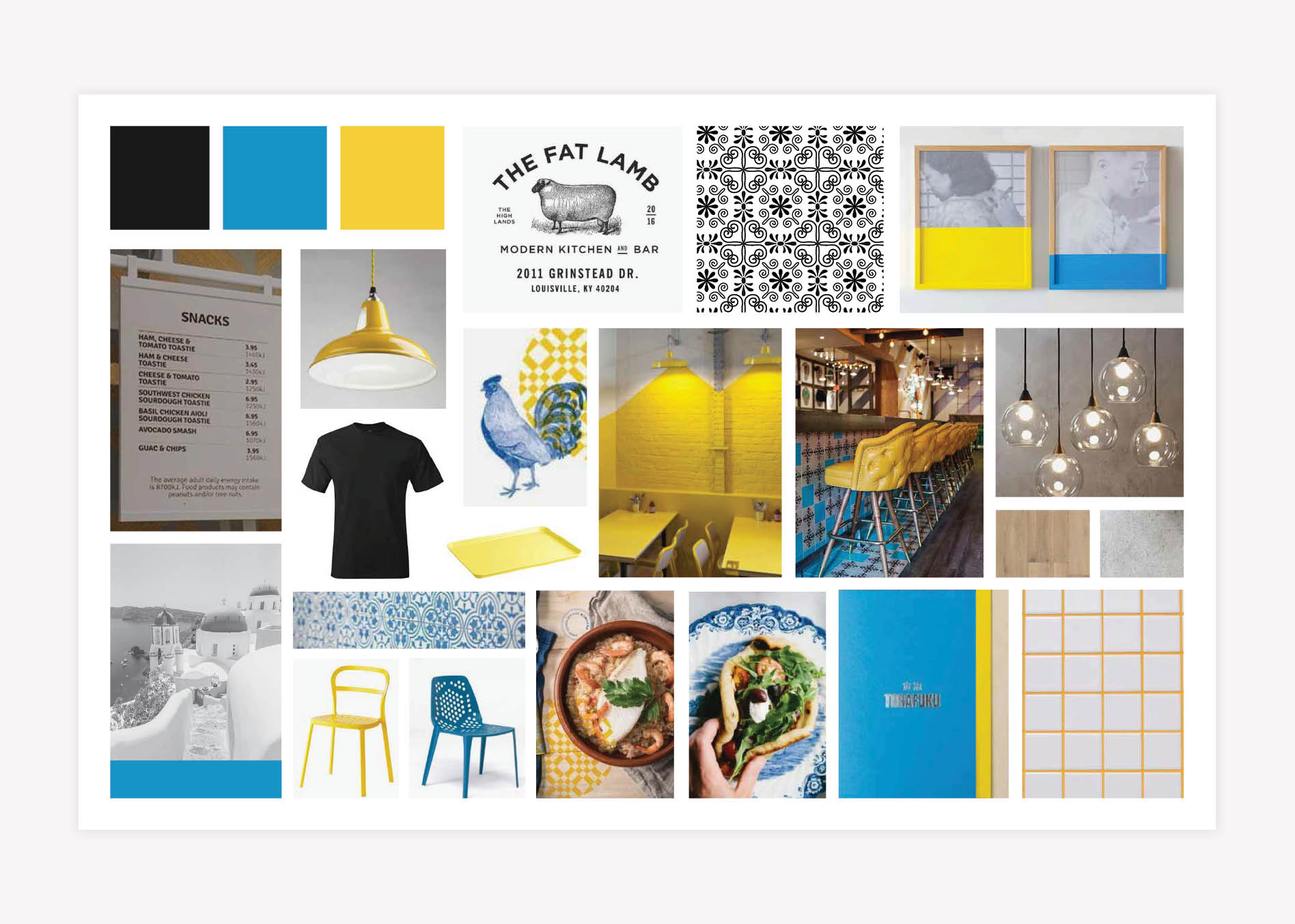
To develop the visual brand direction, our designers put together brand boards that each captured a distinct look. Each of the boards would represent the overall visual of the brand. Yet, each brand board provided a different creative take on the brand’s meaning.
For Gyro Republic, we created three brand direction options.

The first option utilized simple black and white patterns and graphics. It provided a modern twist on the traditional Greek colors of blue and yellow by altering their hues to communicate freshness and vibrancy. The pairing of the simplistic black and white graphics with pops of colors created compelling visual interest. Concrete and brick materials were used throughout the brand board to ground the colors used in the brand.
The second option used line drawings to bring in the history of Greece. The board portrayed a modern, clean, and simple vibe with wood tones and floods of a soft, welcoming mint color. Under this brand direction, the brand would be supported by clean, geometric patterns and have hints of wood and craft paper to give a comforting, relaxed tone.

The third brand board took a more elegant approach. This brand direction presented a modern spin on the classic Greek visuals. We pulled in a more traditional Greek blue with classic gold and marble accents, and then used modern fonts and finishes to update the aesthetic. The logo for this brand would be a seal-style mark that would pay homage to traditional bistro graphics.

Upon presentation of all three options, our client chose to move forward with the first visual direction, and we got to work building the brand for Gyro Republic.

greek restaurant brand direction

Logo Design Direction Brainstorm

Immediately following the selection of brand direction, we moved into logo development. A restaurant’s logo will be on almost all materials. So, it needs to be a strong symbol that aligns with the restaurant’s narrative and position in the market.

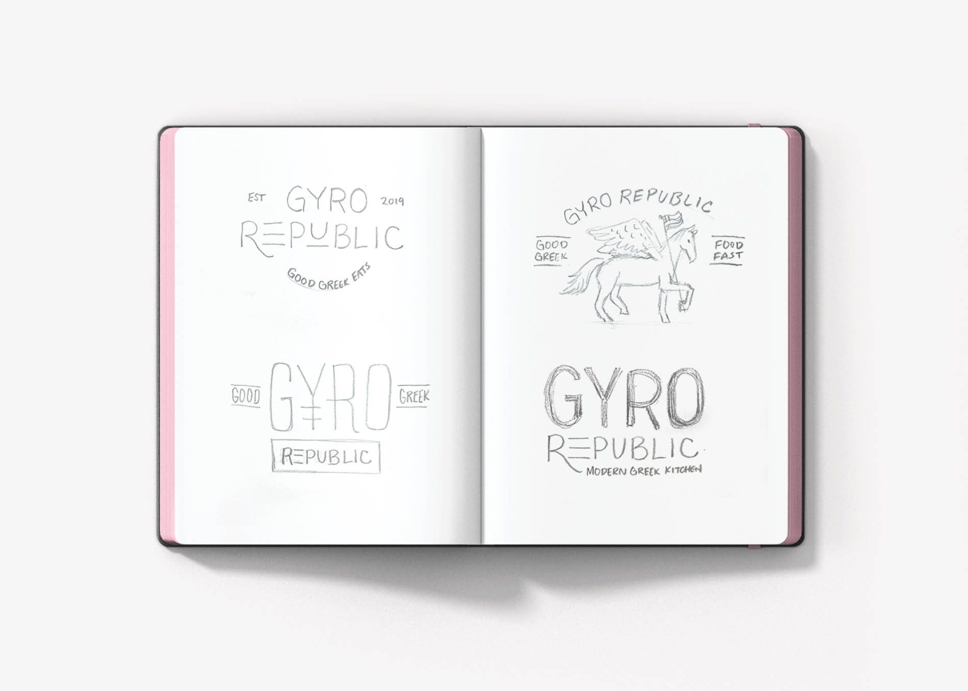
Our design team got together to collaborate on ideas for the logo. Here, we sketched out our ideas while we discussed the design strategy and brand story. Our brand designers created numerous sketches for the Gyro Republic logo design. And these were presented to our Creative Director and Director of Design.

greek restaurant branding

Finalization of Conceptualization

During logo concept finalization, our design leaders evaluate the sketches to determine which of the directions aligns closest with the overall brand direction. They review the presentation of options to ensure that the concepts are original, typographically sound, and compelling enough to help carry the brand.
Based on this internal presentation of ideas for Gyro Republic, our design leaders selected the three strongest logo concepts. These three concepts would be developed digitally and presented to the client.

Restaurant Logo Design

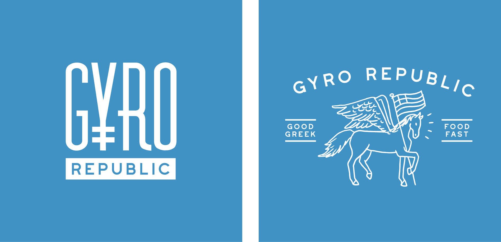
The first restaurant logo design option developed used a stylized “Y” and a tall, thin font. This typography created an elevated look that referenced the Greek alphabet. Additionally, the shape of the “Y” cleverly resembles the spit traditionally used to cook gyro meat.

The second restaurant logo design was based on the concept of the Greek mythical winged horse, Pegasus. Pegasus ultimately is a symbolism of power, freedom, innate talent, abilities or gifts, the gift of voice, the gift of speech, and chance and opportunities. We thought this aligned perfectly with the meaning behind Gyro Republic. In this logo design, Pegasus carried the Greek flag to further convey the idea of freedom and power.

restaurant logo design

The third restaurant logo implemented a modern, slightly rounded sans serif font. This font introduced an approachable feeling to the brand. However, the customization of the logo typography resulted in a unique design that also made the brand feel custom.
In this logo, the letters have meaning. The stylized “R” was used to draw the eye throughout the logo, and provide a stylized approach to what could otherwise be a nondescript font face. The “E” mimics the lines in the Greek flag and creates a feeling of repetition from the E to the U that pulls the eye across the design. Additionally, the “U” is underscored to further convey a concept that puts the power in the hands of you — the consumer. Finally, the restaurant logo design includes a simple tagline that tells people exactly what to expect from the restaurant: Modern Greek Kitchen.

greek restaurant logo design

Presentation and Selection

After presenting our three restaurant logo designs, our client selected the third option. He was drawn to the custom logotype and felt that the design would be a good representation of the brand. The new logo was presented in variations of color that could be implemented in an array of applications, depending on the need.
Additionally, a seal-style icon was developed to complete the suite. This icon implemented the three lines from the “E” in the full logo. This logo icon was strategically created to stand out, primarily on labels and as a social media profile image.

greek restaurant logo design

Logo Revisions

Upon selection, our client requested that we adjust the tagline. He had determined that the final restaurant menu would consist of Greek street food and halal-style dishes. So, we replaced “Modern Greek Kitchen” with “Street Food Kitchen” in the logo design.

The adjusted logo design was presented to the client for approval before moving into finalization.

Logo Finalization

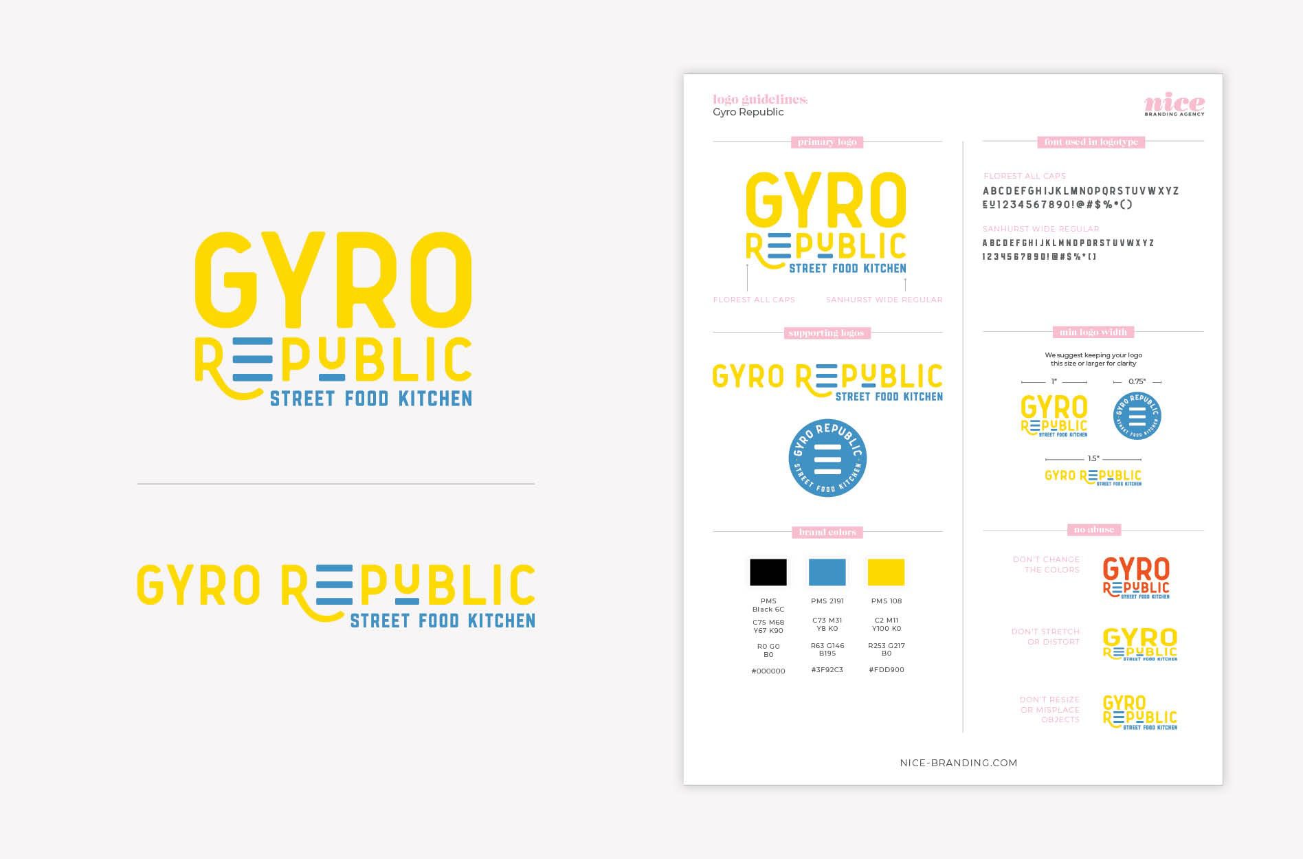
To finalize the selected restaurant logo, our Director of Design carefully reviewed the design to perfect the logotype and spacing before our design team moved into creating final logo files. The final logo files were created in black, white, and full color, in all of the necessary file types.

Logo guidelines were created to note the brand colors and fonts, and to communicate key do’s and don’ts in terms of utilizing the logo design.

gyro republic logo design

Greek Restaurant Interior Branding

Next, we started to work on environmental branding for the restaurant space.

With restaurant interior branding, our goal is to utilize the physical space to create an experience. The experience we seek to create is one that tells a story, so everyone who walks through the door feels the brand through everything they see, hear, and touch.

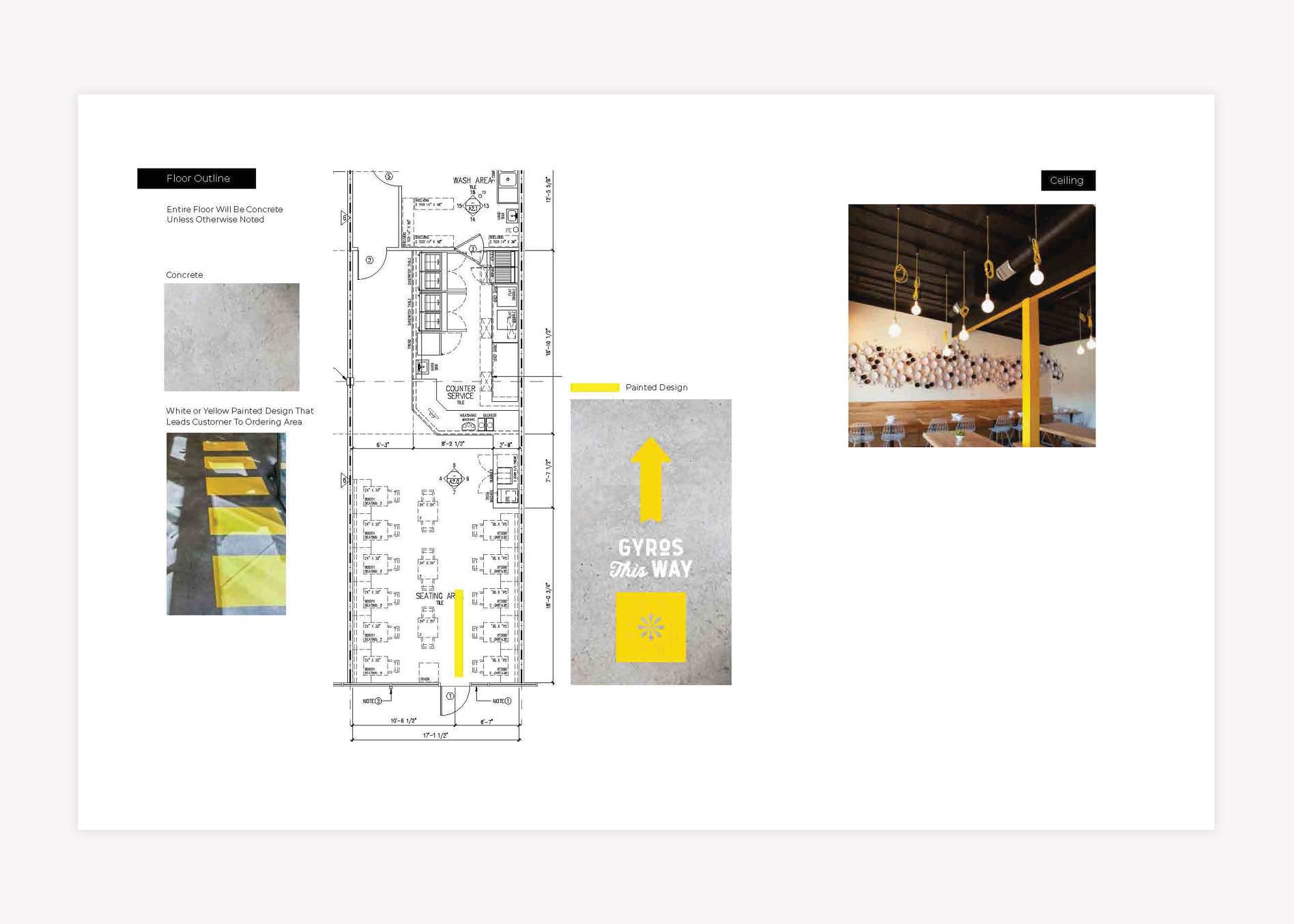
For the interior of Gyro Republic, our client provided us with a floorplan to reference. From the floorplan, we pinpointed the customer journey through the restaurant, from the front door to the ordering counter to seating and more. Based on the outlined customer journey, we implemented interior design strategies to weave the brand through each and every touchpoint.

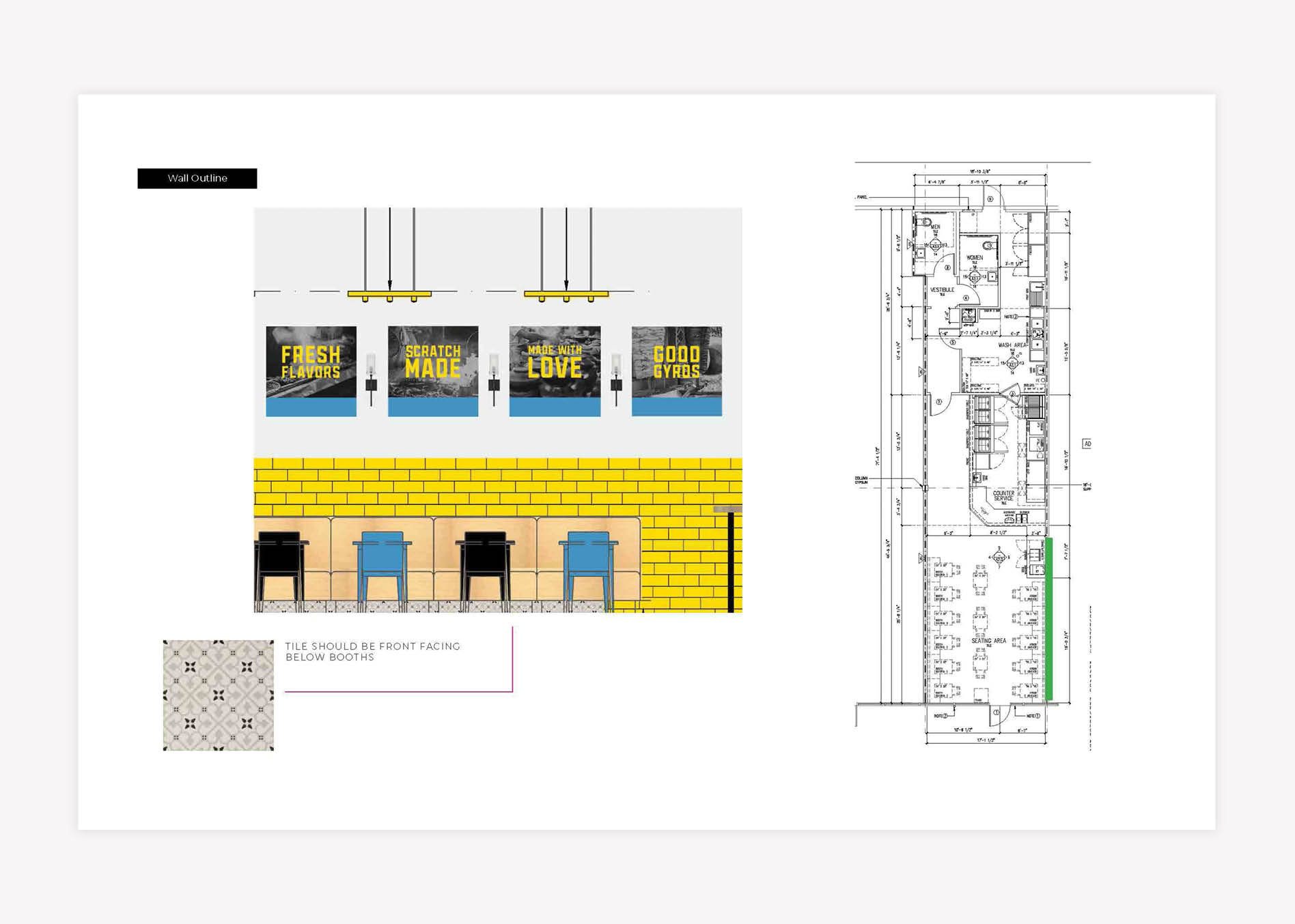
We started with seat selection. One element of the interior plan would be bench seating that ran the length of the restaurant. The restaurant was long and narrow, so while the bench seating was eye-catching, it was also a functional element of the environment. The final seating selections would include a combination of oak wood booths, wooden tables, and a front-of-house window bar top for additional seating.

The use of wood for the tabletops would bring in a natural feel and a casual vibe while keeping the restaurant looking fresh and polished.

restaurant interior design

Next, we suggested that the chairs be a mix of the brand colors and styles to bring in variety and the eclectic nature of the brand.
This variety of colors and styles throughout the seating aligned with the overall visual direction for the restaurant. However, it would also covertly communicate the idea of mixing in a manner that nods to the build-your-own-meal concept.

To decorate the dining area, yellow subway tile would be laid above the booths, along with oversized black and white street-style food photography on one wall. The other wall would feature a large, custom mural.

greek restaurant interior design

We suggested polished concrete for the flooring. Bright yellow floor graphics were designed to direct people through the customer journey and up to the point-of-purchase. These graphics were hand-painted onto the concrete floors and became a true photo-op for customers making their way through the restaurant.

restaurant environmental brand design

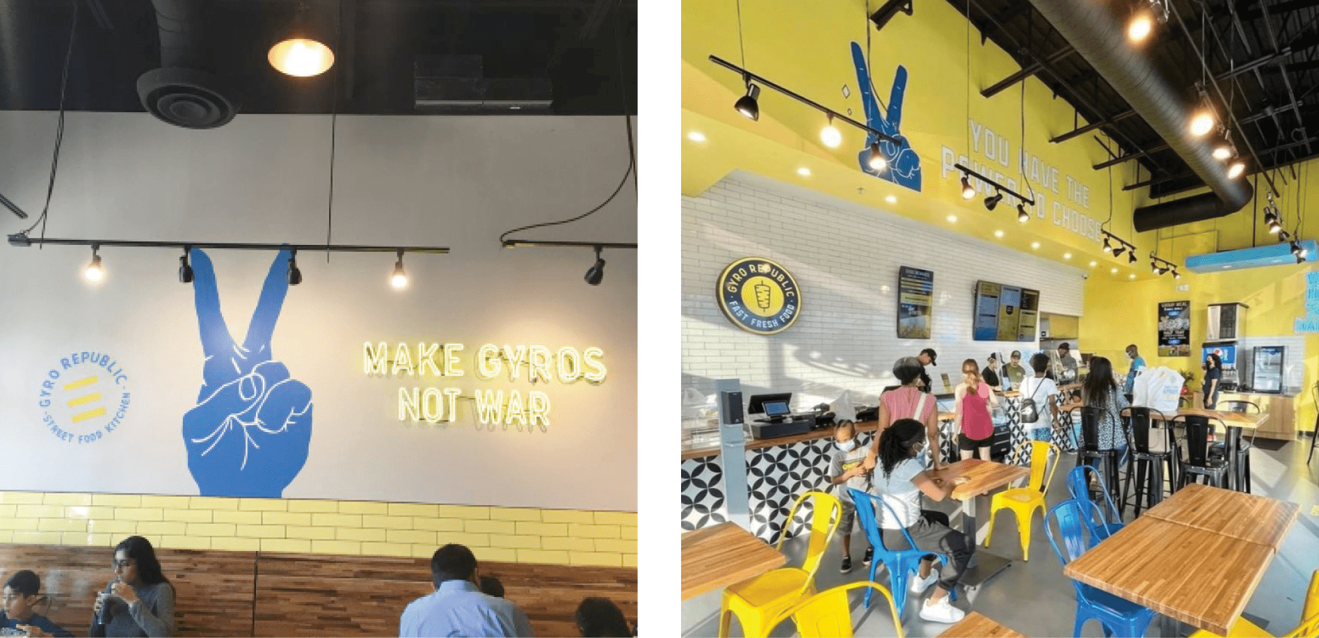
Black and white Mediterranean-style tile was chosen for the riser at the point-of-purchase counter. This counter actually extended through the entire customer journey, starting with the ordering spot, and taking the customer through the topping selection station, and finally up to the point-of-purchase. Utilizing a focal tile here would allow us to further direct the customer journey by drawing a person’s eye directly to the back of the restaurant — where they would need to order — even as they entered the front door.

Blue subway tile was selected for the wall behind this counter. The blue would bring in another brand color to balance the use of yellow throughout. Additionally, this blue tile would strategically convey a sense of playful brightness that aligns with the overall visual direction for the brand. The inclusion of a large flood of color in this space was essential. It ensured that the black and white pattern created by the focal tile remained an accent and not a primary brand element within the restaurant’s physical space.

Gyro Republic - branding interior design

There was no square foot overlooked as our team worked to brand the environment of this restaurant in an effort to create a connection with the consumer.

Greek Restaurant Branding Package Add-On: Custom Mural Design

As an add-on to this Greek restaurant branding package, our client purchased an hour pack for the design of two custom wall murals. The murals would serve as focal points in the interior and provide an opportunity for customers to immerse themselves in the brand story. Restaurant mural design is also strategically implemented to inspire people to photograph key messaging and brand elements, and share the photos with their social media audience.

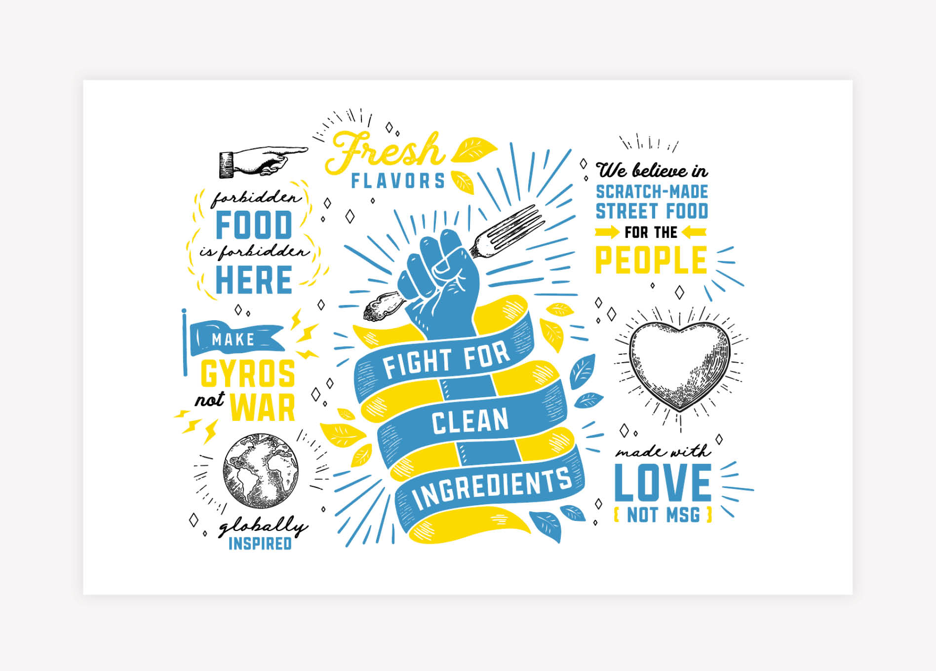
The main mural, found near the order counter, was a concept developed using a mix of line art, solid oversized illustrations, and custom brand messaging that voiced the meaning behind Gyro Republic. The position of the mural in the space allowed customers to read about the brand’s differentiators and snap a picture while standing in line.

custom mural design

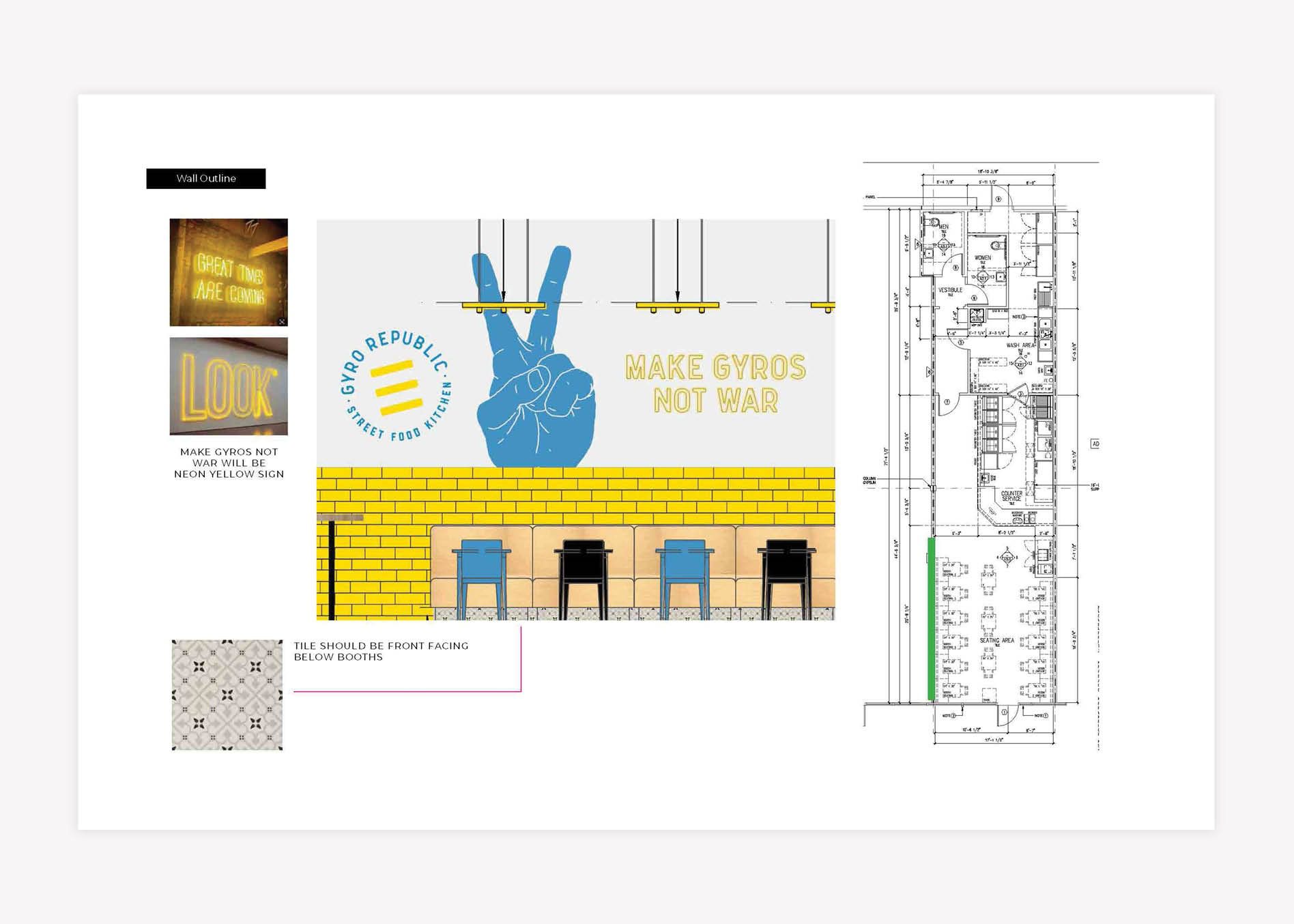
The second mural created for the space was positioned along the left side of the restaurant, over the booth seating.

restaurant mural design

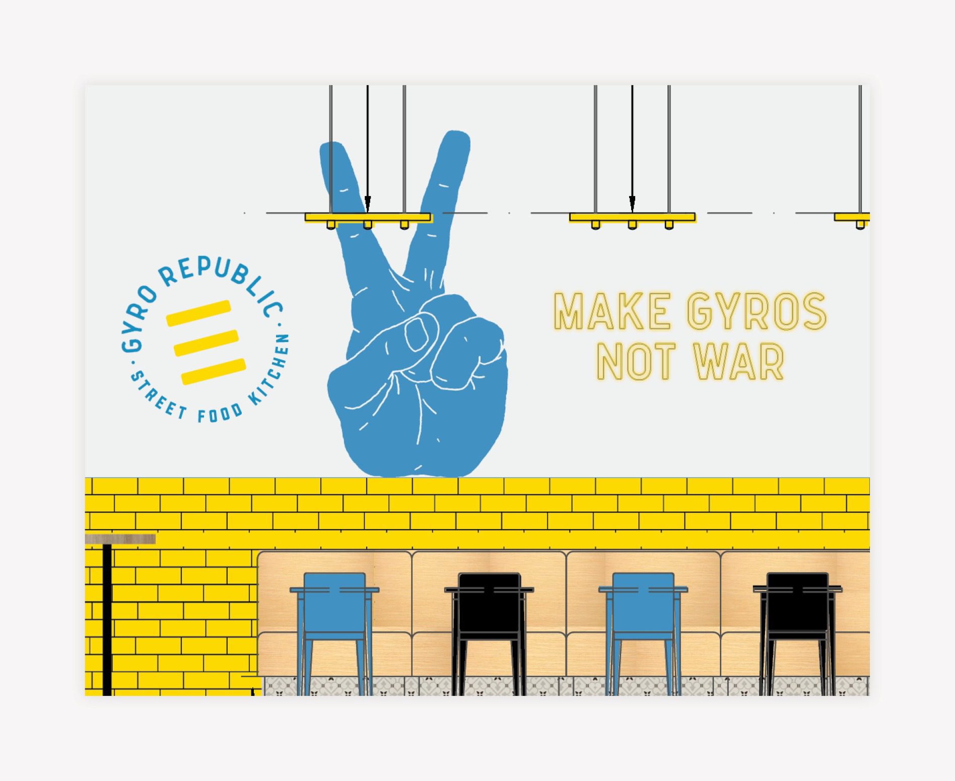
The resulting design was an open-concept mural which had a neon sign that said, “Make Gyros, Not War,” paired with an oversized, illustrated peace sign in the brand colors. The location of the mural and the placement of the custom neon sign made this piece visible from the exterior of the Greek restaurant, drawing the attention of people passing by.

Menu + Menu Board Design

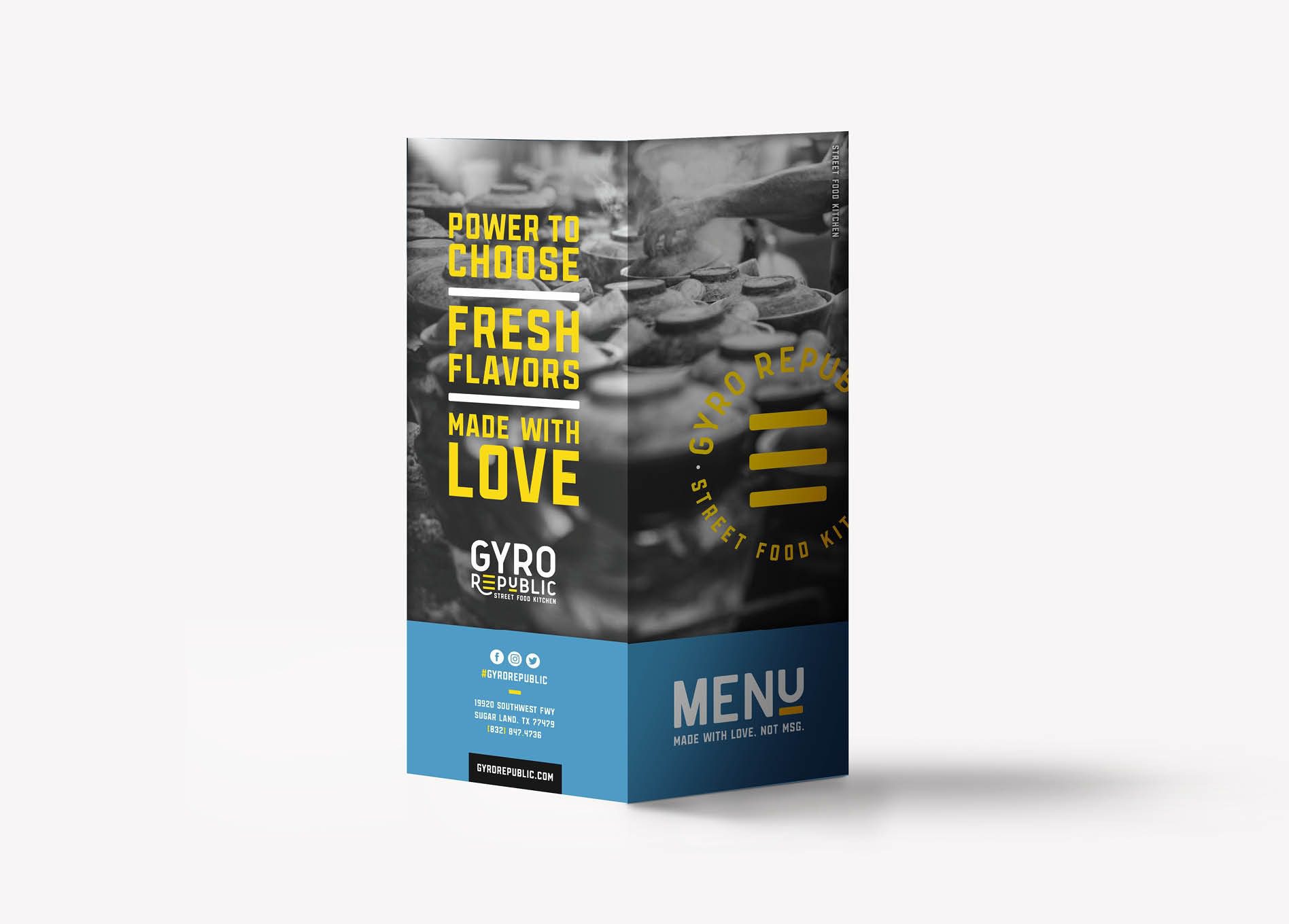
Next, we designed the restaurant menu. For a restaurant, the menu is what sets the tone for all of the printed restaurant materials.

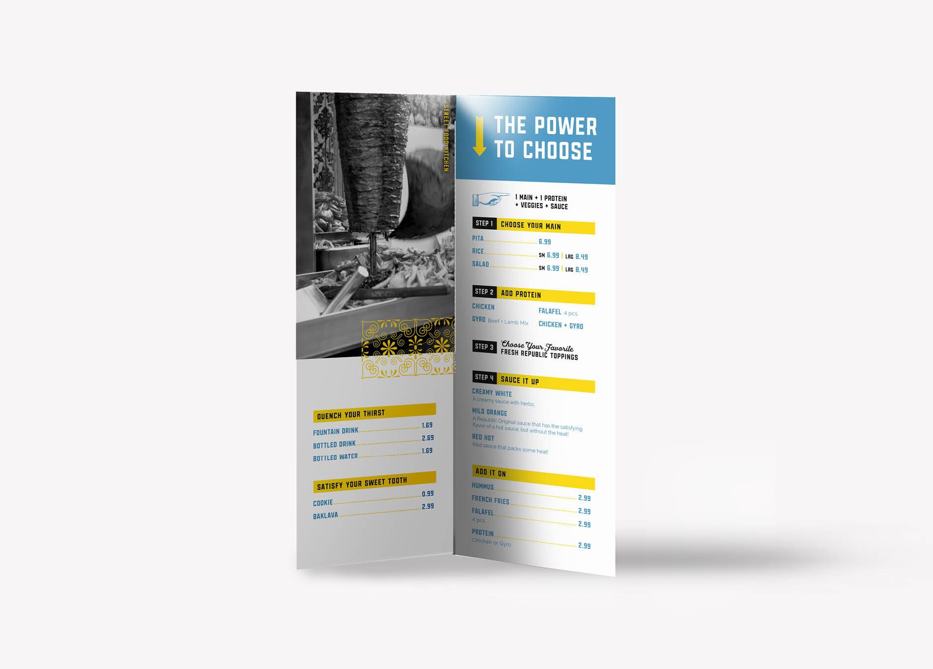
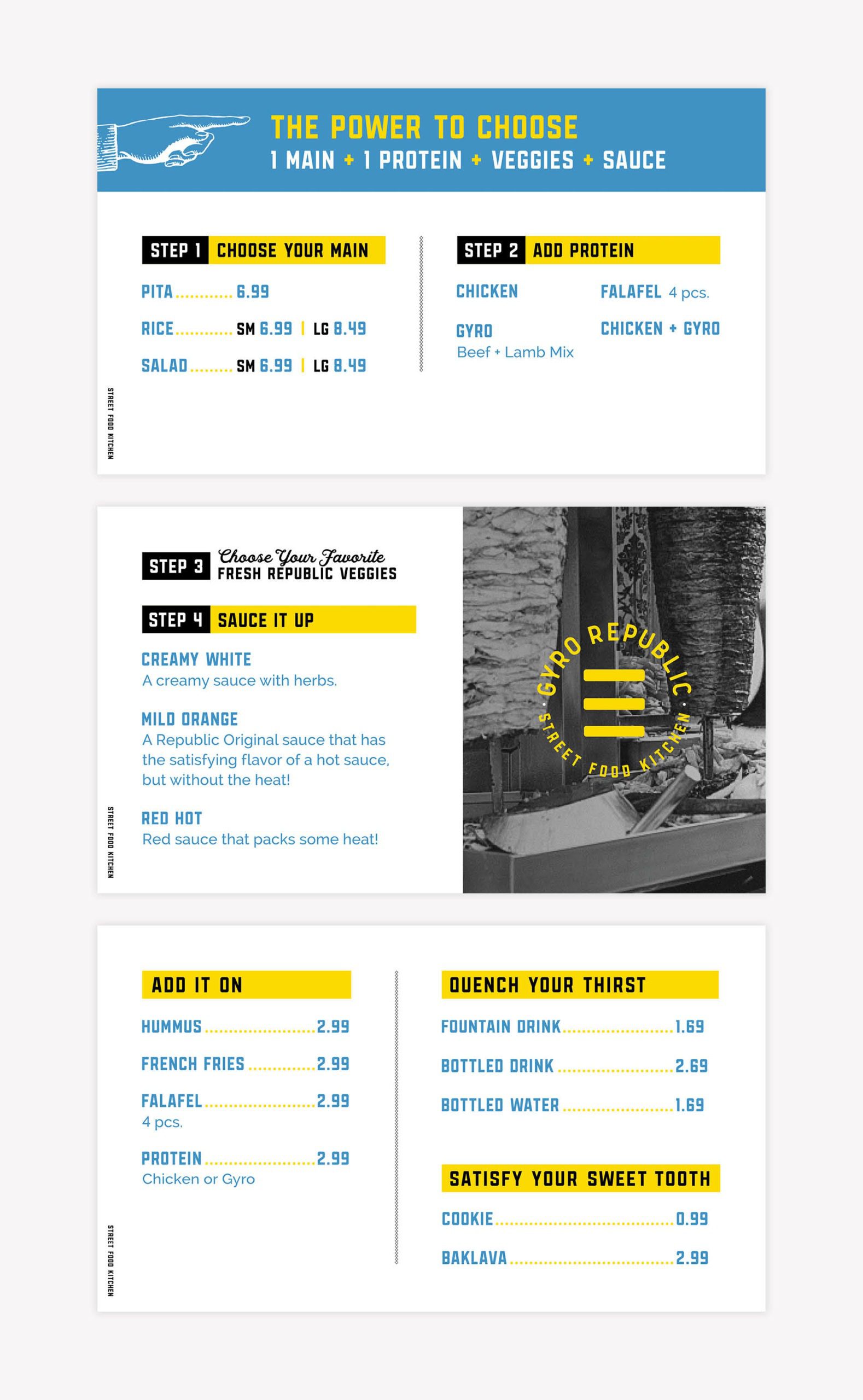
Since Gyro Republic was based on a “build-your-own” process for ordering, we wanted to create a visually uncomplicated menu that would make ordering a no-brainer for every customer, even from the first visit.

For a fast-casual restaurant, ordering has to be streamlined and efficient to avoid a backup at the point-of-purchase. The ease of navigating through the restaurant menu is key in keeping things moving. We organized the new menu into easy-to-follow steps with verbiage emphasizing the customer’s power to choose, bringing in the brand voice, and helping to explain the process.

greek restaurant menu design
restaurant menu graphic design

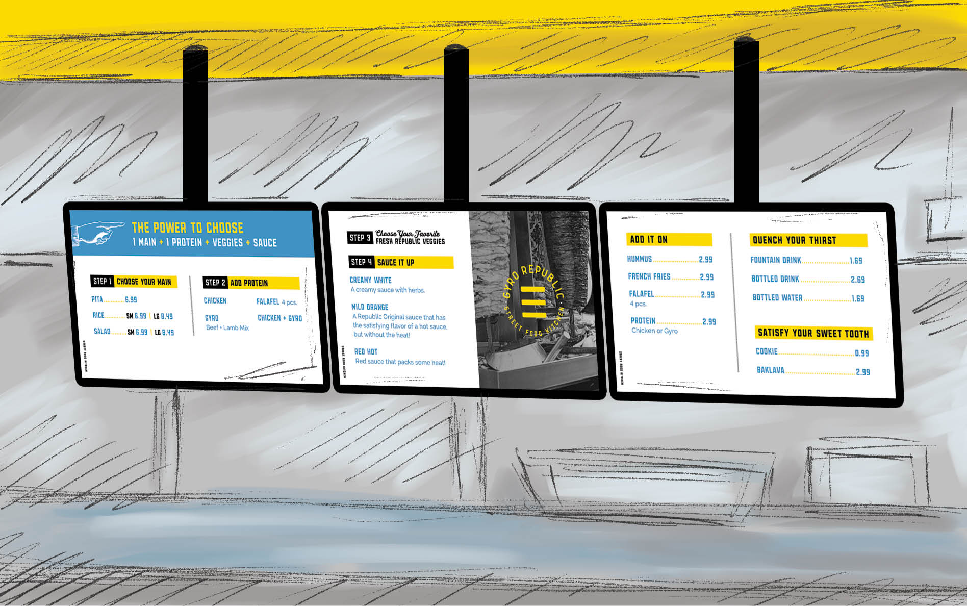
Since we were also working on environmental branding, we consulted on the sizing, construction, and materials for the menu boards as well. Our client chose to use digital menu boards as a cost-effective option for easy updates. So, we created the graphics for the digital menu boards and sketched the menu boards within the space to provide our client with a reference point for installation.

restaurant menu board design
greek restaurant branding

Business Card

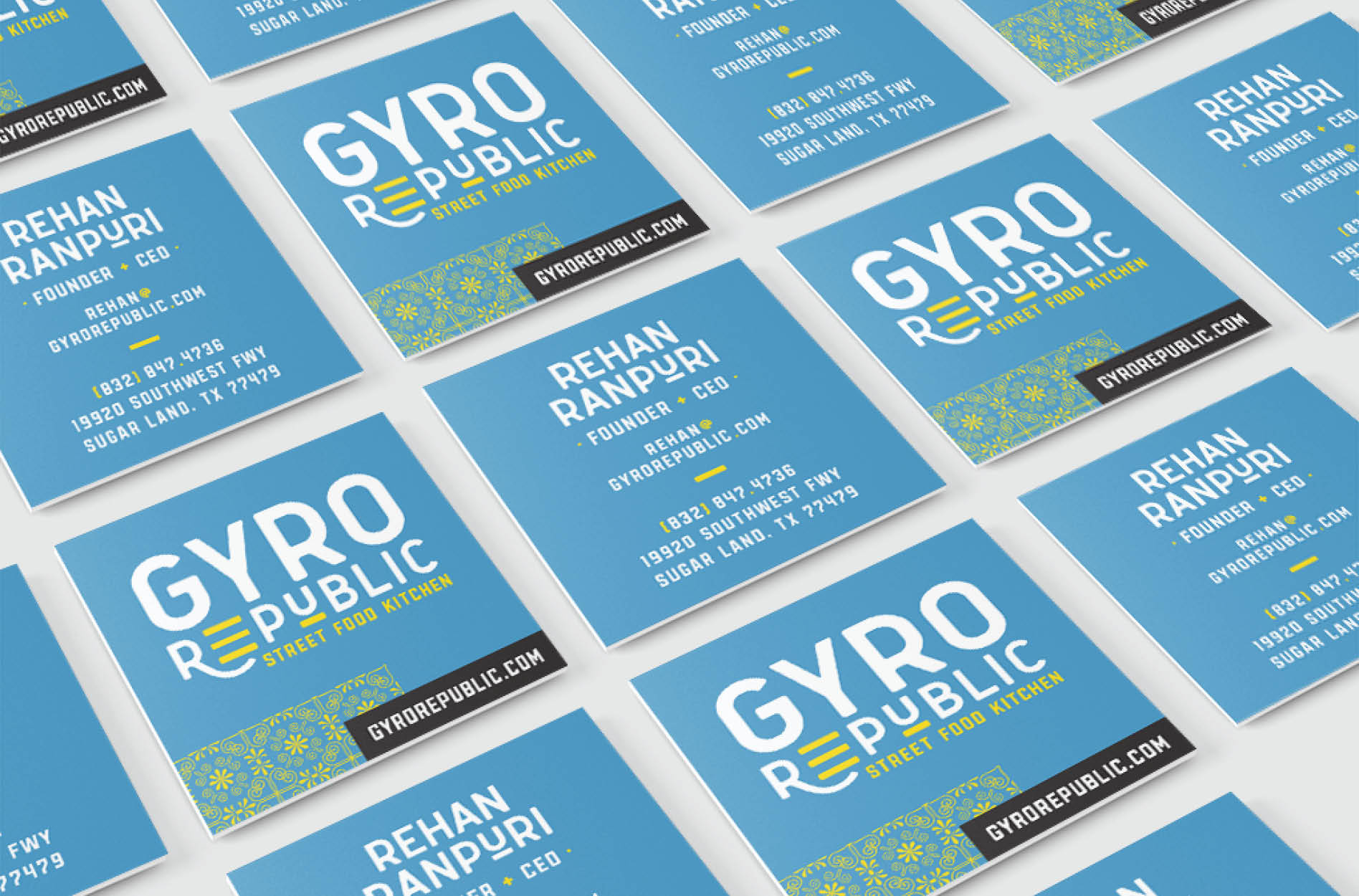
With the new restaurant menu design in place, we developed the business cards next to equip managers and operators with professional, branded collateral for outreach. We designed three business card options, which were presented to the client for selection.

The business card options for Gyro Republic showcases the logo and brand fonts on a flood of blue, punctuated by a pattern that also serves as an accent throughout the other restaurant brand support.

greek restaurant branding business card design

Stationery Package Development

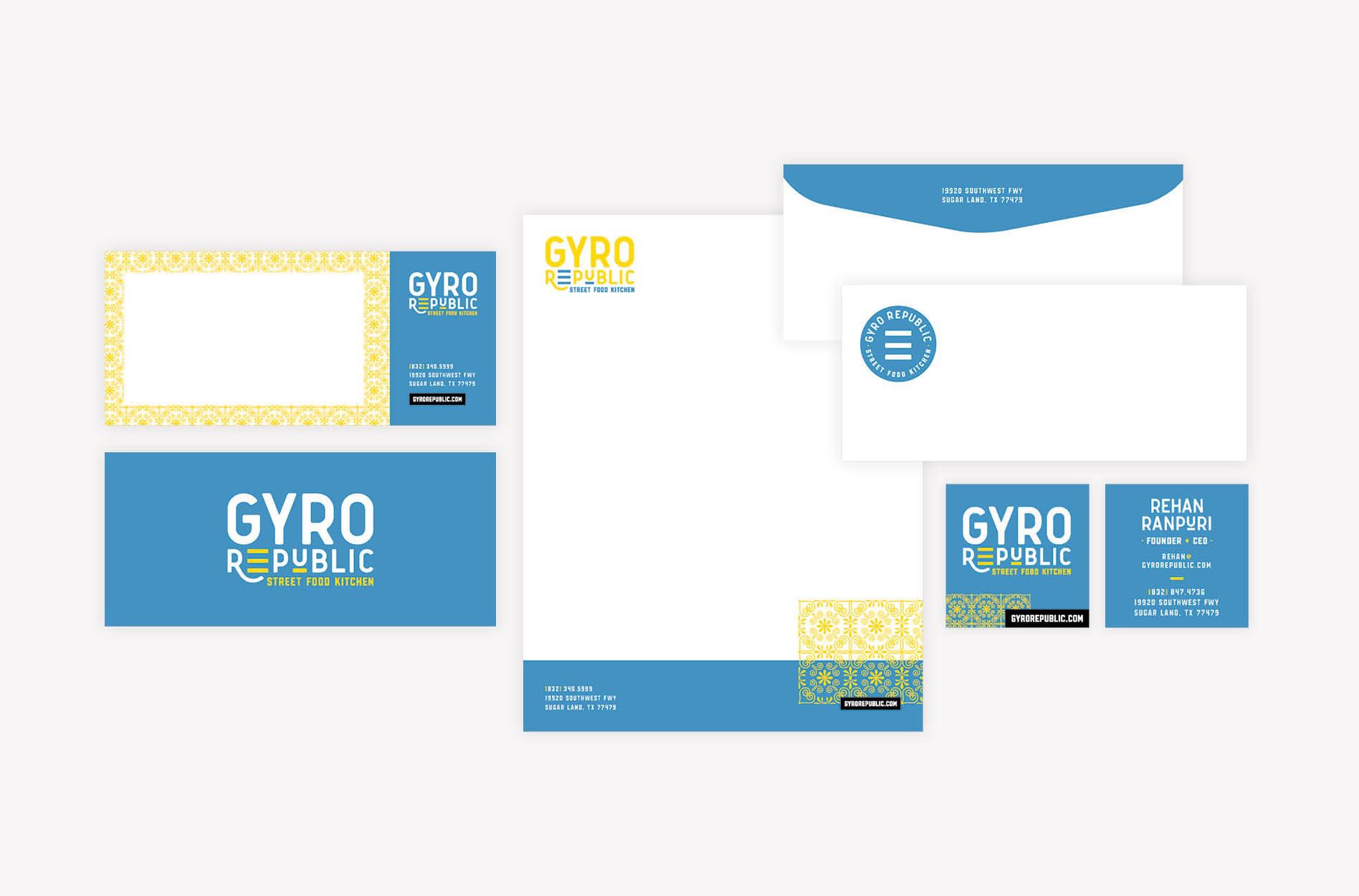
Based on the final business card design, we created a corresponding letterhead, envelope, and notecard design.

For our clients, our team is available to coordinate printing for all printed materials, including stationery, menus, and more. This professional print coordination service ensures that the final product aligns with our vision for the set.

Gyro Republic - restaurant branding package design

Restaurant Materials

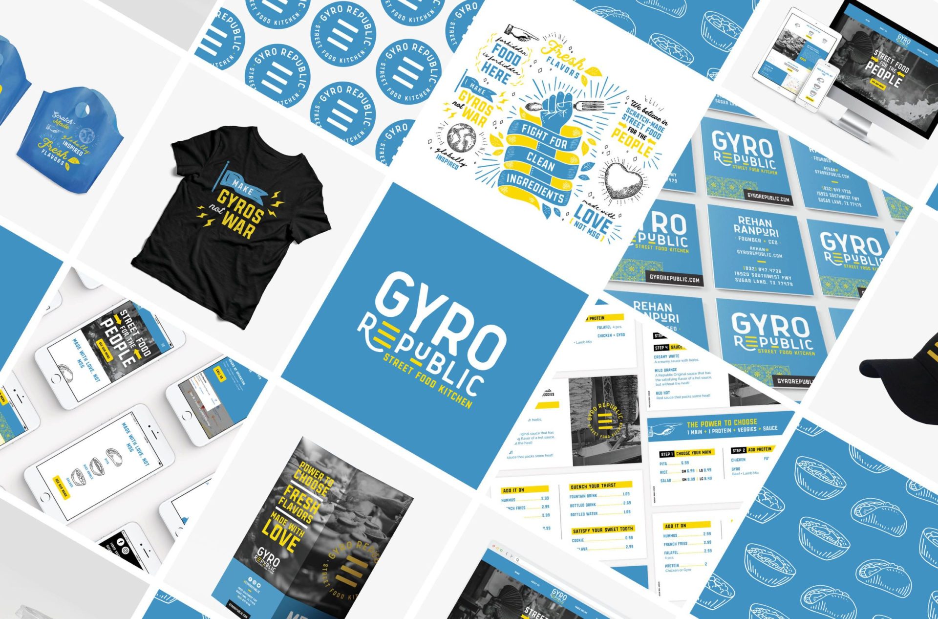
Our Mighty Restaurant Branding package also includes designs for the restaurant’s cups, to-go bags, window clings, and attire to ensure that the restaurant brand permeates every available touchpoint.

It’s worth mentioning that to-go materials and delivery-experience branding as a whole are often overlooked elements of brand support. However, it is the delivery experience that immerses the customer in your brand, even when dining at home. Before you move on, consider this: When a customer dines at home, they are not impacted by your environmental branding or your trained team. When take-out is ordered, your delivery experience bears almost all of the responsibility of communicating your brand and making you memorable — aside from the food, of course.

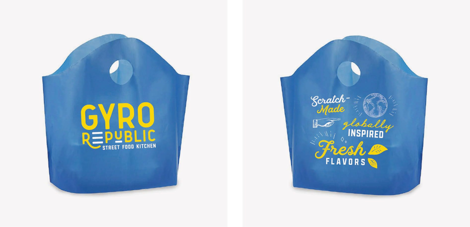
For Gyro Republic, we created to-go designs that would deliver the brand into the hands of every customer, every time. Take-out bags were custom-designed and custom-printed to include the logo on one side and elements from the in-store mural on the other. These elements were strategically selected to convey key messaging about the brand that would differentiate the restaurant from competitors.

greek restaurant branding

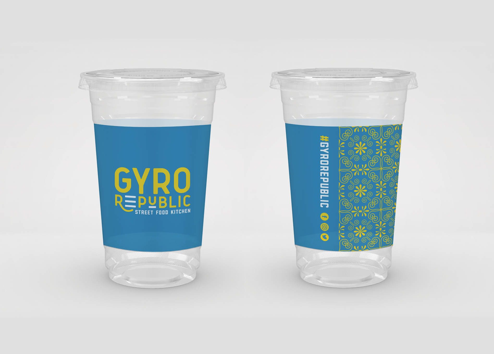
The restaurant cups were similarly designed to include a flood of blue, accented by yellow and punctuated by a brand pattern. The brand’s hashtag and social icons were placed on the cup to encourage engagement. Restaurant cups are often photographed and shared on social media, so we work to harness this small space, making restaurant cups a key player in supporting social media marketing efforts.

greek restaurant branding

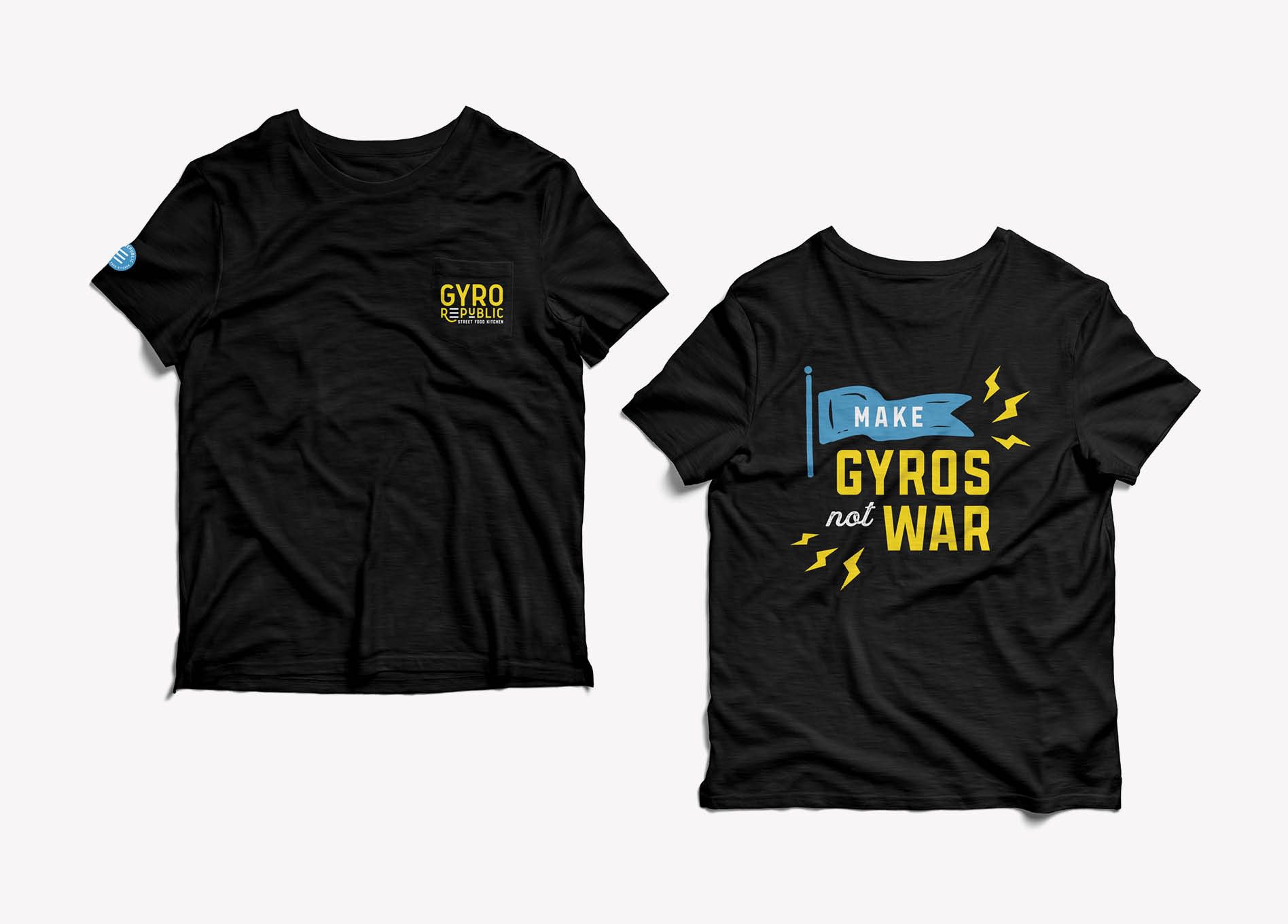
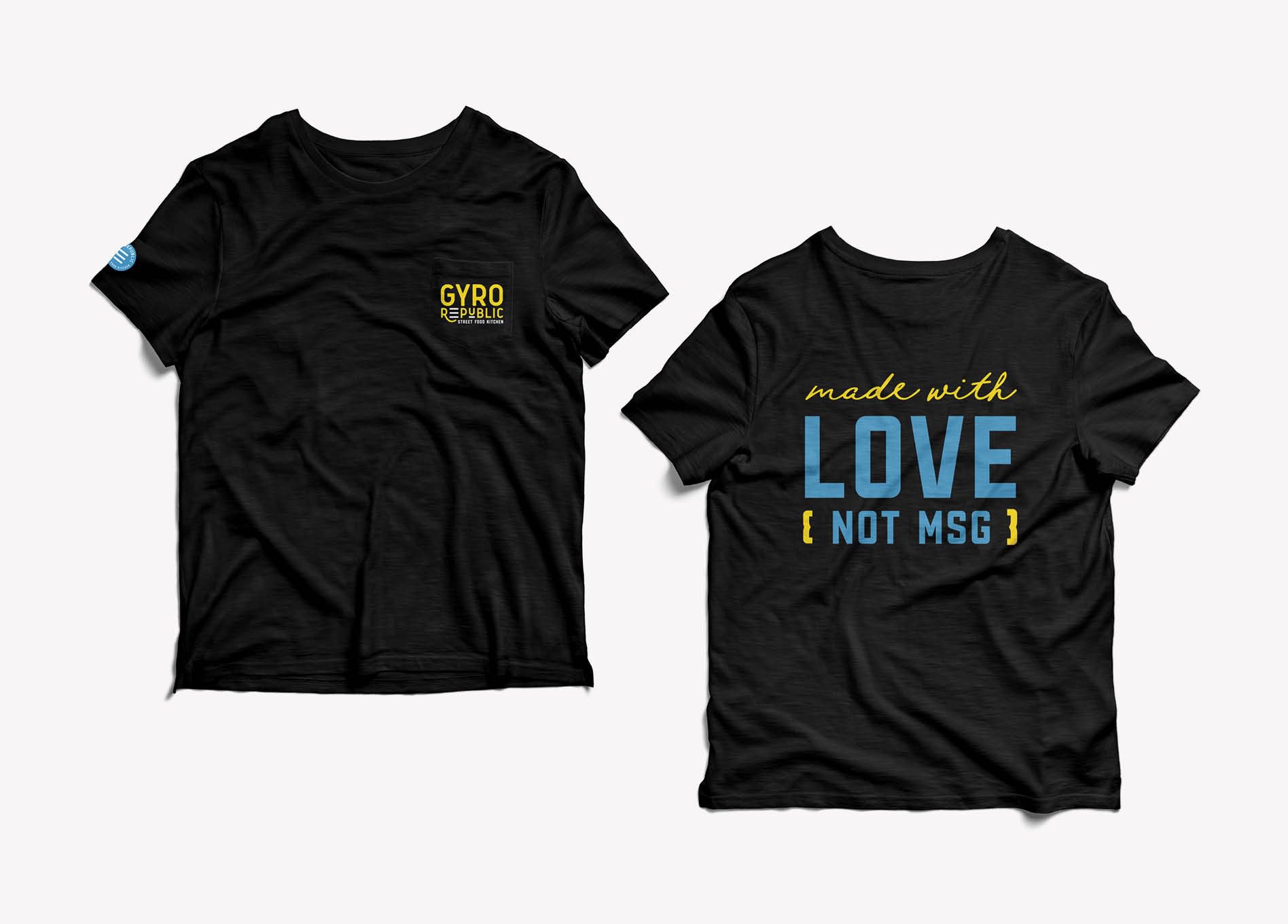
Another often-missed restaurant branding opportunity is employee attire. As part of our Mighty Restaurant Branding Package, we include the design for a staff T-shirt. Restaurant employees are living billboards for your brand. For Gyro Republic, we designed shirts and hats to envelope the restaurant’s #1 brand ambassadors in the brand’s aesthetic and messaging.

Gyro Republic - restaurant branding
restaurant tshirt graphic design
restaurant hat design

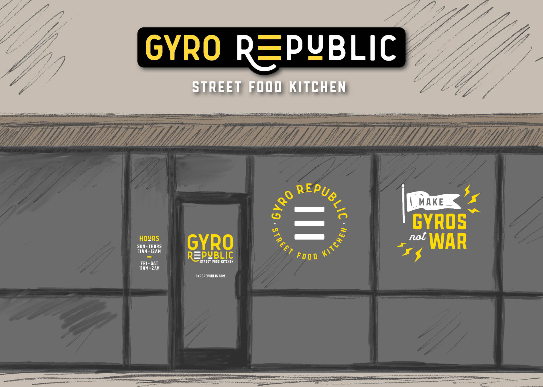
Finally, we designed custom window graphics to brand the exterior of the Greek restaurant space while construction was happening inside. Our approach here was to create graphics that would create a buzz about what was to come, but that could also be left on the windows after the grand opening. In addition, door graphics were created to communicate contact info and restaurant hours of operation.

window graphics

Sitemap Presentation + Website Hosting

While working on restaurant brand support and environmental branding, our website designers were creating a strategy and design for the Gyro Republic website.

In website design, the first step is the sitemap. Here, we outline a list of the pages for the website to begin to organize needs. For Gyro Republic, we were designing a one-page website, so the outlined list focused on the information that the website would need to include.

At this juncture in the Greek restaurant branding project, we also discussed hosting and website maintenance with our client. We offer hosting and website maintenance, and encourage our clients to use us to host the websites we design and develop for them. We partner with a robust WordPress hosting platform that ensures minimal website downtime, consistent updates, daily backups, and optimal page load speeds. As part of hosting with us, we also provide monthly maintenance on the site and the site plugins to ensure the site has proper functionality at all times.

Website Wireframe

Once the sitemap was approved, our website design team started working on the website wireframe.

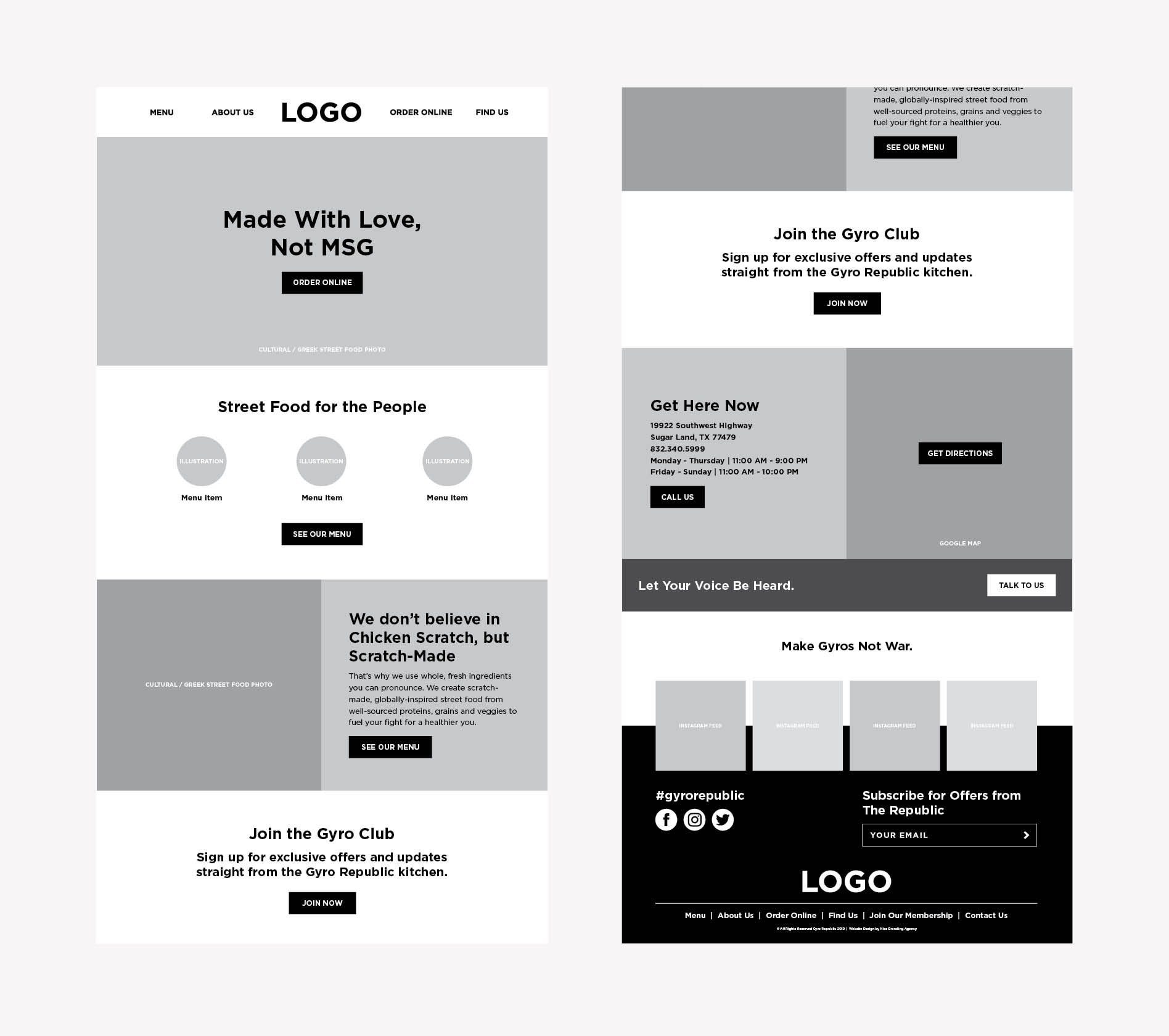
The wireframe creation requires that we take a deep dive into the user experience for the website. During this phase, we strategically map out how the user will find exactly what they are looking for in the most intuitive and natural manner. Specifically, we organize the menus and map out the location of text, images, buttons, headers, and more.

For the restaurant website for Gyro Republic, we created a hierarchy to present the necessary information, starting with the most important things that users would be looking for, at the top of the page. As the user scrolls down the website page, they will continually be fed supporting information, ultimately answering their ask, and guiding them to take intended actions.

Additionally, headlines and call-to-action copy were developed. This copy was added into the wireframe to demonstrate how the website would convey the brand’s story and nudge viewers to action.

Our web design team presented the wireframe to our client and walked them through this blueprint for the website. Once approved, we moved into the website design phase of the Greek restaurant branding project.

restaurant website design

Website Design

Here’s where we start actually designing the website pages. It’s the phase of the restaurant branding project where we start to see the brand come to life outside the walls of the restaurant’s physical space.

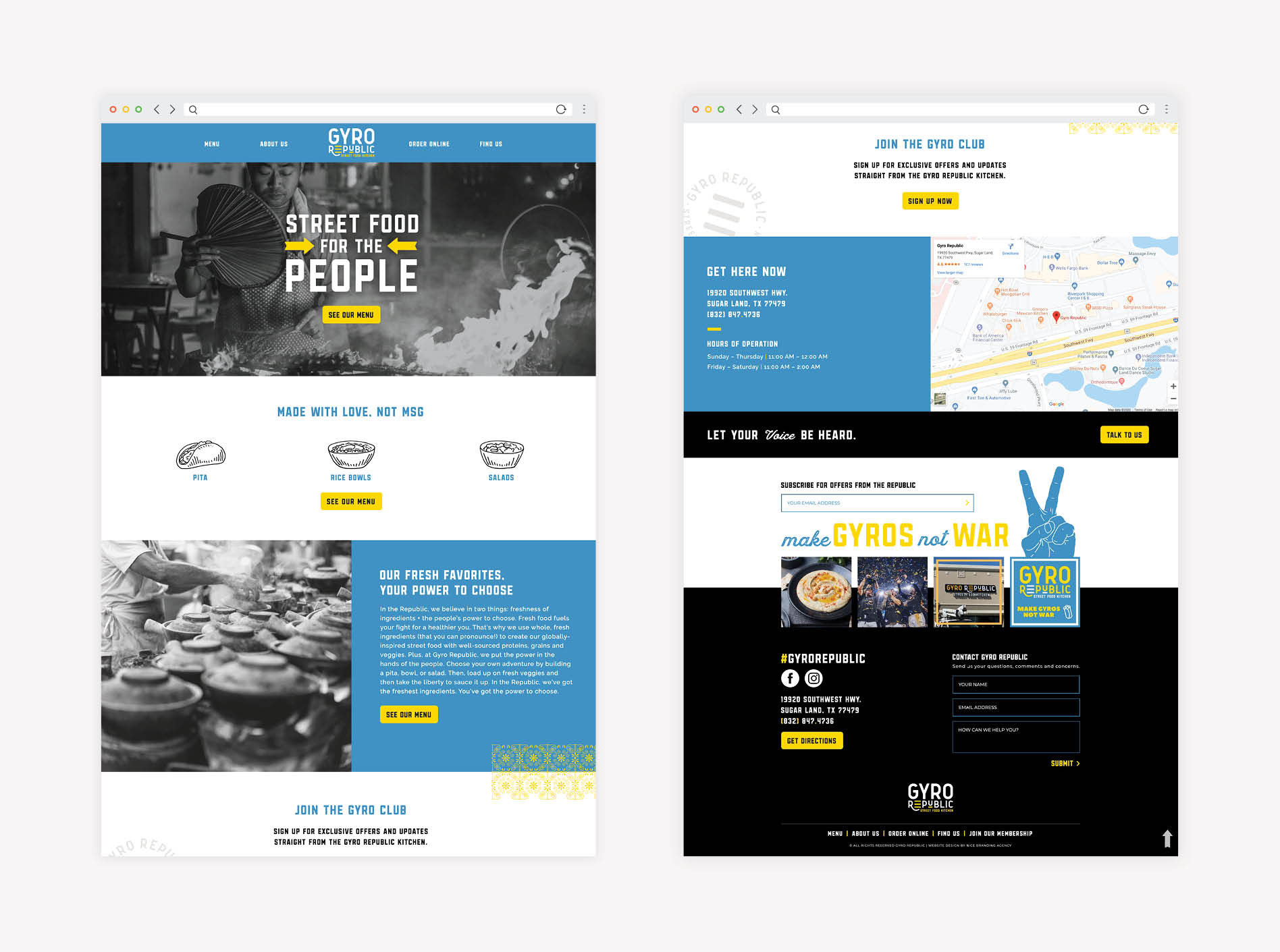
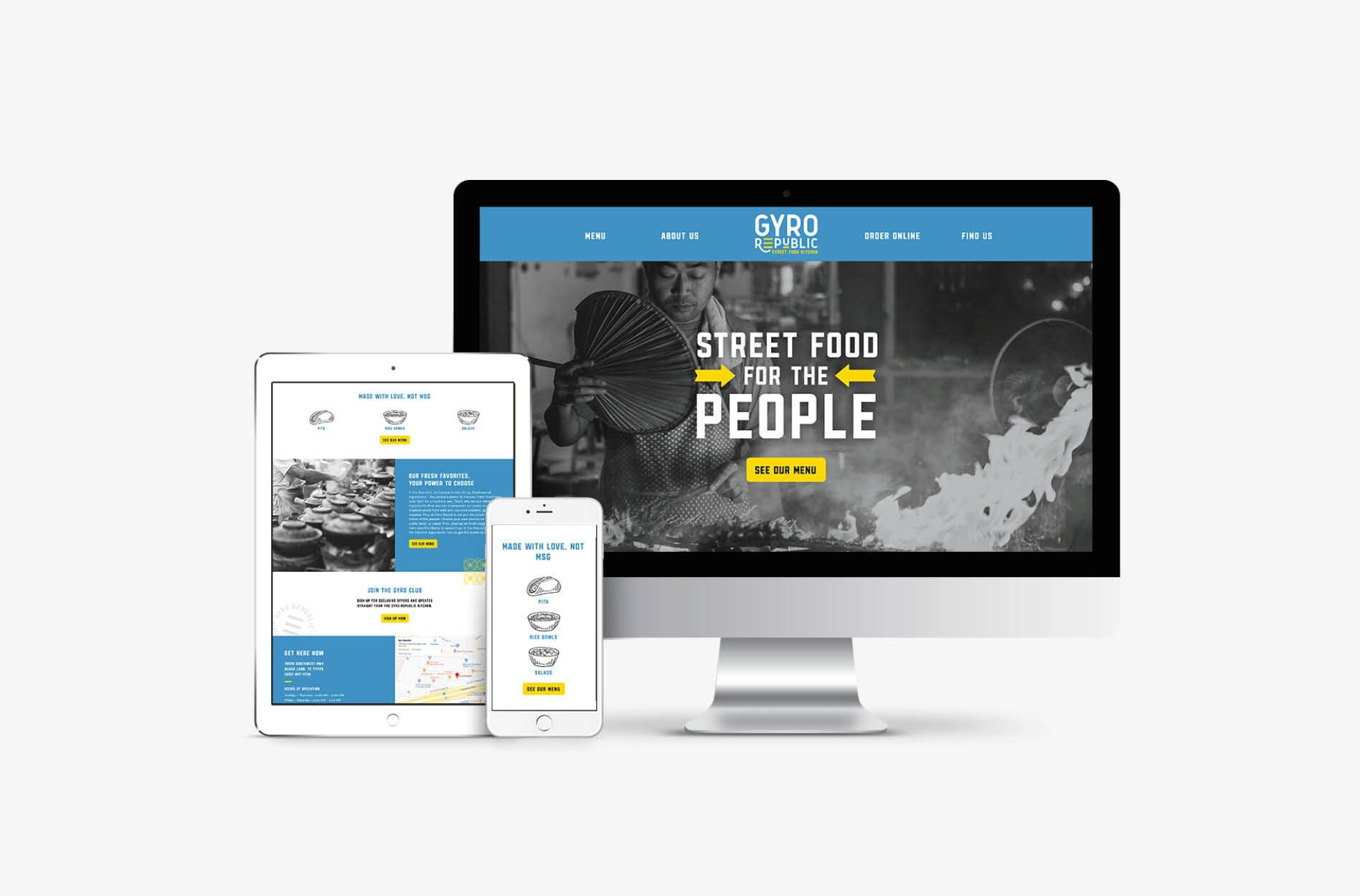
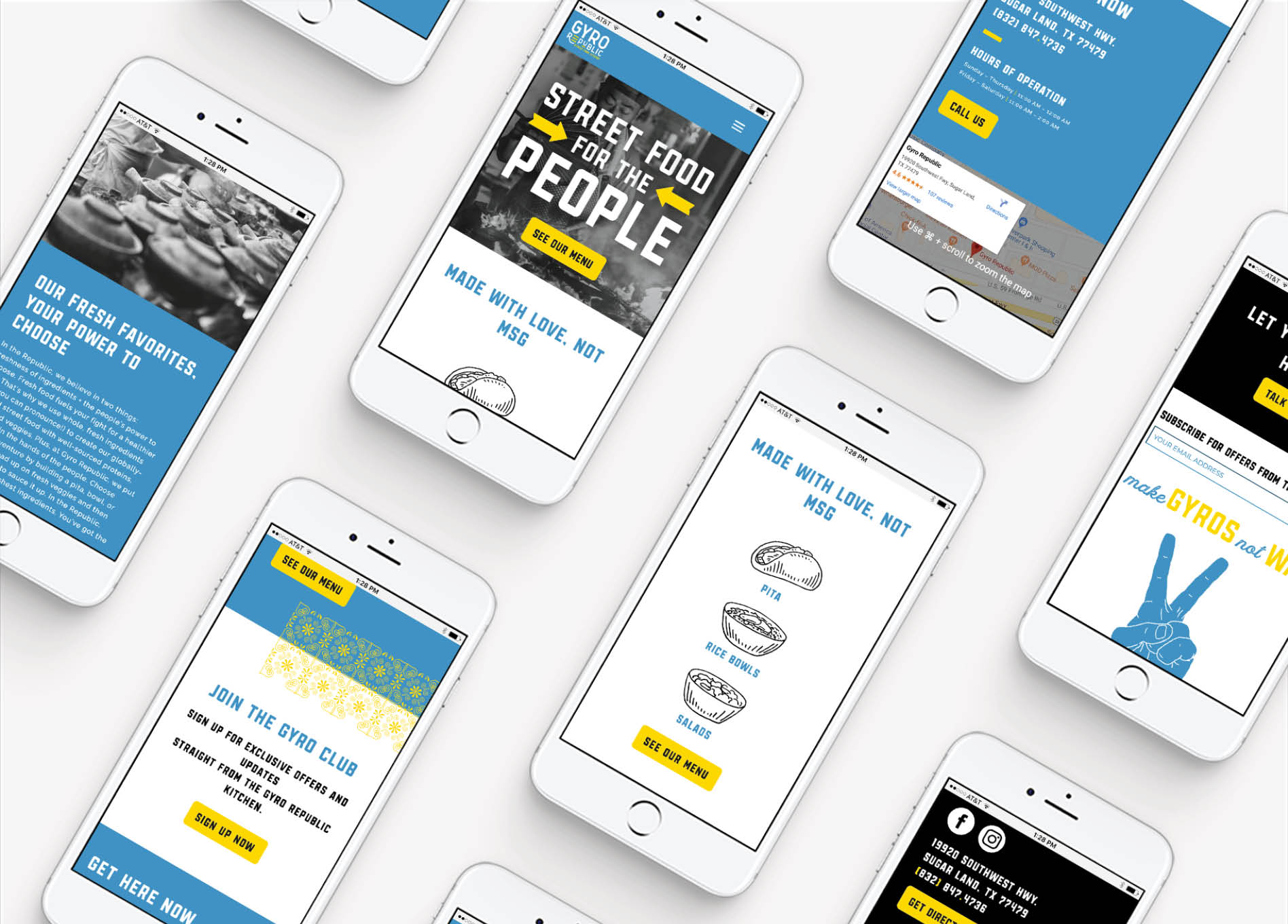
We aligned the design of the website with the overall brand direction and previously developed brand support. The user interface for the website puts the “Street Food for the People” concept front and center for the viewer through a large black and white header image.

Floods of blue with pops of yellow and brand patterns pull the viewer into the aesthetic and are implemented strategically to draw the eye to key messaging.

Additionally, we pulled in imagery that reflects the visual direction of the brand and highlights the relation of street food to the concept. We made sure the design of the menu on the website complements the design of the printed restaurant menu.

Armed with knowledge about the target market, we worked the Instagram feed into the website’s footer to encourage engagement and provide people with a real-life glimpse into the restaurant’s interior and menu items. We used design techniques to highlight this section of the website and tie it into the brand by implementing elements from the restaurant’s mural.

We presented the website design to the client. Upon approval, we moved into the website development phase of the Greek restaurant branding project.

restaurant website design

Content Development

During the website design phase, our copywriters are also getting busy crafting content to fill the site’s pages with body copy to support the headlines and calls-to-action. All of the copy is written in the approved brand voice and guided by the website wireframe.

For Gyro Republic’s website, copy was developed to be catchy and to speak to the viewer in an approachable, yet memorable manner. All content pointed back to the key pillars of the brand, including: fresh flavors, clean ingredients, globally inspired. These concepts were mimicked throughout all brand assets, and it’s this repetition that creates a connection for the consumer.

Restaurant Website Development

Once the website design was finalized, we developed the website to exactly mirror the approved design.

When the website development was complete, we deployed the website to a staged link and thoroughly tested all buttons and forms. Our team also completed a review of all pages side-by-side against the design to confirm that all elements appeared as intended.

Nice Branding Agency utilizes the WordPress platform to build and host websites because it allows for custom functionality. WordPress also provides the flexibility necessary to develop a versatile site that provides an optimal experience both on desktop and on mobile devices. Additionally, WordPress is easy to update, which allows our clients to make content updates as needed after launch.

Website Launch

After one last check and final approval from the client, we hit the go button and launched Gyro Republic’s new website on the client’s domain.

As soon as the site goes live, we work through another comprehensive round of testing to ensure functionality and usability.


restaurant website development
restaurant-website-design

Greek Restaurant Branding Project Closeout

Once all payments were in order, we provided our client with the final logo files and a supporting logo guidelines sheet. Additionally, the client received final files for the stationery package and the restaurant materials. Lastly, we sent over a backup of the new website, along with a training video walking through the steps for updating key content on the website.

The Greek restaurant branding project for Gyro Republic was a huge success. The community flocked to the restaurant and interacted with the newly created brand in a positive way. Social channels are flooded with snaps of photos taken by restaurant customers.

If you are looking to revolutionize your restaurant brand or get started with a new restaurant concept, take a look at our available restaurant packages, and, then, holla at your girls.

Follow along on Instagram for more great project recaps and tips on restaurant branding.

are you ready to create something nice?