New Logo Project Kickoff
The Rail Bar & Bites is a restaurant within the Crowne Plaza hotel in downtown Kansas City. As our client, The Hotel Group, prepared to open the restaurant within the Marriott Hotels property, they reached out to Nice Branding Agency for a new logo design for the restaurant that would bring life to the concept, while still aligning with the design of the rest of the hotel.
We started the project by reviewing the logo creative brief provided by the client. From the information supplied, we understood that the client’s objective for the logo design was to create something upscale, but not too uppity. They wanted the brand to be fun and to appeal to a wide demographic. Our research into the property and the area uncovered the fact that Kansas City has a deep history with the railroad industry. The famous Union Station was constructed in the early 1900’s and local residents of the time welcomed the addition enthusiastically. The large clock that hung from the ceiling there became a meeting place for businessmen, couples, and gatherings.
Today, Union Station stands as a vivid reminder of inspired vision, determination and a collective sense of civic history and pride. Our logo design experts decided that with the name of the restaurant, and the storied history of the railroad system within the region, we would develop several concepts that nodded to the impact of the railroad to this community.
Design Direction Brainstorm
Our logo design team assembled to brainstorm and sketch the logo ideas and present them to our Director of Design and Creative Director. The new logo concepts presented internally included the use of an icon that imitated the shape of the front of the train, as well as several typographic options that brought in the vintage feel of the railroad.
Finalization of Conceptualization
As our Design Directors reviewed the new logo concept ideas presented by our graphic design team, they ensured that each of the options presented would answer the client’s ask, and that we were taking into account the core values of the hotel property and the restaurant. Additionally, at this stage, we ensure that we’re presenting enough variety in the options. The concepts were approved to be developed digitally, and our graphic design team got to work creating the logo options and preparing them for a client presentation.
New Logo Design Options
At this point in our logo design process, our graphic design team works to bring the sketched ideas to life through digital logo creation. We selected and paired fonts with custom logo icons that result in a professional logo design that will stand the test of trends and time. We create several options during our new logo process to include both variety and consistency.
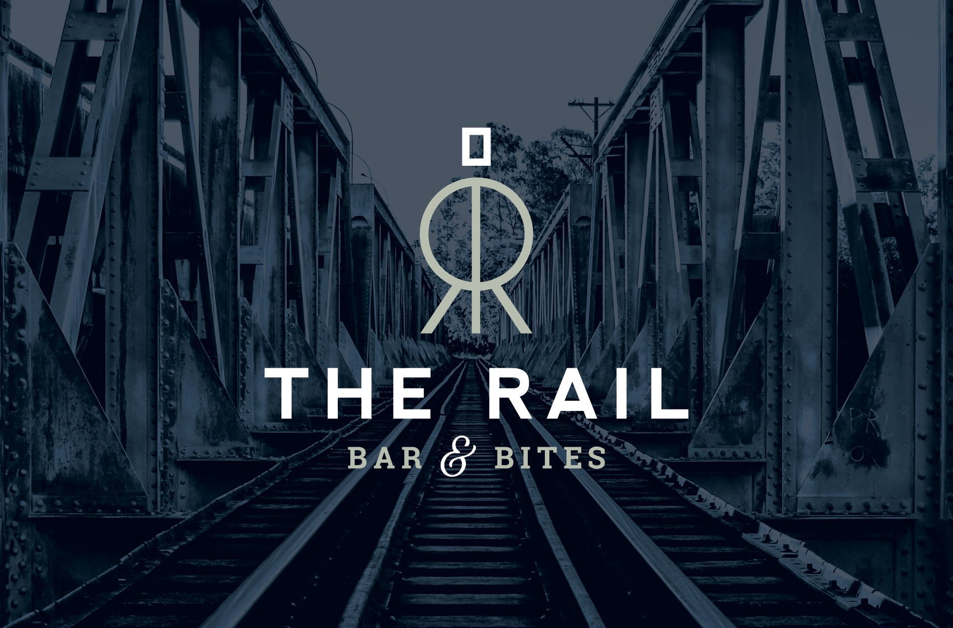
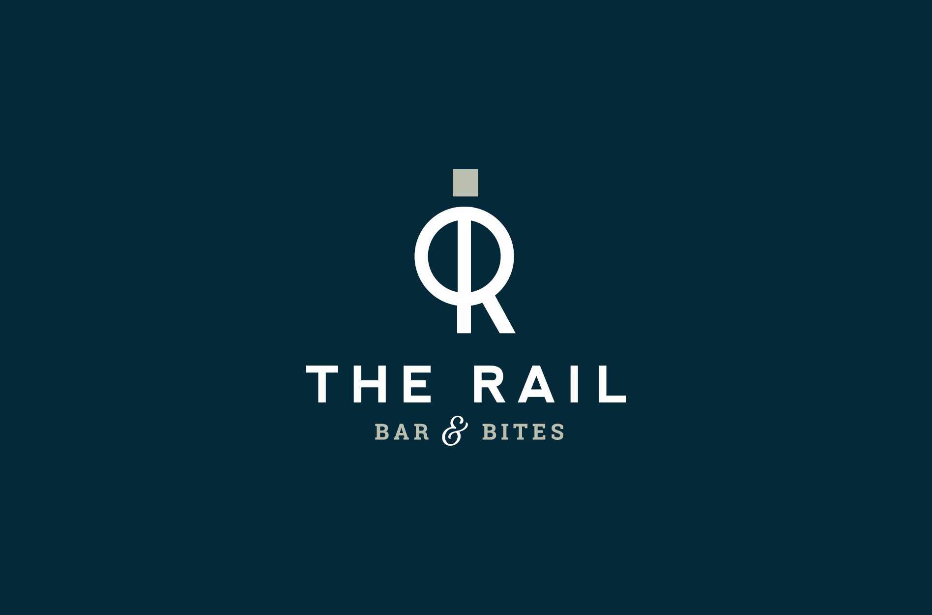
The first logo we created for The Rail Bar & Bites featured a custom, abstract icon, indicative of the frontside of a locomotive train. Shown here with a simplified smokestack, the locomotive logo icon utilizes the letter R to help form the train’s headlight, frame, and “cowcatcher”. We paired a clean and simple, sans-serif typeface, for the restaurant’s name, with a classic serif for the tagline. The pairing of these modern and classic fonts equips the new logo with dimension, timelessness, and a wide appeal. Here we utilized navy and sage green to coexist with pre-existing brand colors inside the hotel.
The second logo option we developed was purely typographical and focused on the historical aspect of the rail lines found in Kansas City. Showcasing the location of the restaurant, we paired both the name of the hotel and the city with vintage design elements and an old-style script typeface.
For our third logo design option, we developed a logo that nodded slightly to the large clock that hung in the original Union Station. The clock was an iconic meeting place, just as we hoped that the hotel restaurant would be. We used the circular shape of the clock, and implemented the initial for The Rail within the space. Decorative horizontal lines were utilized to balance the icon and nod to a vintage era. We implemented the same typography and color scheme from option one in this version.
New Logo Presentation and Selection
Upon the logo presentation, we talked the client through each of the logo options, explaining why we felt each would work well for the restaurant, and how we envisioned each option being used in application. We also explained our color selections. At this point, we asked the client to select one logo direction to move forward with. Logo option one was selected, and we moved forward to finalize the logo for client use.
New Logo Revisions
There was one revision to the selected logo that the client requested. Instead of showing the icon as an abstract silhouette of the train, creating a R, they wanted to see a more symmetrical logo version that showed the entire front of the train engine. This logo change was implemented into the final logo icon by reducing the thickness of the lines and incorporating a reverse of the R shape to balance the logo icon.
New Logo Finalization, Files, and Guidelines
During the logo finalization process, we worked to perfect the logo by ensuring that each element of the design was placed and spaced perfectly. Additionally, our Director of Design works to select final logo color codes, selecting PMS, CMYK, RGB, and hex codes. Once the new logo is final, we move into the project closeout phase of the project.
Project Closeout
Having approval from the Director of Design to create logo files, our team develops files for the client in PDF, EPS, JPEG, and PNG. We provide a full color logo, an all white version, and an all black version. We also create a logo guidelines sheet that outlines the font names, color codes, and logo usage recommendations. This sheet is provided, along with logo files in order to help our client maintain the integrity of the new logo design.
Ready for a Nice Logo?
We loved keeping this logo design project on the rails. If you’re ready to depart, give us a call and we’ll jump aboard.