Project Showcase: Bar Chido
Let’s start off this Mexican restaurant branding recap by telling you that “Chido” means hip in Spanish. Restaurateur, Sam Vlahos, based his Bar Chido concept on a modern approach to tacos. But unlike other hipster taco joints, Sam was bent on making sure families and other non-hipsters would feel comfortable at Bar Chido. Our restaurant brand team created an identity for Bar Chido that infused a sense of style throughout every customer touchpoint.
Mexican Restaurant Branding Project Kickoff
This project was unique in a sense. Our client came to us with a brand concept in hand. His restaurant architect had already created a brand identity for Bar Chido. However, Sam felt that the look and feel wasn’t quite right. He liked some of the elements, but had an overwhelming sense that the aesthetic was missing something.
Upon review of the existing brand presentation, our team knew just what to do.
Brand Direction
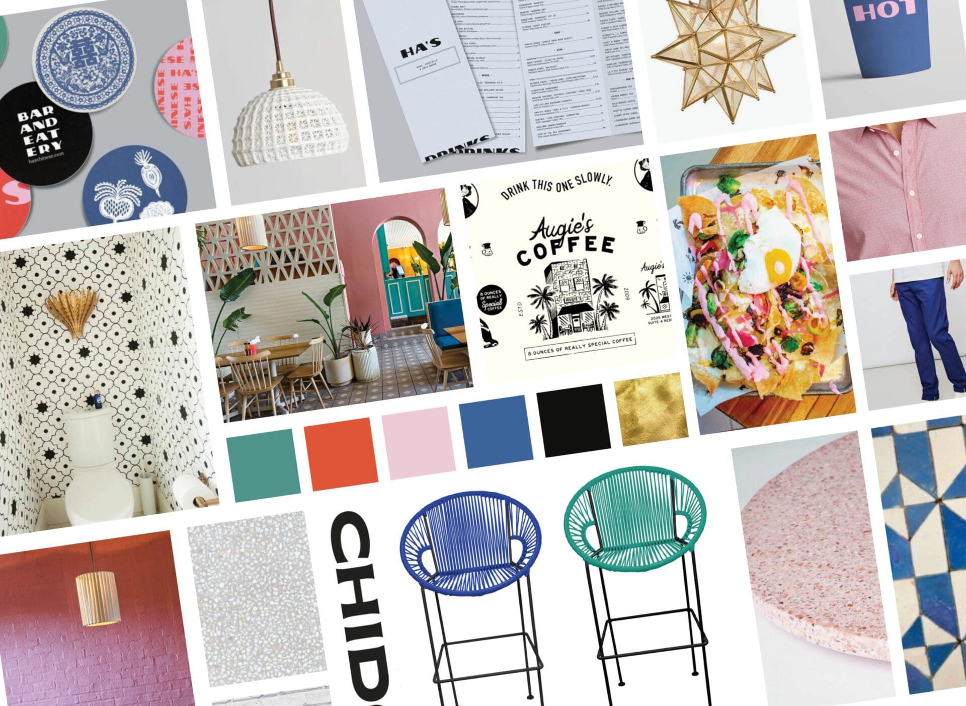
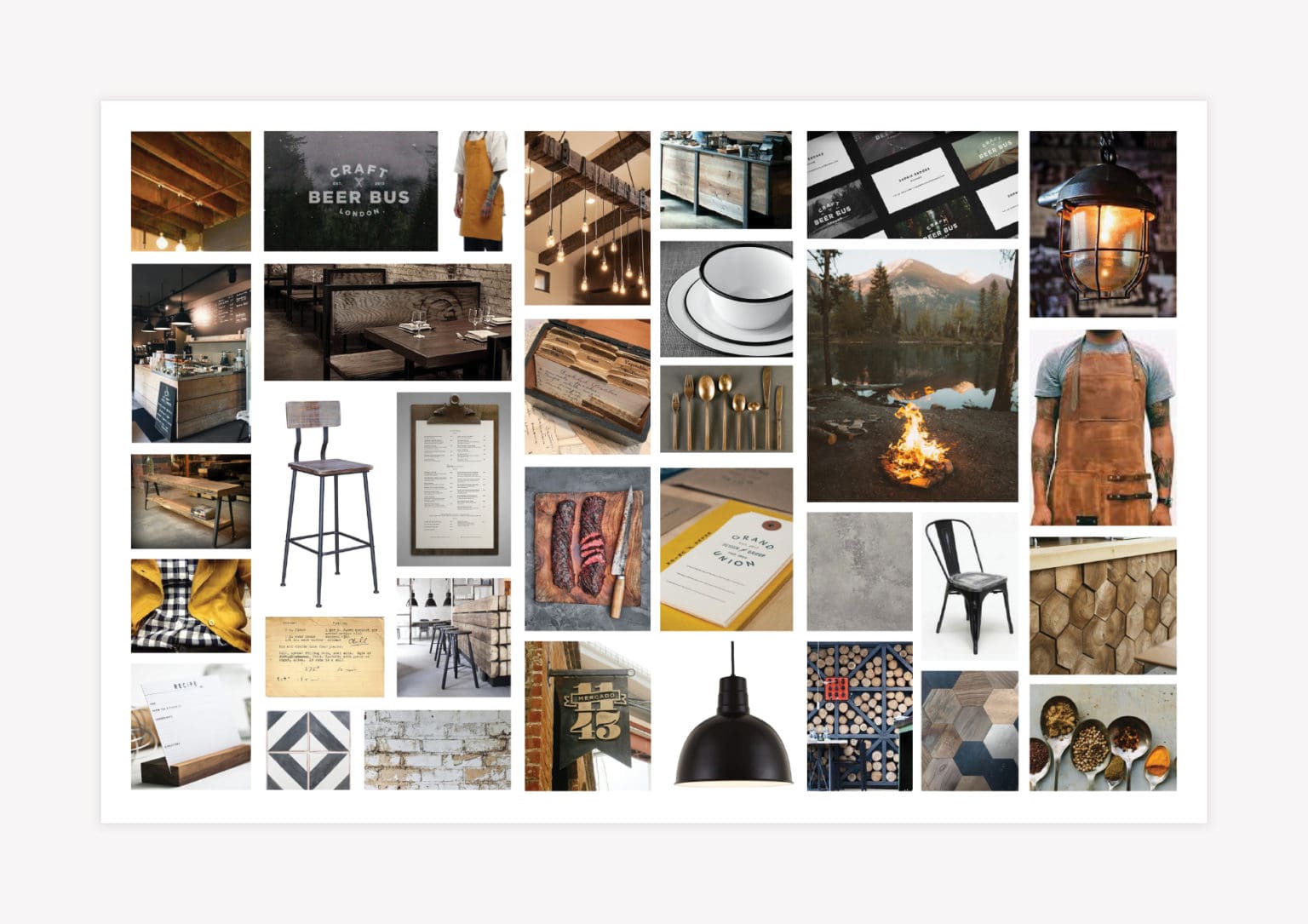
We started with brand direction. Under this part of the project, our team creates a robust mood board to set the aesthetic tone. The board contains references for typography, interior branding, brand colors, team attire, graphic design, and more. When taken together, the images convey a sense of personality.
For Bar Chido, the brand direction can be described as Mexican or California-cool. The look is based on a color palette of blush pink, royal blue, teal, orangey-red, and black. To balance the palette, white and black graphics and typography appear throughout the brand. This black and white aspect is especially apparent in the proposed menu design style.
The brand board indicates that intricate focal tile, terrazzo patterns, painted brick, and floods of color inspire the interior branding. Additionally, plants introduce an element of life to the space.
Our client loved the brand board. Based on our work on Brand Direction, he knew that he wanted our team to fully flesh out the rest of the restaurant brand.

Logo Design Direction Brainstorm
Within the presentation created by the architect, there was an existing Bar Chido logo.
However, we wanted to create entirely new logo designs that aligned with the approved brand direction. We decided that we would develop three options with custom-looking fonts in attention-grabbing lockups with memorable icons.
Logo Design | Mexican Restaurant Branding
For the first option, we used a modern, art deco-style font. The font has a lot of personality. Plus, the intricacies of the design give it a sleek look. We also brought in the use of an exclamation point as the “i” in Chido. The exclamation point conveys a lively atmosphere, exciting flavors, and a certain element of customization.
For this logo, we developed a logo icon in the shape of a palm tree. The icon can be paired with the logotype, or used alone on social media and marketing materials. The palm tree’s style has the art deco vibe and aligns with the coastal Mexican style dictated by the brand direction.

In the second logo design option, we’ve used a font that has a slightly more classic look. We created a pinata-inspired donkey character (named Chido, of course) to accompany the logotype. This option is more playful than the first, but is still in line with the brand direction.


The third logo design has a bit more variation and personality in the fonts themselves. Here, we selected a fun modern font, paired with a more loose Mexicali-inspired font. We added graphic flourishes to bring a distinct energy to the logo. Additionally, we created a secondary logo, including a flamingo graphic. This supporting logo design embodies the aesthetic of the brand.

Presentation and Selection
Upon presentation, our client selected option two. He decided that he liked Chido, the donkey. However, he wanted to retain some elements of the style of his existing logo.
We evaluated the design and determined that we could make improvements to the font and construction of the existing logo and pair the type with the donkey graphic.
We provided various logo setups for use. These included a horizontal logo setup, a stacked version, and a version shown with the primary logo icon. The different structures are vital in building in flexibility for the brand.
Logo Finalization


Once the logo design was approved, we finalized the mark.
This process includes perfecting every element of the logo and selecting exact logo colors. We choose logo colors in PMS, CMYK, and RGB codes. These codes, along with the logo’s fonts, and other imperative parameters, are noted in the logo guidelines provided to our client along with logo files.
We supply the final logo files in various file types, including PDF, EPS, PNG, and JPEG.

Supporting Brand Icon Designs
As a restaurant branding agency, we know the importance of bringing the brand into every customer touchpoint. It won’t always do to print the entire logo here, there, and everywhere. But luckily, there are other options for infusing the brand.
For Bar Chido, we created a set of supporting brand icons. The icon set includes a palm tree, a set of super-hip sunglasses, a lime wedge, an avocado, and Chido, the donkey.
The icons all align with the graphic style of the brand. They also subtly convey the brand attributes and menu items.

Menu + Menu Board Design | Mexican Restaurant Branding
We designed a restaurant menu for Bar Chido consistent with the brand direction. If designed properly, the menu puts the brand personality in the hands of every customer who picks it up.
When designing a menu, our restaurant branding team has two goals. First, we want to ensure that the menu design is an extension of the brand. Also, we need to make sure that the structure of the menu puts user experience first.
This menu design was primarily black and white; however, brand colors were implemented in certain areas to guide the eye around the menu. To create a hierarchy of subheads throughout the menu, we used lines and various fonts. The variety of fonts creates interest, while delineating the array of menu sections.
The resulting design is an 11x14 flat menu.

Business Card
For Bar Chido, we created a business card that puts the brand on display. The business card design includes floods of brand colors with the logo design on one side and contact info on the reverse.
We proposed having the business cards printed on 32pt uncoated stock with black painted edges. The customization of the printing provides an unexpected, hip nature to the cards.

Restaurant Brand Support
Brand support plays a significant role in the effectiveness of a restaurant brand in connecting with customers. A successful restaurant brand reaches customers at every available touchpoint, communicating brand differentiators and personality.
For Bar Chido, we created a variety of Restaurant Materials, including take-out bags, custom coasters, and restaurant staff attire.
The takeout bag design shows the logo and icon in a stylized treatment at the base of the bag. The bag itself is a large paper bag with handles, an elevated take on a typical plastic to-go bag.
Although it’s not a typical restaurant material, we introduced branded coaster designs for Bar Chido. These coasters showed off the supporting logo icon designs.

Finally, staff attire was selected and customized for the restaurant. We outfitted the cooks in hip, black and white flatbill hats with the logo and supporting icons. Waitstaff attire was carefully curated to give off a coastal-cool vibe consistent with the brand aesthetic. We chose flat front chinos (shorts or pants) for the uniform. However, staff could choose from a palm-tree printed collared short-sleeve shirt, a logoed pink polo, or an embroidered button-down shirt.


Project Closeout | Mexican Restaurant Branding
With the Mexican restaurant branding design done, we presented all options to our client for approval.
At the time of this post, Bar Chido has not yet opened. However, we provided all print-ready materials to our client for safe-keeping. When he’s ready, we can coordinate print with our vendors, if desired.
Ready for a Nice Brand?
If you’ve got a restaurant concept in need of a Nice brand, let’s talk it out. Contact the team today.
