Restaurant Branding Review: The Halal Guys
A restaurant branding review on The Halal Guys brand by Amy Dennis, owner of Nice Branding Agency, a branding agency focused on restaurant brand development.
Impressed is an understatement. The following that The Halal Guys have built without the support of a brand is remarkable. I’m happy for them, but when tasked to write a restaurant branding review about one of the fastest-growing franchises that doesn’t actually have a brand, I’m a little sad for me! This should be fun.
This is one of those scenarios that truly stumps me. I’ve always stood as a firm believer that restaurants win through the successful trifecta of operations, food, and brand. When those three avenues are running at full speed in the right direction, the intersection is restaurant bliss.
There’s one caveat to that thinking, though. Sometimes, if two of the three of these are surpassing the top of their game, they can indeed carry the third that may be lacking and the restaurant can still succeed. How long? Who knows. However, for The Halal Guys, I believe this to be the case.
The food and operations are carrying the brand, or the lack thereof. You see, the brand has been built in a very unintentional and unfocused manner, leaving confusion and a lack of cohesion in what the consumer sees and hears. People have connected directly with the food. The problem is, if you haven’t had the food, there’s no spark or connection, thus leaving a huge number of untapped people that could connect to the brand and be a Halal Guys fan if there was actually a brand to connect to.
Instead, those people who can’t experience the food are left with a plethora of mismatched visuals and verbiage that the restaurant spits out. This is not creating any type of cohesion, in voice or visuals, and as we all know, consistency is what builds connection.
Let’s rewind just a moment and talk about branding.
You see, branding is how someone perceives a particular organization based on the sum total of everything they encounter related to their restaurant. So, a brand is what people think of your restaurant, based on all they’ve seen, heard, or experienced. The Halal Guys are leaving out the first two and completely reliant on the experience aspect. I believe their “brand” could be stronger if they lent some focus on the “seen” and “heard” aspects.
If they focused on building up the third spoke of that success trifecta, not only could they build a larger and stronger following through dining consumers, but I think they would also connect with even more franchise opportunities, which seems to be one of their main avenues for growth.
Let’s take a look at a few pieces of The Halal Guys’ brand to see where it stands.
The Logo
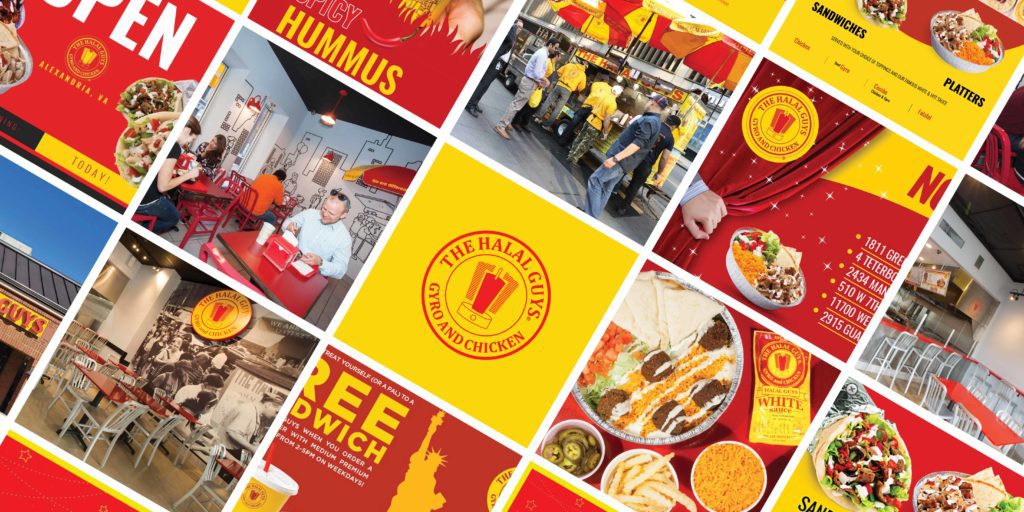
From what I can see, the logo has a similar construction to many other fast-casual concepts that have brought ethnic cuisines to the American food scene.
Many years ago, we rebranded Masala Wok, an Indian and Asian fast-casual concept based in Texas. Before we got our hands on it, their logo was also a round seal with an illustration in the middle.
Pei Wei, one of the first successful ethnic cuisine concepts, also had a logo with a similar structure. They say imitation is the sincerest form of flattery, right?
The Halal Guys logo needs some work, not only from a basic design perspective, but also from an elusive, creative perspective.
The fonts used are generic, which contradicts their unique story and the flavors found in their cuisine. The spacing between the letters is inconsistent, and the weight of the strokes used are all over the place.
From a creative perspective, the illustration in the middle lacks meaning and connection. My best guess is that it is indicative of New York City, where The Halal Guys began, but through creative brainstorming and branding techniques, a more meaningful mark could and should be developed.
The quality of the logo and the icon doesn’t seem to hold a candle to the quality of the food that people flock to. Consider the strength The Halal Guys' branding could have if the logo was as strong as the dining experience!
The Website
I think it's fair to assume that the food is the leader within this concept. When I hit the www, I’m not connected to the food at all. Instead, my eyes want to close due to the lack of color harmony that screams at me on the restaurant website.
I’ll come back to the colors, but I’ll continue to harp on the lack of connection I get from the website.
The story of this brand is one that could really get people excited. It’s so cool to hear of the humble beginnings and the substantial growth that the company has seen since. It’s exciting and full of life. It’s experiential. It’s riveting. And it’s nowhere to be found on the website.
Yes, of course they have their history page and their about page filled with the basic core values and mission and vision statements, but come on! Tell me the story and tell it to me loud and proud. Show me the food and let me feel the excitement and the experience surrounding the cuisine.
Let's jump back to those colors. It's really simple. The talented touch of a graphic designer with experience in restaurant branding would work wonders for the visuals of The Halal Guys’ branding. The brand needs color harmony that supports the simplicity that the brand is working so hard to achieve, as opposed to creating an experience that shuns the eye.
I think The Halal Guys really went into it thinking like this: McDonald’s does food fast. Let’s use their colors. Pei Wei did ethnic food in America successfully. Let’s use their logo.
Shameless Plug: Hey, The Halal Guys, you’re better than both of those two combined, but you need to allow a strategic restaurant branding firm like Nice Branding Agency to pull the brand to the surface and allow it to live. Your story is dying to be told. Let us help.
Social Feed
The social feed is where I start to connect with the actual food experience a bit, so I will give props there. Food photos fill the feed, allowing me to do almost everything but taste and smell the dishes.
Ideally, this feed could provide more purpose and cohesion both visually and verbally, but at this point, I don't expect it because there has been zero foundation laid for visual or verbal direction of The Halal Guys' branding.
There are bold designs, softer designs, font faces times 1,000, and filters and photo styles galore.
It’s OK for a social feed to be messy, but it’s better when a social feed delivers some form of consistency. After all, I’ll say it again: Consistency builds connection, and that’s what restaurants need to get people coming in the door time and time again.
The Interior
I don’t have too many thoughts about the interior because I haven’t had the opportunity to visit a location in person yet; however, I will say that the direction I can see in the interior seems to be heading in a better direction than the previously discussed brand elements.
I connect with the mural and the historical reference that it provides to The Halal Guys’ story. The style again feels like something I’ve seen before; however, I’m glad to see them bringing their story to the walls of the physical space.
Additionally, I’m not seeing the stark contrast of red and yellow everywhere I turn. Instead I’m seeing a harmony of red and white with pops of yellow, which provides unity from an aesthetics perspective.
Final Thoughts on The Halal Guys' Branding
From what I’ve found, The Halal Guys are the pioneers of Halal food in America. They got their humble start owning and operating a hot-dog cart in New York City before expanding their concept to brick-and-mortar locations in 2015. Somewhere in the middle, they threw out the hot dogs and traded in for flawlessly cooked, premium-quality Halal meats. New Yorkers and tourists alike have stood in the city’s longest food-cart line (sometimes for hours) to get a hot, steaming platter of chicken or gyro over rice, covered in The Halal Guys’ famous, proprietary White Sauce. They rode the coattails of this success through today, and success it surely is.
The brand is a different story though. The Halal Guys' branding has seemingly developed organically, with zero intentionality or purpose.
The Halal Guys, like many other restaurants we see, are at the point in their journey where it is advisable to sit down and focus on defining the heart and soul of the restaurant, and then allowing that personality to flow through all customer touchpoints, as opposed to taking an approach that feels half-baked and hazardous.
The Halal Guys have quite a story and one that would lend itself to a very strong brand if they allowed it.
If you’re looking to open a restaurant, start strong with a purposeful restaurant brand that defines the heart of the brand from the get-go. If you already have a restaurant that is operating, now may be the time to shift your focus to defining your brand to support future growth. Either way, the experts at Nice Branding Agency would love to light the way. Give us a shout to begin.
Follow along on Instagram for restaurant branding inspiration and tips for restaurant owners.
