Curio Coffee Roasters

coffee shop logo

The logo development process at Nice Branding Agency is one that produces consistently stellar results for our clients. In addition to developing a custom logo design for our clients, we also create visual inspiration for the brand through the creation of a mood board, along with the selection of brand colors and brand fonts. This brand Starter Pack equips our clients with the elements necessary to begin building a brand.

While we understand that the logo is not the complete brand, it is a foundational element. Your logo should be able to serve as a platform for telling your story. We were retained by the Nashville craft coffee connoisseurs at Curio Coffee to create a logo and visual inspiration for a brand that would brew up some great conversation about why they started their business.

project type

Project Kickoff

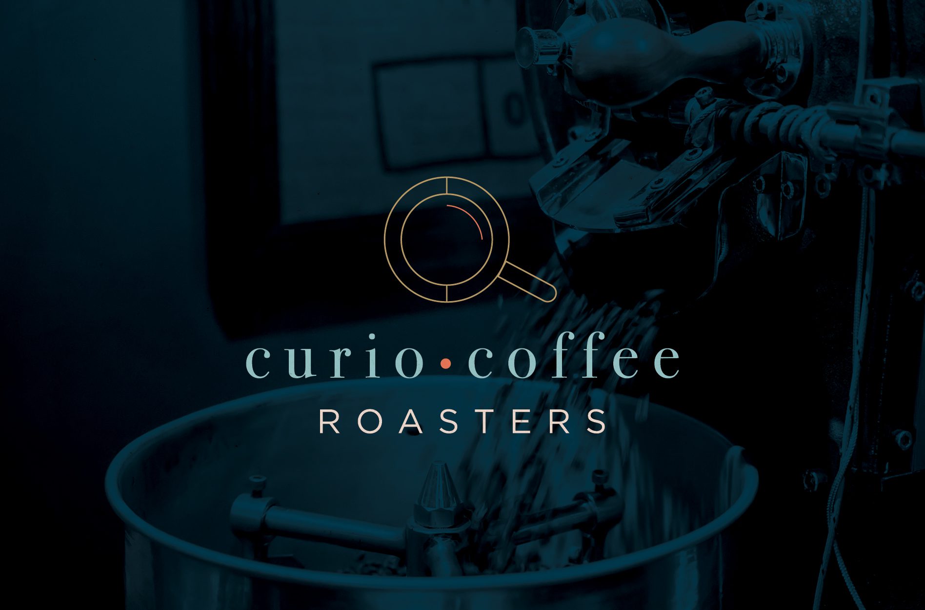
The purveyors at Curio Coffee Roasters in Nashville approached Nice Branding Agency with the need for a custom coffee shop logo. They were depending on this logo design project to equip their company to grow beyond a corporate coffee service into a brand that would resonate with coffee connoisseurs.

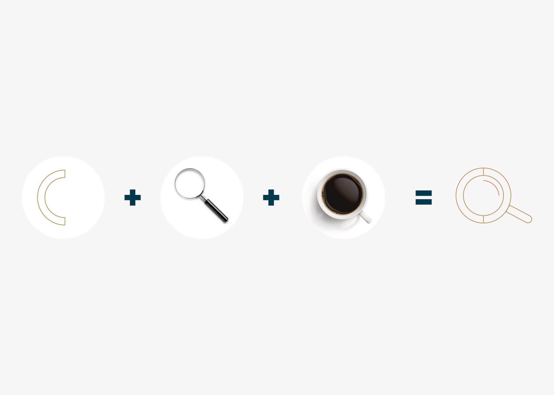
We wanted to really delve into the meaning behind the name and the overall vision for the company that the owners had cast as they were starting their coffee business. The idea was that there’s an element of curiosity around coffee that’s been sourced from around the globe.

Curio Coffee is all about developing curiosity within people. According to the team at Curio Coffee, curiosity is what drives the world to understand and create new experiences to further better themselves.

In fact, it’s curiosity that brought Curio Coffee owners David & Alex together as partners to explore the different capacities within the specialty coffee culture. They are committed to ensuring that people can experience the best possible cup of coffee during their busy day.

Their passion lies in helping people explore the flavor complexities of the glorious bean and grow in appreciation of the craft. Additionally, Curio is all about collaboration and bringing together the fast growing world of coffee.

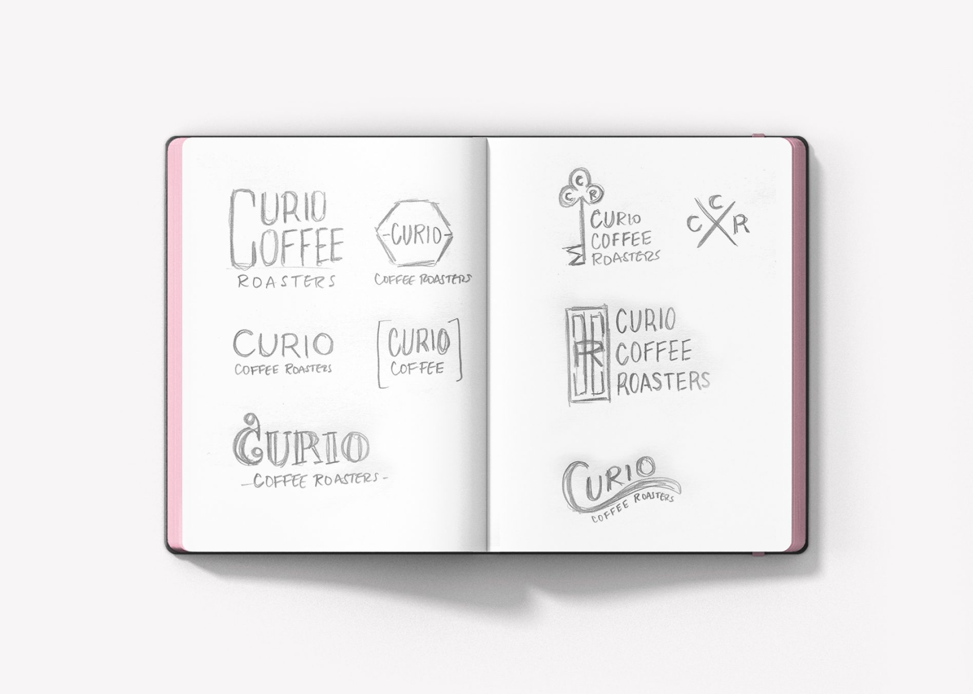
Our clients wanted a logo that would be easily recognizable (shouldn’t they all be?) and one that would make viewers curious about the company, wanting to investigate to learn more. Our team took on the challenge, and started by creating two mood boards with logos, colors, and fonts to develop options for the brand’s identity.

Design Direction Brainstorm

Upon consideration of the information provided in the brief, our conversations with our client, and the research we conducted about the coffee market, we started strategizing to create two visual concepts for the brand.

The first visual direction would be founded on the curiosity surrounding the brand. The direction would implement imagery that would pique people’s interest, and nod to the collaboration it takes to bring the bean to consumers.

The second direction would be a bold, modern aesthetic that draws inspiration from the simplicity, yet boldness of a cup of coffee. The visuals would include sans serif fonts set against floods of black or white and offset by a sophisticated gold.

coffee shop logo

Finalization of Conceptualization

From here, we set forth to create logo designs that included logo icon options indicative of the meaning behind the coffee shop business.

Coffee Shop Logo Design Options

During the logo design phase, our design team took to their desktops to digitally create several logo options that included both typography and iconography. The options were paired with color palettes that we determined would work well in application, and capture the mood of the business. These logo design options were compiled and reviewed internally before being prepped to present to our clients.

As part of our logo development process, our creative team fully develops three logo options to present to our client for selection.

The first logo we created for Curio Coffee Roasters featured a stylized magnifying glass, used to symbolize curiosity, that is comprised of two side-by-side letter C’s. In addition, we specifically developed this looking glass icon to resemble an overhead view of a coffee mug. It’s this subtle underlying meaning that provides a starting point to talk about the brand story and the meaning behind the business.

This logo icon was designed to be able to live alongside the logo type or to stand alone, as required by application. A modern color palette of blues promotes relaxation and comfort, while a subtle pop of burnt orange brings the coffee brand to life, and conveys curiosity or excitement. The inclusion of gold adds a layer of sophistication.

coffee shop logo

The next two options presented were primarily typography-based, an on-trend treatment for coffee shops and cafes of the like. In the option below, you will see that the large letter C, with the star in the center, could serve as a standalone icon. However, it is utilized in the typography to begin both of the words “Curio” and “Coffee.” The selected typeface is weathered, yet sophisticated, and the color palette is both rustic and polished. Additionally, don’t miss the shape the entire logo creates. If you use your imagination, you’ll see a coffee mug staring right back at you.

coffee shop logo

The final coffee shop logo design shown below is decidedly modern and clean. In this approach, we used the letter U and C in the word “Curio” to fashion the shape of a coffee mug. The black, white, and gold color combination creates a level of refinement or elegance for the brand, and makes the logo extremely versatile. This was the most modern logo option of the three logo designs presented.

coffee shop logo

Presentation and Selection

Upon presentation of the coffee shop logo options, our client selected the first option. The clever nature of the logo icon really won their hearts and they felt like the color palette was one that was not frequently present in their industry. This would promote the curiosity aspect and allow them to stand out in the market. Additionally, they determined that the new logo icon would be able to easily grace mugs, packaging, merchandise, attire, and more. It would be recognizable and wearable, and that was a major goal for the new logo design.

coffee shop logo
coffee shop logo

Finalization, Files, and Guidelines

When the new logo design was selected and the color palette finalized, it went back to our Director of Design for a final touch. During this phase, the new logo design is inspected to ensure that all spacing is perfectly correct and that the design of the logo icon is impeccable. At this point, exact color codes are selected in PMS, CMYK, RGB, and hex codes.

Project Closeout

Finally, we were ready to provide logo files to our client. We created a full set of logo files, including black, white, and full color. These were provided to the client as PDF, JPEG, EPS, and PNG files. Additionally, we shared a logo guidelines sheet with the new logo files. This guide outlines the usage requirements, font names, and color codes for the new logo.

coffee shop logo

Ready for a Nice Logo?

Our logo design process is one that is slow-roasted for success. However, in reality, the entire project takes about two weeks to complete. If you’re sipping on what we’re brewing, give us a shout. We’d love to create a new logo for you.

are you ready to create something nice?