Full Steam Coffee Shop

coffee shop logo

Our logo design process is tried and true and our clients come to rely on Nice Branding Agency for creating custom brand marks that will set them apart. We were retained by a hotel group with locations nationally to create a coffee shop logo for a cafe within one of their hotels. For Full Steam Coffee Shop, our hotel client, The Hotel Group, had worked with us previously to create a logo for a sister restaurant that exists within the same hotel. For the coffee shop, we wanted to create a fresh idea, but one that would align visually with the logo for the other restaurant within the space. All aboard! Grab a cup of coffee and settle in for a quick read on how we created the Full Steam Coffee Shop logo.

project type

Coffee Shop Logo Project Kickoff

The first step of our logo process is to obtain all of the pertinent information about the business and the goals for the project from our client. To do so, we provide a creative questionnaire for our client to complete.

From there, the design lead on the project reviews the answers and assures that no further information is needed before our team assembles for our first strategy session. If necessary, we clarify any questions we have about the information our client provided.

Specifically, for this logo development project, the name of the coffee shop was named Full Steam Coffee Shop. The hotel (and subsequently the coffee shop within the hotel) serves primarily business commuters — people who are on the go. So taking into consideration this target, coupled with the name of the coffee shop and the fact that a major railroad rolls through town, we decided that the logo options would take the form of a train concept, while weaving in the coffee aspect of the business.

After reviewing the information from the brief, we found that our client desired a logo that would pay respect to the region, while also aligning with the property’s aesthetic.

The primary application for the logo would be the exterior signage, as well as the signage within the hotel. The take out coffee cups and sleeves would be another place the logo would be visible.

Design Direction Brainstorm

Once the imperative information was confirmed and we were crystal clear on the project details, the design team held a brainstorming session to pinpoint different details about the business that could come to life within the logo. We researched the business’ location, competitors, company differentiators, company name and more to determine how we would weave this information into a purposeful brand mark.

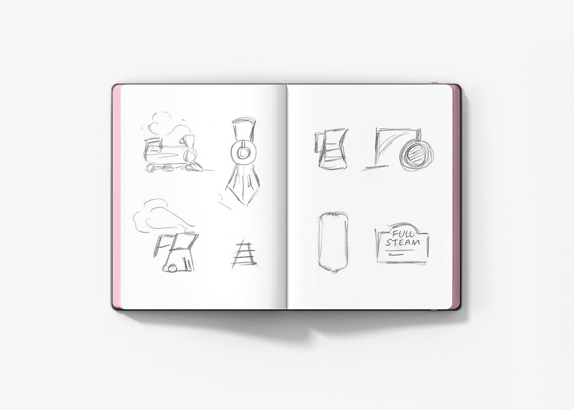
During the design brainstorming meeting, our team looked to see what was being done in the industry from a branding perspective. Then they began to sketch ideas for icons and discuss the different fonts that could be used to convey a look and feel that would align with the icon.
 

coffee shop logo

Finalization of Conceptualization

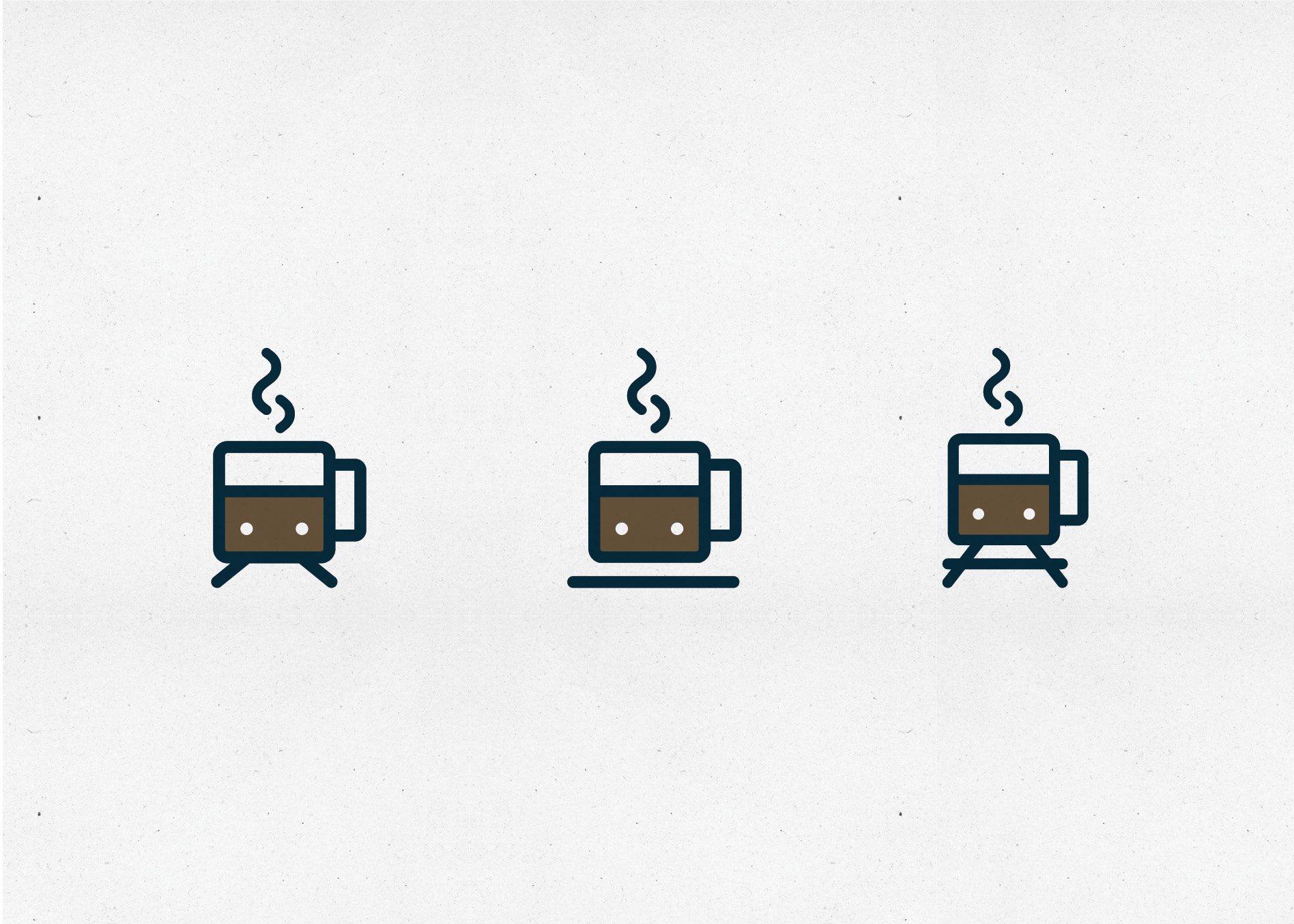
From here, the design lead brought all of the ideas to our Director of Design and Creative Director, and together the senior design team determined which of the options presented were viable for digital development. As designers themselves, the directors also brought additional ideas to the table. By the end of this meet-up, three logo concepts were chosen for full digital development, all centered on the train aspect and the coffee shop nature of the business.

Coffee Shop Logo Design Options

With the concepts sketched out, our team of graphic designers got down and dirty creating three logo options that could be presented to our client.

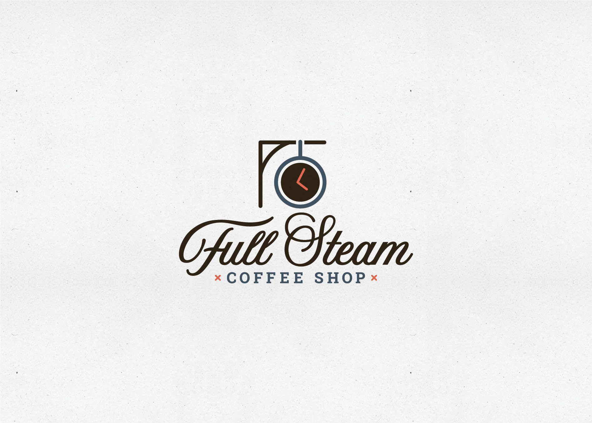
The first option was developed to include an element of a train station with an iconic large clock mounted on the wall. The clock took the shape of a coffee mug as it appears when viewed from overhead. This gave a nod to the impact that time has on a commuter’s schedule, while paying homage to the local railway, and implementing the core product of the business.

coffee shop logo

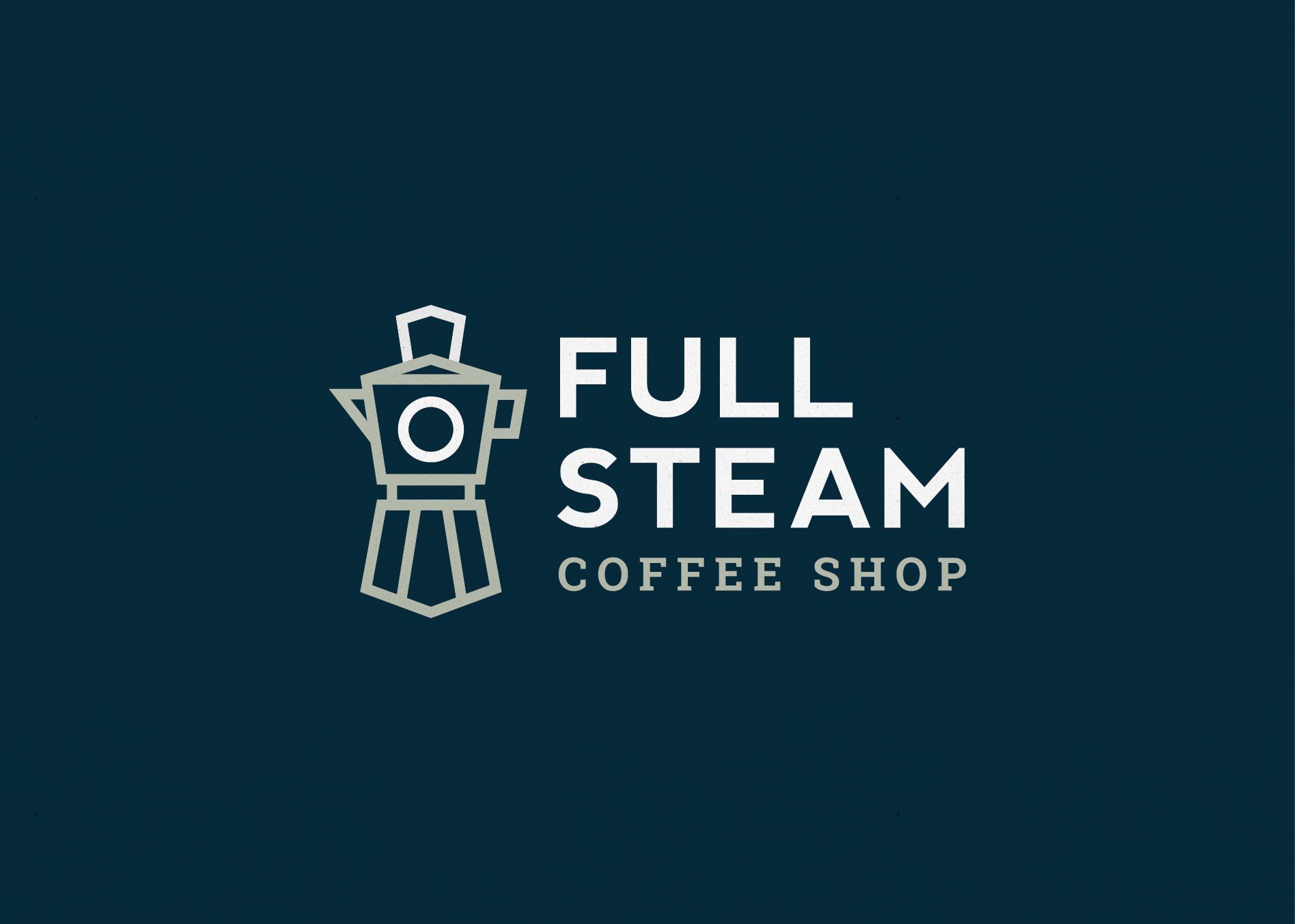
The second concept created also tied in the train idea. This custom-designed icon was created from the shape of a french press, artfully developed into the outline of the front of a train. This option provided another modern take on combining the train and coffee concept into one cohesive mark. The font pairing in this option combined a clean and modern sans serif with a classic serif to tie in both traditional and modern aspects of the brand.

coffee shop logo

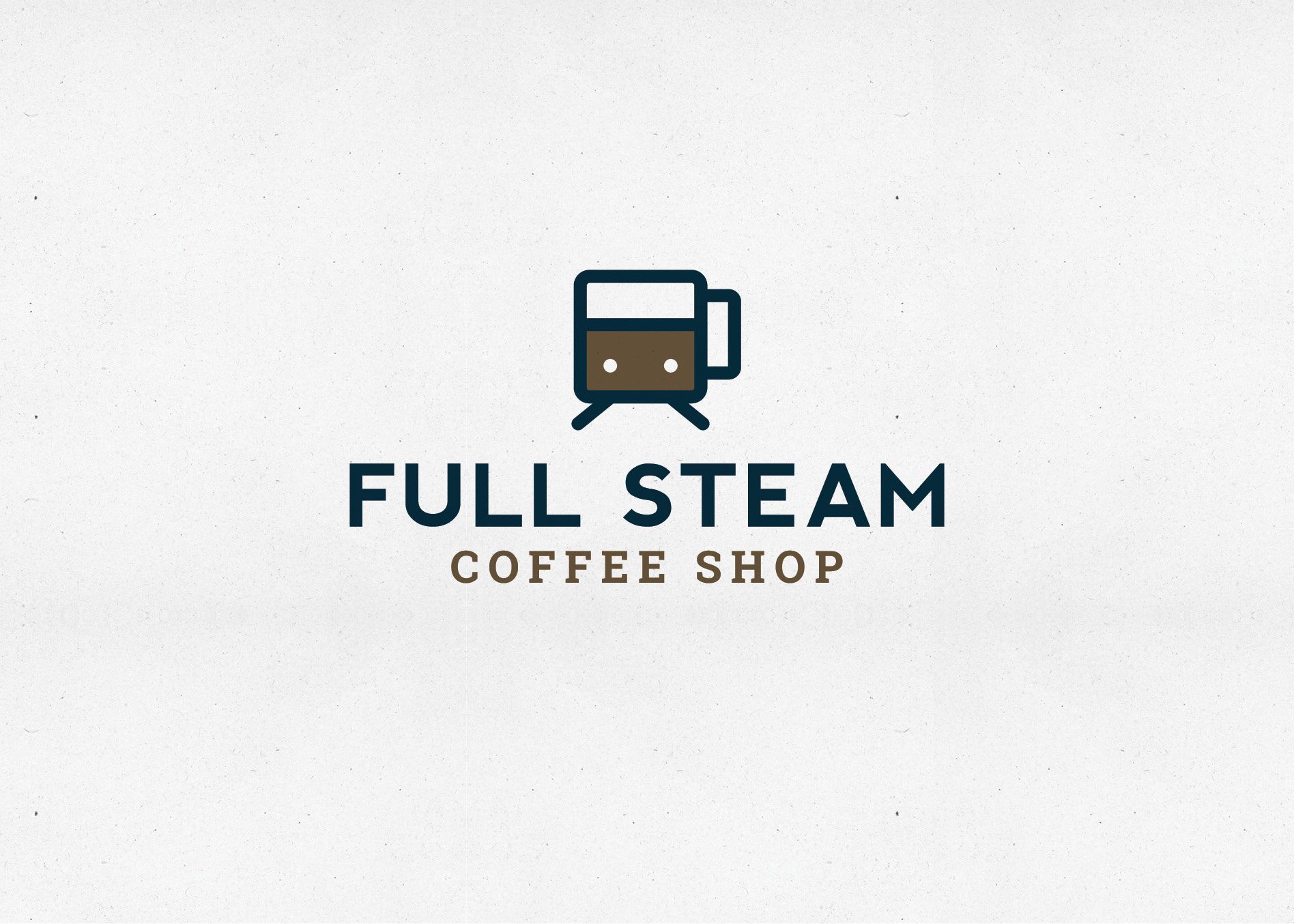
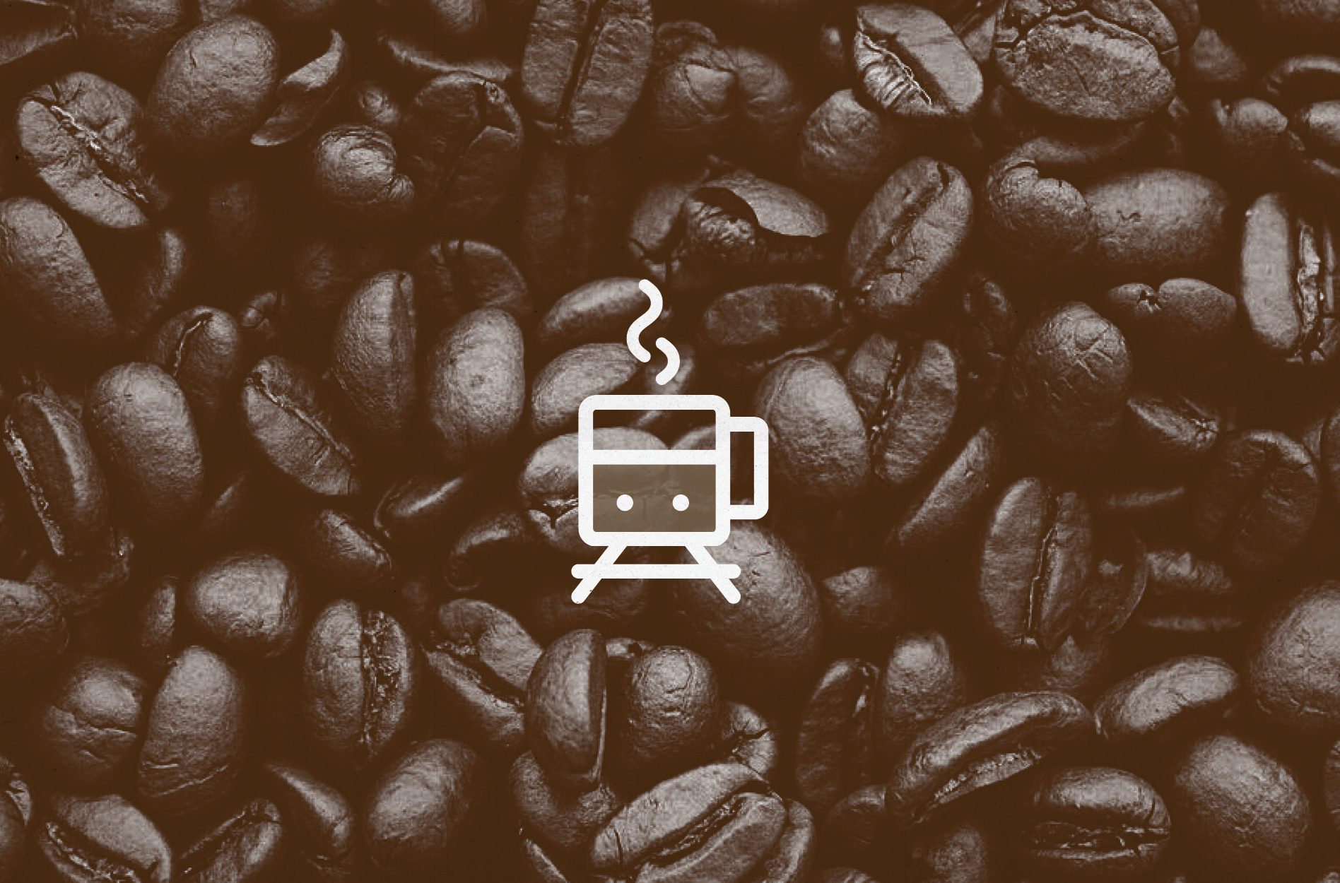
The final concept intertwined both train and coffee once again. This logo utilized the front view of a coffee mug to create a custom train icon. The icon was again paired with a font set that complemented the logo we created for the sister restaurant.

coffee shop logo

It’s important to note that all three logo icons were paired with fonts that would match the existing fonts used in the hotel. However, we also presented the options with script fonts that were more indicative of the vintage train station look.

Presentation and Selection

After the logos passed through internal review, we presented the ideas to our client and talked through the meaning behind each of the marks. There was overwhelming agreement that the most modern design of the three (the coffee cup as a train front) was the way to go.

coffee shop logo
coffee shop logo

Coffee Shop Logo Finalization, Files, and Guidelines

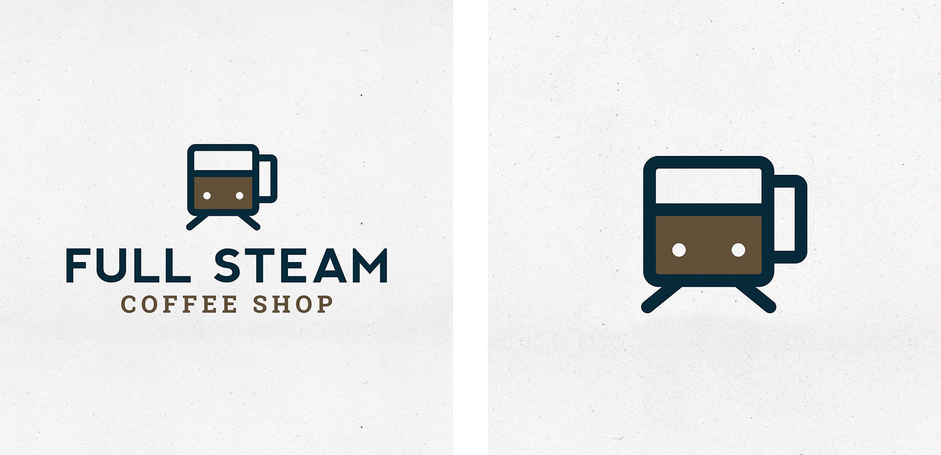
The feedback was mostly positive; however, our client felt that the icon somewhat resembled a subway car instead of the train that traveled through town. They requested to see a line beneath the train car that would ground it and remove the subway car feel.

We are happy to oblige, but had concerns about the grounding line as a long-term solution, so we presented two other options that would address the issue at hand. The final version included a horizontal line under the front of the train to indicate a train track.

coffee shop logo

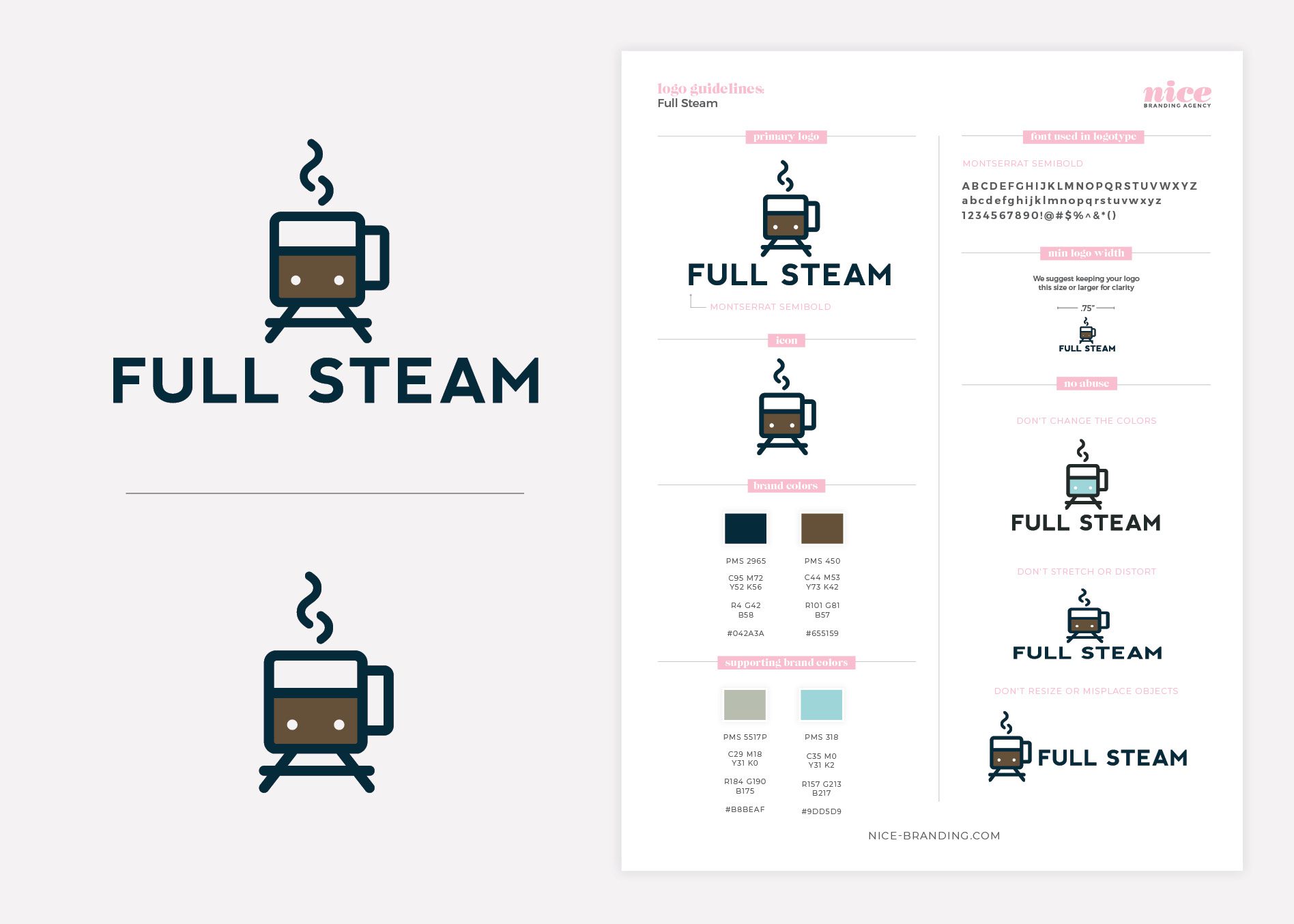
Upon client selection, the chosen logo goes back through our Director of Design for finalization. Exact color codes are selected at this point, including PMS, CMYK, RGB and web tones.

From there, our graphic design team created logo files in PDF, JPEG, EPS, and PNG. The logo files and a logo guidelines sheet were then sent off to the client for safe keeping as part of our logo company deliverables.

coffee shop logo

Ready for a Nice Logo?

The only thing we love more than coffee around here is creating coffee logos. If you’re ready to jump on the Nice Branding Agency logo train, give us a whistle. We’re ready to depart when you are.

are you ready to create something nice?