Menu Design
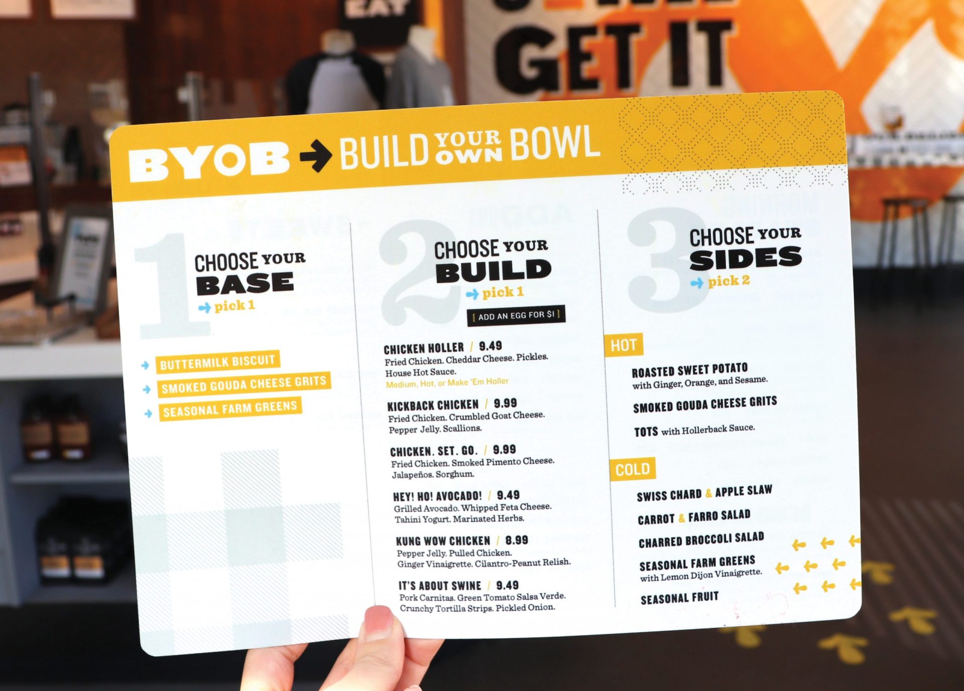
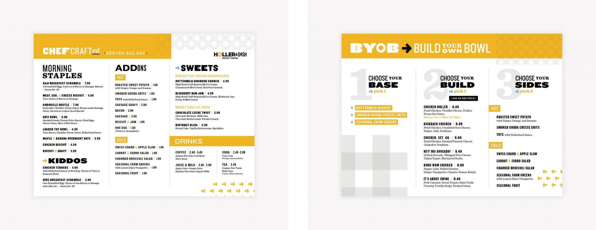
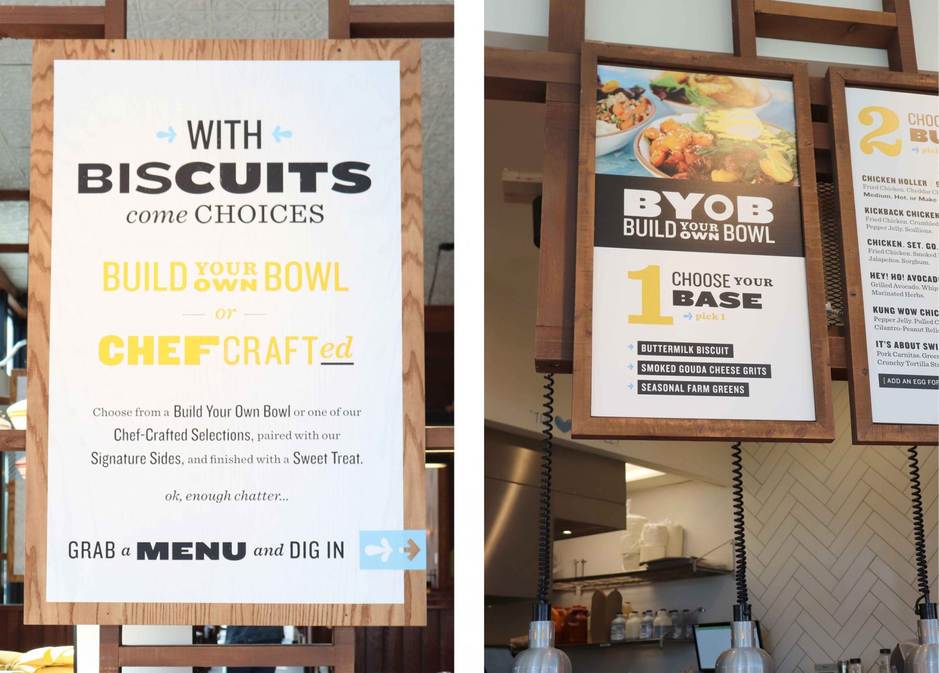
With the menu at the heart of the matter, we started the project off by redesigning the existing handheld menu to better organize the offerings. Additionally, we created a structured section for the Build Your Own Bowls to guide the customer through the process of ordering.
Menu Board Design
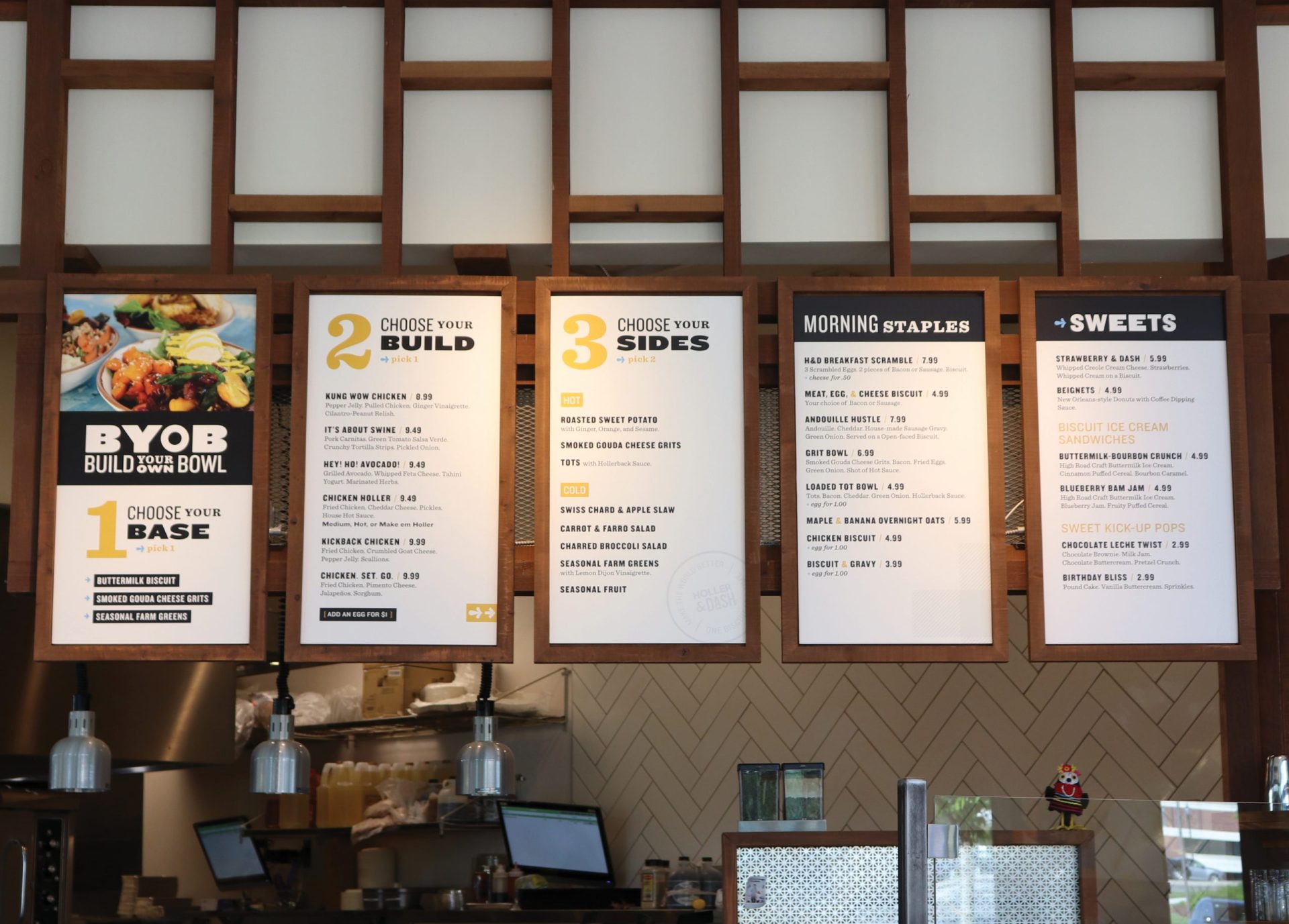
When the handheld menu was designed and approved, we translated the design to a menu board system that prioritized the Build Your Own Bowls. The menu boards were encased in wood and mounted above the point of sale. They featured on-brand imagery and fonts, situated in an easy to navigate format.
Environmental Graphic Design
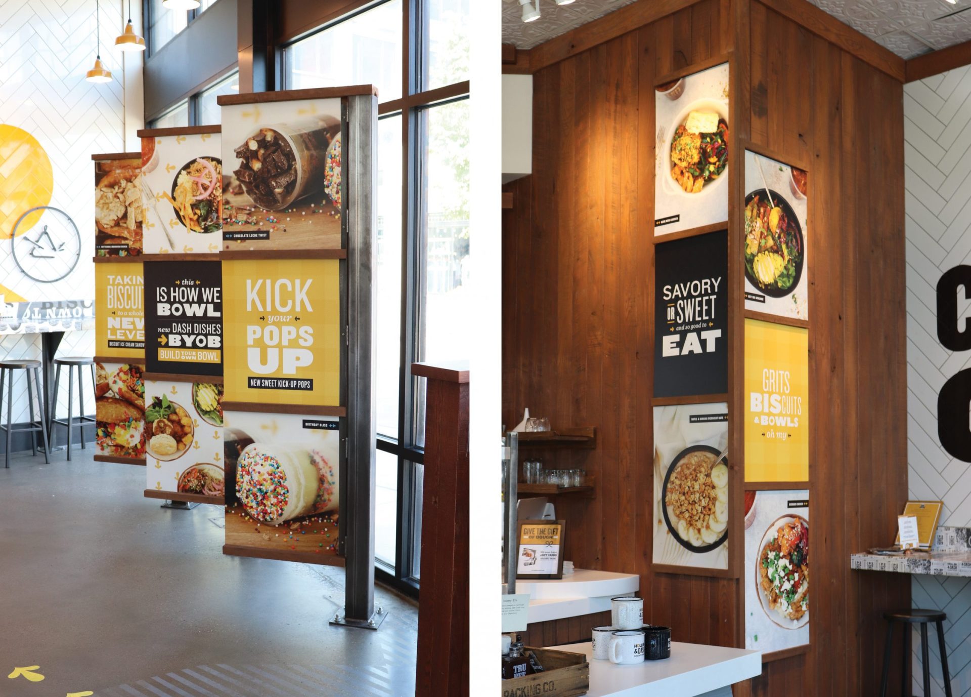
With the menu in place, we worked to create environmental graphics to support key menu items and to communicate with the customer throughout the journey from the front door to the point of sale. A primary message was the introduction of the Build Your Own Bowls (BYOB), and this was placed strategically throughout the store. Additionally, we created copy and typographic lockups to promote the new dessert offerings. These were paired with compelling imagery of the desserts and the graphics were placed alongside the BYOB communication.
Food Photography
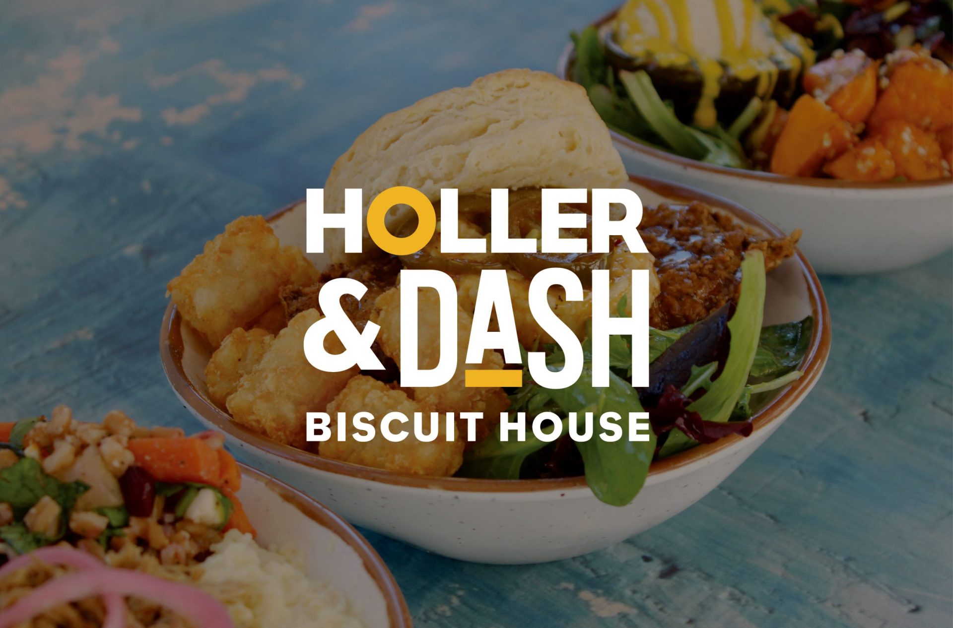
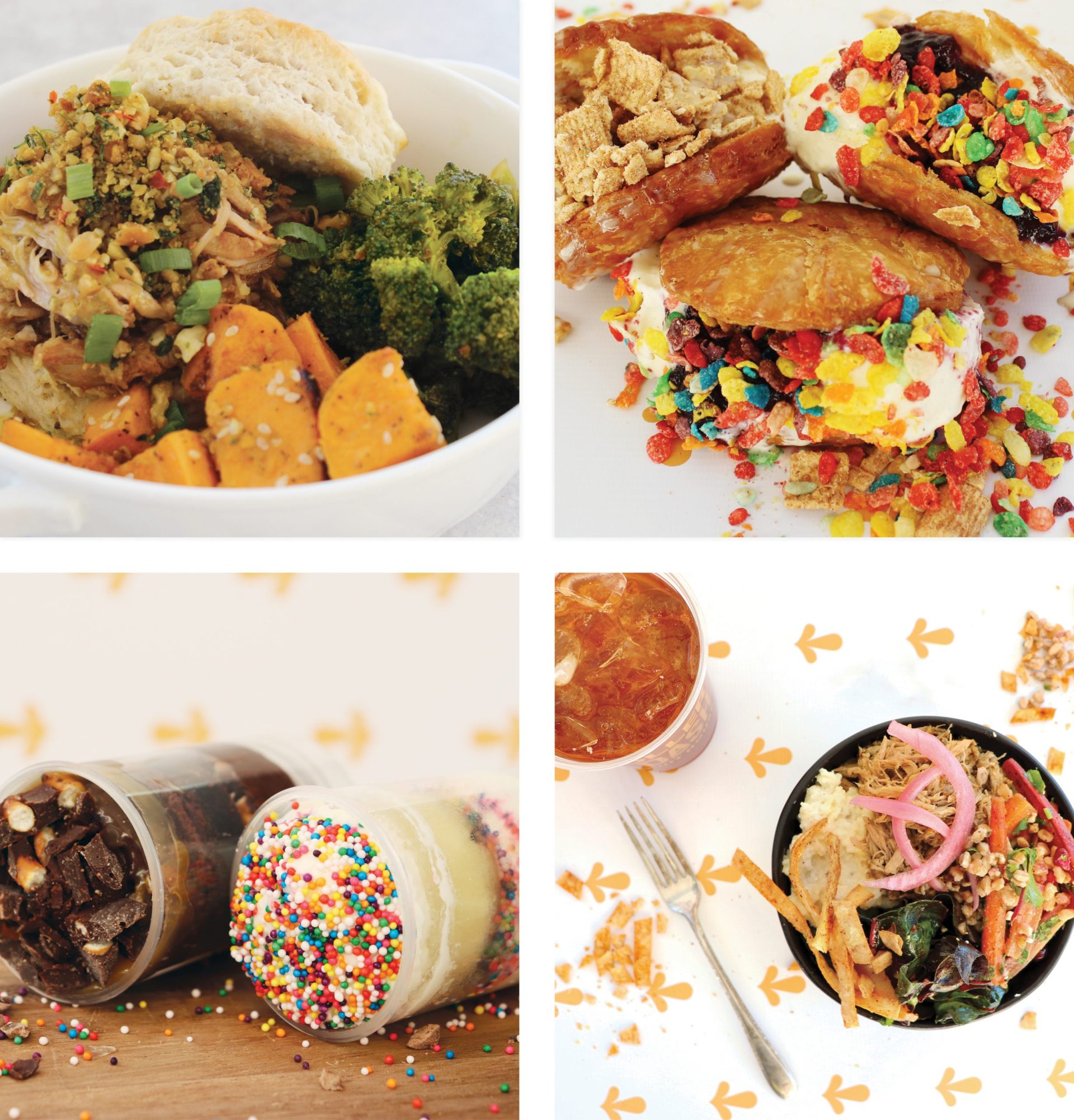
A major player in the success of this project was the food photography. Our team styled and shot images of the BYOB items and the new sweets to support the campaign. To capture the food photography in a manner that would allow the images to be used over and over again in the environment and in marketing, our team started with planning. We created a mood board for the shoot that dictated colors, textures, image inspiration, prop direction, and more.
With the planning in place, we began to source props and backdrops to ensure that each and every element within the photographs was 100% aligned with the brand. Additionally, we shopped for food styling props including additional, decorative ingredients that could be used to style the setups.
Finally, we arrived with all props, backdrops, and photography equipment to capture the food in its best light. We shot 10 unique setups and then selected and edited the best images.
The power of this project was immense for Holler & Dash. They were able to cohesively launch their new menu items in-store and provide customers with an enhanced customer journey designed to drive sales.
If you’re ready to make menu updates that will need to be supported by strategic graphic design, give us a holler. We’ll dash on over.
