Hogwood BBQ

nashville restaurant branding

With plans to open a brick and mortar BBQ restaurant in Franklin, TN, our clients approached us for our expertise in restaurant branding. The concept was somewhat of an existing one, however it was only operating as a small catering company out of Crested Butte, CO. With the recipes in hand, our clients were ready for us to bring life to the brand through the development of a brand board, logo, interior branding, environmental graphics, menu design, and a website.

project type

If there’s one thing we love almost as much as Nashville restaurant branding, it’s Nashville BBQ. When our clients at Hogwood approached us to brand their Nashville concept, we were excited for the opportunity. At the start of the BBQ restaurant branding project, our client contacted us with an idea to bring Hogwood, a successful Colorado catering business, to Nashville. Experienced with restaurant operations, he knew he needed a strong brand to carry the concept into a new market, so he reached out to Nice Branding Agency, and the rest is history.

Brand Direction

Our restaurant branding projects start out with the development of a brand direction for the concept. This includes both a visual direction and a brand story. Once the brand direction is in place, we can then utilize it as a roadmap for the creative development of all other assets.

For Hogwood, although the catering entity had some elements in place, the transition from a catering business to a brick and mortar restaurant required the creation of a new identity that could be woven through every customer touchpoint.

To turn the existing catering business into a fast-casual restaurant concept, we developed a brand board that would reflect the soul of the brand. The images on the brand board included rough wood tones, industrial hardware, aged recipe cards, wall installations, black-and-white focal tile, and a hint of mustard.

We then set out to create a brand story that would be the basis for the messaging. We met with Michael, the chef behind the original Hogwood endeavor, to glean additional information about his inspiration. Using the details we obtained through the conference with Chef Michael, and referencing the visual direction, we finalized a message that would exemplify the brand voice and provide background to the brand. Additionally, the brand story brought some context to the restaurant and conveyed to viewers the unique value behind Hogwood.

There are tons of BBQ restaurants in Nashville, so it was important that through the creation of all brand elements, we were able to weave in a narrative that set the restaurant apart from the rest. The message told the public that barbecue isn’t from the south. It’s from around the world. And Hogwood would introduce flavors from across the globe to infuse their smoked meats and artisan sides.
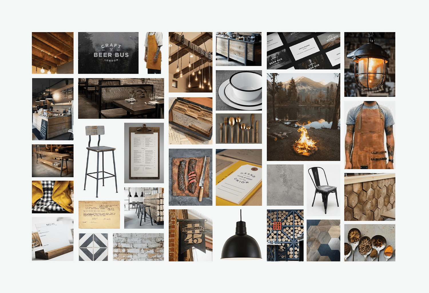
bbq restaurant brand board

Logo Refresh

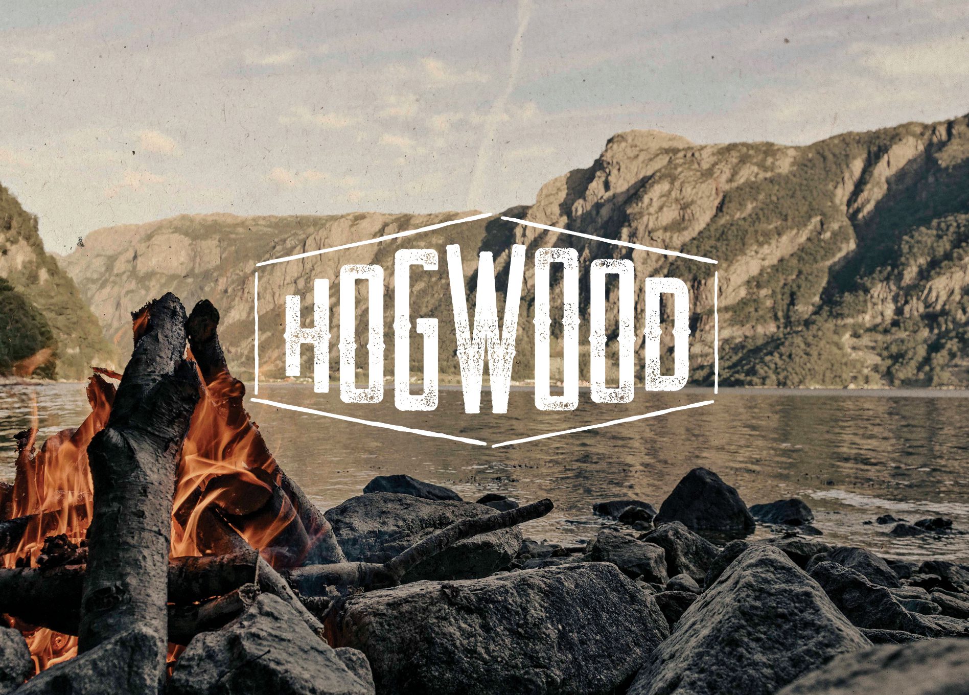
Typically, once the brand direction is in place, we move into the creation of a logo for the restaurant. For this restaurant, there was a logo that had been developed previously for Hogwood.

We compared the existing logo for the catering business with the brand direction determined at the outset of the project. While the logo was close, it wasn’t completely aligned with the new direction and aesthetic. Additionally, the logo was illegible in some instances, and it wasn’t versatile enough for the task ahead as the main mark for a restaurant concept.

With that in mind, we worked to revise the existing logo to maintain its heritage, while also bringing it up to date and in line with the rest of the brand.

nashville restaurant branding bbq

Logo Finalization

With the refreshed logo approved, it went on to our Director of Design for finalization. Here, we ensured that the logo was perfect and ready for logo files. We also selected exact colors in PMS, CMYK, RGB, and hex codes. Additionally, we created guidelines for the logo that included the font names, color codes, and appropriate usage for the logo itself.

Interior Branding

Ensuring that the brand is apparent throughout all customer touch points in the interior of the restaurant is one of the keys to success for a restaurant. In fact, Nashville restaurant branding is all about well executed experiences for customers. During the interior branding process for the first Hogwood brick-and-mortar restaurant, we were able to see many of our brand board ideas come to life.

The flooring would be a poured concrete and the walls would be bathed in black paint, custom wall installations, white brick, and white subway tile.

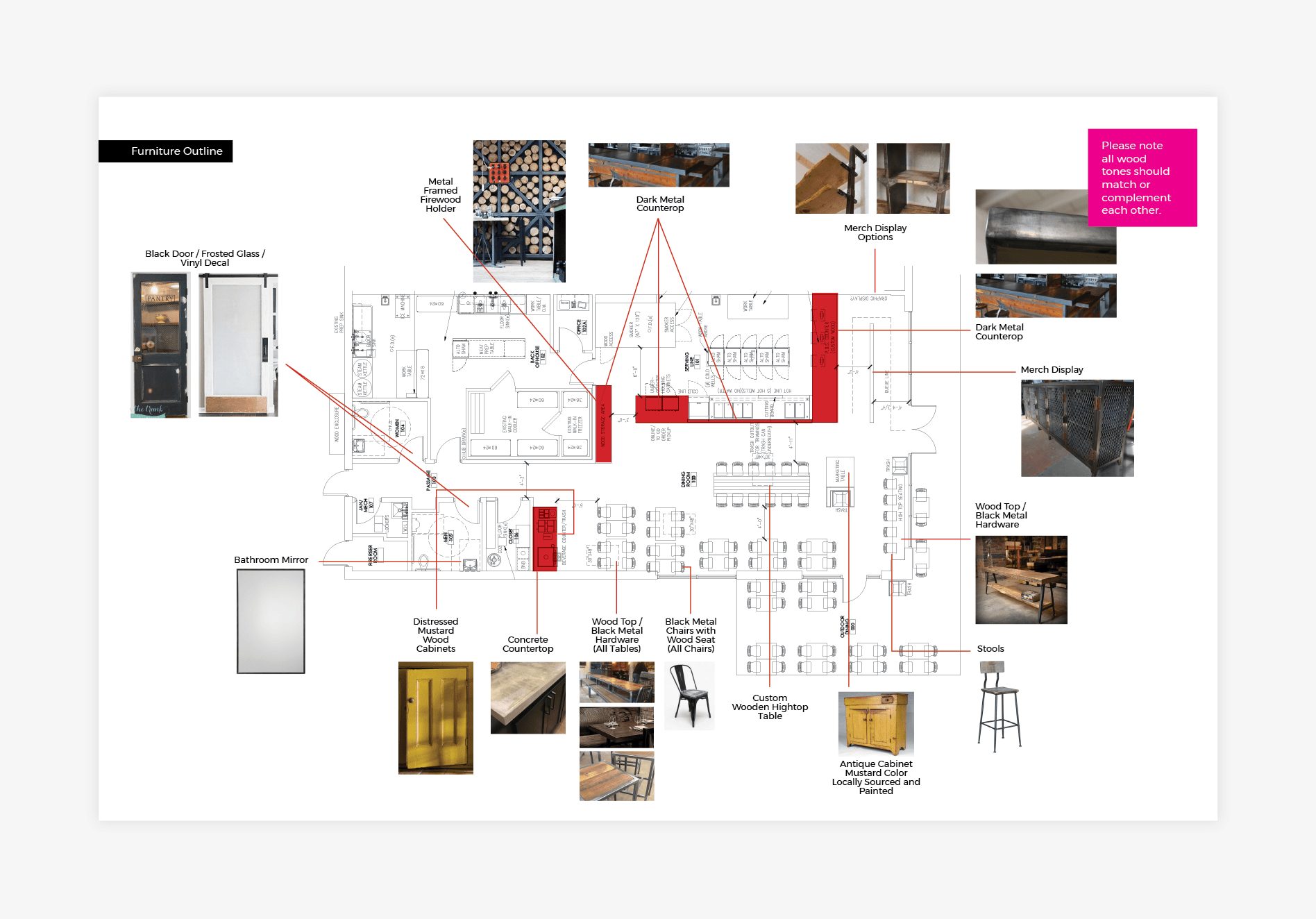
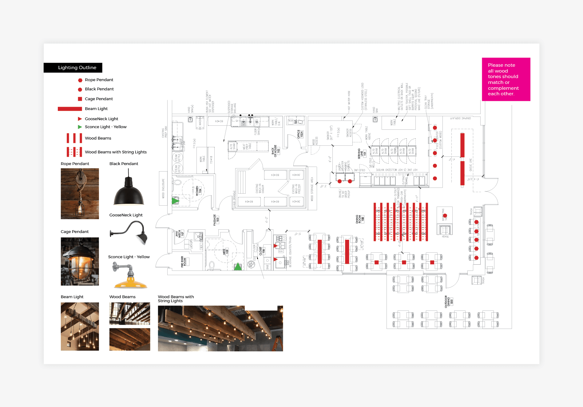
Custom-made wooden community tables and industrial seating were used throughout the restaurant to bring the brand to life. Focal tile guided the customer journey, broke up the heavier wood tones and modernized the space. Additionally, rough hewn beams were used to support hanging lightbulbs to illuminate the dining area.

We proposed a wood storage area that would highlight the rustic, soulful brand elements and put the focus on the fire, while simultaneously serving the purpose of holding the wood used in the smoker.

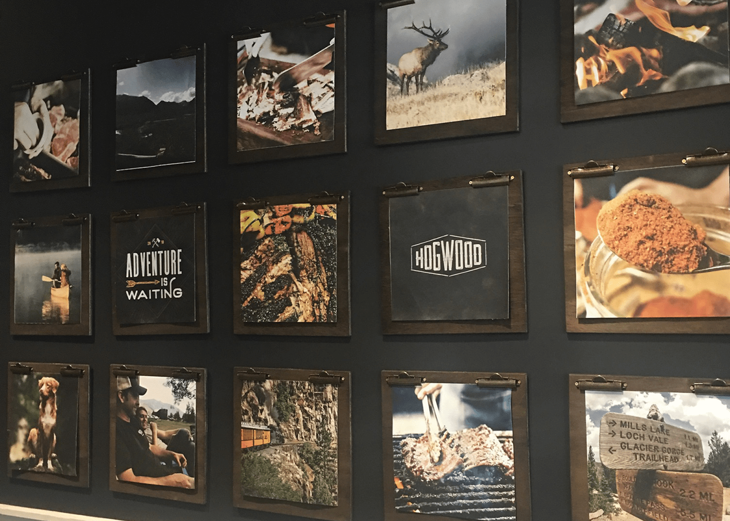
Above the wood storage, we printed the brand story as a wall installation to communicate the voice of the brand and to evoke emotion so customers could feel the message. A gallery wall lined the hallway to the restrooms and was populated by stunning imagery of smoking apple wood, rustic scenes, and vistas from Hogwood’s origins in Colorado.

The bathrooms weren’t overlooked either. A black and white plaid wallpaper brought the brand into the space and industrial fixtures finished off the look.

An interior branding plan was developed that dictated the aesthetics of the interior. This was presented to and approved by our client, before being handed over to the architect and general contractor for implementation.

nashville restaurant branding floor plan
Nashville Restaurant Branding Environmental
bbq restaurant environmental design

Menu + Menu Board Design

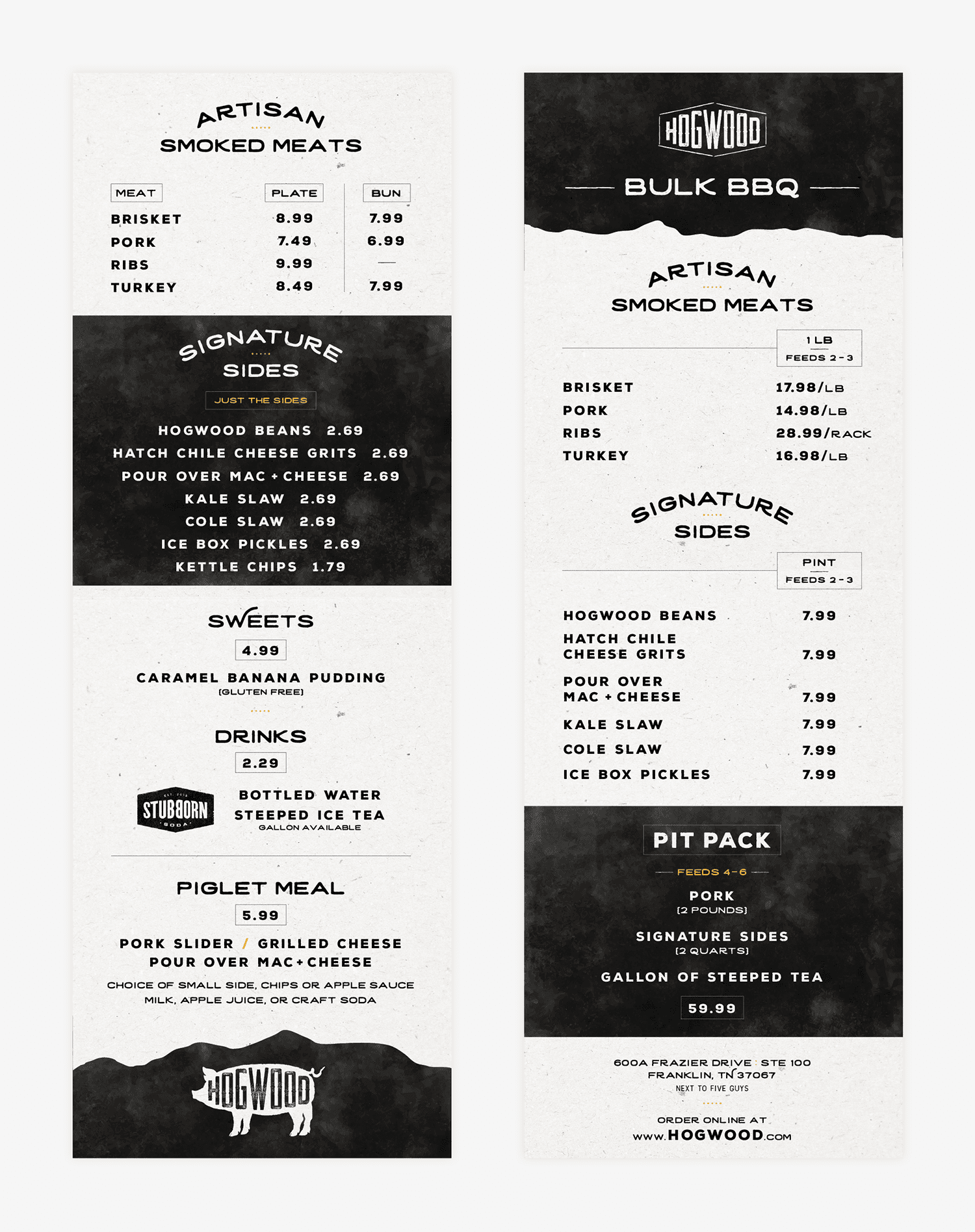
A handheld menu is often utilized in our fast-casual restaurant branding concepts. For Hogwood, customers would line up at the front of the store and come through the point of sale pretty quickly. Thus, the customer would need to be able to figure out what they wanted to order at a glance.

A simple, versatile menu was designed to be used both in print and online. The menu could be used for both dine-in and take-out orders. This dual purpose menu would eliminate the need for the restaurant to place separate print orders for take out and dine in menus, and would make it easy for customers as well. Plus, as customers perused the menu in-store, they would be organically informed about takeout options.

Corresponding menu boards were developed for the restaurant’s interior. The menu boards were designed to mirror the handheld menu, while taking on a simplistic, yet brand-aligned look and feel. The boards were hung from the open ceiling on industrial-style chains. This setup makes the boards easy to replace as menu updates are required, and keeps the implementation in line with the visual direction.

bbq restaurant menu design

Business Card

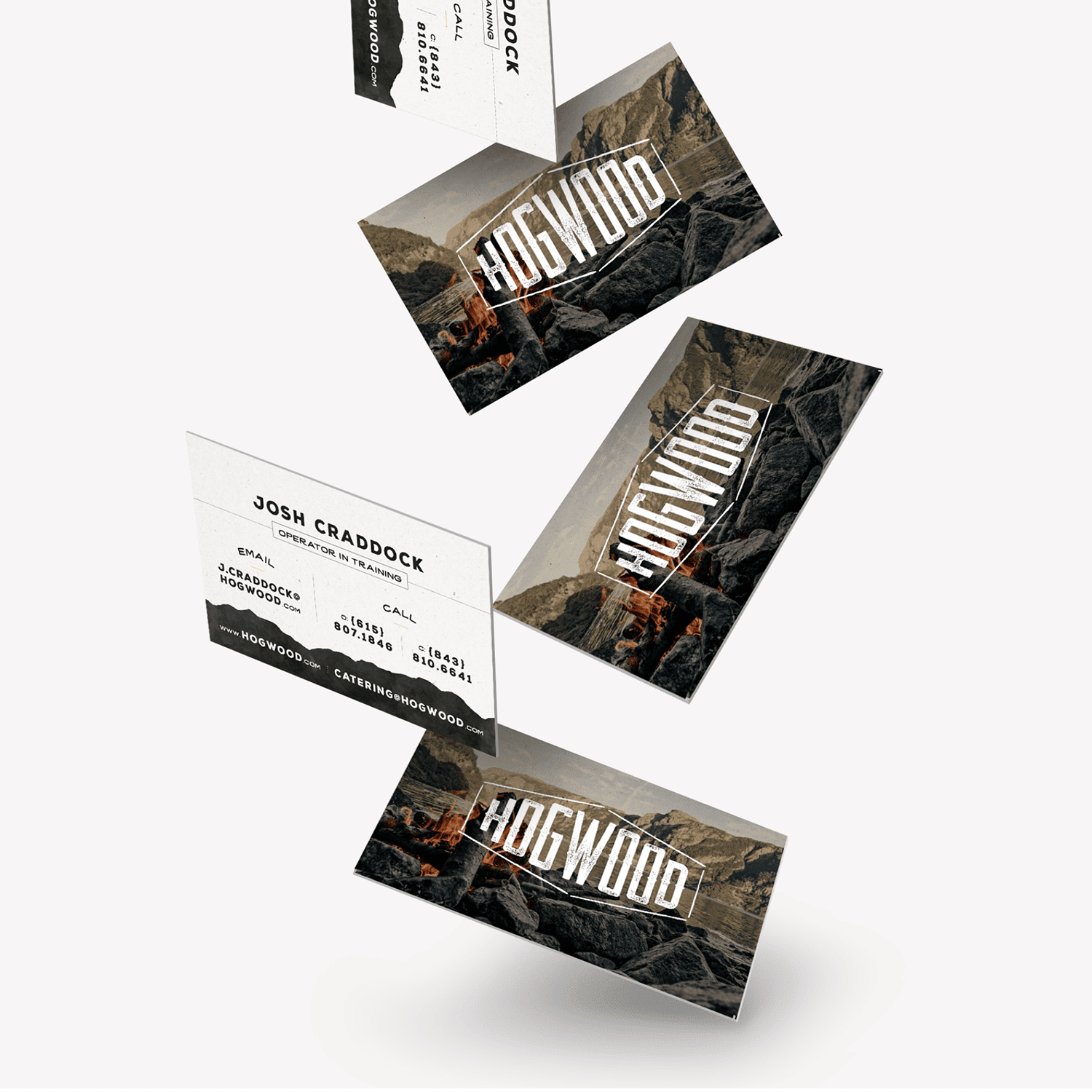
Another of the printed pieces that we create for restaurant branding, is the business card. We created a suite of business cards for Hogwood, including some really beautiful cards printed on 32pt stock with black painted edges. The business cards took on the smoky feel of the interior of the restaurant, and the warm hues found throughout the brand. Uncoated stock aligned well with the rustic vibes, and the information on the cards was presented in brand fonts.

restaurant business card design

Restaurant Materials

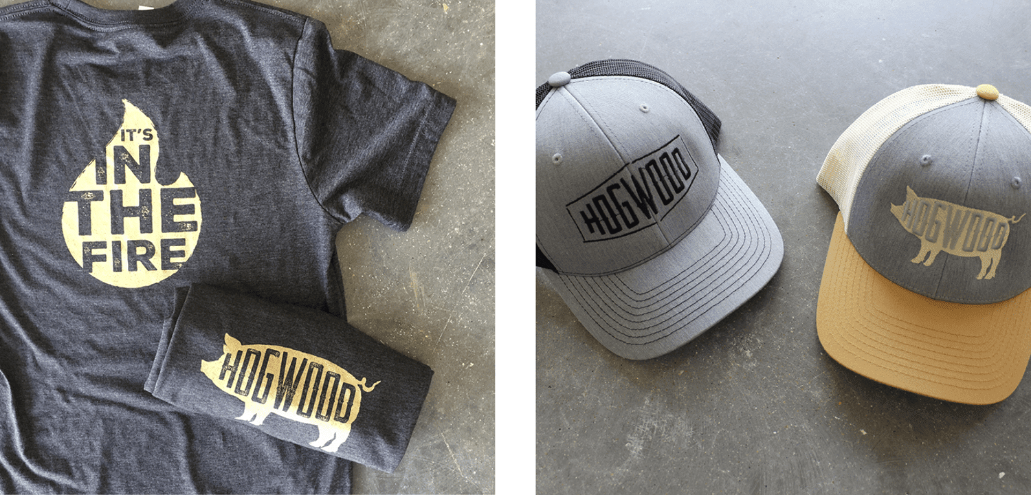
A complete suite of restaurant materials was also designed, including cups, attire both for merchandising and for staff, take-out bags, a gift card and more.

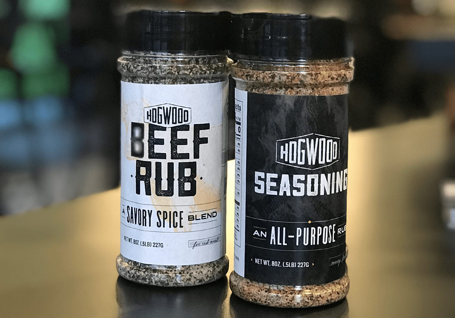
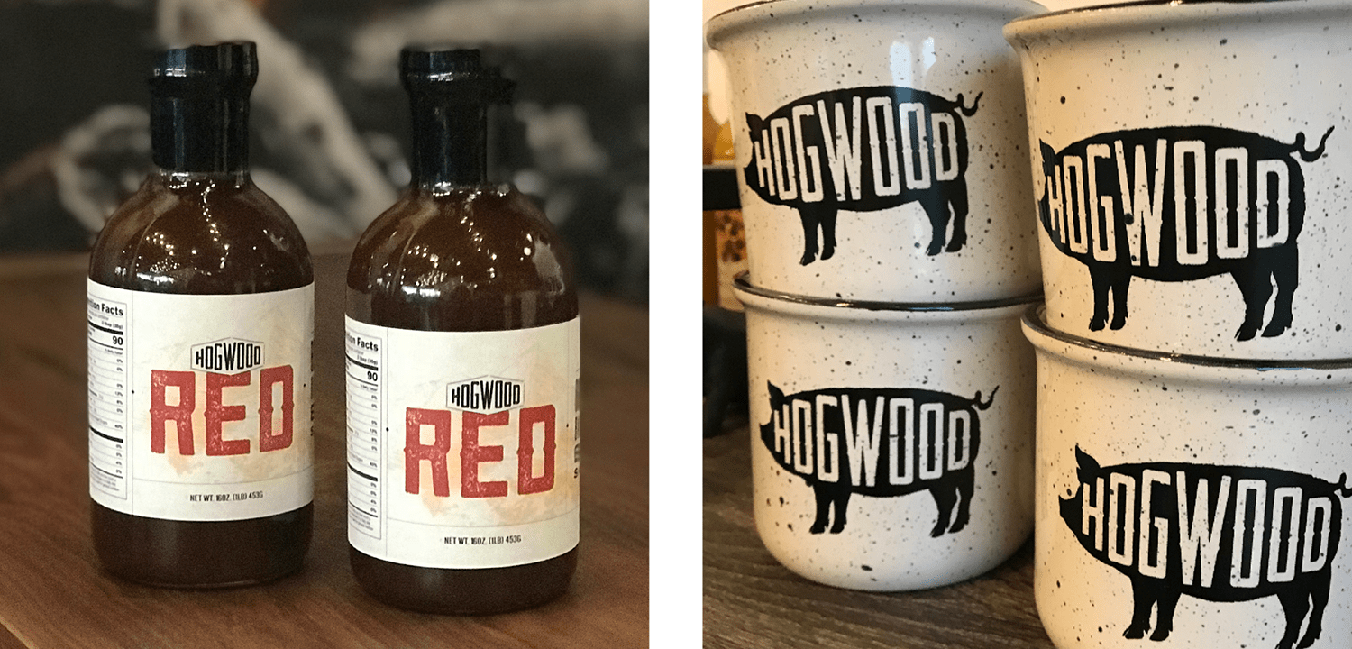
Additionally, we custom-designed bottle labels for spices and sauces that would sit on the tables at Hogwood. The extra touch not only conveys a thoroughly branded concept, but it also tells customers that what’s within the bottles has been custom-blended by Hogwood. This ties well with the scratch-made concept.


bbq restaurant attire design
restaurant packaging design
restaurant promo product design

Sitemap Presentation

We then created a sitemap for the website. Since this was a new restaurant with no existing website, we simply outlined the page(s) we would need to accommodate on the new website. It was determined that we would design and develop a single page website for Hogwood, with external links to location mapping via google maps and online ordering. The menu was to be uploaded to the site as a PDF.

Website Hosting

In addition to sitemapping, we also discussed website hosting with our clients at Hogwood. Our host provides the best platform for WordPress websites, featuring daily backups and fast page load times. Additionally, with our package we include monthly maintenance and monitoring to ensure the platform and plugins are operating optimally. Hogwood decided to host the website themselves, so we would provide the site files and they would be able to launch the site themselves.

Website Wireframes

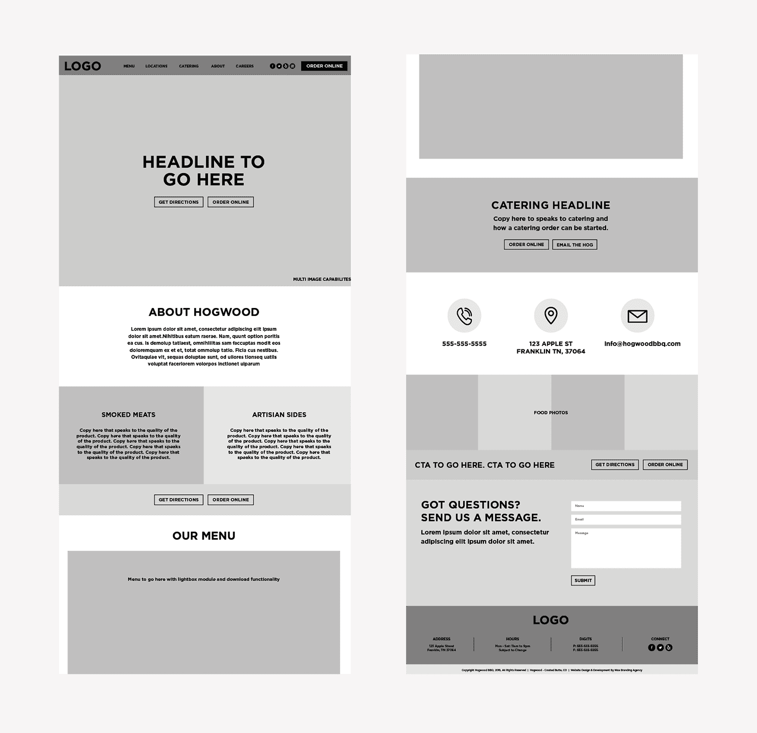
With the primary branding elements in place, we began to work on the website, starting with the wireframe. The wireframe process for the single page site was pretty straightforward. We created a blueprint for the page that mapped out exactly where text, images, calls to action, and the menu would live. We designated a space for the Instagram feed to be pulled into the footer and ensured that hungry customers could find exactly what they were looking for upon every scroll down or up the page.

restaurant wireframe design

Website Design

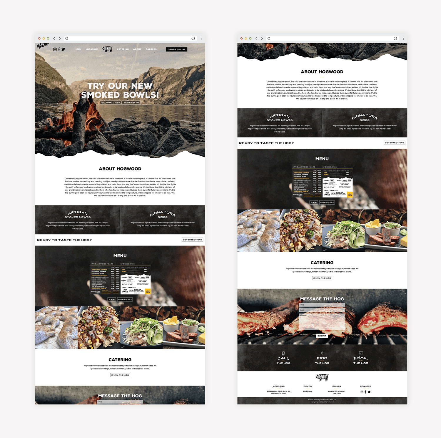
The Hogwood website concept we created was simple, with strong calls to action that prompted customers to get directions to the restaurant or view the menu to order online.

Here, highlighting the brand story was important. We brought the brand to life through the bold imagery and on-brand calls to action. Additionally, we ensured that the single page was both interesting enough, yet not too cluttered so that customers would be drawn to the main calls to action.

bbq restaurant responsive website development

Website Development

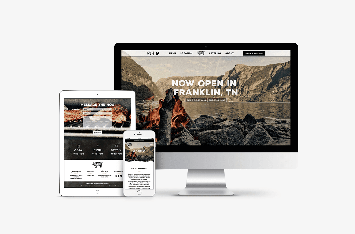
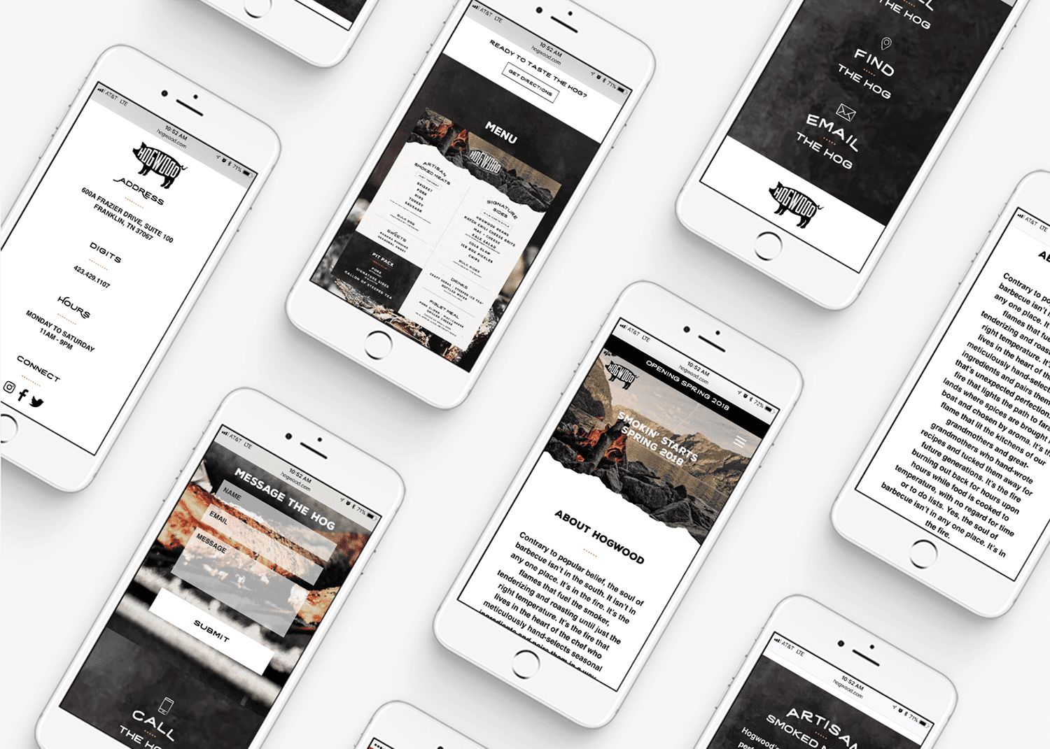
The website was custom-developed on a WordPress platform. The WordPress CMS makes it simple for our clients to manage the content updates on their websites themselves. Additionally, we equipped the team at Hogwood with a basic training on how to update their menu and other key information once the site was live.

bbq restaurant responsive website design
restaurant mobile friendly website

Website Launch

With the website approved by the client and the restaurant ready to start launch marketing, we send the website files to the client so that they could take the website live on a domain that they already owned. Once live, our team tested all bells and whistles to ensure that everything was in working order before the client started driving traffic to the website. Google Analytics were set up and login info was passed along to the client for safe-keeping.

Nashville Restaurant Branding Project Closeout

We wrapped the project up by providing Hogwood with their logo files, website backup, and print-ready PDF files for their business cards and menu. Additionally, we did a final check of the interior to confirm that all elements were on-point leading up to the grand opening.

We loved working on the Hogwood BBQ restaurant branding project and are so stoked that they’re a hop, skip, and a jump away from our Nashville office, where we specialize in Nashville restaurant branding. If you’re interested in branding or rebranding your restaurant, give us a holler.

are you ready to create something nice?