PROJECT KICKOFF: RESTAURANT BRAND DESIGN
Our restaurant brand design creative process starts with discovery. For The Starter Package, this discovery phase comes in the form of a Creative Questionnaire. Our clients complete the questionnaire to transfer pertinent information about the project to our team. We pair this information with our notes from previous conversations with the client, and then we brief our branding team before we get to work.
DESIGN DIRECTION BRAINSTORM
We knew from the brief that the restaurant concept would leverage the popular Nashville hot chicken trend. Our client has already secured the restaurant name, Howdy Hot Chicken. Additionally, we knew that changes to the physical space would be minimal as existing furnishings would remain in the restaurant.
Our client signed on for The Starter Package, so for this project, we would create two restaurant brand design concepts. We based the brand look and feel of each of the two concepts on what we knew about the restaurant, including location, target market, menu details, and existing furnishings.
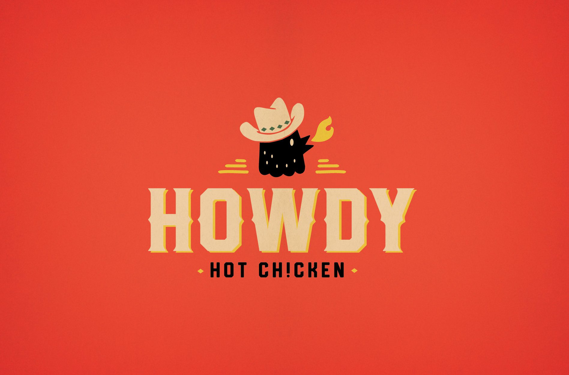
We decided that we would create one option that would be bright and bold. The other option would take on a vintage look that nods to the restaurant’s Texas roots.
We’ve detailed the options below, but you’ll have to stick with us until the end to find out which option was selected.
FIRST BRAND CONCEPT DEVELOPMENT
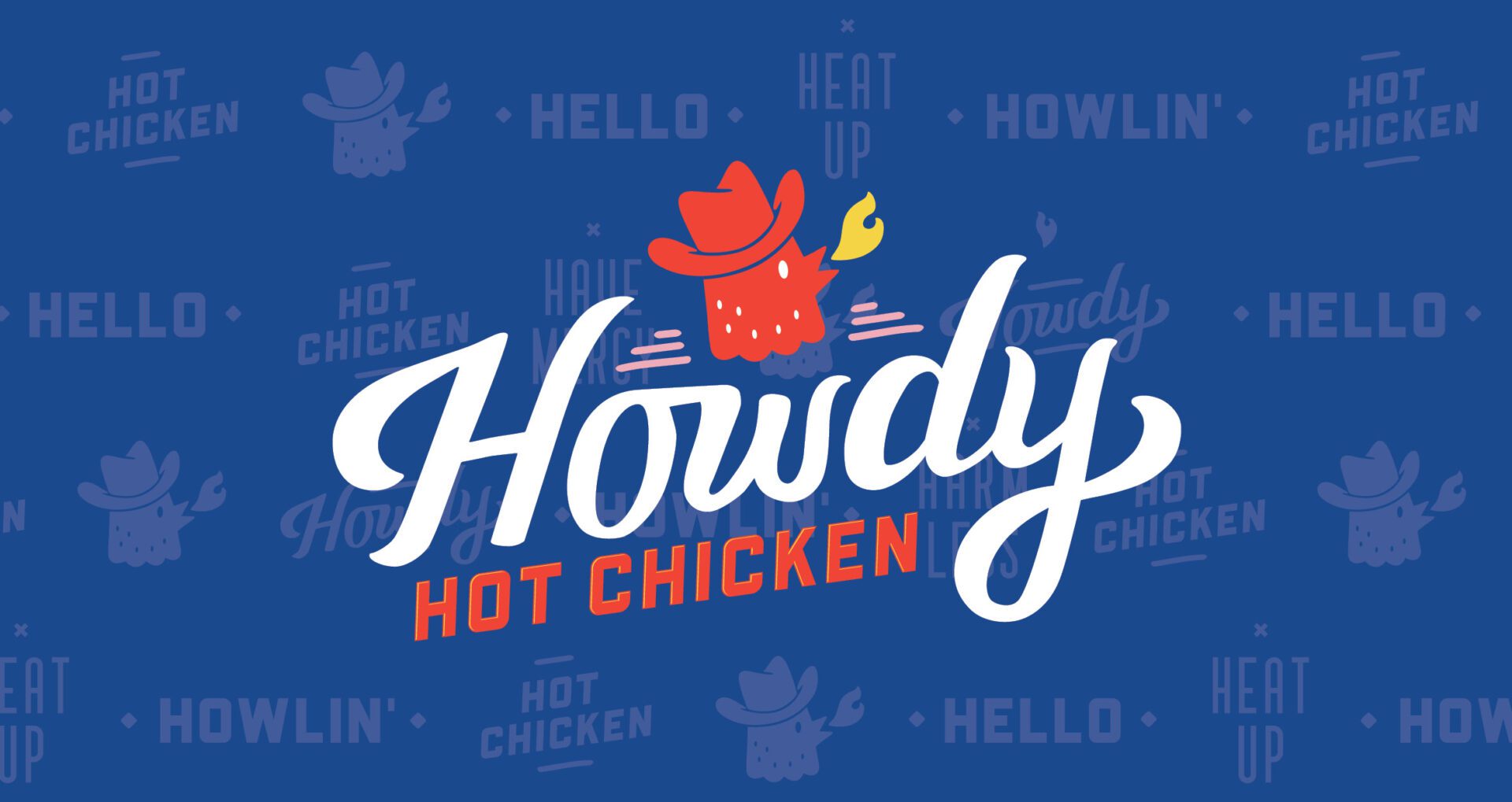
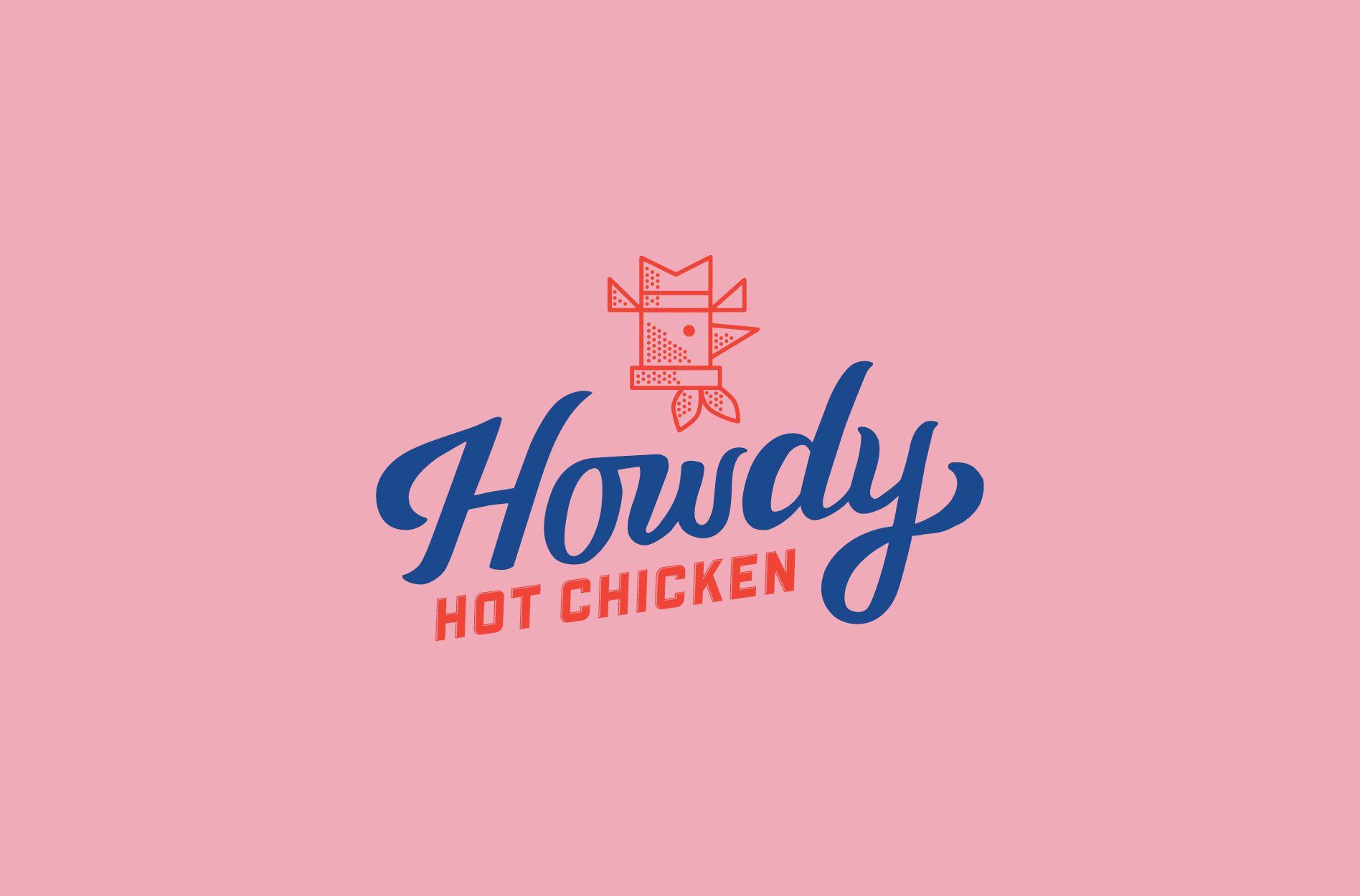
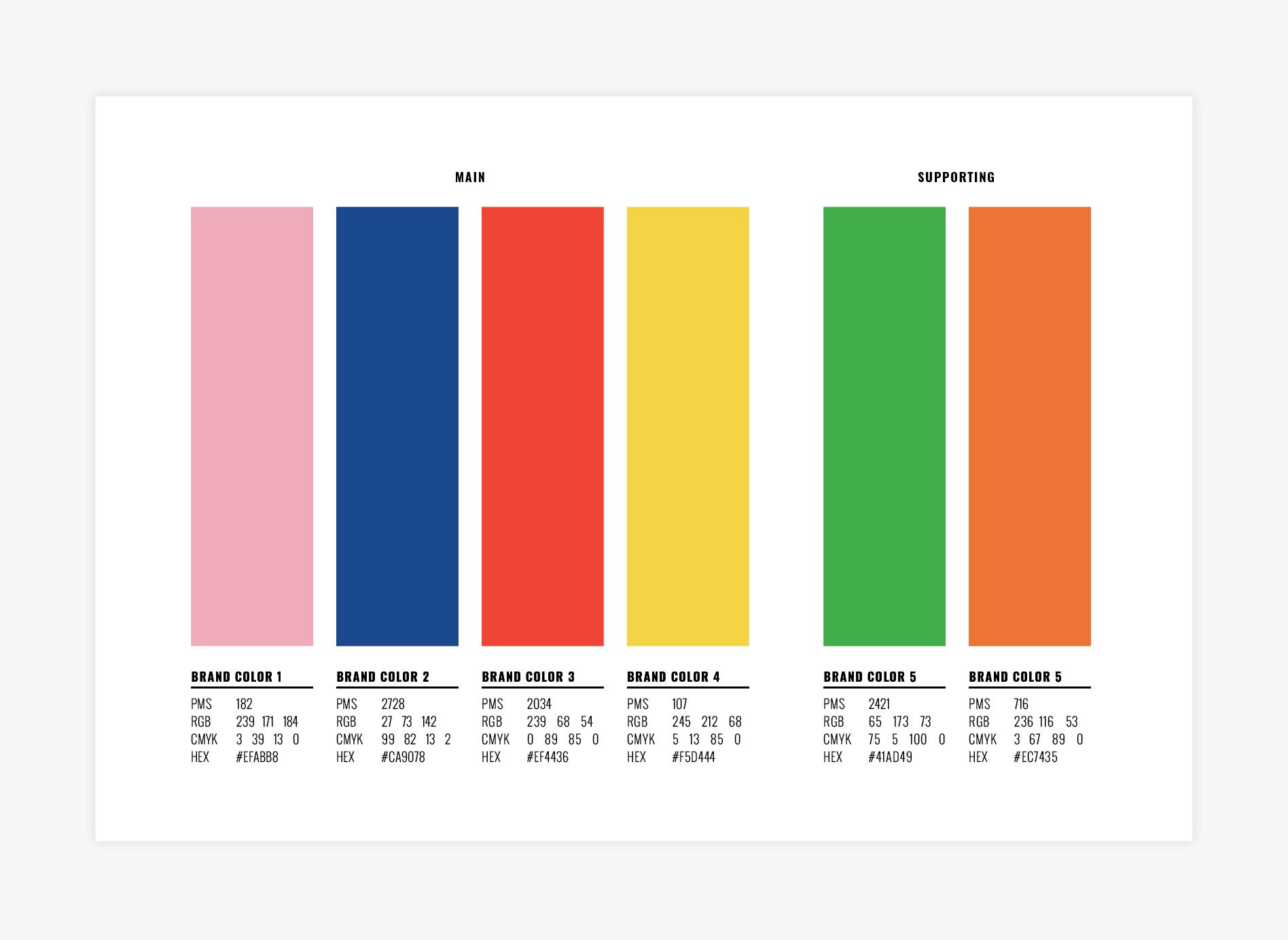
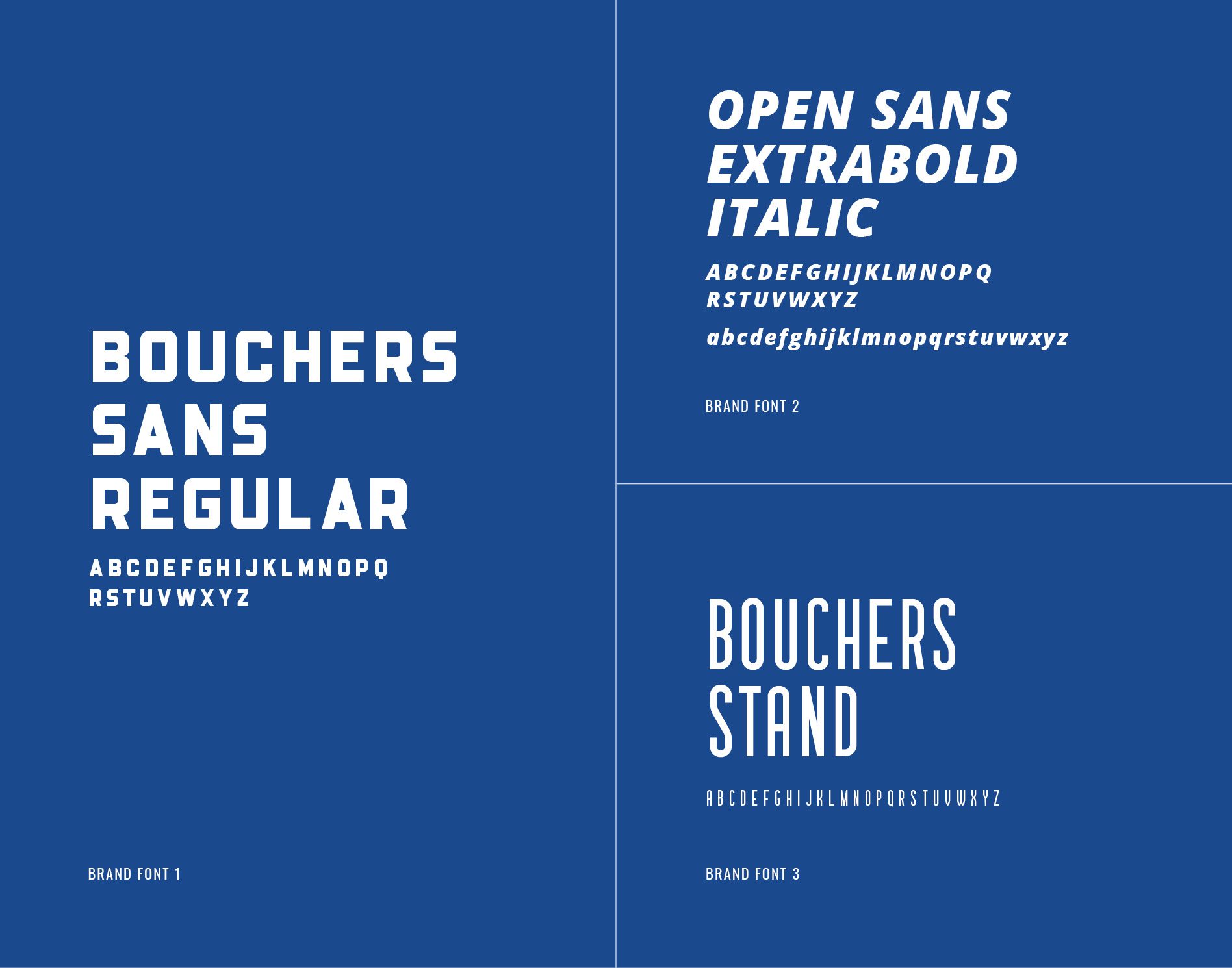
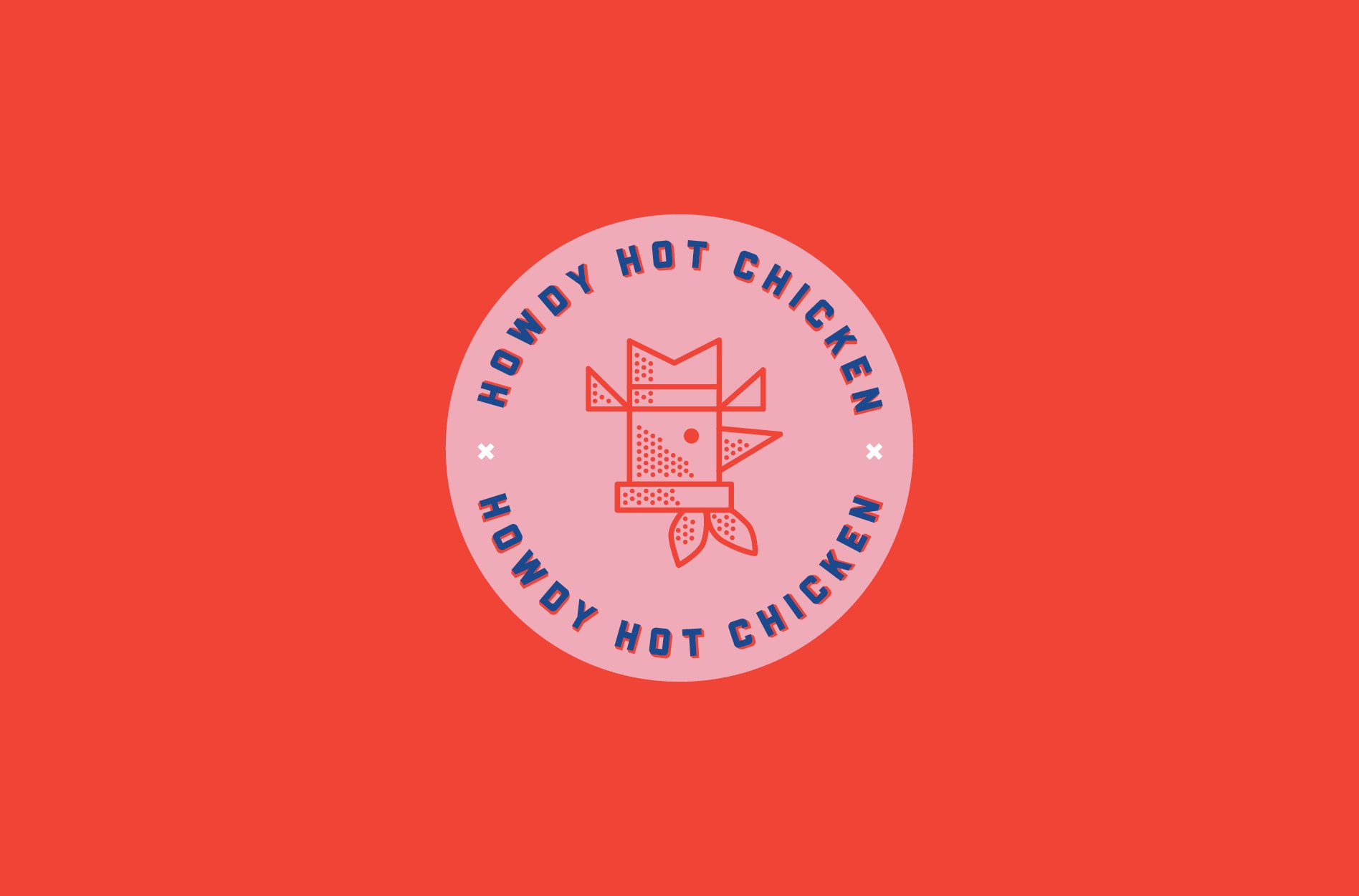
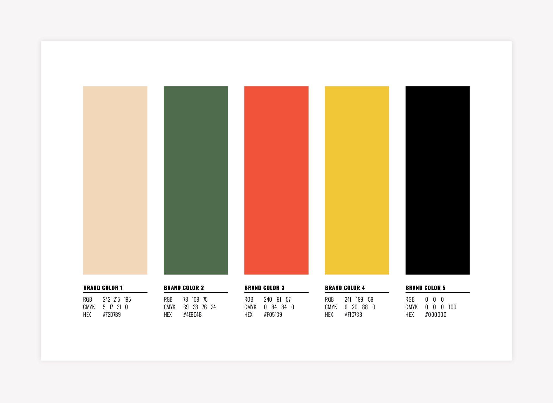
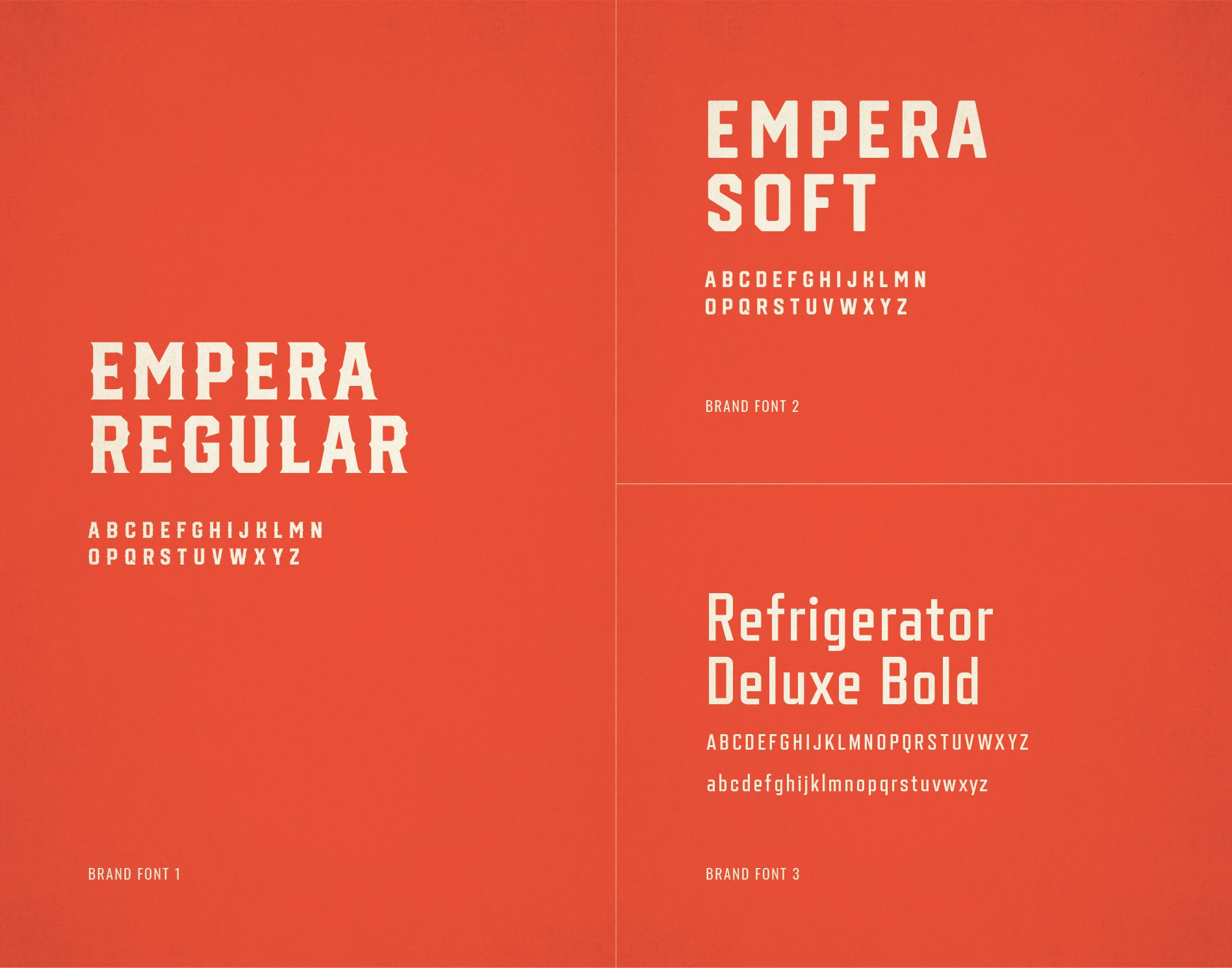
The first restaurant brand design direction presented was the more modern of the two. We used bold, retro, layered typography and geometric shapes to represent the seasonings and spices used in hot chicken. Cheeky Southern slang would come in through the messaging, and the color palette reinforced the playful, friendly, and unique vibe.
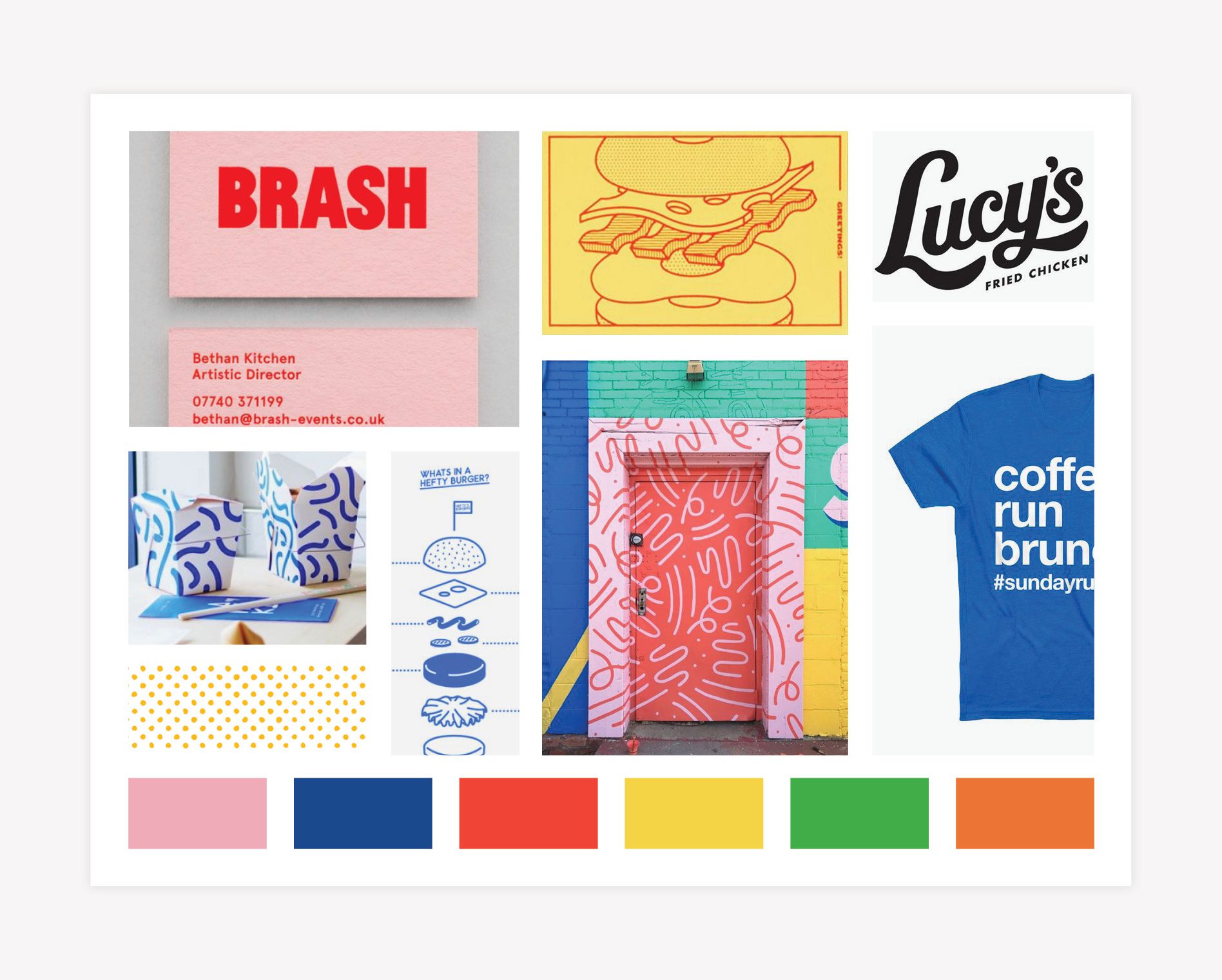
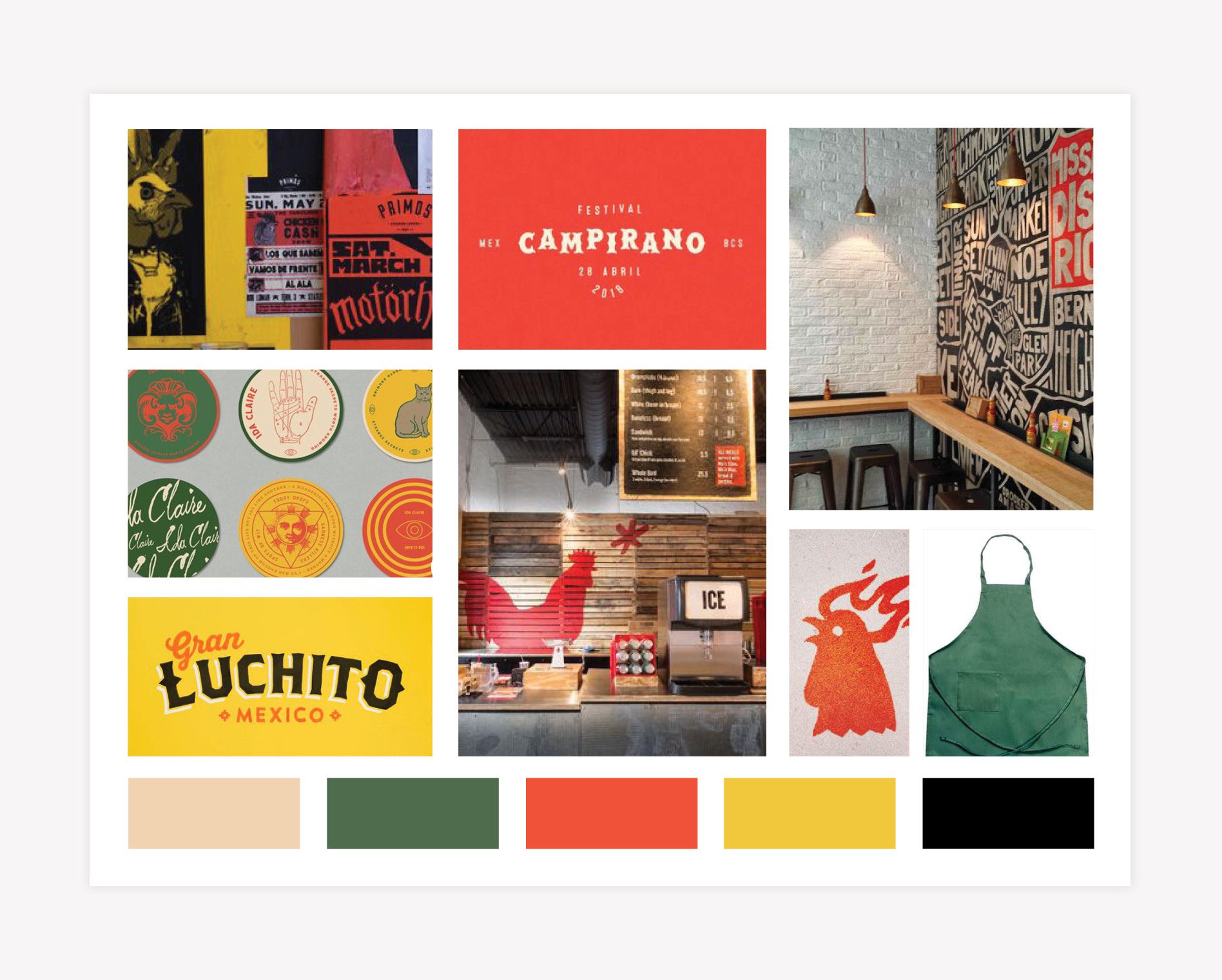
RESTAURANT BRAND DESIGN MOOD BOARD
The Starter Package begins with the creation of a six-image mood board to communicate the overall aesthetic of the restaurant brand design.
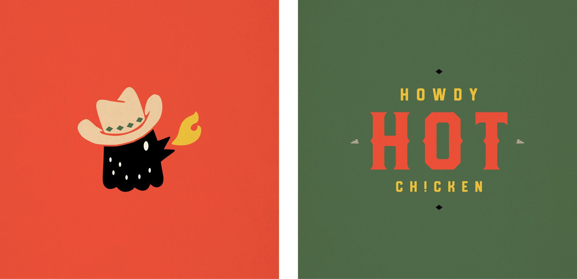
For Howdy Hot Chicken, the images introduce clean lines and simple type over big, bold floods of color. The uncomplicated treatment of lines and type conveys a modern look, while the color brings in an unexpected juxtaposition of energy and play. Custom line drawings, icons, and graphics communicate brand messaging and custom brand patterns.
