Mr. Wong’s Chicken and Rice

asian restaurant branding package design

We worked with Original Chicken N Rice on a restaurant branding project that equipped the restaurant with a bold brand.

The owners reached out to us with a need to rebrand the restaurant in a manner that would resonate with their existing customers, while also appealing to new ones. Their goal was not necessarily to bring in more business (although that never hurts, right?!) but to align the brand and brand support with a narrative that would resonate better. Additionally, changes to the business structure were impending, so a new brand was 100% necessary.

project type

Our restaurant branding agency worked on a restaurant rebrand project to create a bold new brand for Original Chicken-N-Rice.

The owners reached out to Nice Branding Agency with a need for a restaurant rebrand that would resonate with their existing customers, while also appealing to new ones. Their goal was not necessarily to bring in more business (although that never hurts, right?!) but to align the restaurant brand and brand support with a narrative that would resonate better. Additionally, changes to the business structure were impending, so a new brand was 100% necessary.

Restaurant Rebrand Project Kickoff

We kicked off the restaurant rebrand project with a trip to Dallas to meet with our clients. We sat down with them to learn about the restaurant and the people who eat there. We came to find out that the target market primarily consisted of working-class families and blue-collar workers. There was a large component of the market that was Spanish-speaking, as well.

The restaurant’s differentiators were pretty straightforward. They were a family-owned establishment that served up heaping portions at affordable prices.

The menu items consisted primarily of fan favorites that included tempura-battered chicken tenders, Hawaiian-style wings, fried and white rice, and an assortment of sauces, sides, and drinks.

We also learned that the restaurant had been started by an immigrant named Mr. Wong. He came to this country and was enamored by fast food concepts and their ability to serve good food at good prices. He started cooking out of the back of a convenience store before opening the very first Original Chicken-N-Rice concept with his business partners.

After years of success and a passion for his business, Mr. Wong retired and turned over the operations of the restaurant to his children, our clients.

As they worked to grow the restaurant and to separate certain locations from others, our clients relied on us to create a bold new restaurant brand that would keep them current in the fast-casual market.

Brand Direction

After reviewing the information provided, and working through our own research into the market and target, we got busy creating narratives and visual direction options for the restaurant rebrand. Our desire was to reposition the restaurant from an inexpensive place to grab food to a family-run restaurant that served fresh, heaping portions at friendly prices.

Additionally, we wanted to create visuals that more closely aligned with the bold branding that was winning in the QSR market.

We created three options for visual direction. Each of the brand boards we created could be used as a vessel for telling the story we sought to weave into the brand. These brand boards also allowed a natural way for our clients to have a say in the direction of the brand.

The chosen brand board retained a color palette that was similar to the existing Original Chicken and Rice brand; however, it implemented updated tones and a more modern approach.

We took into account the notes mentioned in our conversation with the client to create a visual direction that incorporates the natural elements — concrete, metal, natural wood tones.

Within the visual direction, we included modern illustrations to bring in the chicken concept.

This restaurant rebrand also includes modern, clean fonts and a yellow that’s warmer than the typical sunny hue often presented. We included an orangey-red color as well. These colors update and refresh the tones and existing colors to provide a much improved aesthetic while nodding to the “original” brand indirectly.

The graphics in this restaurant brand would be big and clean, as shown in the NY image and the Y image at the top right. The interior graphics would be uncomplicated as seen in the bottom left striped image, except where the illustrations come in, which would be more minimal.

Furniture and fixtures would be industrial with pops of color, while finishes would remain natural in materials and tones.

Black and yellow would be the primary colors for the brand, and red would come in sparingly, through the employee attire, menu, and food photography and potentially through graphics.

Stainless would come in through the fixtures and restaurant materials. Although the restaurant served its food on styrofoam, we proposed stainless trays. However, if that would not be possible, we considered looking to bring the stainless in through other materials.

Upon presentation, this board was approved and became the basis for the restaurant rebrand project.
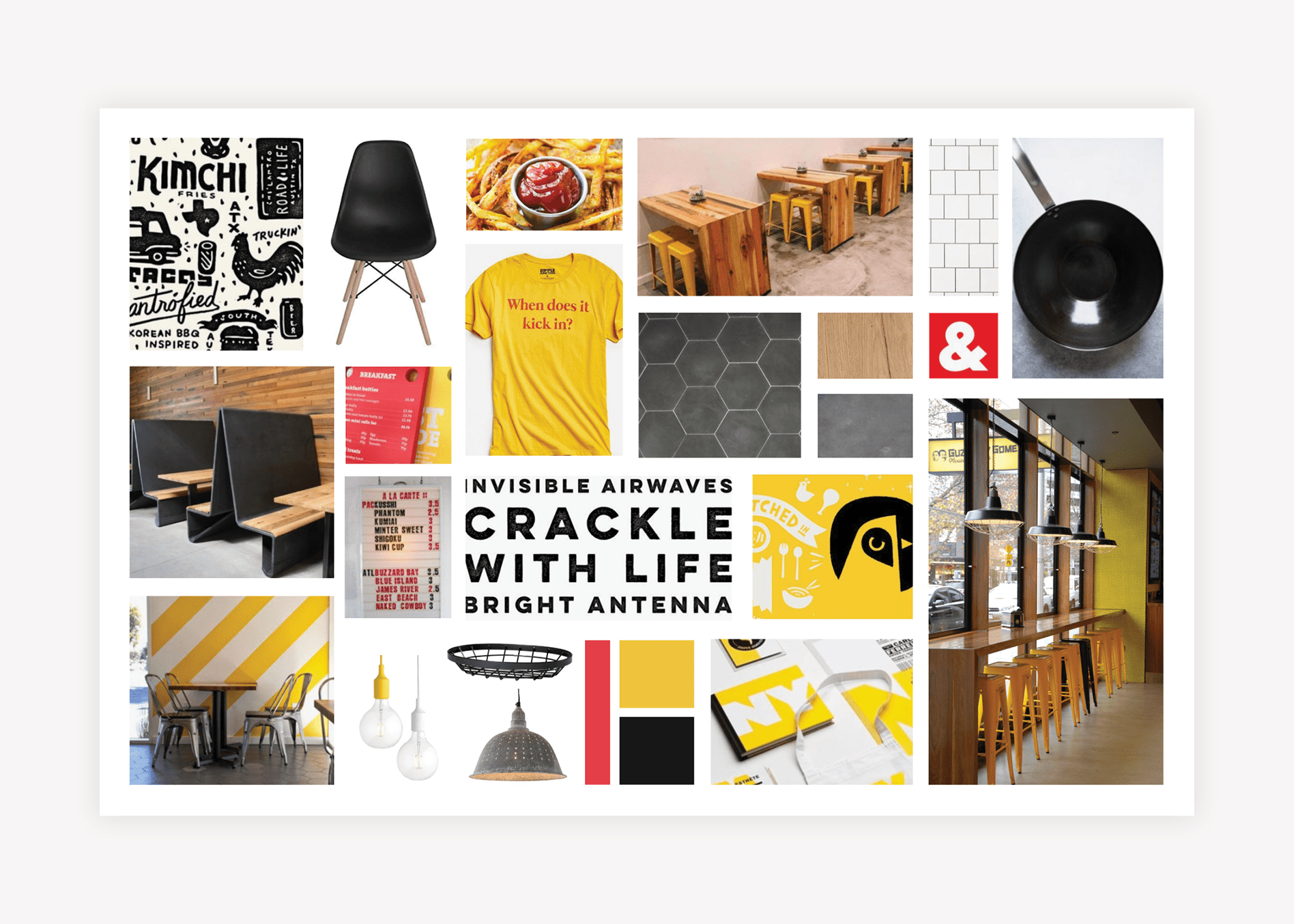
asian restaurant brand board design

Restaurant Rebrand Name Development

Based on the need to distinguish the restaurant from similar concepts in the area, we embarked on a restaurant naming project at the outset. During restaurant naming, we work to gain a good grasp of what makes the restaurant different and how we can use the name to connect with people.

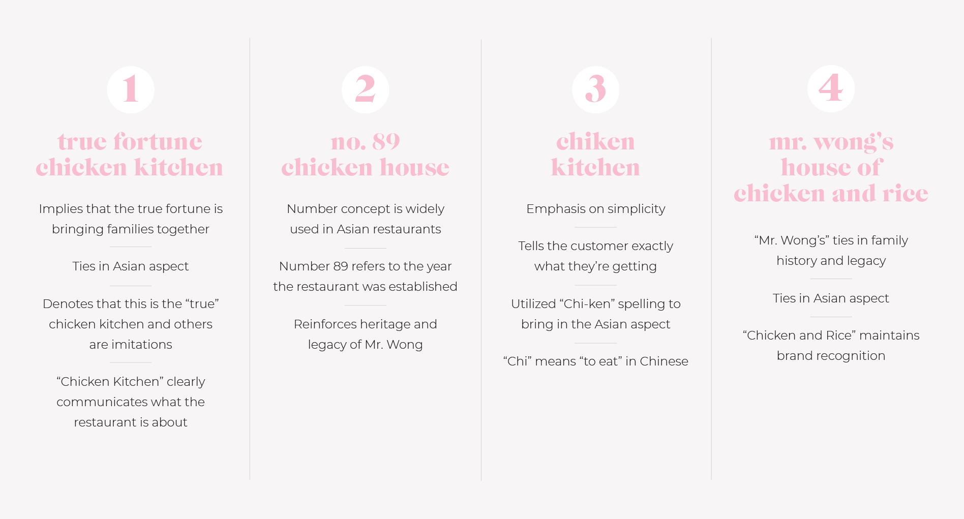
For this project, we engaged in our naming process and delivered several name options to our client, including True Fortune Chicken Kitchen, No. 89 Chicken House, and Chiken Kitchen.

restaurant name development

The name True Fortune Kitchen ties in with the story. Here, we are implying that the true fortune of Mr. Wong’s legacy is bringing families together. Also, True Fortune Chicken Kitchen denotes that the restaurant is the “true” chicken kitchen and that the others are imitations. The term fortune implies the Asian aspect of the concept in a manner that doesn’t risk being offensive, while Chicken Kitchen tells the community exactly what the restaurant is about. Adding Chicken & Rice in place of Chicken Kitchen for a short period of time would allow customers to retain the awareness they’d developed thus far.

No. 89 Chicken House, or Number 89, was the final name presented. The number concept is one that is used widely throughout Asian restaurants, and the 89 refers to the year that the restaurant was established. While this might not be apparent to all who enter, it will be something that reinforces the heritage and legacy of Mr. Wong, while still remaining a catchy name. The number 89 could be used throughout the branding and you could retain “chicken + rice” for a time to allow the community to become accustomed to the new name.

With Chiken Kitchen, we played on the simplicity of the brand board with a name that depicts exactly what you will find within your establishment — a chicken kitchen. However, we’ve utilized the spelling chi-ken to bring in the Asian heritage. Chi in Chinese is to eat.

We also informally presented the option of Mr. Wong’s House of Chicken and Rice, which could eventually be shortened to Mr. Wong’s or Mr. Wong’s House of Chicken.

It’s worth noting that the story and some of the back history on a business and its name may not be obvious to each and every customer. However, it starts to form a foundation for the brand that serves as a jumping-off point for conveying a compelling narrative. The name and story will be supported by all of the brand support, both visual and written. So, while it may stand alone now, once it’s woven through website, social, restaurant materials, staff attire, interior, etc all pieces will come together to communicate the brand.

Of course, the name and story shouldn’t lead to confusion for the customer, but all aspects or underlying meanings just might not register with each and every target. For example, in “Chiken Kitchen,” not everyone will know that Chi is “eat” in Chinese, but it may be an underlying meaning that comes in through brand support in a manner that makes people say, “Oh! I get it now.”

This is in the same way that the name Wendy’s alone doesn’t convey Dave Thomas’ story, but over time, Wendy became known universally as his daughter. Or in the case of Panera, not everyone knows that the word means breadbasket, but that’s alright.

Upon presentation, our restaurant rebrand client decided to use the name Mr. Wong’s Chicken and Rice. This would pay homage to the restaurant’s founder and their father, while clearly stating what could be found within: chicken and rice.

Food Photography

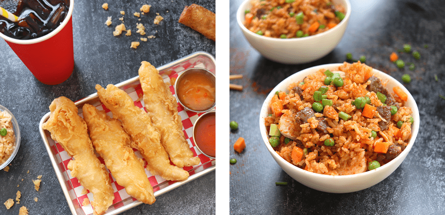
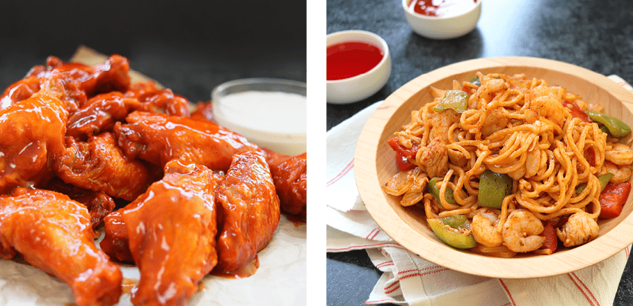
Based on the brand direction, our branding experts started planning for food photos. The goal of food photography is to enhance brand image, as well as entice customers and attractively showcase available food and beverage offerings throughout brand and marketing materials.

Our team proposed a shot list of different menu items for approval. Once approved, we coordinated details with our client and the kitchen manager regarding the manner in which the food would need to be prepared on the day of the shoot.

Then, we worked to plan for the food photoshoot. We created a visual direction for the shoot that aligned with the menu items and how we could show them off in a manner that would represent the overall brand direction. All shot setups were meticulously planned in advance to ensure efficient use of time and resulting images that we would be able to use for brand support.

Additionally, we created a prop list and procured all props and backgrounds necessary for the photoshoot. We then had all items packaged and shipped to Dallas.

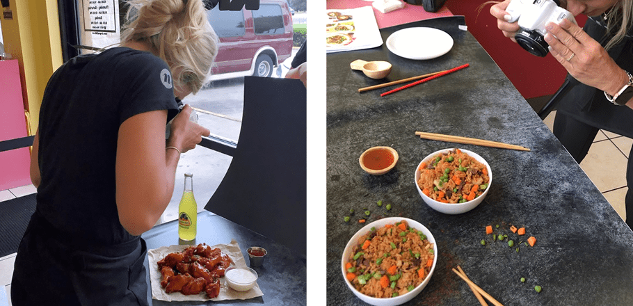
Finally, our team flew out to Dallas for the day. We arrived at the restaurant and spoke with our client and the kitchen manager, who had prepped all the ingredients in advance. We set up at a table against the window, where we would have ample natural light. We then proceeded to create 10 staged environments in which we could photograph the menu items.

food photography design agency

Upon completion, we returned to our offices and selected the best images. These were sent to the client for final selection, and the selected food photos were edited.

Final food photographs were provided to the client for safe-keeping, and our team was able to utilize the shots in the development of brand support.

food photography company
food photographer

Logo Design Direction Brainstorm

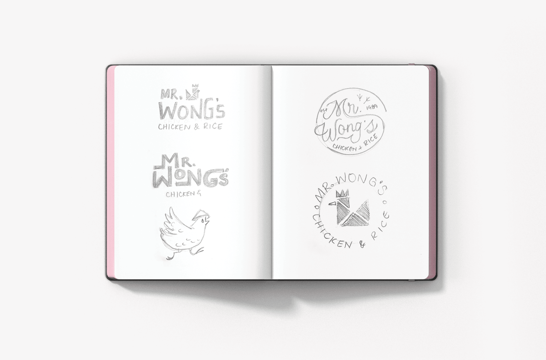
Our logo design team put pencil to paper to come up with concepts for the logo design that would align with the overall brand direction. Our logo designers sketched out various designs that encompassed the idea of a chicken icon. They also included typographical options that would bring in a pattern indicative of chicken footprints.

restaurant logo sketch design

Finalization of Conceptualization

Upon review, our Creative Director and Director of Design determined that the rebrand concepts including the chicken icon and the typographical round logo would serve the brand well.

Restaurant Rebrand Logo Design

With concepts in hand, our logo design team sat down at their computers to get to work. They designed three new restaurant logo options to present to our client, with one variation to create a fourth option.

Three Restaurant Logo Options

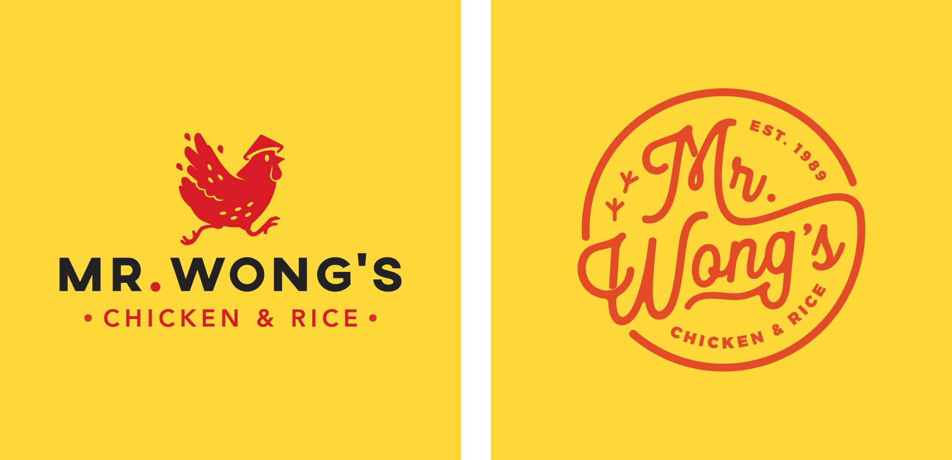
The first restaurant logo option featured a modern, but unique type, paired with a custom-illustrated chicken on-the-go. The movement within the type mirrored the movement of the icon to represent the quick-serve nature of the restaurant. “Mr. Wong’s” took primary placement, while the tag “chicken & rice” was featured just below. We included a stacked and horizontal version of the new logo, along with various options for the icon. The color palette here included a warm yellow, a bold red, and a grounding black.

chicken restaurant logo designs

The second restaurant logo option introduced a completely different typeset. The restaurant name was placed in a round setup, indicative of a diner-style logo. A casual script font was implemented to indicate movement and quality, and the name was encapsulated by the established date and tag. Also, a pattern indicative of chicken footprints was worked into the logo design. If chosen, this would be a primary brand element.

asian chicken logo design

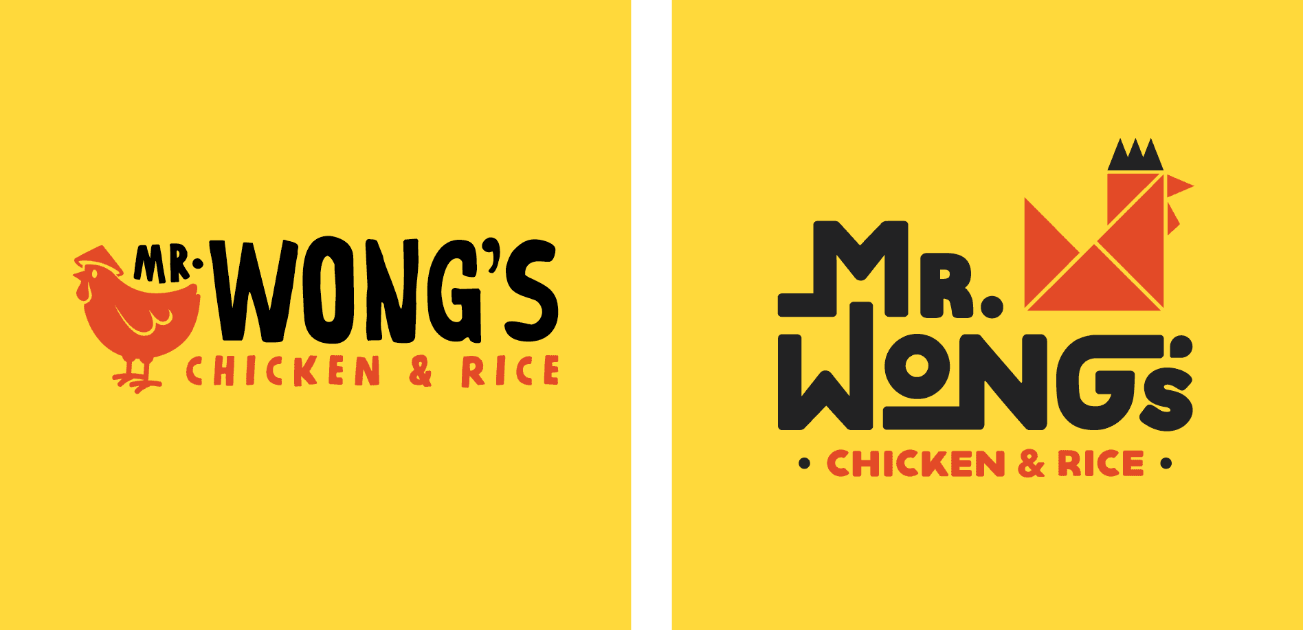
The third logo our restaurant branding team presented included the same chicken as the first option. However, this time, he was stationary. We thought that the running chicken may bring about a negative connotation for some, so we created an option with the chicken just chillin’. Here, we used a more hand-written-style font to align with the casual nature of the business in all caps for boldness.

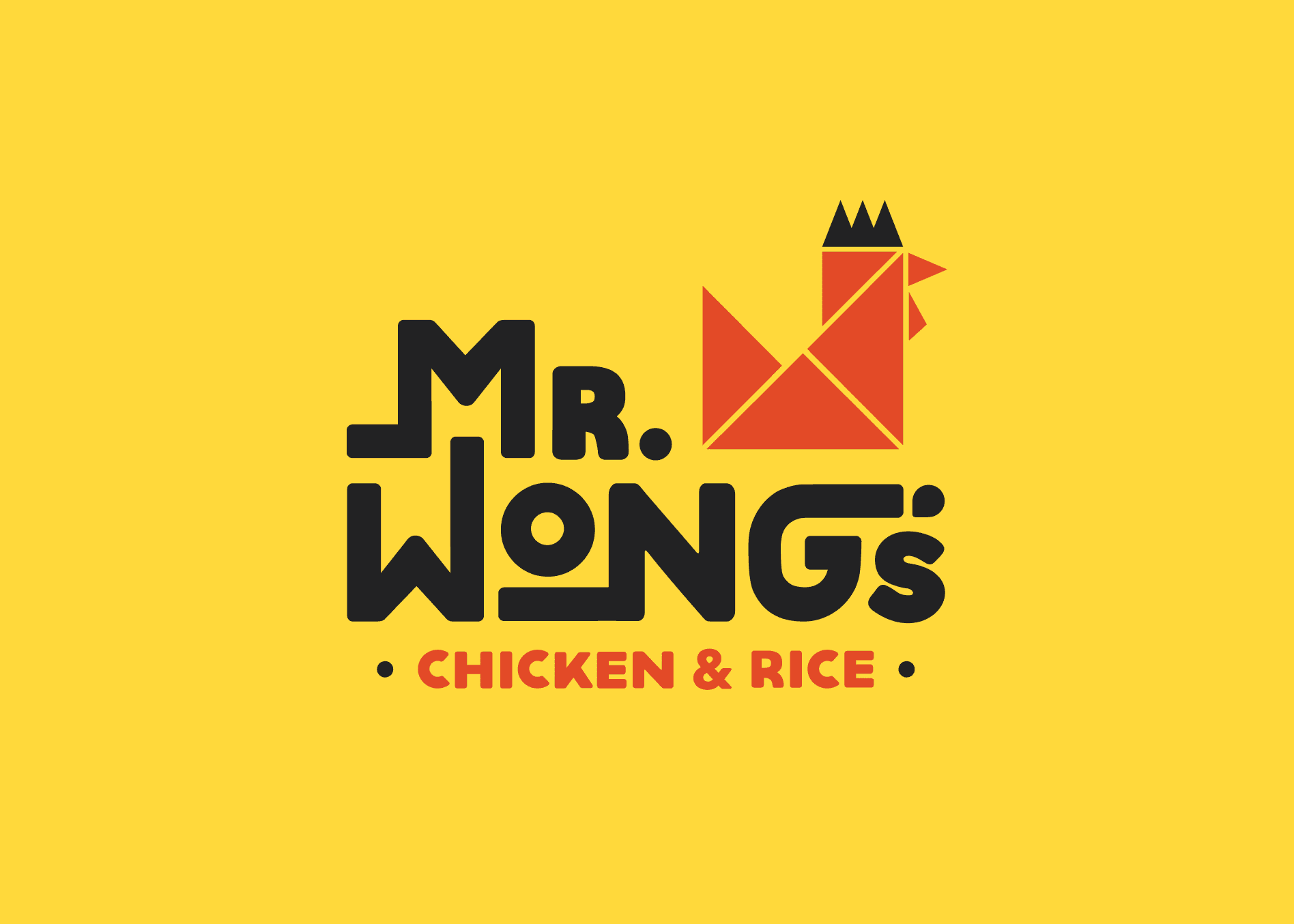
The final chicken logo option utilized the same type as the first; however, the running chicken was replaced with a custom-designed origami-style rooster icon that nodded to the Asian culture.

chicken logo development

Presentation and Selection

Upon presentation of the new restaurant logo concepts, our clients selected the final restaurant logo option. They were drawn to the clean lines of the bold icon and felt that the origami-style chicken icon would be a good representation of the brand.

Logo Finalization

chinese restaurant logo development
chicken food logo graphic design
chicken restaurant logo graphic design

Although the icon was a hit, our clients requested to see a change in the logotype. They thought that the extended lines weren’t as easy to read and wanted something simpler. We revised the type and presented it to the client for approval.

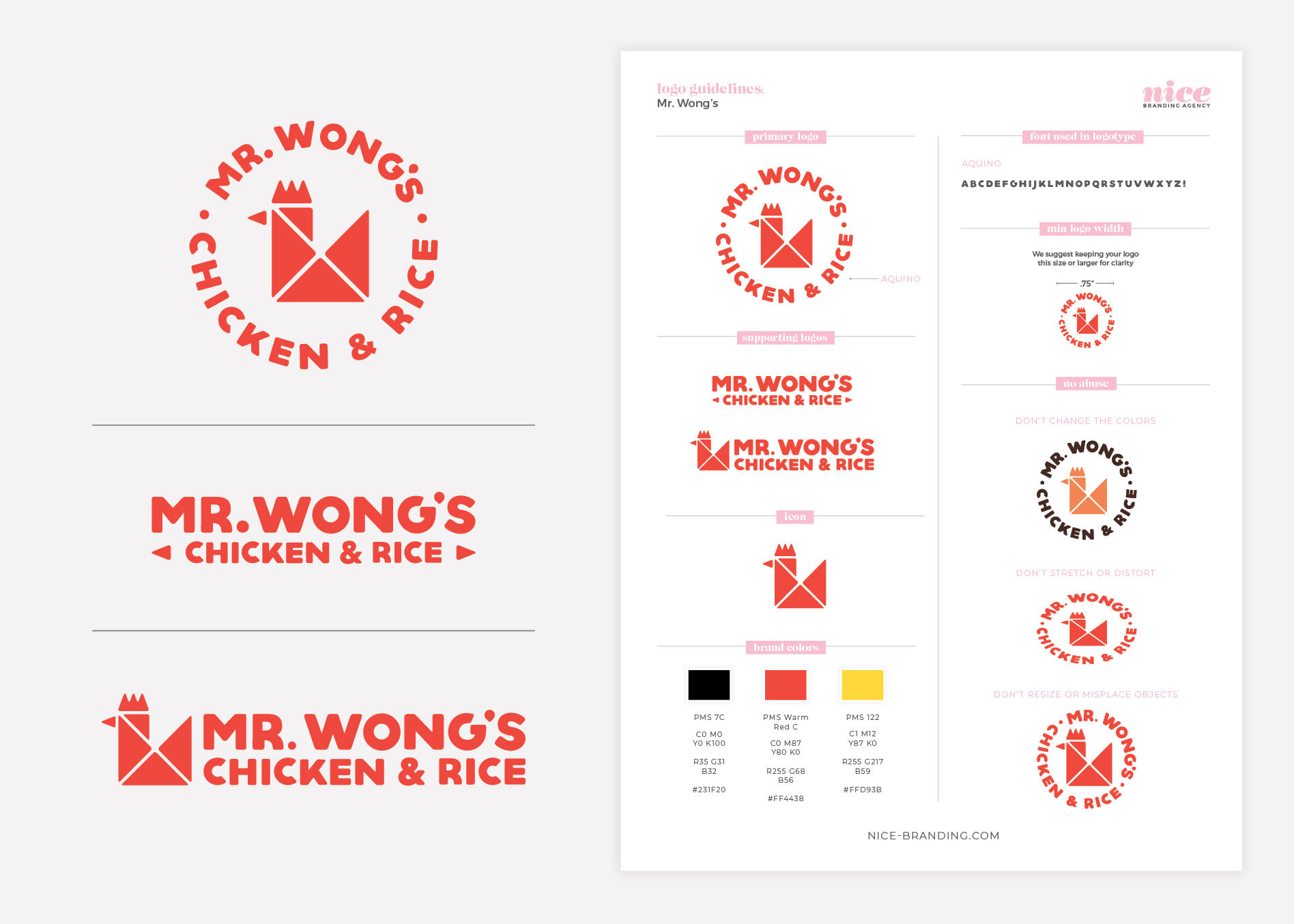
Upon approval, we finalized the logo and selected the exact color codes. These color codes were provided on our logo guidelines sheet in PMS. CMYK, RGB, and hex tones. Additionally, we prepared a complete set of logo files in PDF, EPS, PNG, and JPG.

asian restaurant logo guidelines

Sitemap Presentation

As the brand began to take shape, we began work on the restaurant website. We started by pulling a sitemap of the existing website. In order to ensure that we plan appropriately for the pages the restaurant website will require, we assess current pages. We then determine whether we’ll need to increase or reduce the number of pages, based on the content and goals for the new website.

Website Hosting

Additionally, we talked to our client about website hosting. Our team hosts with the best WordPress website host available. This allows us to ensure fast page load speeds and daily backups, along with monthly maintenance. Also, when we host the restaurant website, we make the website live on launch day. However, our client decided to have their marketing agency host the website, so we would plan to package up the files and provide them prior to launch.

Environmental Branding

A huge part of the restaurant branding process is weaving the brand and narrative through the customer touchpoints. And this Environmental Branding is an often overlooked piece of the branding or restaurant rebranding puzzle.

At Nice Branding Agency, our branding team has perfected the process of implementing a brand throughout the physical space of a restaurant in order to deepen the connection with the customer.

Mr. Wong's Chicken and Rice - restaurant branding interior

This is how it goes down:

First, our team identifies opportunities within the customer journey that have the power to impact the customer. Then, we creatively and strategically weave the brand through each touchpoint utilizing both graphic and interior design techniques.

Our environmental branding package includes a visual presentation of ideas and strategies to fully brand your restaurant’s interior space. The package does not include architectural drawings, construction planning, construction drawings, or specifications of any kind, but instead outlines finishes, fixtures, and design features to implement into the interior.

Our interior branding team provides a presentation, and upon final approval, we translate all ideas to the architecture or construction team to implement into final construction drawings. Then, Nice Branding Agency acts as a consultant through the final build, including a midway construction meeting if applicable.

asian restaurant interior brand design
asian restaurant environmental branding

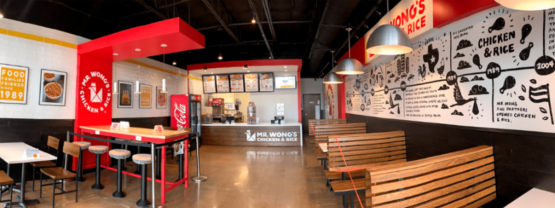
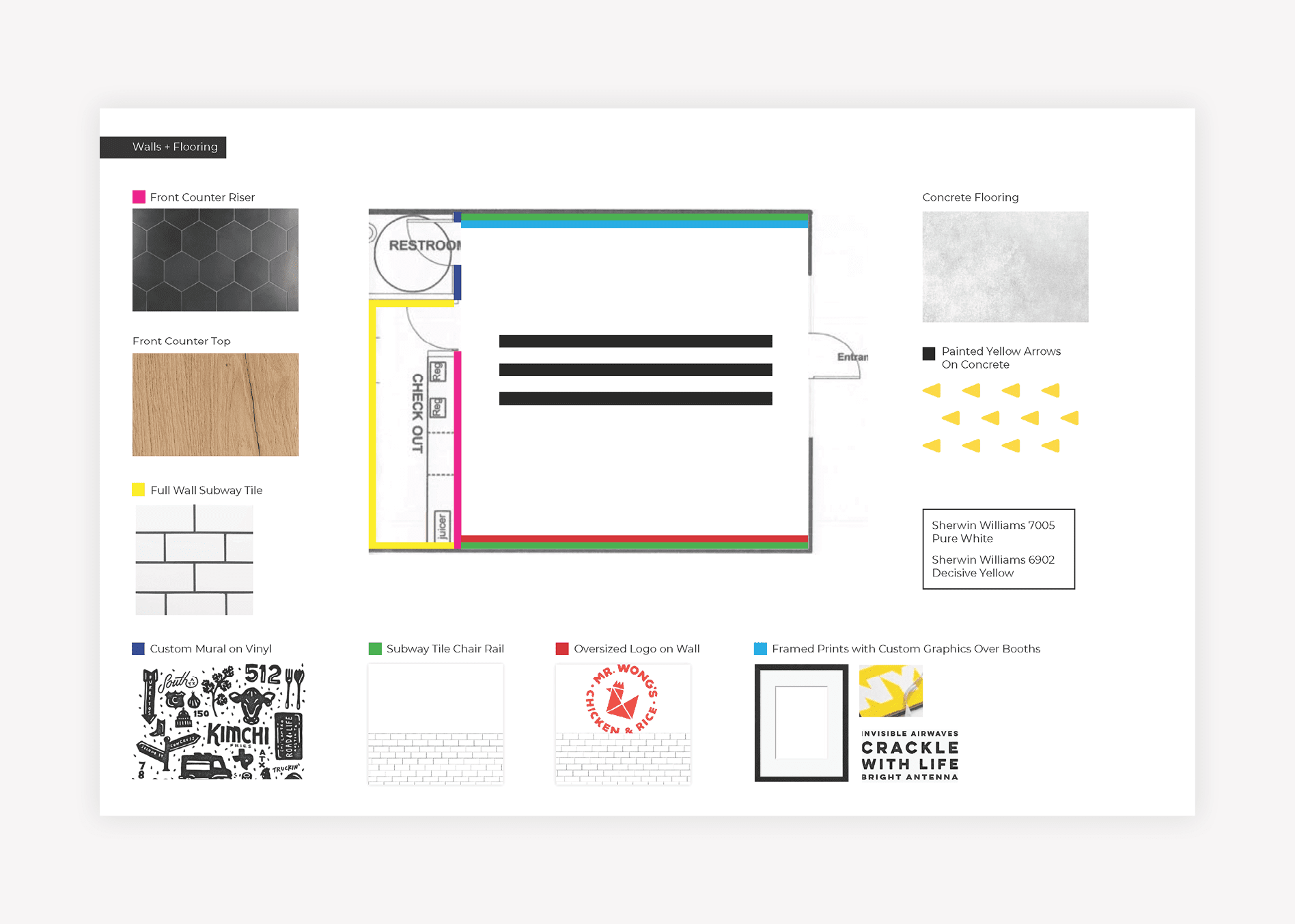
For Mr. Wong’s Chicken & Rice, we wanted to bring the story into the walls of the space so that anyone who entered could see how much family meant to the business. Since many of the customers were families, we knew that this would resonate.

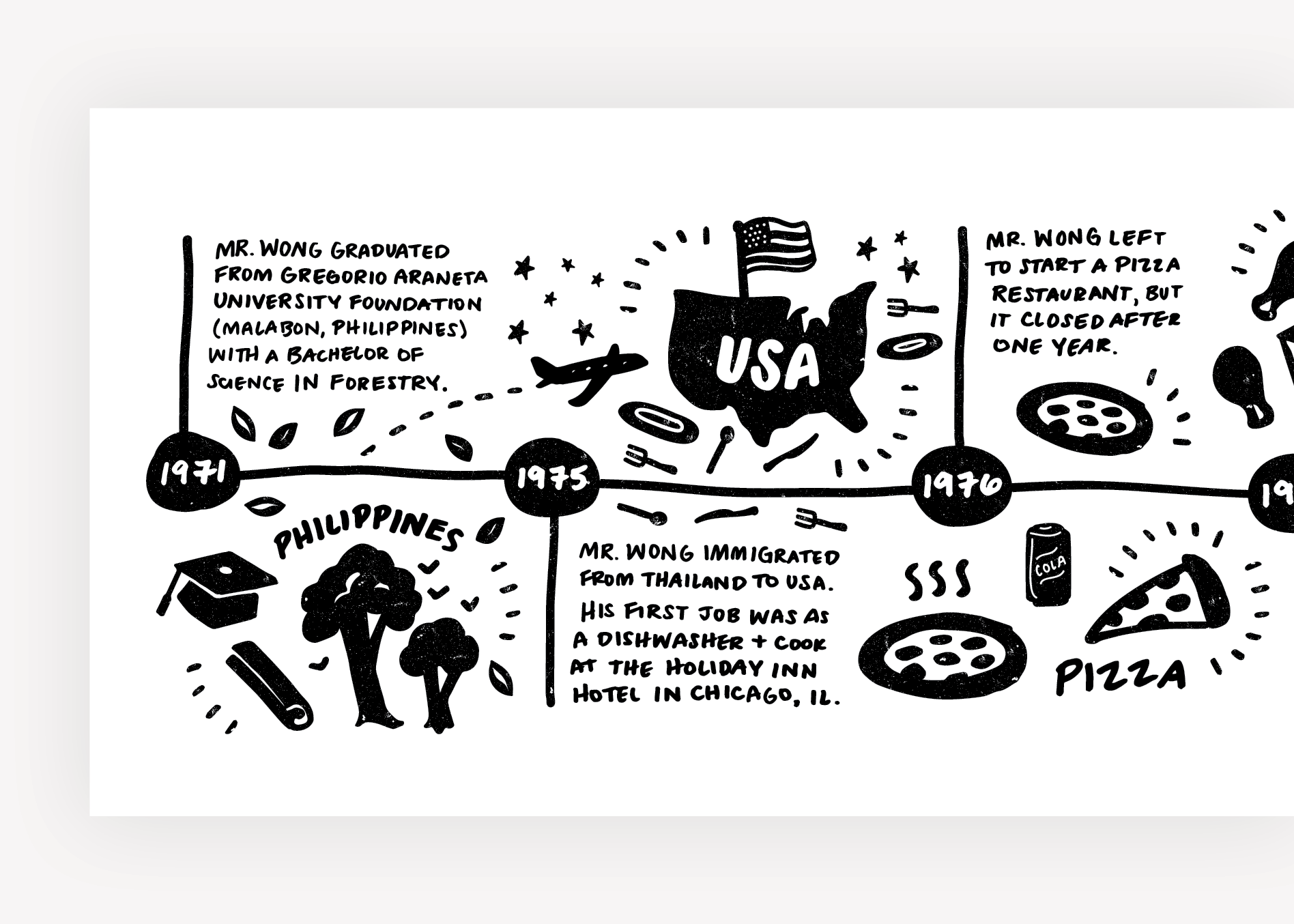
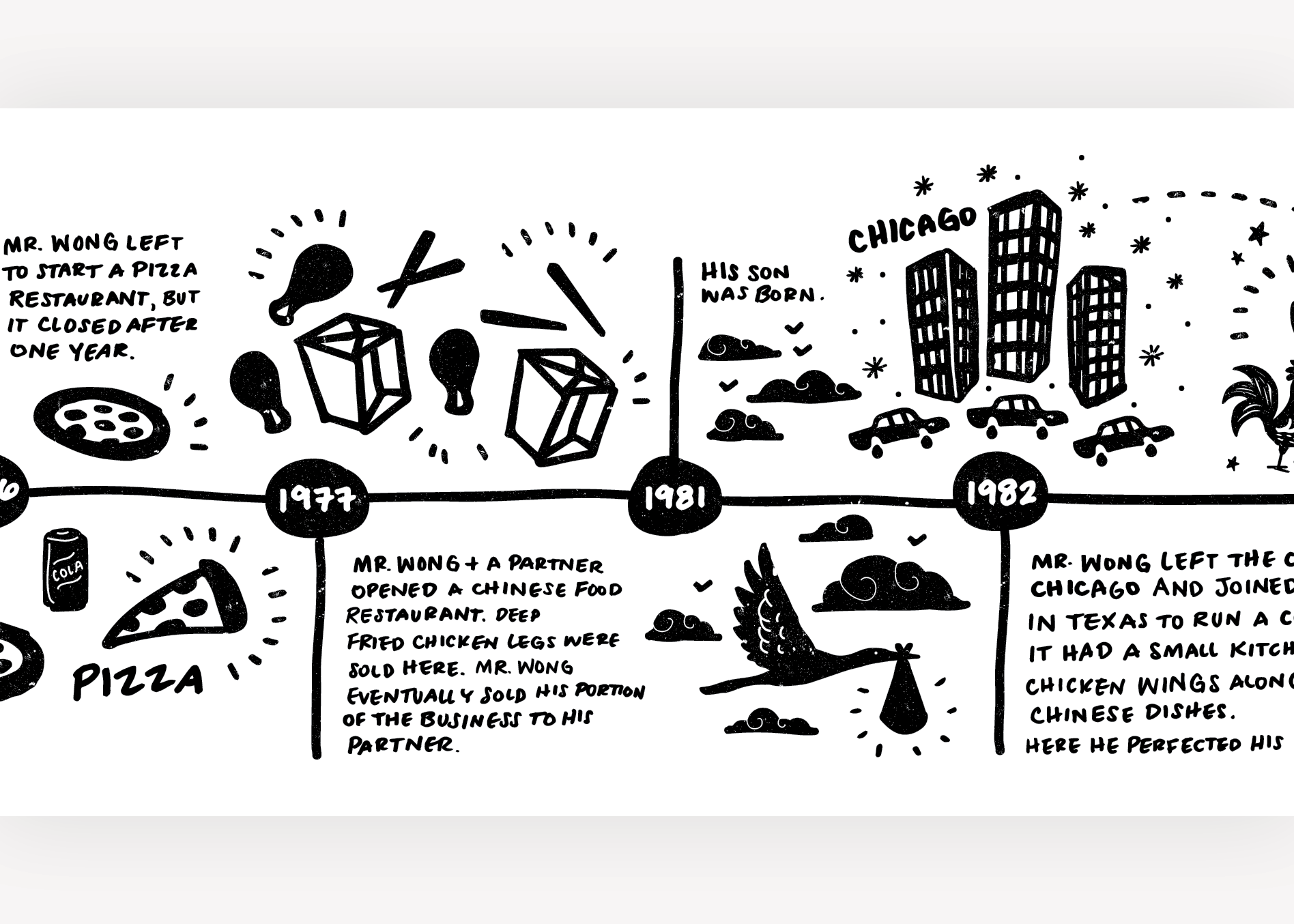
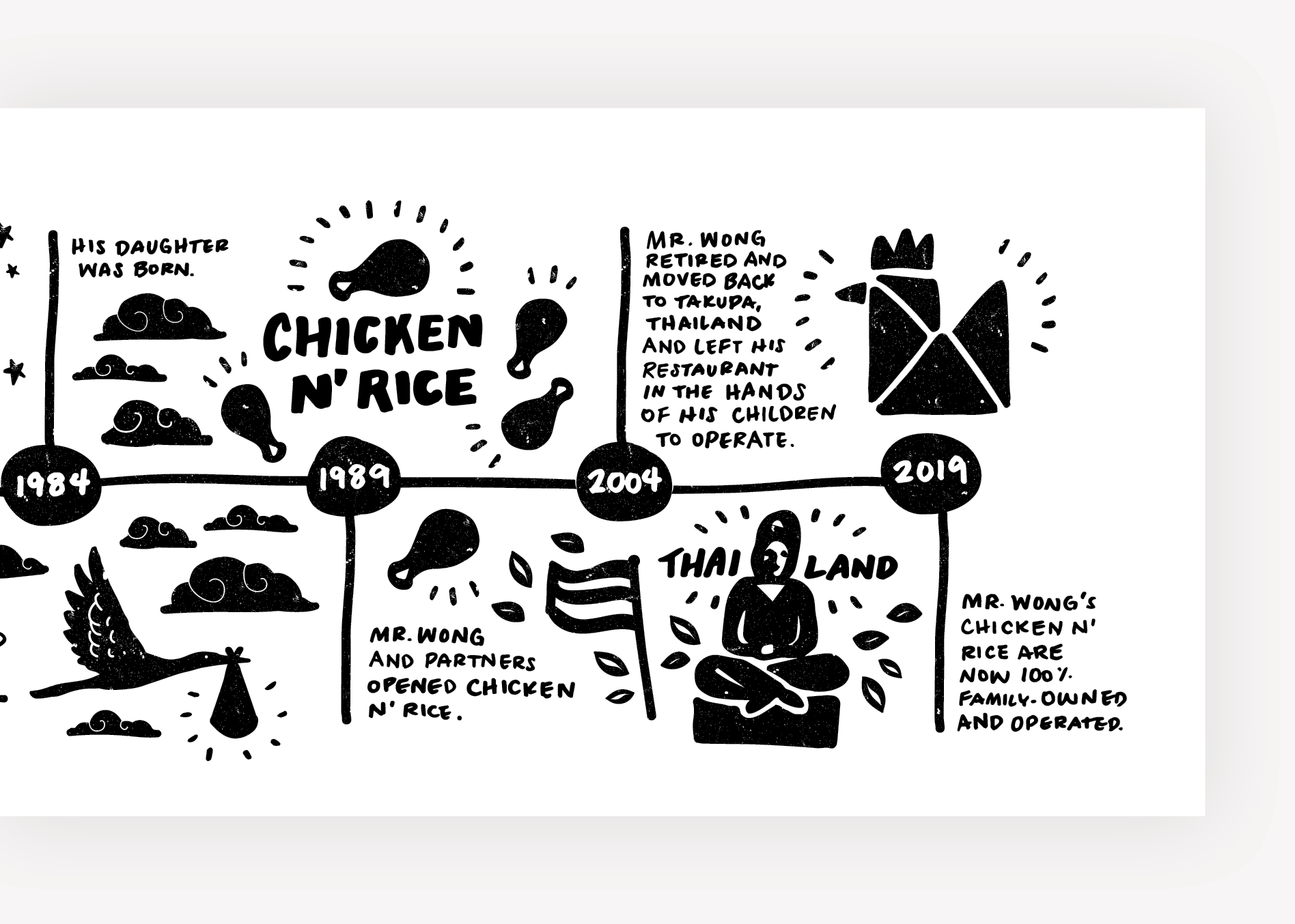
So we flanked one wall with a custom-illustrated timeline that told the story of Mr. Wong and how his influence shaped the fast-casual chicken restaurant.

asian restaurant mural graphic design
asian restaurant mural illustrations
chicken restaurant mural illustrations
chicken wall graphic design

Additionally, we wanted to show off the quality of the food. So, the other wall was reserved for large food images that we captured during our food photography session in Dallas.

While we were in Dallas, we sat inside the restaurant and observed the comings and goings of the customers. Our restaurant branding experts noticed a couple of things. For one, there were three types of customer groups. The first was the take out person or family. They ordered ahead or ordered at the register and grabbed food to go. The second was the lone diner. This person came in alone and ate alone, often keeping their eyes on the tv as they ate. And the third customer group was the family. Families of three or four would order and eat in, talking with one another over the food.

Based on this observation, we created a seating plan that included booth seating for families, and counter seats and hightops for singletons or people waiting for takeout. We kept the middle section wide open for the line.

Below the wall art, the walls were covered in subway tile, which would be easy to wipe down, but decorative in a manner that was still natural and casual. The floors would be polished concrete and the lighting would be a mix of industrial-style pendants and flush-mount fixtures that would introduce black, stainless, and yellow into the design.

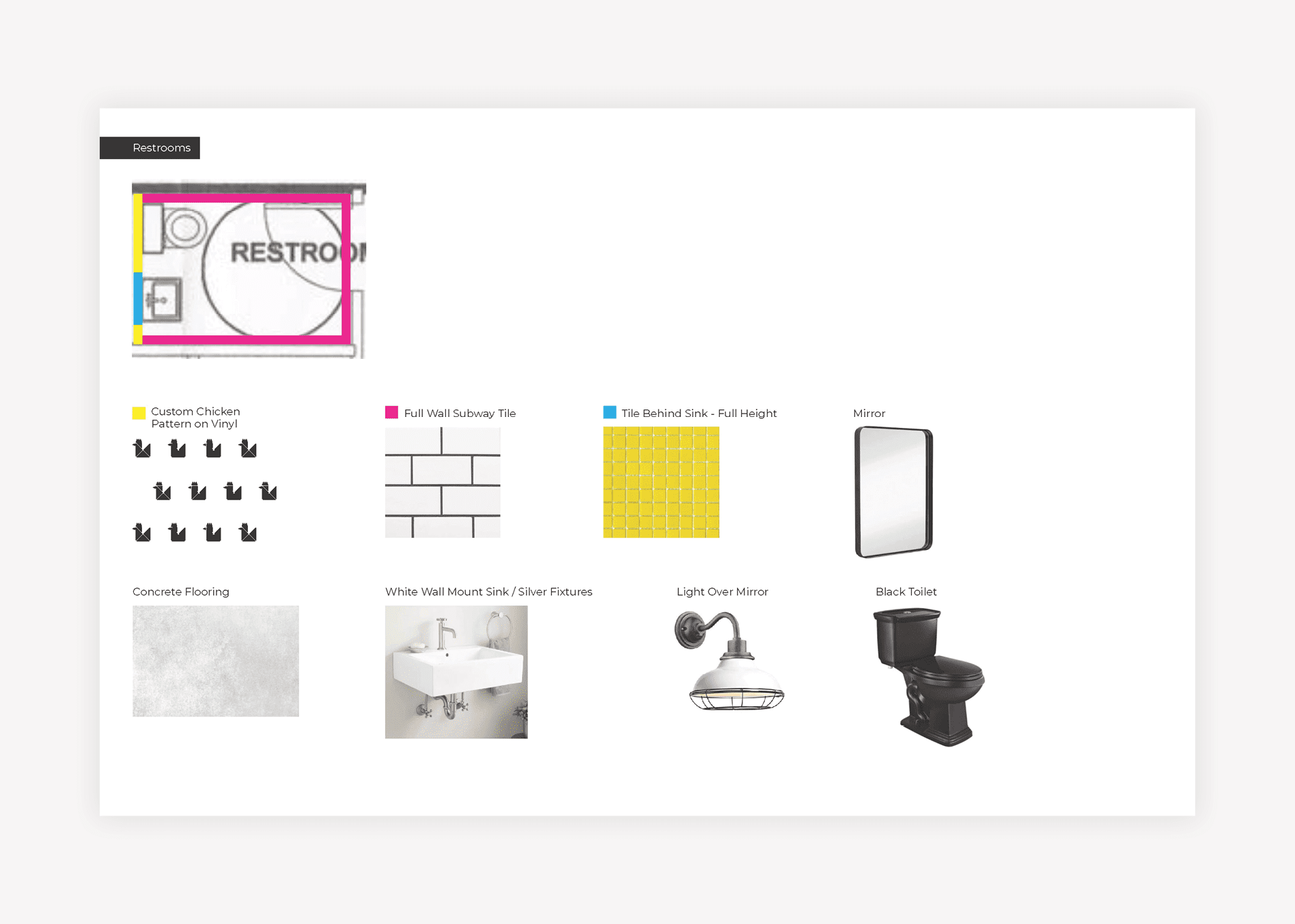
The bathroom was a key touchpoint, as it was a super-small space, but it opened directly into the dining room. So, we proposed a black toilet and a pedestal sink with metal legs and a white basin. One inch by one inch square yellow tiles would extend floor to ceiling above the toilet, and custom wallpaper would cover the space on either side of the tile. The wallpaper would be white, with a pattern created from the brand icon printed in black.

Trash receptacles would be black and the interior doors to the restrooms and back office would be black as well.

Menu + Menu Board Design

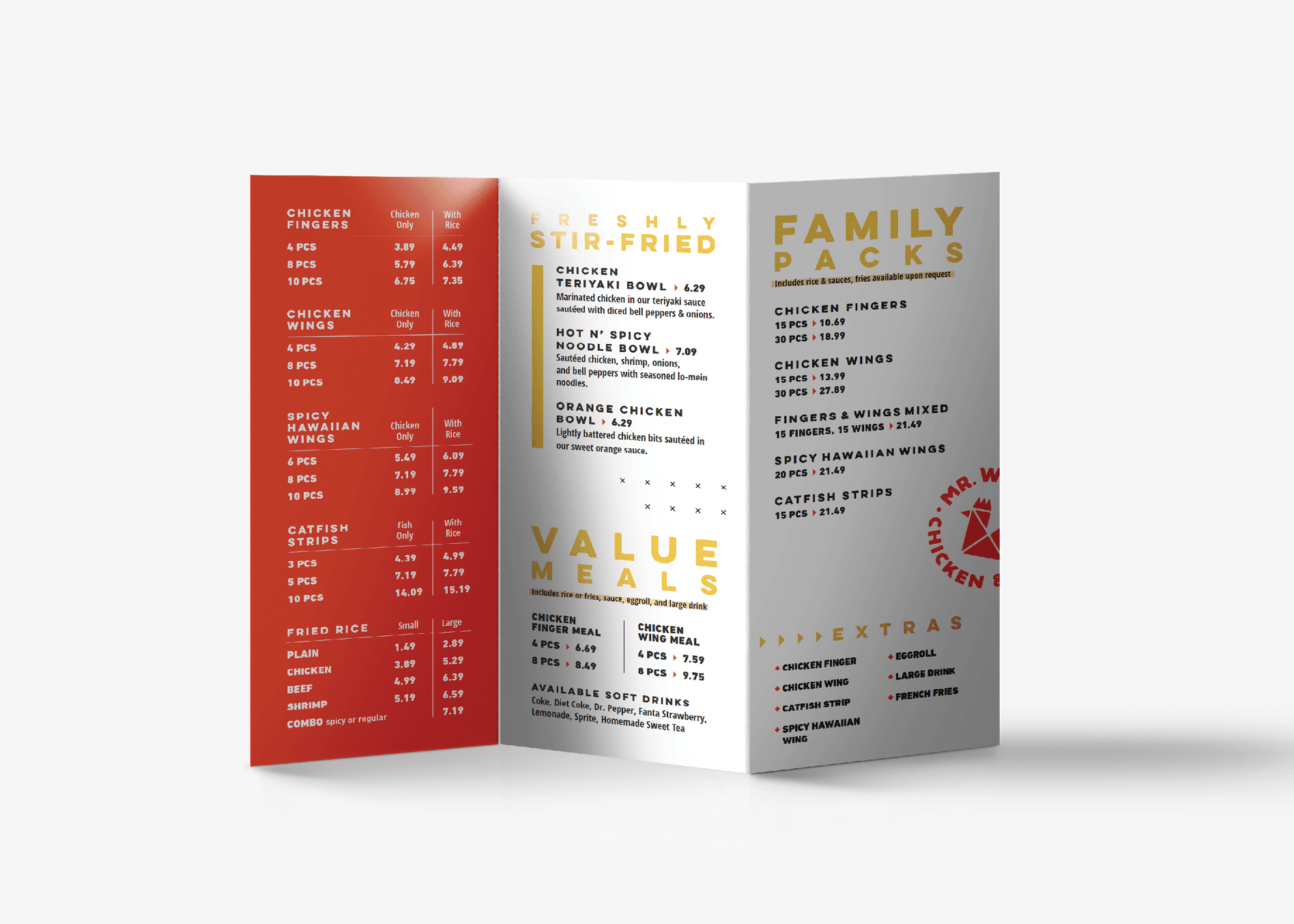
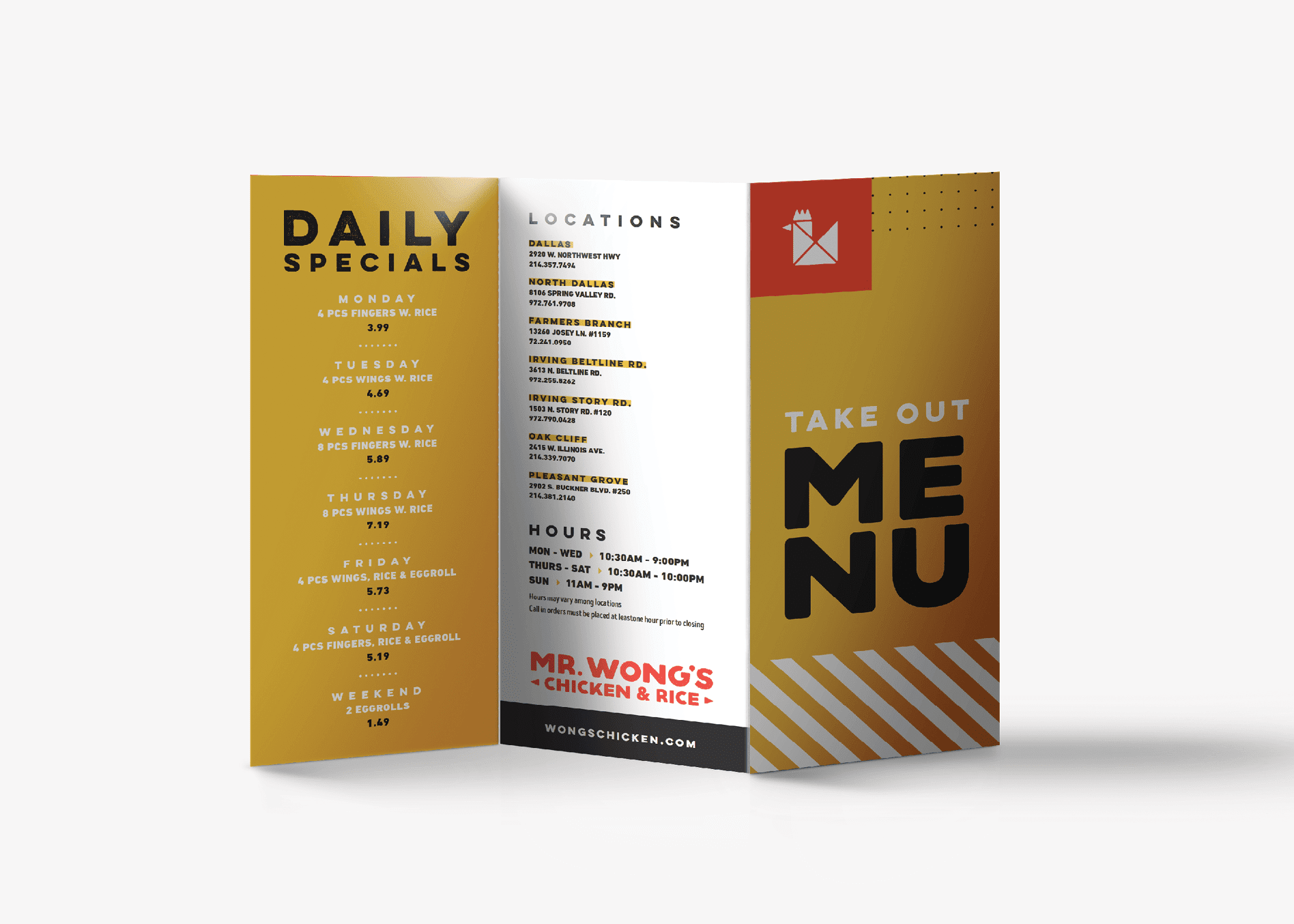
For the dine-in / take out menu, our graphic design team created a trifold measuring 11 inches tall by 8.5 inches wide when laid flat. The trifold allowed us to create a small finished size that would be easy to read inside the restaurant, or put in your pocket to take on the road.

The menu design featured a cover design that instantly connected the viewer with the brand and showed off the stunning food photography. The back of the folded menu included a list of locations. And the inside front flap highlighted the restaurant specials.

When folded out fully, the inside of the menu was split into sections for the main menu meals, fresh stir-fried bowls, family packs, and value bowls. Color blocking was implemented to draw the customer’s eye across the different sections of the menu and to separate the content in a manner that made it easier to read. Imagery was introduced to the menu design to further connect people with the food.

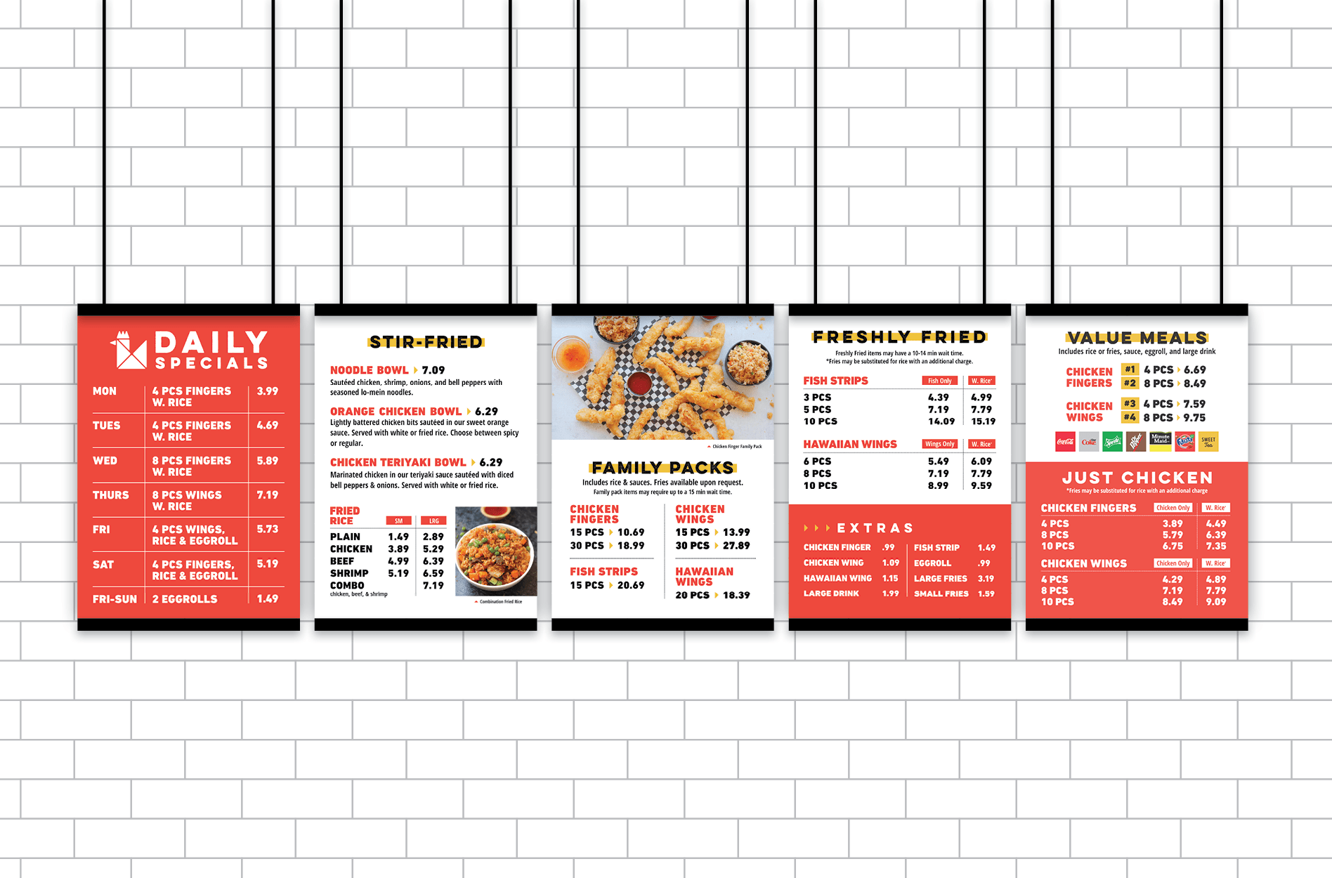
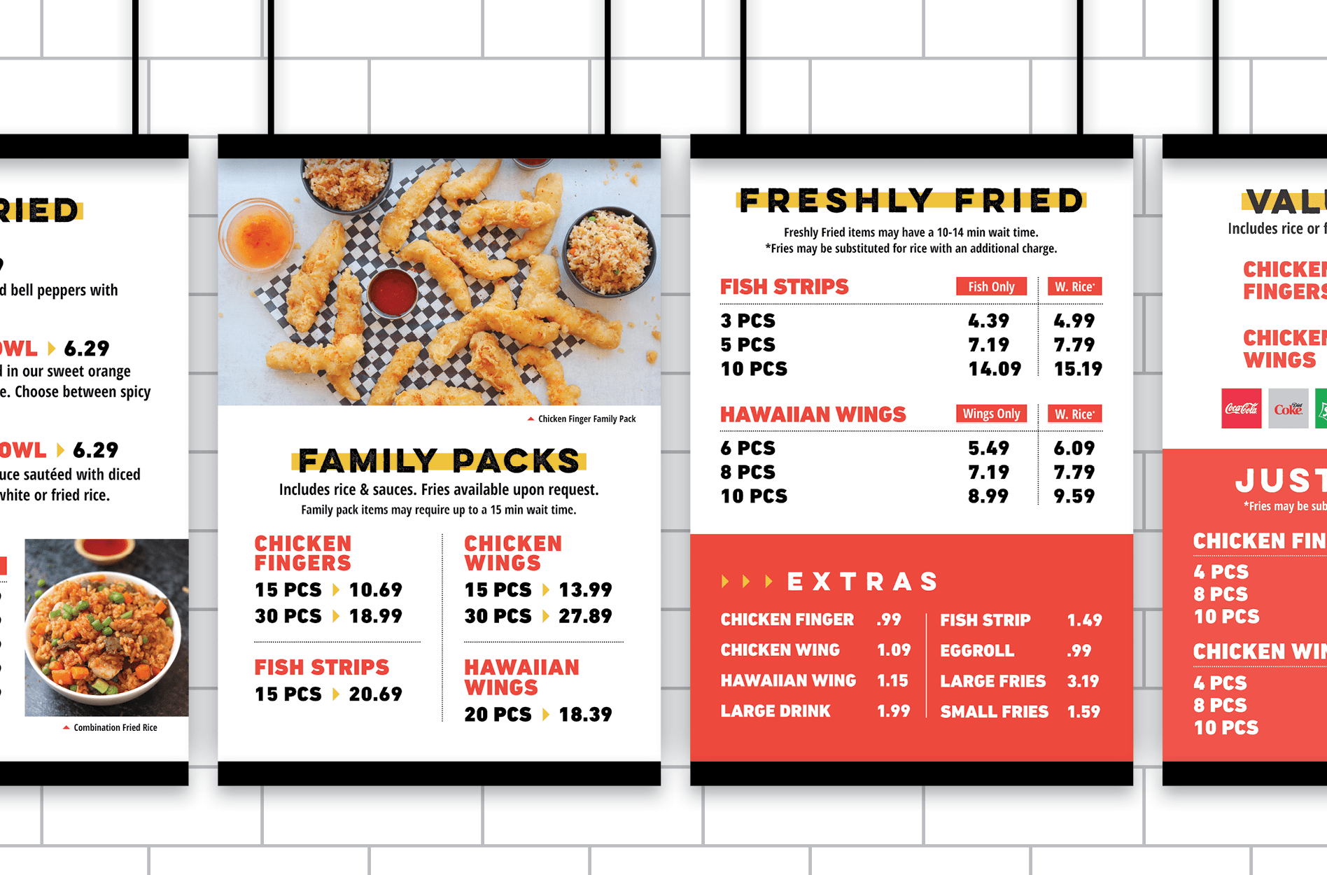
The menu board design consisted of five panels that aligned with the environmental branding and the take out menu design in terms of look and feel. But the menu boards were much simpler in terms of content. This inclusion of simple, easy-to-read text, with ample negative space, would allow customers to read the boards from a distance.

asian restaurant menu graphic design
restaurant to go menu design
Restaurant Menu Board Design & Branding in Nashville, TN
restaurant menu board graphic design
chicken menu boards design

Restaurant Rebrand Business Card

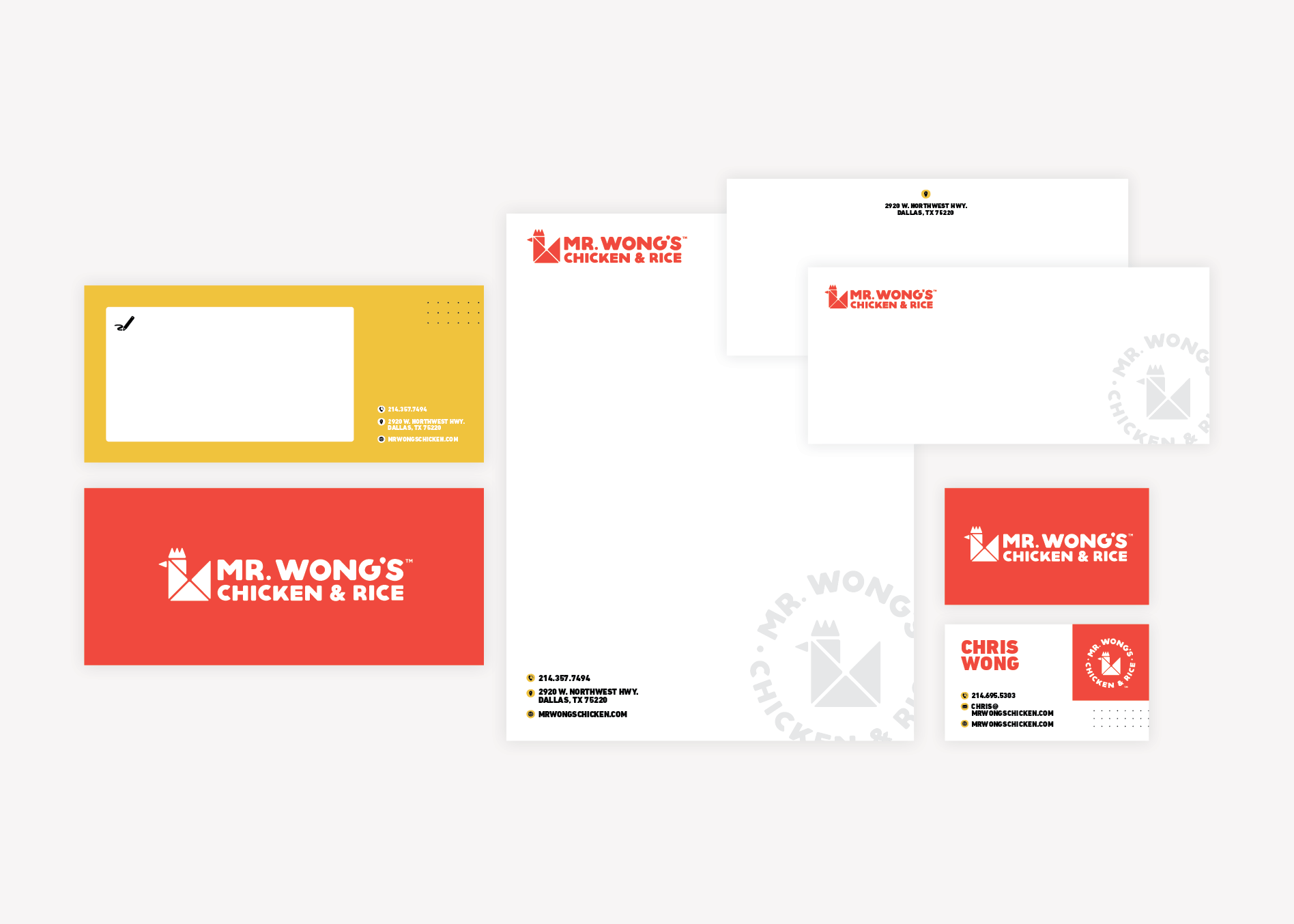
Based on the selected logo, we designed a set of business cards that would put the restaurant rebrand on blast. The new restaurant business cards were designed to convey contact information in a simple manner, while also putting the brand colors and fonts on display. The new logo icon was included to draw interest and keep the card memorable.

restaurant business card graphic design

Stationery Package Development

Additionally, we created a stationery package to align with the selected business card. The stationery package included a letterhead (both print and digital), as well as an envelope design, and a notecard. Our team provided final files to our client, but also equipped them with print prices, should they desire to order from our vendors.

restaurant stationery package design

Website Wireframe

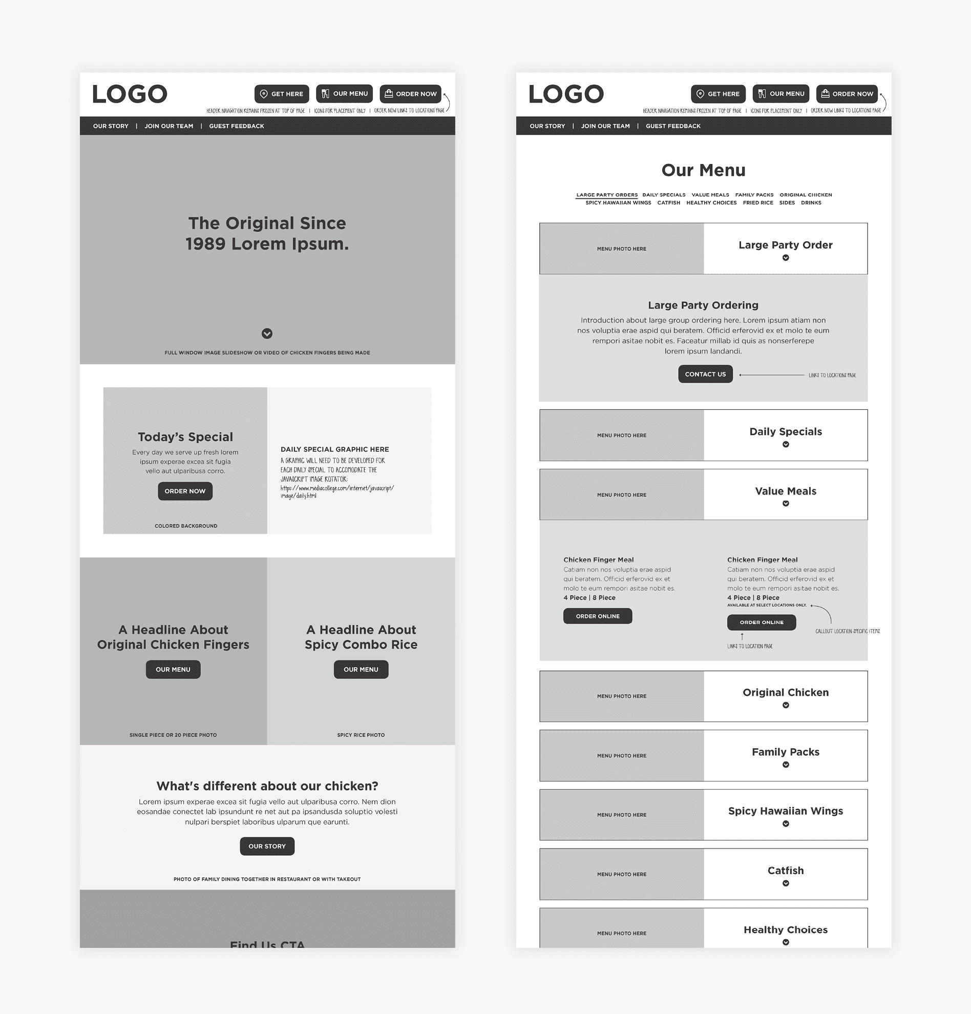
With the sitemap and hosting sorted out, we moved into the real work of website design: the website wireframe. Website wireframing is where all of the strategy work is done. It’s during this process that we determine the goal for users who land on the website, and how we are going to call them to action to achieve that goal.

During the website wireframe phase, we worked with our clients to learn that their ultimate goal for users on the website was to get them to view the menu or find the closest location.

Additionally, they had a rewards club and a pretty extensive system for garnering reviews and feedback from clients.

We worked through the website wireframe, giving proper attention to the locations page and the menu. Additionally, we created several contact forms within the website to collect reviews, feedback, customer information for rewards, and contact information and messages from customers. Finally, there were job applications within the restaurant website that would need to be distinct for the front of the house and back of house applicants.

The entire website would be translated in both English and Spanish, so we addressed the translation functionality as well.

The content was created for the website wireframe to include on-brand headlines, subheads, and calls-to-action. This content would aid our client in reviewing the wireframe and navigating through the PDF to determine how the user would journey through the new restaurant website.

We walked our client through the website wireframe and made a round of revisions to the website wireframes before finalizing and moving into website design.

restaurant wireframe graphic design

Website Design

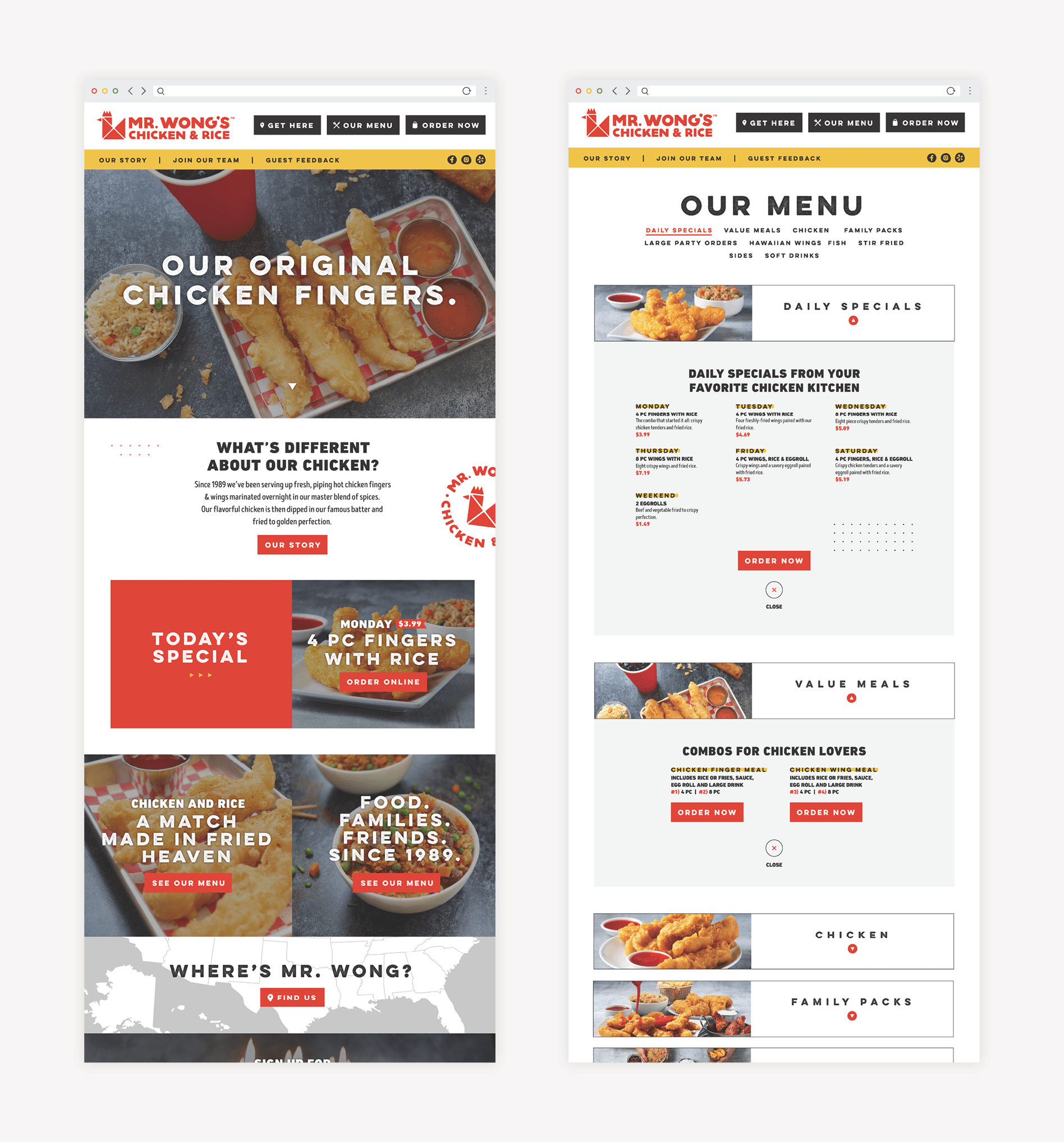
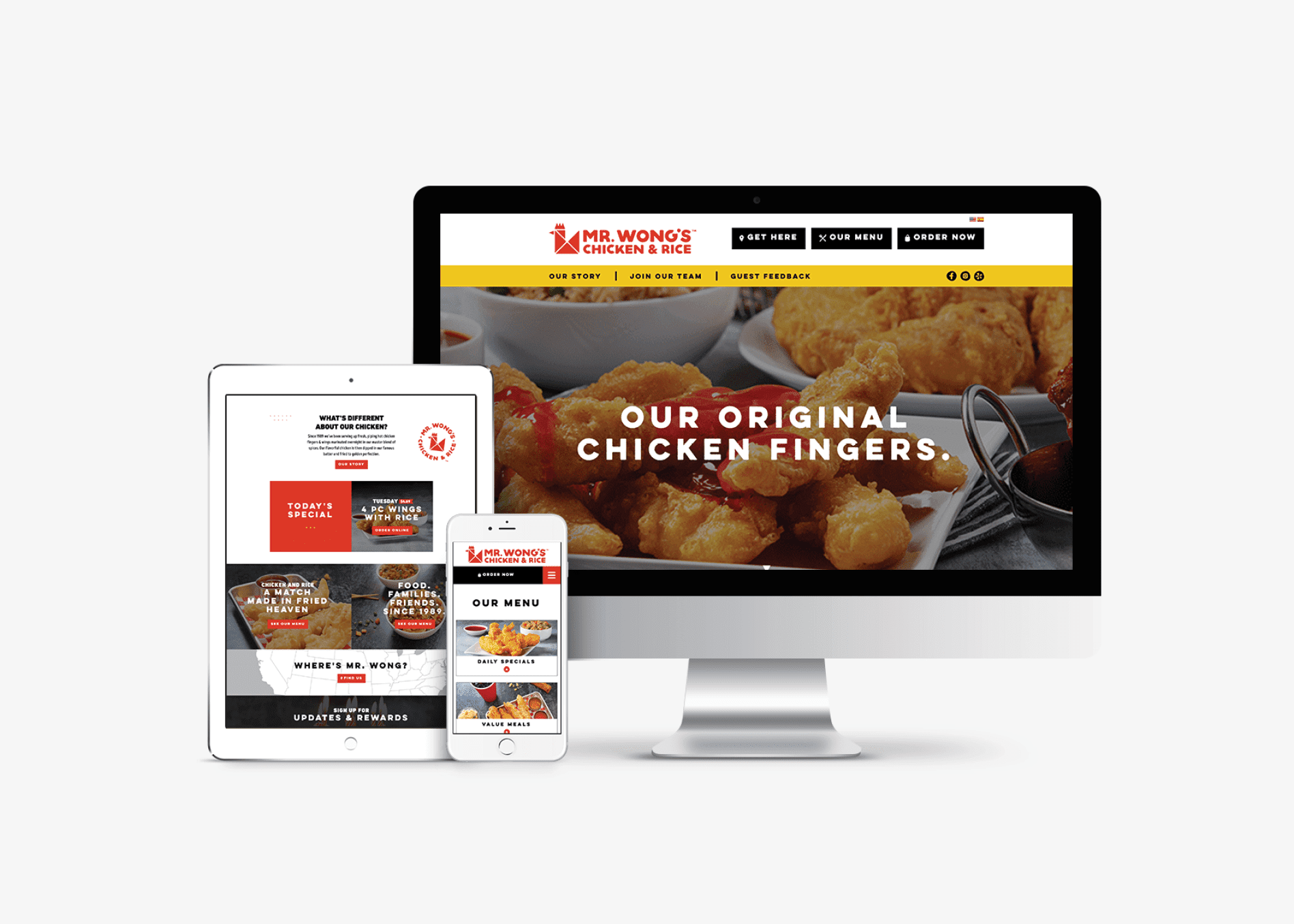
With the wireframe finalized, we moved into website design. Here, we implemented brand colors, fonts, copy, and food photography into the wireframe to bring it to life visually.

The resulting restaurant website design put food photos on par with compelling content that told the story of why Mr. Wong’s was different, and what you could expect from the restaurant.

restaurant responsive web design

Restaurant Rebrand Website Development

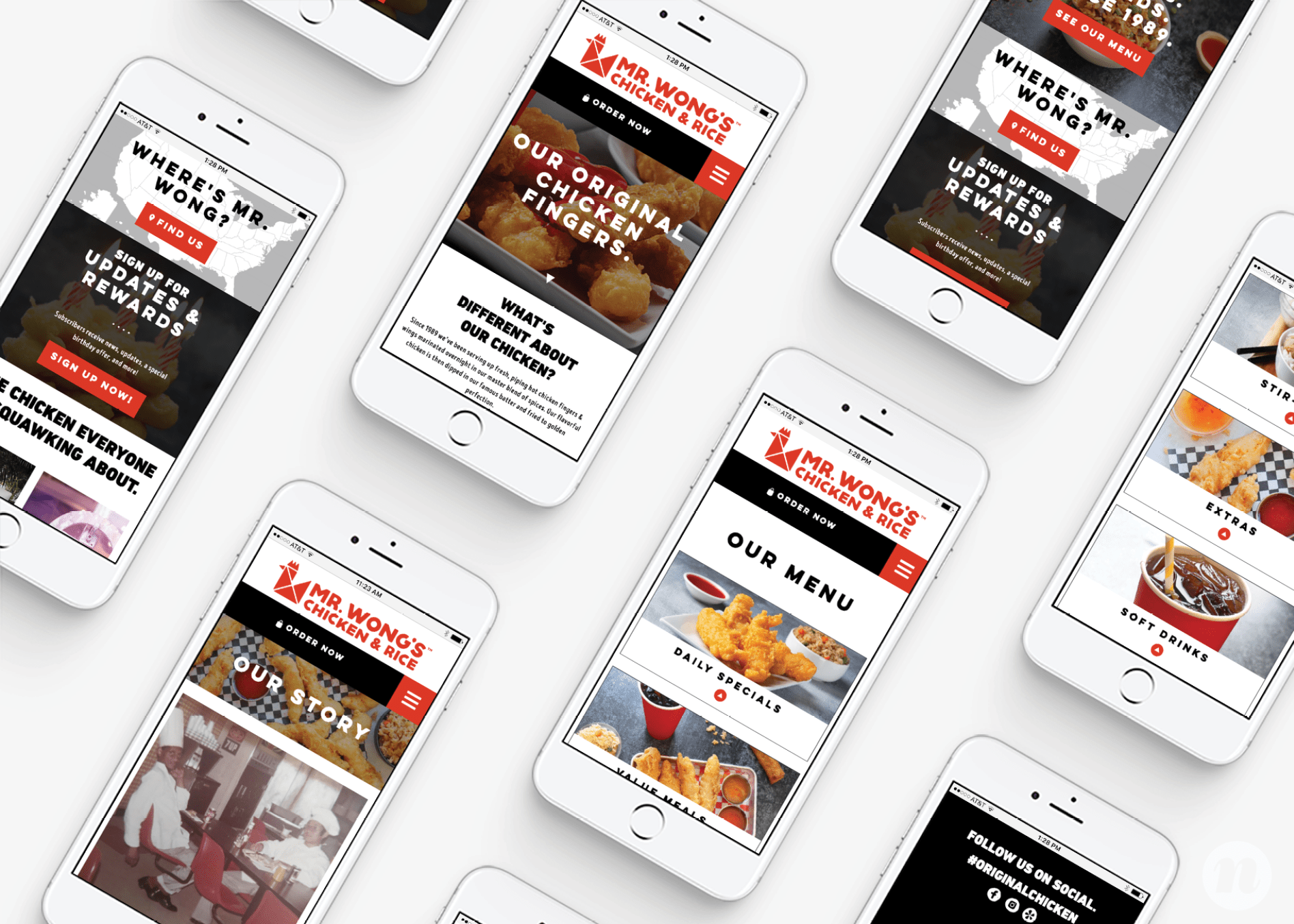
We developed the restaurant website from a mobile-first perspective, respectful of the knowledge that over half of traffic would come from a mobile device. The website for Mr. Wong’s was constructed on WordPress, which is our content management system (or CMS for those in-the-know, which now includes you) of choice. Custom WordPress websites provide us the flexibility to build the website exactly to specs. But they also provide our clients with a content management system that’s easy to update themselves, which is key.

Additionally, we implemented a translation feature, that allowed the new website to be translated from English and Spanish and back with the click of a mouse (or tap of a finger on mobile).

Finally, the new restaurant website underwent ADA accessibility auditing and remediation to ensure compliance with accessibility requirements.

restaurant web design
restaurant mobile web design

Website Launch

Finally, when the new restaurant website was complete, our agency team put it through a pre-launch closeout process. This process includes the testing of all buttons, forms, and pages on both mobile and desktop to ensure proper functionality and appearance.

With the testing complete, we packaged the site files and the ADA audit and passed it over to our client’s ongoing marketing agency for migration.

Restaurant Rebrand Project Closeout

This restaurant rebrand project allowed us to exercise our strategic and creative minds. Not only did we create a bold brand that would allow the restaurant to leverage its legacy, but we also worked through the strategic implementation of the brand’s story through several mediums.

Are you squawking for a bold brand of your own? We would love to talk to you.

are you ready to create something nice?