The Greyson

The Greyson cover image for case study completed by our Nashville Branding Agency

The Greyson is an upscale sports bar that offers a diverse selection of food, drinks, and entertainment. In order to create a large, diverse menu, they worked with chefs to ensure plenty of options.

The client’s main goal was to create a place that was a league above the other sports bars in their area while also reflecting their family friendly atmosphere. We were excited to create their Prime Branding Package with a modern, elevated-industrial look and feel.

Restaurant branding logos used on merchandise

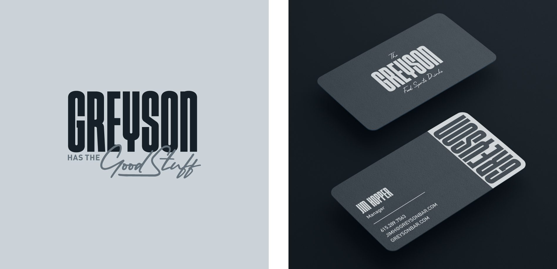
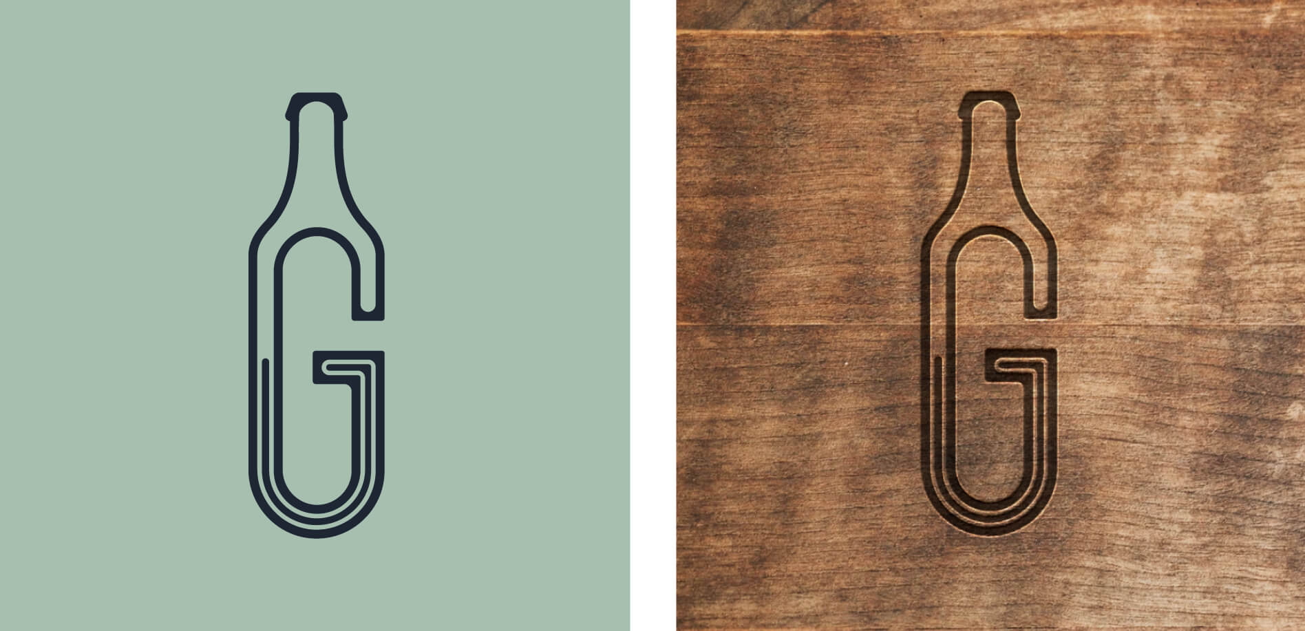
Project Kickoff: Restaurant Branding

As with every restaurant or cafe brand design process, we first begin with discovery activities to get our team acquainted with our client. In order to begin to deliver another amazing brand under a Restaurant Branding Package, we first ask our clients to participate in a project kickoff call. This provides us with essential background information. Our strategists study the information and our notes from previous sales meetings before we begin the brainstorming process. For The Greyson, our Prime Branding Package included two unique brand boards, two unique logo designs, and a website to complement the chosen brand direction.

Design Direction Brainstorm

The owners wanted to create a space that they would enjoy bringing their families and friends to which is not something present in their local market of sports bars. Their focus on quality food is another key factor that they wanted to highlight as it drastically separates them from their competitors.

Additionally, they wanted both concepts to be modern, with one focused on a more industrial look and feel, while the other was a bit more trendy. In creating these concepts, we focused on making it inviting to potential customers in the 21-50 year old demographic, and feel like a comfortable place to hang out to watch sports and eat and drink.

First Brand Concept Development

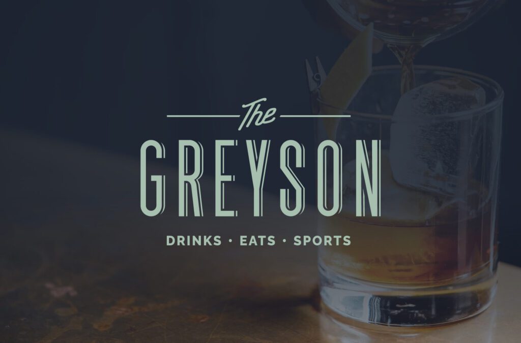
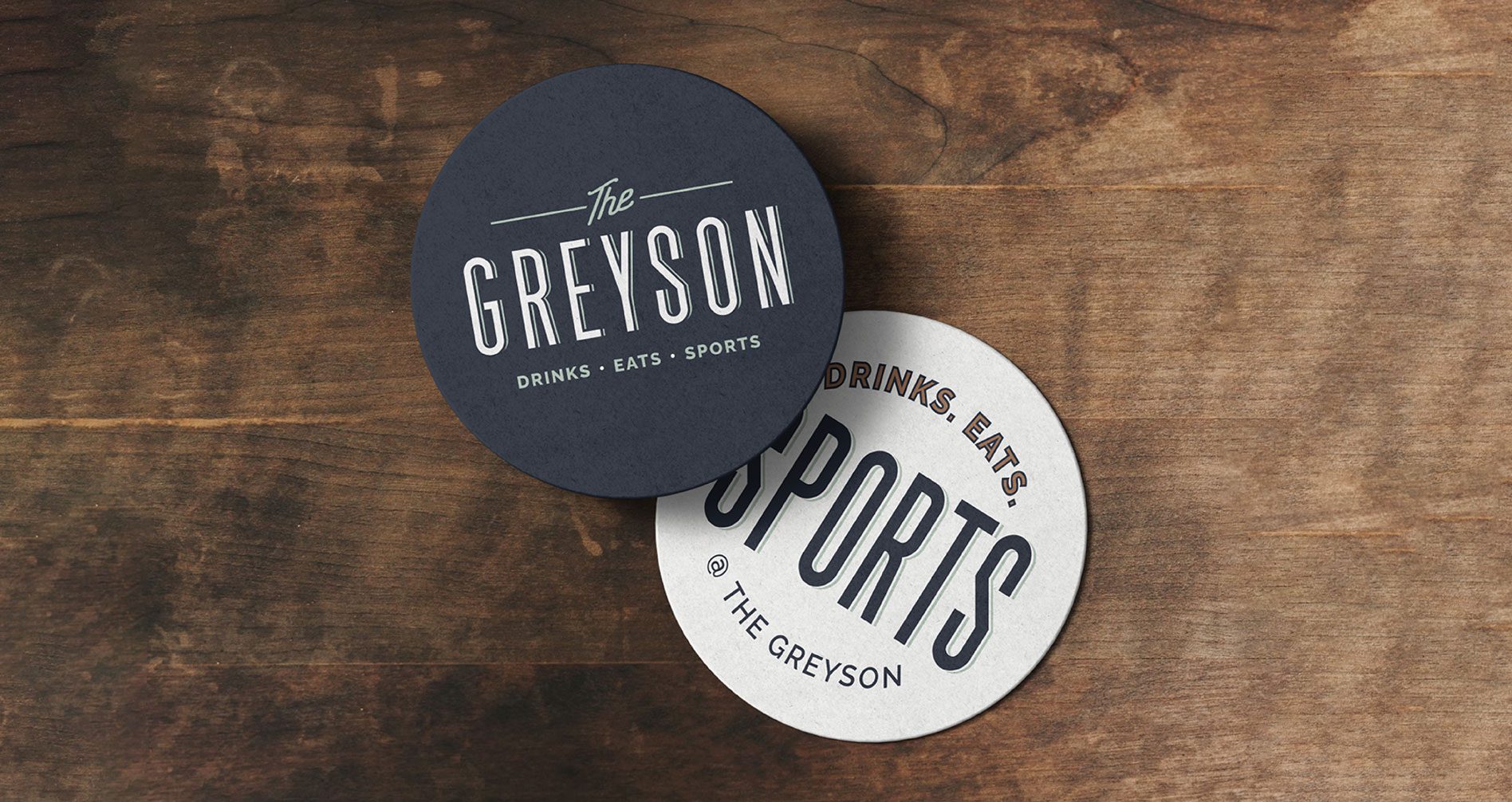
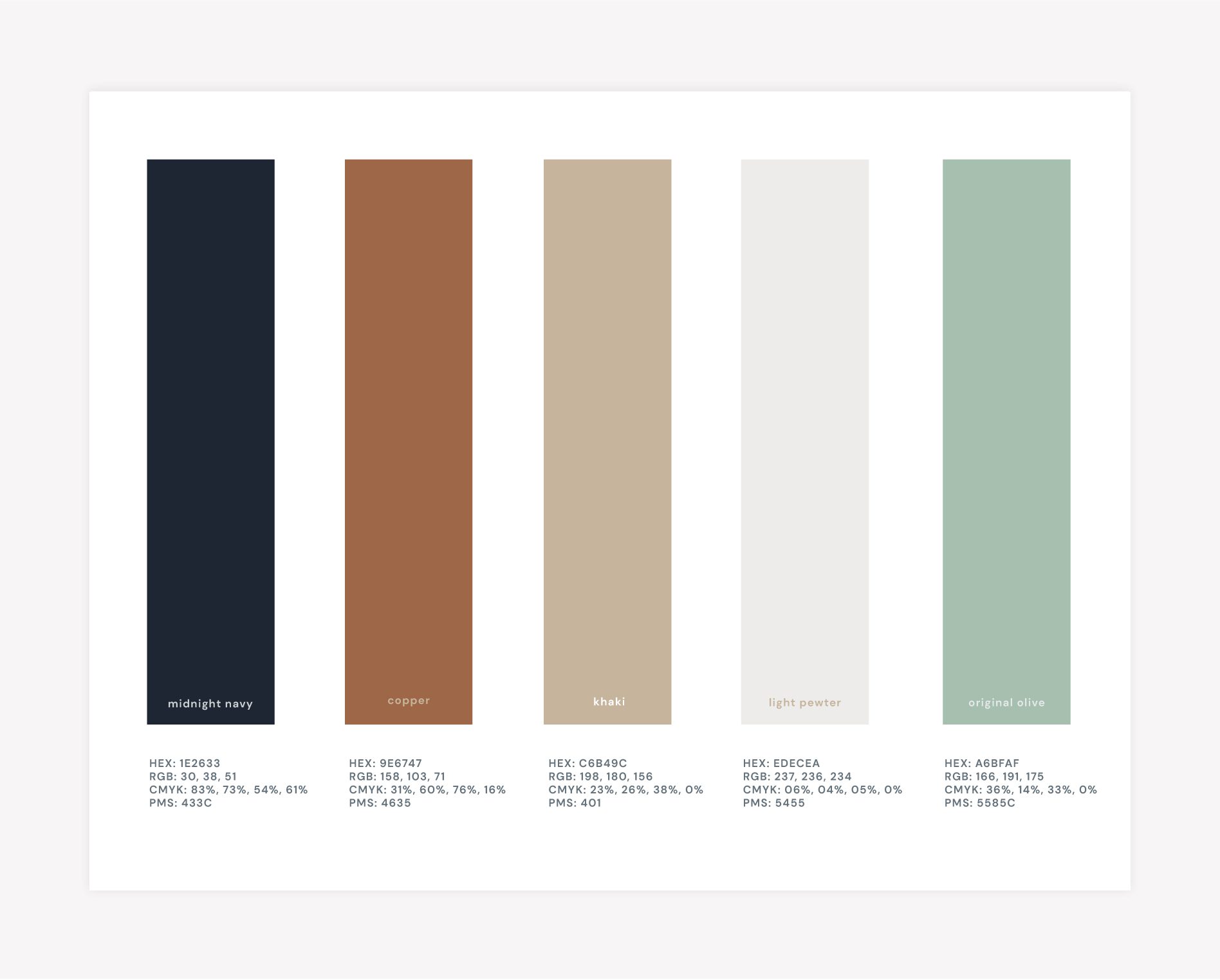
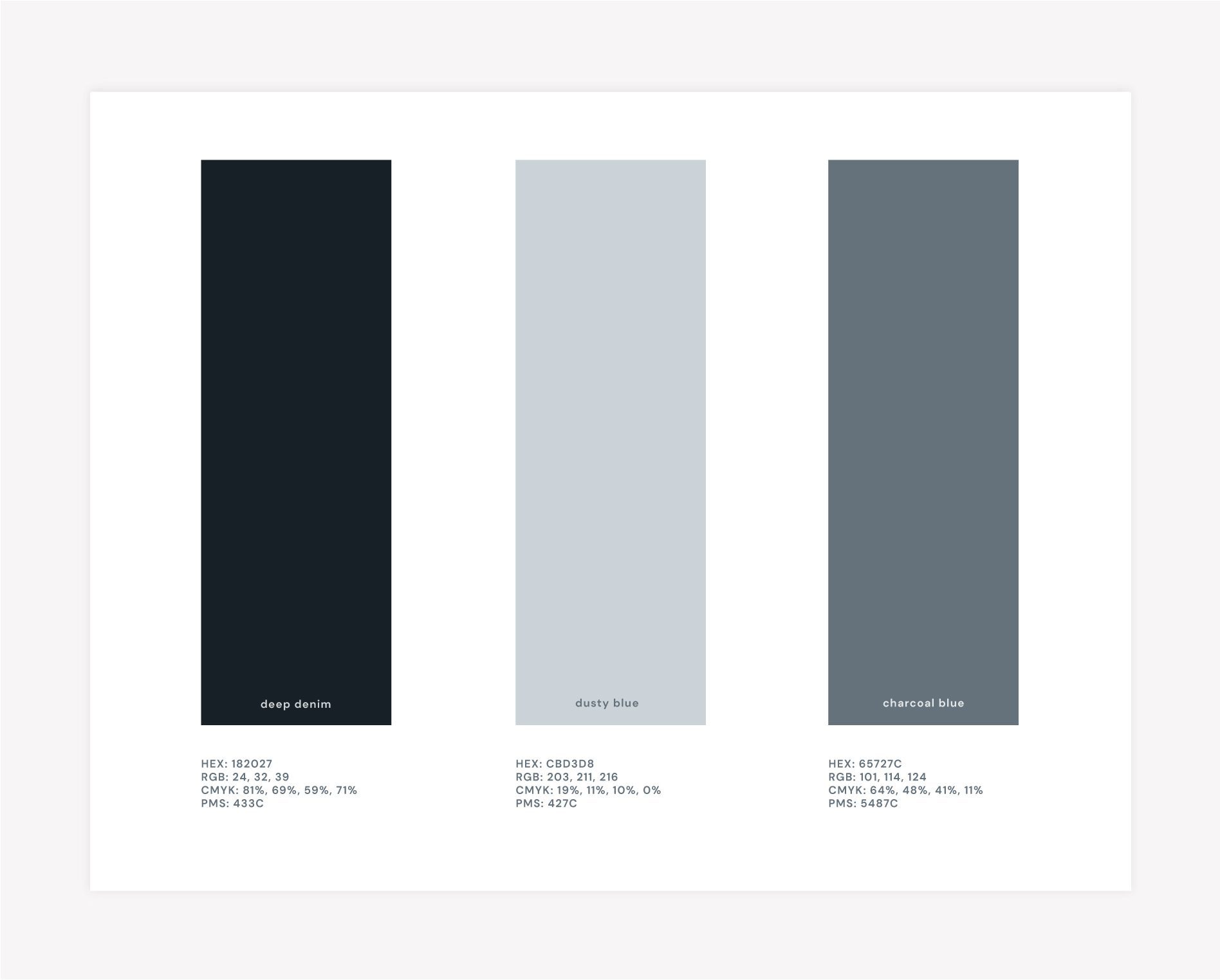
The first restaurant brand direction that we presented explores a range of colors that compliment a moody, industrial space with a more contemporary feel overall. It focuses on the concrete, wood, rust and exposed infrastructure of the building while accents of navy and green bring out the surrounding area. The textures feel cozy and familiar without feeling worn-out.
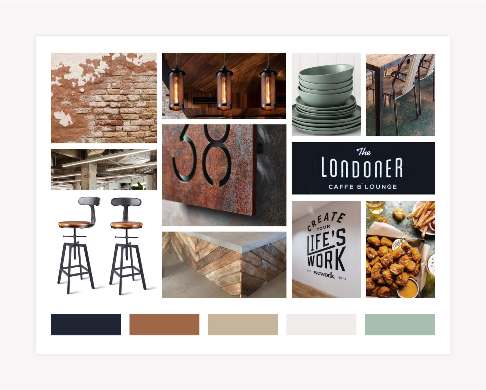
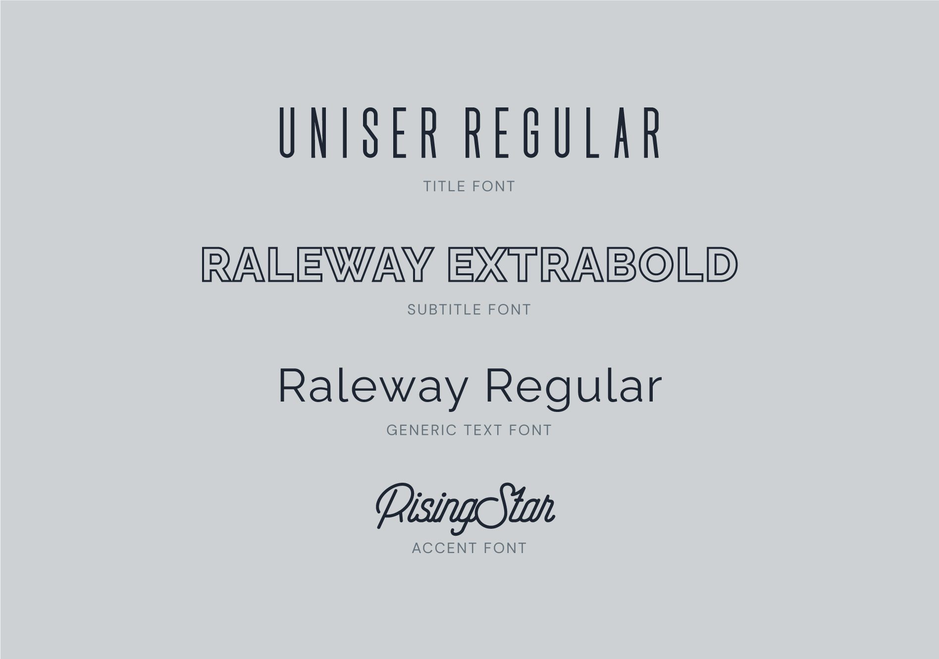
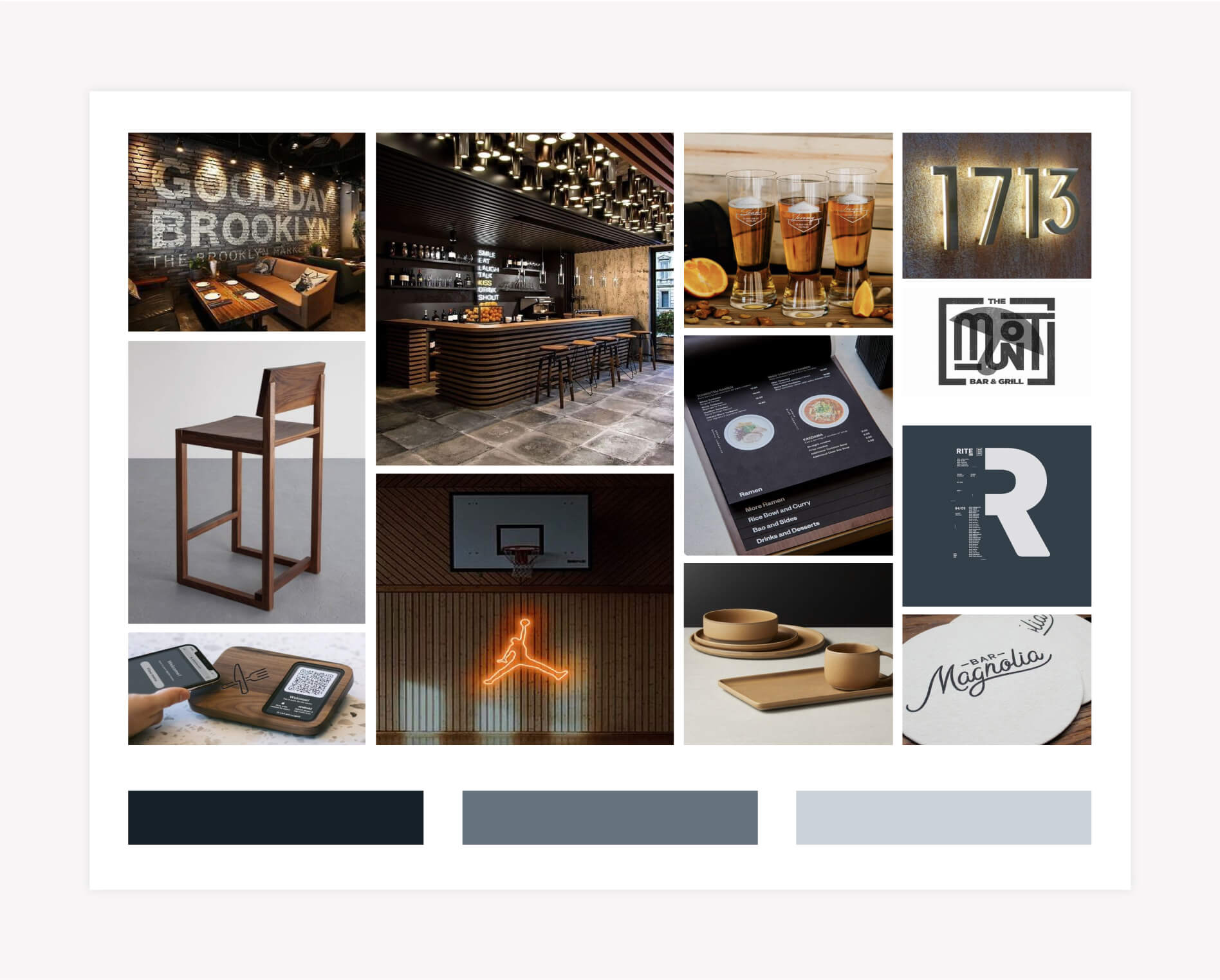
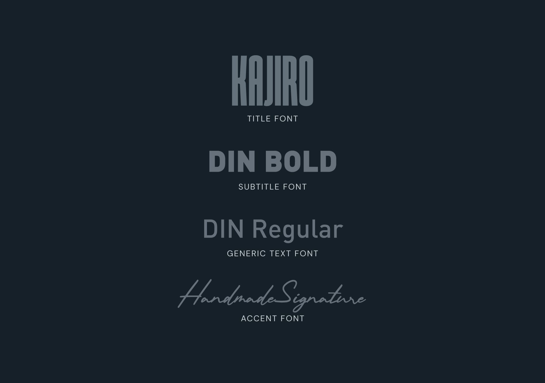
First Mood Board

As part of our Prime Branding Package, we developed a mood board that showcases six images to convey the overall artistry of the restaurant brand design. For The Greyson, our experts pulled from a variety of images that convey the look and feel of their new design.

Our mood board for this concert features imagery and typography that is reflected in the rest of the brand. Our imagery pulls from the overall experience and color palette that customers will experience in their restaurant. The brick interior and seating images reflect the more industrial feeling while the lighting and dishware showcase a more modern feel. We enjoyed playing with various elements that will help them stand out from what people think when they imagine a sports bar. Our branding experts created this concept while keeping their demographic in mind and creating a welcoming, family-friendly atmosphere.

Mood board used to help with restaurant branding

Logo Concept One

For our first concept, our branding experts created a logo that uses their accent colors and highlights their three main focuses – drinks, food, and watching sports.

The Greyson cover for case study provided by Nashville Branding Experts

Colors

The colors we selected help set them apart from competitors by focusing on neutral tones that reflect both their atmosphere and environment. We started by using midnight navy to integrate a darker tone while staying away from black to create a more interesting contact with our light pewter, that we used instead of a pure white. Next, we choose copper which reflects industrial elements while original olive draws from the natural environment.

Range of colors used by Nashville Branding Experts

Brand Fonts

The fonts we selected capture the restaurant’s modern atmosphere. The Uniser Regular font reflects their contemporary feeling while the subtitle font, Raleway Extrabold, is a unique and playful san serifs font.

List of fonts for The Greyson business branding

Supporting Brand Icons

Restaurant logos appear in a wide variety of places from coasters and napkins to menus and signage. To expand on The Greyson’s brand we created supporting brand icons that have distinct illustrations.

The Greyson Restaurant Branding and Web Design in Nashville, TN
Logos - The Greyson Restaurant Branding and Web Design in Nashville, TN

Second Brand Concept Development

The second restaurant brand concept focuses on a dark and moody feeling. This brand’s direction focuses more on the upscale nightlife feeling that sets them apart from competitors.

Mood Board

In regards to the design aspect, our team incorporated elements in a mood board that can be used throughout their branding assets and interior selections.

Mood board for The Greyson restaurant branding and website design

Logo Concept Two

For the main logo for brand concept two, we chose the Kajiro title font and the Handmade Signature accent font which combine a bold yet inviting feeling. Both of the main logos our team developed easily translate to exterior signage for our client.

Case Study Image for The Greyson - Nashville Restaurant Branding Services

Design Colors

The three brand colors we chose for this color palette are all shades of blue. We choose this as in color psychology, blue is largely associated with communicating trust, loyalty, and cleanliness. The darkest tone we selected is deep denim with dusty blue as the lightest color and charcoal blue as our middle tone.

Colors used for restaurant branding project in Nashville, TN

Brand Fonts

For The Greyson’s second brand direction, we wanted to use typography that again, captures the restaurant’s modern atmosphere. We liked the way the Kajiro font stands out in any circumstance while the cursive styling of the Rising Star font gives it a handwritten feeling.

Fonts used for restaurant branding project in Nashville, TN

Supporting Icons

To give The Greyson’s brand weight, our branding experts created supporting imagery, focusing on different aspects of their brand and messaging. That’s why we created designs that use the “food, sports, drinks,” tagline while others use “bar & grill” or “has the good stuff”. One of our variations uses “drinks, eats, sports” with sports as the main focus to draw attention back to them being a sports bar.

Greyson Case Study - Design Logo
Case Study Image for The Greyson - Restaurant Branding Experts in Nashville, TN

Presentation Excerpts and Selected Brand Direction

The Nice Branding Agency’s team of seasoned professionals unveiled two restaurant brand design possibilities to The Greyson. In this presentation, we guided our client through each concept, explaining the reasoning and strategy behind our choices and methodologies.

Ultimately, they chose the first brand direction, and after a couple of small tweaks, ended up with the final version shown below!

The Greyson Case Study from Branding Experts in Nashville, TN
The Greyson Icons for Branding Case Study Nashville, TN
The Greyson - Restaurant Branding Logos Nashville, TN

Website Design

Following along with the selected brand direction, our team created the website design for The Greyson, shown below. Click here to view the entire website design.

Greyson - Nashville Restaurant Web Design and Branding

Ready for a Nice Restaurant Brand Design

Craving a unique brand image for your Restaurant? Give us a shout at (615) 905-9936 or send us a message and our team of professionals will contact you for a quote!

are you ready to create something nice?