Restaurant Branding Review: Grilled Cheeserie, Nashville, Tennessee
Today I'm taking a deep dive into a restaurant branding review for Grilled Cheeserie, a Nashville food truck turned brick-and-mortar. For starters, I want to be clear that this review covers the way the Grilled Cheeserie brand was woven throughout their interior.
Restaurant Branding Review | The Exterior
Grilled Cheeserie set up shop in the Hillsboro Village neighborhood of Nashville after its time as a food truck. The first win of their exterior was the floor-to-ceiling window. We love bar height seating near windows, which has a great way of giving a big city feel to restaurant branding.
The white vinyl macaroni pattern on the windows bring an illustrative, kiddie, hand-drawn vibe to the exterior, furthered by a sans serif, half diner, half century/gotham font style. More on that later.
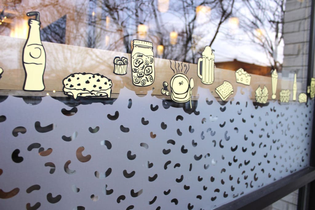
Clearly a lot of thought was put into this restaurant branding exterior, but it throws me off a little because, well, this is a grilled cheese sandwich shop, not a macaroni shop.
Given, there are macaroni noodles on one of their sandwiches... but only one sandwich. And those noodles are not the same noodles that are everywhere throughout the Grilled Cheeserie environment. That's a missed detail in our book.
We really like the vertical, black and white striping detail on the exterior. It's a nice touch because the stripes were a feature of the truck that made The Grilled Cheeserie famous. However, we wish they would have used them to create an awning, which would have given a stronger nod to their food truck days.
Restaurant Branding Review | The Interior
One of our favorite parts of the interior was the custom neon sign. Neon signs are all the rage for Nashville restaurants. This is a great focal point for the wall behind the register.

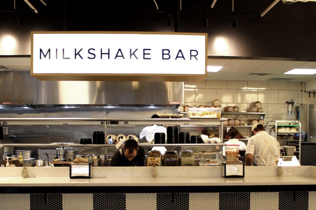
Similarly, another highlight is the milkshake bar. This looks so good. The hexagon tiles and black vertical stripes are really nice details that bring out the old school vibe of the brand. The lighted sign and stools bring a vintage style to the interior that we love. Sadly, though, the giant "milkshakes" sign is a little confusing... because this isn't a milkshake bar. It's a grilled cheese spot... with a huge milkshake sign.
The next-most noticeable thing is the retail area. We like the homemade vibe of the display, but overall we felt there is a disconnect with some of the retail. We see this with restaurants all the time. Our suggestion is that unless your restaurant is a major tourist destination, people aren't really going to feel very inclined to rep your logo on a hat or a shirt.
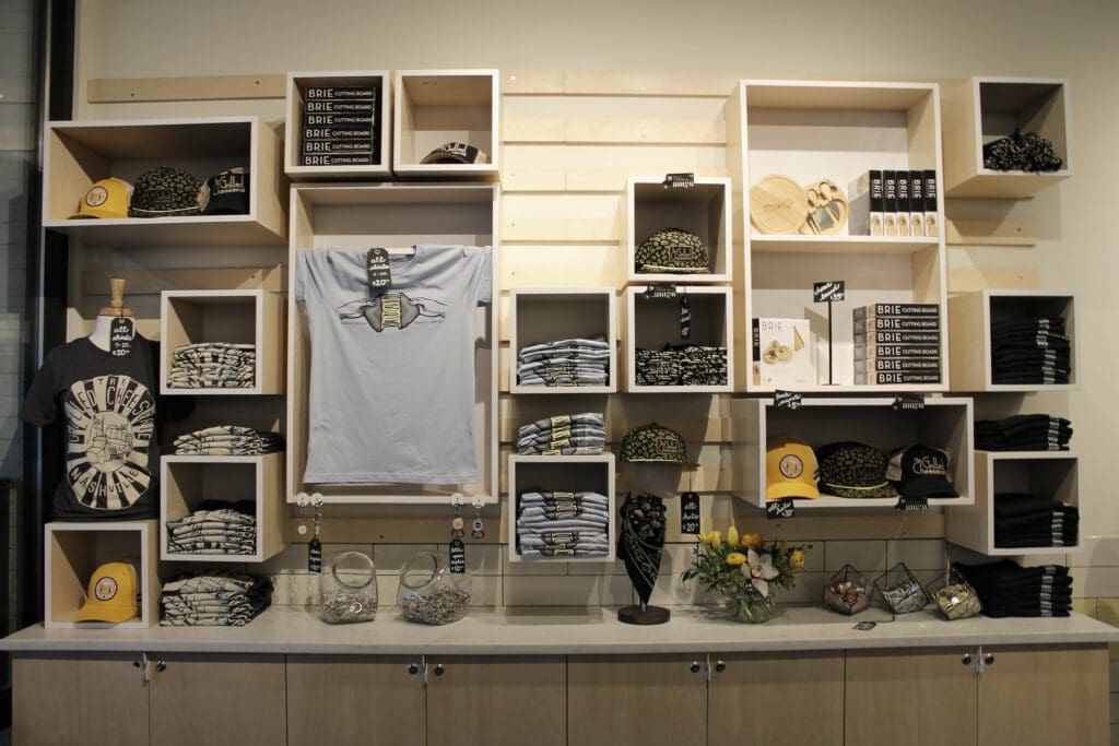
You have to sell them on your brand before you can sell them on your retail.
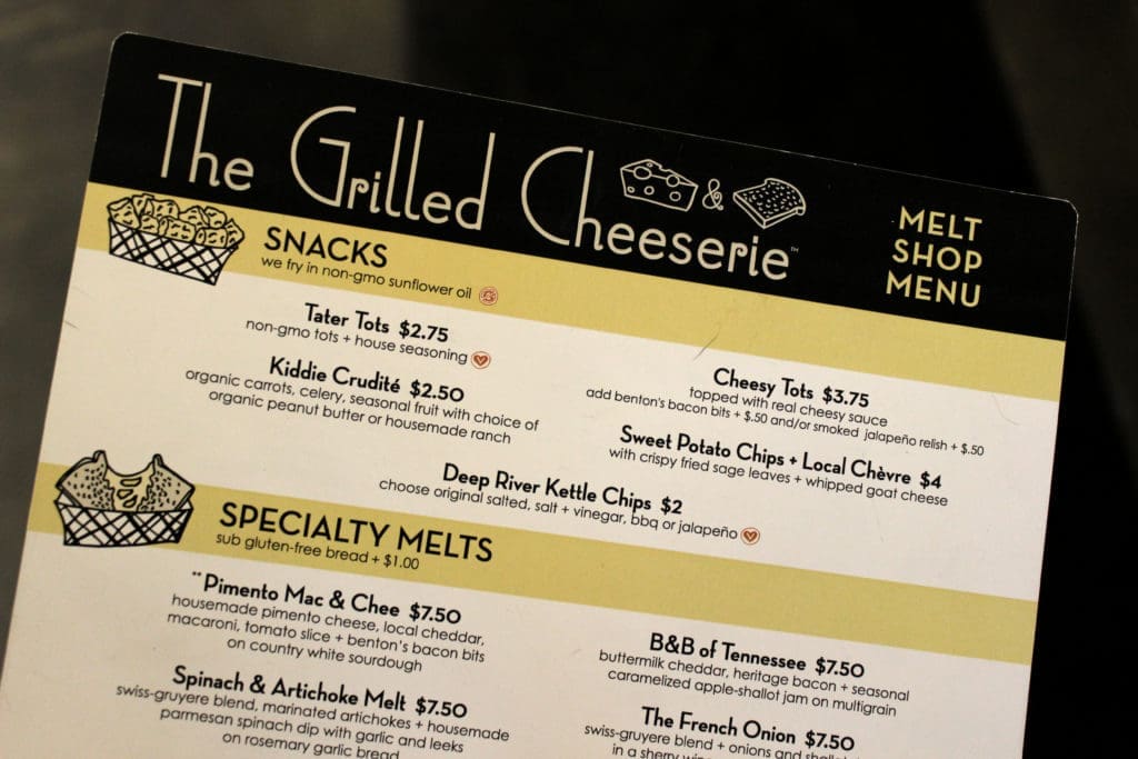
Okay, now we're getting hungry. The next thing we see if the wooden menu holder with handheld menus inside. We're a little disappointed that their menu is smaller and harder to see than the "milkshakes" sign and the retail items that we don't yet love. Where's the respect for the grilled cheese??
Branding Review | The Menu
We love the paper choice but that's about all for this part. The font usage derails the cohesiveness we see and we just don't love these fonts together. There's a lot of sans serif fonts floating around through this restaurant branding. Some are trendy, some are nostalgic and some are more geometric, but the only thing they have in common is that they're all sans serif.
Subway tile with dark grout was found in places. Subway tile with white grout was found in places. I especially liked the detail in the yellow runner tile displayed amongst the white tile in various spaces. This took me back to the old school, vintage feeling that I truly think the restaurant is after.
The seating choices were for everyone. White and light wood modern picnic tables were found, which I think serves as a nod to the seating you may find in a food truck park, which carries forth the beginnings of the brand. Black diner style metal chairs paired with marble top tables were found. And just the coolest little window bar seating, as previously described. So date night, study sesh, or playdate — all bases were all covered.
Napkin holders were splattered around the restaurant with custom inserts. I thought these were very new-school napkin holders. How cool would it be to see some old school, silver shiny vintage napkin holders! Small touches like that make a big difference in the overall experience.
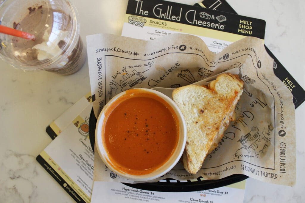
The food presentation was great. Little baskets. Branded tray liners. Craft tot holders. Clear branded cups. All great stuff.
The directional signage found throughout the restaurant wasn't great. Different styles. Different fonts. No consistency. That’s a-ok, but this could have brought a little improvement to the consistency issue that I’ve already harped on.
Last note, big miss in the bathrooms. A little love in here can go a long long way in a bathroom, especially since they house so many dang mirror selfies these days. I don’t think there was anything on the doors, on the walls, stalls, etc. Just more black and white. Come on… let’s get creative.
My one piece of advice for anyone working on restaurant interior design or restaurant branding, is to first align your direction. Once selected, pick it and go full-freaking force in that direction.
Big props to the food truck for taking a risk to move forward with a brick and mortar, caring enough to print your menu on great paper, and creating a post-worthy area of the restaurant that just straight on, blows me away.
Want or need some recommendations for making your restaurant brand in Nashville or elsewhere great? Don’t hesitate to ask us!
