Restaurant Interior Design Review of Holler & Dash
UPDATE: Beginning in November 2019, Cracker Barrel, who owns Holler & Dash, converted all Holler & Dash locations to Maple Street Biscuit Company.
Native Nashvillians and visitors alike all agree that the restaurant interior design at Holler & Dash, a southern-style biscuit house, is on point. This restaurant branding is great; we'd love to meet up with the creatives who perfected it for a biscuit or two sometime.
Each customer touchpoint was branded thoughtfully and executed well in this restaurant interior design. The whole experience is cohesive and feels like true Southern comfort. Our restaurant interior design agency is breaking down just what it is that they did so well in this interior design review.
Restaurant Interior Design: Eye-Catching Exterior
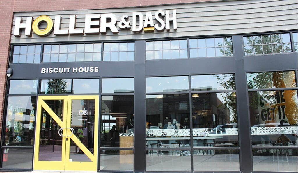
The retail development that Holler & Dash is in is new and well-curated. We can only imagine the building restrictions for a new establishment in an up-and-coming area of Brentwood, Tennessee. That said, we're impressed with the exterior that Holler & Dash created. It displays a bright and modern interior, inviting patio and bold exterior sign. The colors and materials are inviting, modern and, most importantly, on-brand.
The Holler & Dash exterior sign is completely custom, a unique mix of neon lights and channel letters. It is striking.
The yellow doors are one of our favorite details on this exterior. It is such a simple change to switch up the paint colors, but it makes a huge difference. We reference color psychology a lot, and for a good reason. Yellow truly is the happiest color, and it works so well on this door to communicate that Holler & Dash is a happy place to be with an open-door policy.
Restaurant Interior Design: Back Entrance
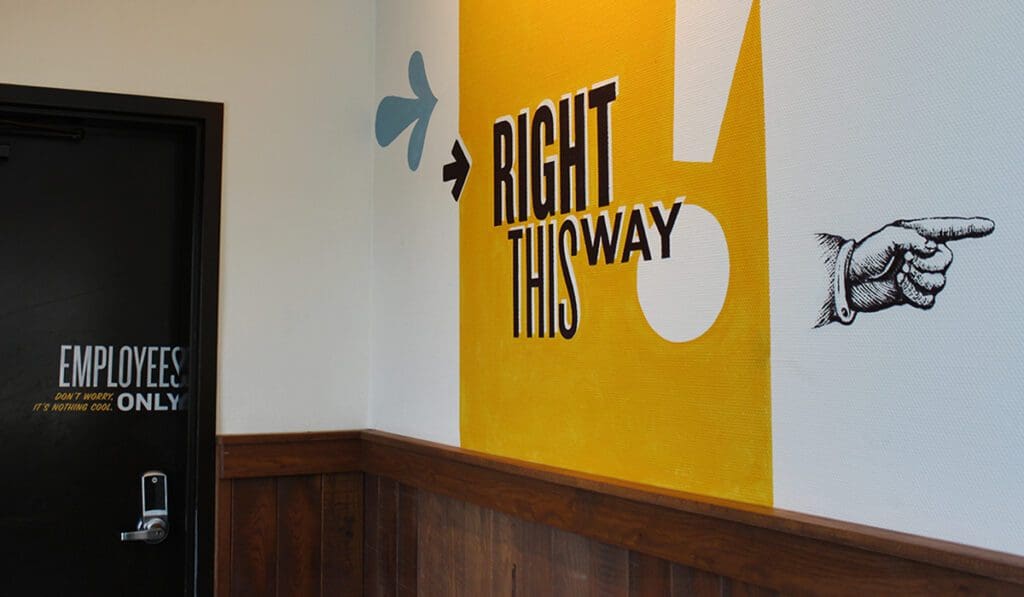
Okay, so let's switch gears and talk about the alternate route: the back entrance. The back entrance to Holler & Dash places you near a staff door and the restrooms. These doors are plain black, packing a punch with their witty words instead of the color, like the front door.
The staff-only door reads "Employees only. Don't worry. It's nothing cool." Super cheeky and clever, just like the rest of the Holler & Dash brand. This tiny customer connection makes for a real nice feel-good moment that is consistent with the rest of the brand. That's a win in our book.
Restaurant Interior Design: Tiny Details
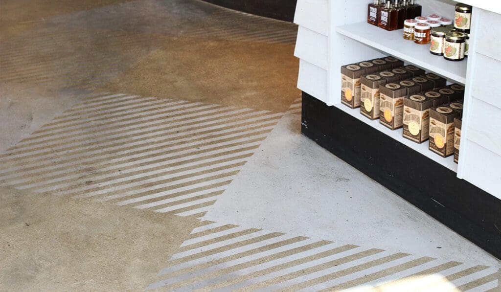
The Holler & Dash floor is your standard restaurant-in-Nashville concrete floor, but they amped it up a bit with custom designs in a geometric pattern. The patterns are spaced throughout the restaurant, breaking up the space and adding interest in an unlikely place.
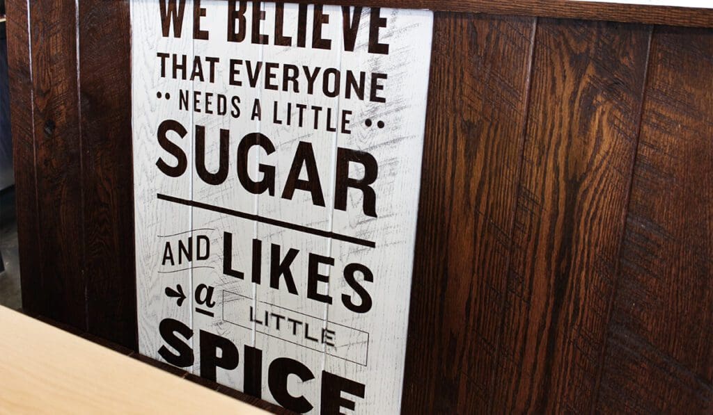
One of the next features you notice are the wooden booths, banquet bar, and wood printed illustrations, all of which display the beliefs and visual identity of the brand. This is exactly what a restaurant interior design is for: to subtly show what the brand is about, throughout every touchpoint possible, from the flooring to the wall decor.
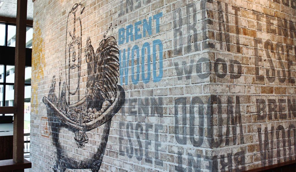
One of the coolest features is a huge brick wall with a hand-painted blue rooster on it. Nothing says "southern food" quite like a rooster. The rustic vibe of the artwork nods to the home-cooked recipes and the freshness of the food.
The Hidden Number Four
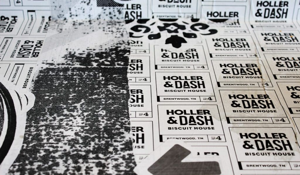
The booths at Holler & Dash also have a custom feel: many of them are custom-painted with a vintage floral pattern. Over and over again, Holler & Dash shows that you can put a custom restaurant interior design in restaurants with more than a half-dozen locations.
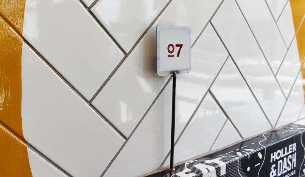
To deepen the hometown feel in this location (one of seven so far in the chain), Holler & Dash went a step beyond throwing up a community cork board and calling it a day. They worked the city name and the store number (four) into the restaurant interior design. This not-so secret but subtle four is a subtle and cool way to communicate the store number that makes knowledgable visitors feel "in" with the brand.
Trendy Interior Design Elements
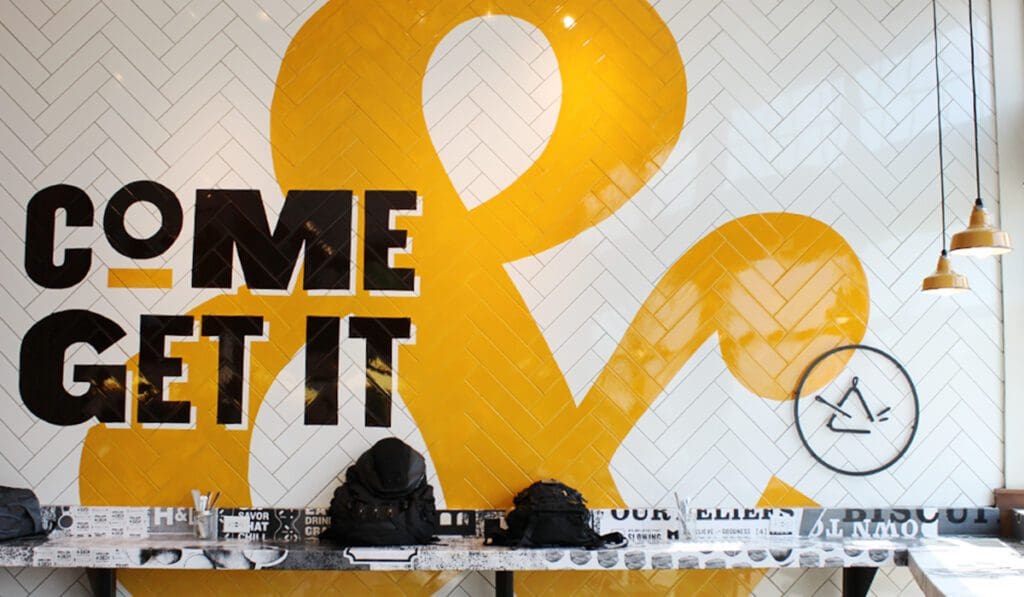
A large focal wall displays the logo on herringbone subway tile, making a great photo wall above bar seating.
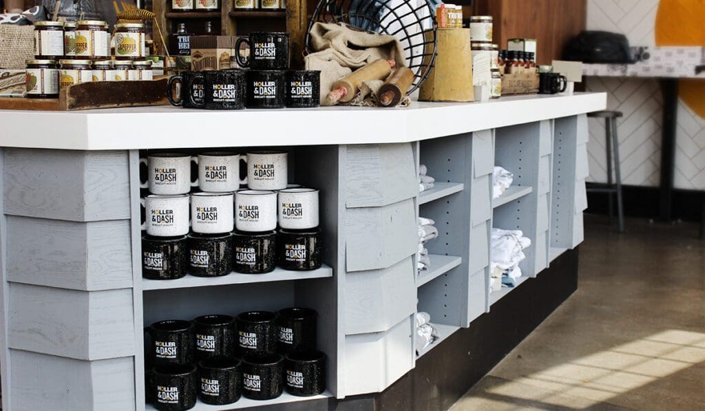
A retail merchandise display bar marks out the natural flow for a line to form to the register. The collection of retail items is so well-curated, it almost makes it obvious that Holler & Dash is owned by Cracker Barrel.
The table numbers were another fun and well-branded element of this restaurant interior design. The metal numbers are distressed and hand-painted in the brand fonts, and they stand creatively in little holes at each seat in the restaurant.
Next, the
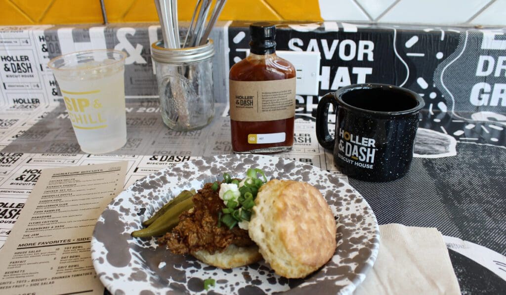
Final touches include a vintage tile design that serves as a welcome mat, decorative ceiling tiles, yellow barn pendants, barn lights, and printed materials covered in excellent typography. Truly, Holler & Dash got all of it right; no touchpoint was overlooked.
We are so inspired by their branding: they took their made-by-hand approach to biscuits and turned it into a handcrafted restaurant interior design.
If you're looking to extend your branding into your restaurant interior design, give us a call. We would love to give you a hand and create a space that reflects who you are.
