16 Handles

successful restaurant rebranding

16 Handles came to Nice Branding Agency for a rebrand. They’d been operating under their existing brand for years, and had attempted rebranding with various other firms before finding our team. The project entailed our typical rebranding process, along with a few variations that served this fro yo chain’s needs more specifically. In addition to reworking the logo and other brand support, we were able to engage in brand and consumer insights, merchandise wall design, and a tiered system for interior implementation throughout the franchise locations.

project type

When we were approached for fro yo restaurant branding for the NYC franchise 16 Handles, we knew this project was going to be cool, yo. See what we did there?! The more we learned about our new client, the more we understood just how passionate founder Solomon Choi was about his product and the frozen yogurt empire that he built from the ground up.

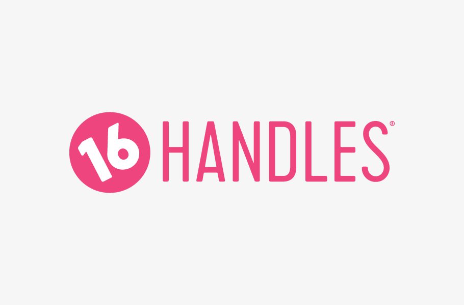
This project was unique in terms of a rebranding project. The logo needed to stay intact, and the client was only open to a slight refresh. They wanted to keep elements of the brand that they had established in 2008 to maintain the brand awareness they has earned thus far. Additionally, the 16 Handles team includes an internal graphic design department. So for this project, we were coming aboard to elevate the brand in a manner that the company could continue to carry out.

Discovery

We kicked off this fro yo restaurant branding project with a discovery session. Our team traveled to the 16 offices in NYC to learn about the company’s goals and mission directly from the founder and his key leaders. Here, we dug into what had worked in the past and had not worked. We discussed the true differentiators of the brand, and we talked about the quality of the product and the cheeky personality the brand had come to take on. Throughout the discussions, we referred back to the target demographic or ideal customer. Key leaders had an idea what their target personas looked like, but were curious to find whether their assessment was valid.

We also visited a variety of stores, both corporately-owned stores and franchise locations. During the site visits, our team was able to experience the stores as a customer would. We interacted with the layout, menus, staff, product, and overall environment. Additionally, we sat in the stores and observed the customer journey in action, while assessing the true 16 Handles customer demographic. We also looked for pain points in the customer experience or opportunities for brand communication within the physical space.

Brand + Consumer Insights

After our discovery session, we decided it would be valuable to deploy a customer survey to find out what the current customers knew and loved about the brand and what they felt was lacking. This allowed us to uncover the true 16 Handles target market. With this information, we were able to identify the quintessential 16 Handles customer. This info was crucial to the success of the fro yo restaurant branding project. We presented the “16 girl” by composing a visual board and a narrative that painted a picture of the typical 16 Handles customer. This information was curated based on the data found within the survey results paired with our findings during the site visits. The preferences of this ideal customer were compared against the existing brand to identify opportunities to better align the brand with what the customers naturally gravitated toward.

Branding Direction

Equipped with information about both the business and its customers, we worked to create a visual direction for the brand. Here, we compile images, typography, text, colors, textures, and more to create brand boards. The brand boards provide a visual reference to what the brand can become, and the client is to select one option to move forward with. This one selected option becomes the basis for brand development.

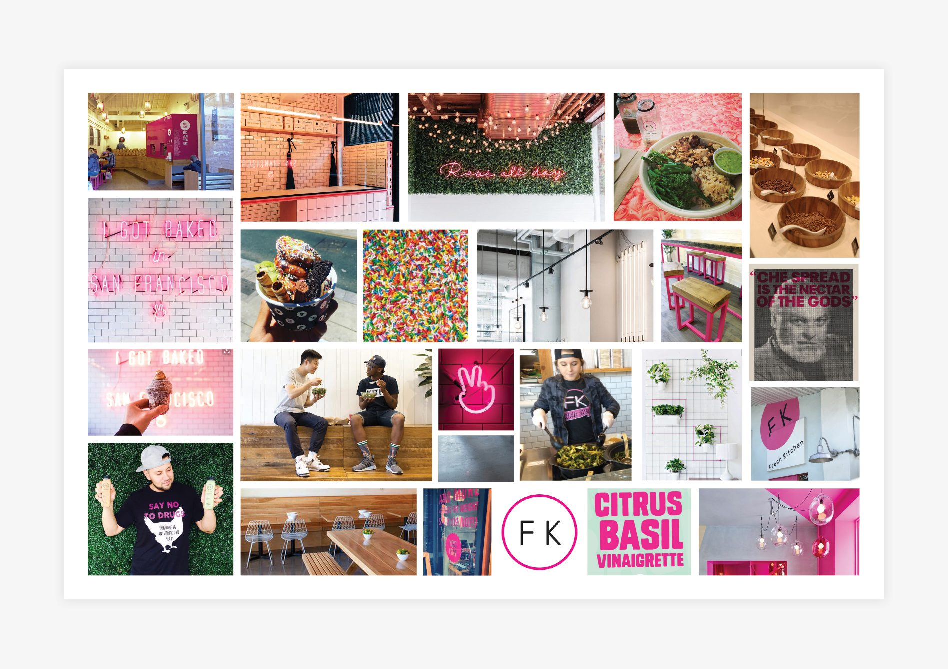
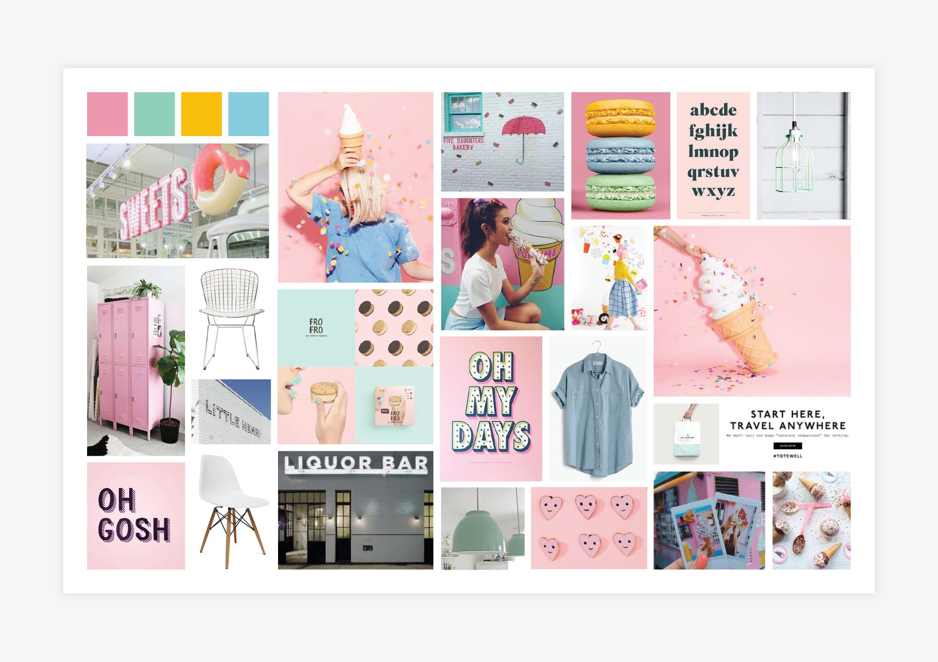
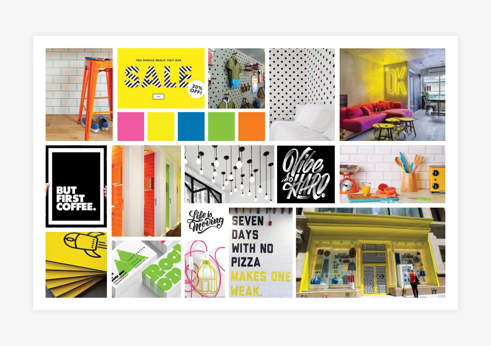
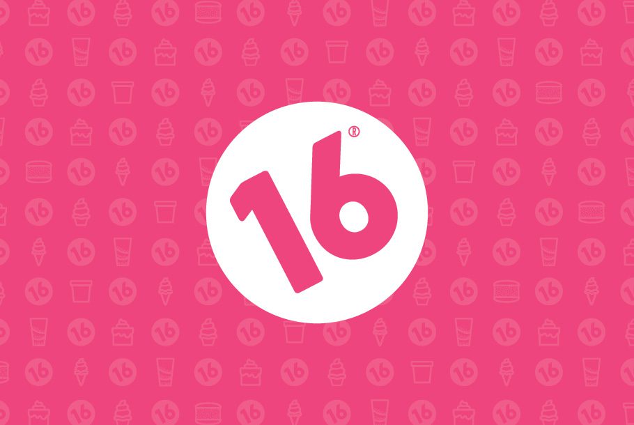
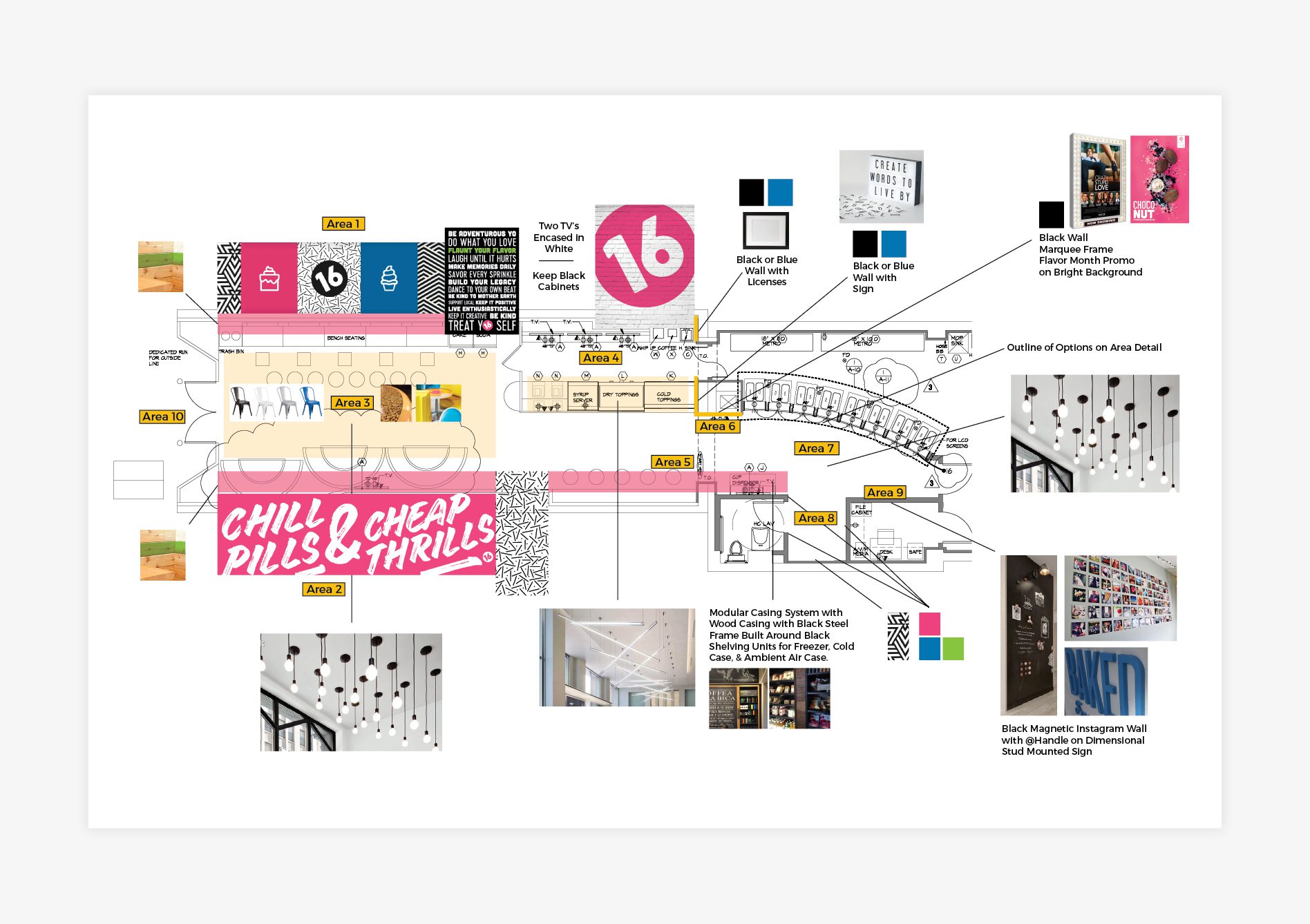
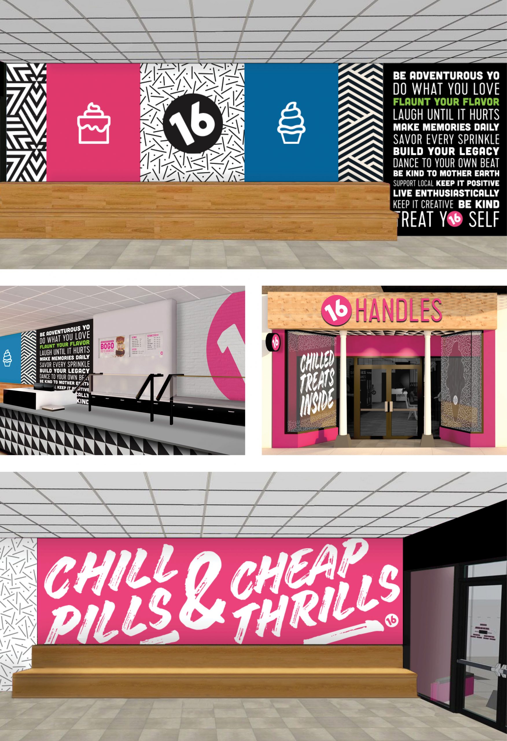
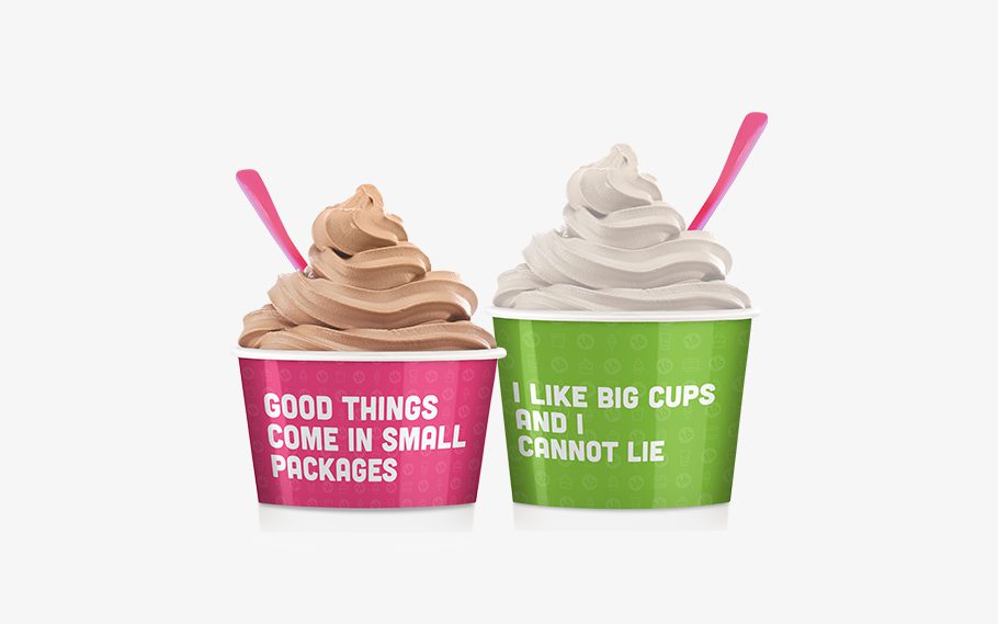
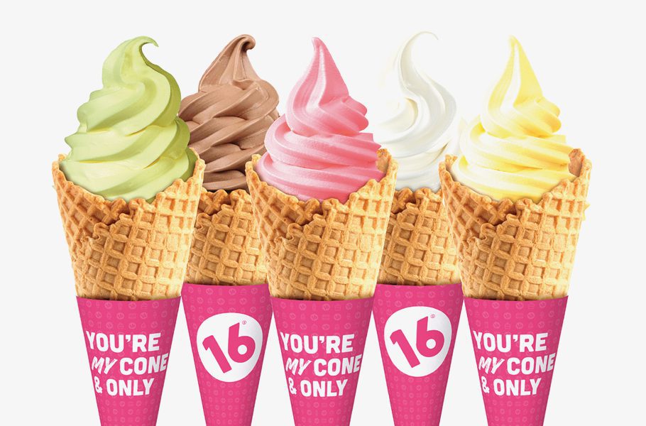
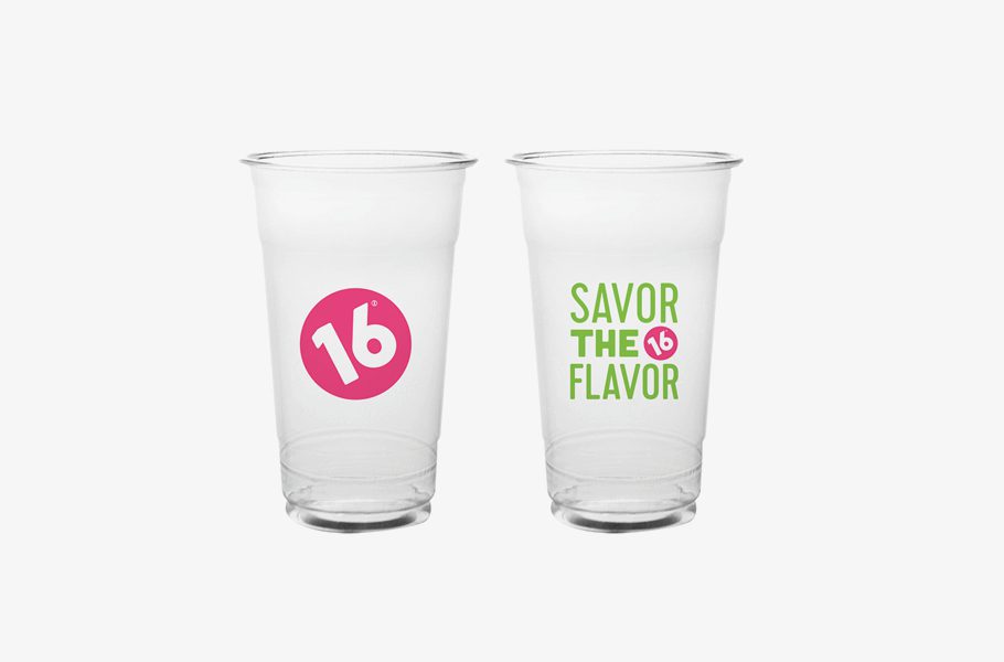
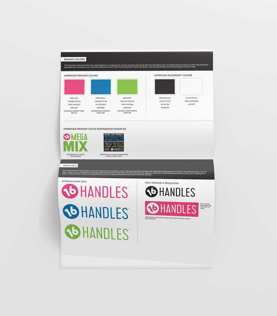
For this project, we delivered three variations of brand direction to the client and worked with them to choose one brand board to implement moving forward. One of the options was edgy, one was colorful and playful and one was more bold and graphic-based. While 16 Handles was originally drawn to the first brand board shown below, they were hesitant to make what they felt was such a drastic shift away from their existing brand. Ultimately, they settled on the third option shown below and we embarked on a refresh of the existing brand. While the brand board selected demonstrated a heavy use of bright yellow, our client requested that we prioritize the use of the pink and green shown, with small inclusions of a blue and the implementation of black as an additional color.

This color selection was very much in line with the existing brand, however the tones selected by our team greatly elevated the brand, and the inclusion of the additional colors allows us to incorporate a level of dimension that wasn’t previously apparent in the brand.

successful restaurant rebranding project
restaurant rebranding 16 Handles
Restaurant Rebranding Experts

Logo Refresh + Icon System

Using the chosen brand board as a roadmap, we refreshed the existing logo to align with the new look. The logo refresh focused on bringing balance and legibility to the logo and the icon. We understood that the exterior signage would be a main application for the logo, and in the existing brand, the word handles appeared within the icon, along with the number 16. Our goal was to allow the 16 to stand alone in our quest for customers to begin to associate the number with the fro yo itself. Just as someone would say, “let’s get a Starbucks,” we wanted people to begin to say, “let’s get 16”.

Additionally, we created an icon system to communicate all of the product offerings to customers at a glance. The icons were used to better familiarize the customer with the various product offerings. This was intended to address the fact that prior to the rebrand, customers only identified 16 Handles with fro yo, when in fact, the restaurant had way more to offer. The icons were distributed throughout the space through interior graphics to bring all offerings to the forefront of the customer journey in a way that was visually appealing and on-brand. We also used the icons in custom patterns and intended that they be utilized on social media, in restaurant materials, and through promotional attire and merchandise.

successful restaurant rebranding 16 Handles
Expert Restaurant Rebranding
Restaurant Rebranding Icons

Environmental Branding

Another large facet of this project was addressing the customer experience and ensuring that the brand was woven throughout the interior in a manner that was cohesive. Our team tackled this element by creating an interior design plan for one new store. The work included creating an ideal store layout, developing an interior branding plan, creating all environmental graphic design necessary to implement the plan, selecting all fixture, furniture, colors, textures, window graphics, customer directives, custom installations, and more.

We started with the customer journey and focused our efforts on ensuring that the layout would allow the product offerings and the brand’s pillars to shine, while encouraging the customer to connect with the brand through verbiage, color, texture and materials used.

First, we created mockups of the space, so that the client could visualize the changes within the space. This floorplan and accompanying mockup included details regarding everything from a redesigned facade to a complete redesign of all interior elements including wayfinding signage, colors, wall graphics, furniture, product display, lighting, and interior finishes.

In addition, we developed taglines and sayings that would connect with the customer, and these were used on a grand scale within the walls of the restaurant, as well as throughout the customer touchpoints.

In order to ensure that the products were showcased professionally, we developed the design for a custom merchandise unit at the request of our client. The merch wall consisted of dry shelving and freezer storage, and was created to modular and adjustable. This modular design would serve the needs and space restrictions of the brand’s 42 stores and would also accommodate the addition of new products as they’re developed.

Creating a system for the environmental branding of the various franchise locations was another aspect of this project that was important to our client. We devised a system that would allow franchisees to update their locations in stages, by communicating non-negotiable, priority, and lower level changes and by including interior options at various price points.

Successful Restaurant Rebranding Interior
16 Handles Restaurant Rebrand

Restaurant Materials

The restaurant materials for the store provided a major opportunity to connect customers with the brand, and to encourage social sharing. We redesigned the food packaging, including fro yo cups, cone wraps, and to-go cups . We also aligned the design of the flavor screens on each of the fro yo machines with the new brand. Witty phrases were utilized that were in line with the brand voice, and the custom pattern was incorporated to elevate the look and feel of the packaging. The fro yo cups are regularly pictured on social media through user-generated content which extends the reach of the brand tremendously.

Frozen Yogurt Rebranding
frozen-yogurt-cone graphic design
restaurant cup design

Digital Design + Consulting

From a digital perspective, we took on a consulting role that allowed us to provide the client with ways to align on-going social media, and directives to improve the user experience and design of the current website.

Brand Standards Guide

At the completion of the fro yo restaurant branding project, we developed a brand bible to provide the client with guidelines to reference for future development of promotions and on-going development of the brand.

All of the elements that we designed, as well as all of the strategies that we developed were handed off to the client to implement themselves within their existing stores and during new store builds.

Restaurant Brand Guidelines

NOTE: Pictured portfolio items do not necessarily represent final client selections and images are intended solely to showcase the work of Nice Branding Agency.

are you ready to create something nice?