Burger King Rebrand Review
In the design world, the Burger King rebrand is a big, whopping deal. As a branding agency owner who loves to review brand refreshes, I was excited to dive in headfirst and check it out.
Visually, what I was seeing roll into the social media feeds was intriguing, compelling, beautiful, and most of all, familiar. As I set down to unwrap the refreshed burger brand and dig in, my thoughts were confirmed. The new brand was a play on the vintage Burger King brand I had known and loved many moons ago.
The Burger King Rebrand
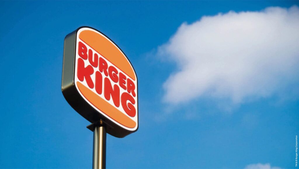
Burger King, founded in 1954, is the second largest fast food hamburger chain in the world. To say the rebrand was an undertaking is the understatement of the century.
The rebrand included an update to all elements of its visual identity. With 18,800 locations, it’s not a task for the faint of heart.
The new burger brand describes the update as “mouthwatering, big and bold, playfully irreverent and proudly true.”
The agency responsible was Jones Knowles Ritchie. When speaking of the rebrand, they said, “This brand refresh pretty well covered it all. It includes a new logo, packaging, restaurant merchandise, menu boards, uniforms, restaurant signage and decor, and social media, digital, and marketing assets.”
Burger King Rebrand: The Logo
The original, classic Burger King logo ran from 1969 to 1999. Then, it was replaced with a more dimensional, cheesy logo that included a blue swoop. Oh, the years they lost with that one.
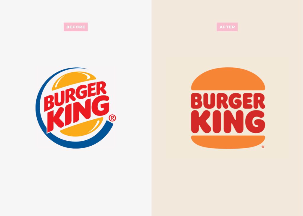
The logo redesign under consideration takes us back to the original logo. It’s simple, straight-forward, and clean. Two buns anchor the stacked restaurant name, a respectful nod to the history of the brand.
Jones Knowles Ritchie states, “The new logo pays homage to the brand's heritage with a refined design that's confident, simple, and fun. We were inspired by the brand's original logo and how it has grown to have an iconic place in culture.”
Iconic indeed. If you were raised on Burger King in the ’70s, ’80s or ’90s, the Burger King logo is engraved in your mind. And, if you’re anything like me, the new logo brings you right back to your childhood, which appears to be the intention of this rebrand.
We are seeing a lot of brands return to their roots, back to what people in their 30s and 40s remember as kids. Restaurant brands that customers worshiped in their youth now have to compete with the Whole Foods hot bar. The best way to do that? Dive into the subconscious and tug on their heartstrings.
There’s absolutely no way that Burger King’s food can compete with the fresh, organic, unprocessed fare that people of this age group desire. But, appeal to the comforting nostalgia of sitting in a rear-facing station wagon seat, and you’ve suddenly got my attention.
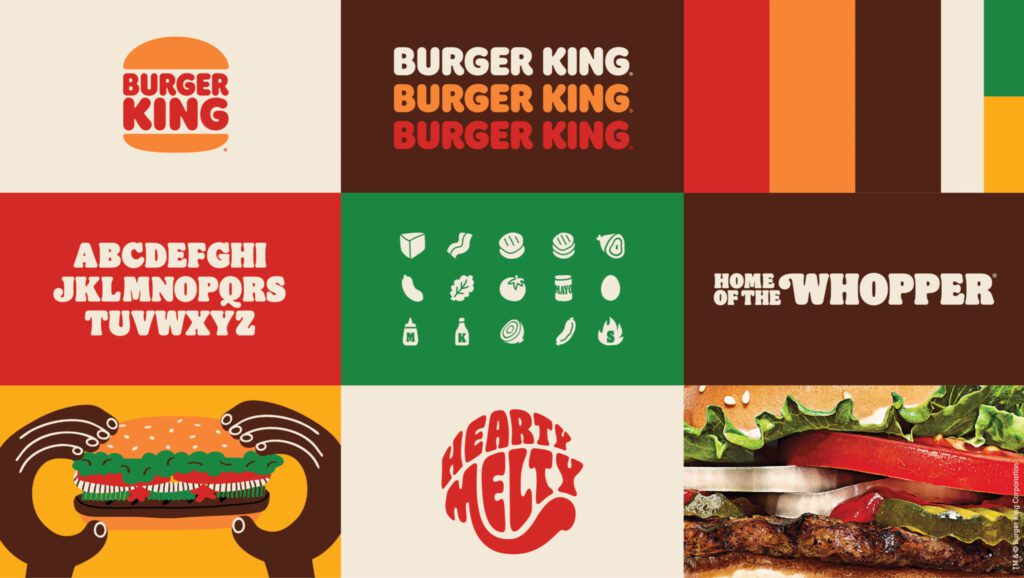
As an added bonus, there’s a nifty little icon that comes along with the redesigned burger logo, featuring a K in between the buns. It’s fun, looks tasty, and it’s a good pair with the main logo.

Burger King Rebrand: The Fonts
When commenting on the fonts in the Burger King brand refresh, Fast Company said, “You can almost just taste the typeface.” It’s quite possibly my favorite quote of all time—and accurate.
A typeface you can taste. What more could a fast-food concept ask for?

The new brand touts a custom semi serif typeface called Flame, “that evokes the natural, organic shapes of food," said Jones Knowles Ritchie.
This is designer gold, and please, follow me on this tangent momentarily. I am swooning over custom fonts lately.
They have been around for a long time, but they are so next level.
Currently, the design market is flooded with “brand designers” buying fonts off of Creative Market, typing it out in Illustrator, stacking it, coloring it, and calling it a logo. Great effort, but there’s no meaning behind that. There’s no story behind the font.
Don’t get me wrong, these fonts are stylish, they’re modern, and oftentimes, they are beautiful, but they are lacking soul and truth.
There’s so much intricacy and heart behind typefaces, and it’s a designer’s job to utilize fonts to bring a unique personality to a brand. It goes far beyond a transaction and color choice.
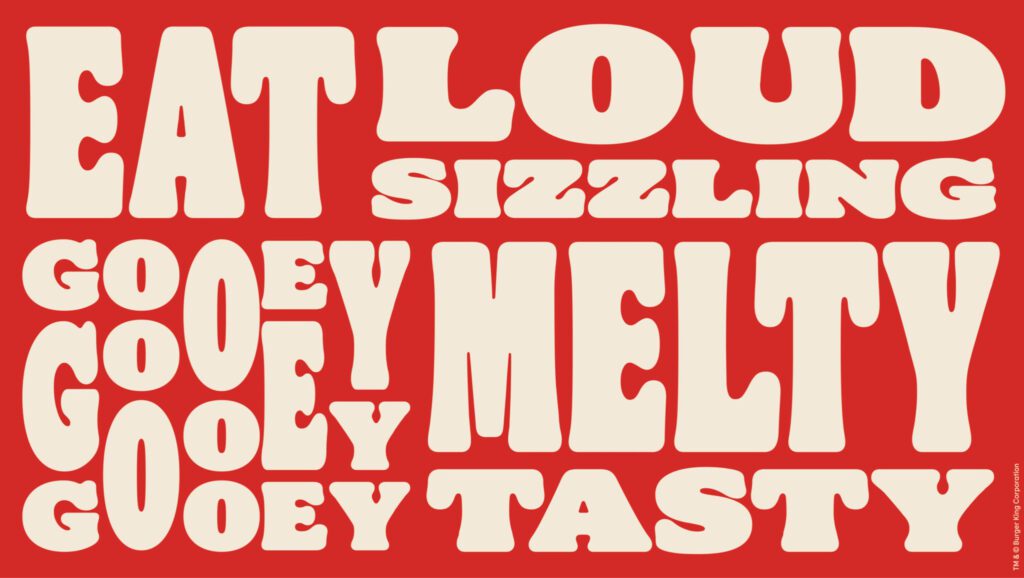
I’m all for custom fonts and the unique use of fonts. The Burger King rebrand wins in the font space.
When your brand font or logo font can be described as tasty—certainly it must be custom.
Burger King Rebrand: The Colors
The colors are at once warm, retro, current, old school, and modern. How can any of us survive this? It’s such an oxymoron, but so RIGHT NOW.
Mustard, burnt orange, brown, cream, and green. The colors are pulled from key Burger King ingredients and are meant to bring the burger brand’s trademark flame-grilling method to mind.
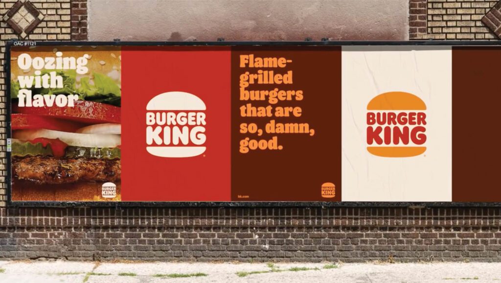
According to Jones Knowles Ritchie, “Warmer colors bring vibrant, fresh ingredients, and the brand’s trademark flame-grilling method to life in packaging, crew uniforms, and digital experiences.”
The fact that there is meaning behind the colors that correlates with food on the menu is a win. Additionally, if the goal was to take them back to the brand’s heritage, these colors are doing it.
I’m not sure that I want to go back into the dining room with the brownish tile and dirty cream-colored booths, but I do think the way the brand is utilizing the colors in brand support, with a fresh approach, is bringing me back to what I initially loved about the brand: the crown, the ketchup, and that sesame seed bun—yum.
I will note that there’s a vibe to the colors that could take a wrong turn really fast. The dark brown paired with the warm, rich orange and red is pulling me into a space that I don’t want to be. I think the King is going to have to be very cautious about color relationships and how the colors are paired in brand support.
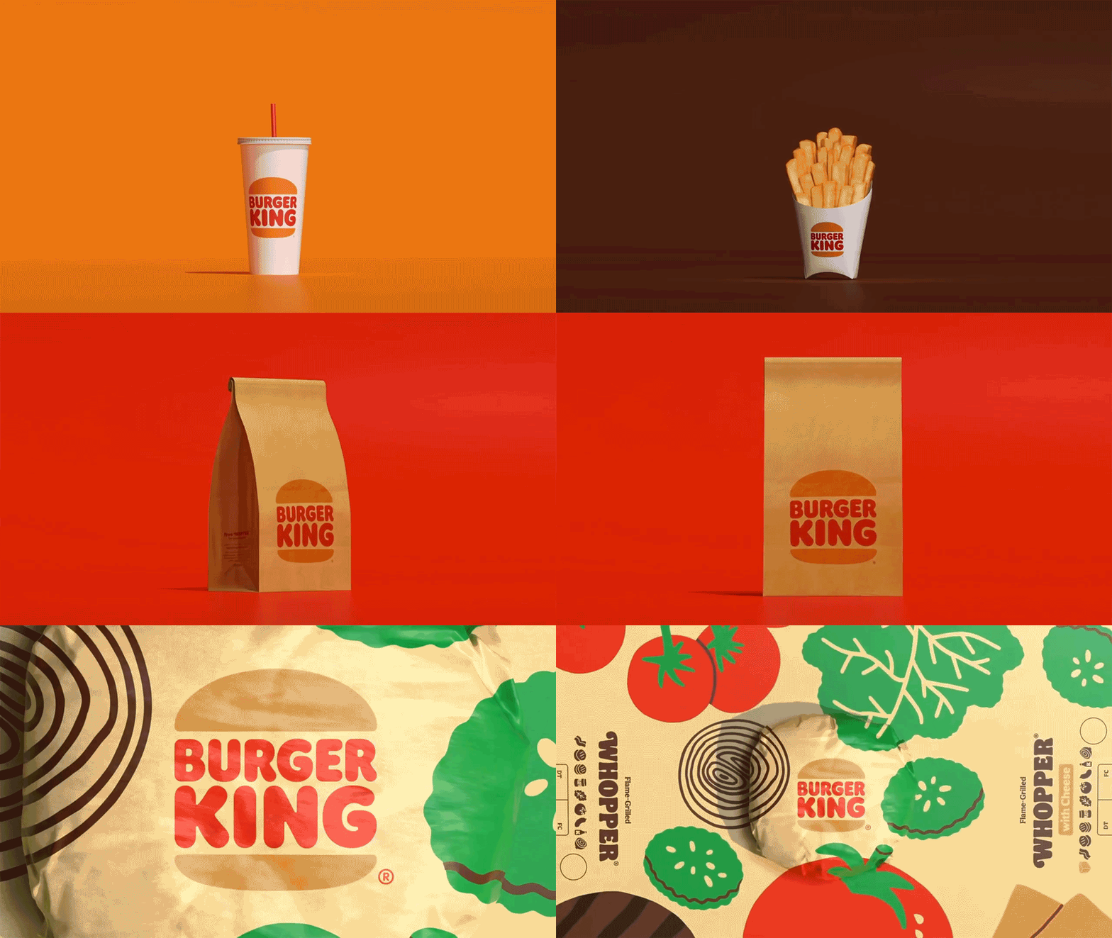
Each color has its place in the brand, and as I review the brand support, there’s a distinction I’m feeling between certain pieces. The one below seems harmonious, but then when the brown, orange, and red tones start playing together without enough white space, I’m not craving the flame-grilled freshness as much.
Burger King Rebrand: The Brand Support
As noted previously, they’ve redesigned everything the eye can see. All visual aspects of the brand have been reimagined under the new, refreshed brand direction. Let’s review a few of the key brand support pieces that have been revealed.
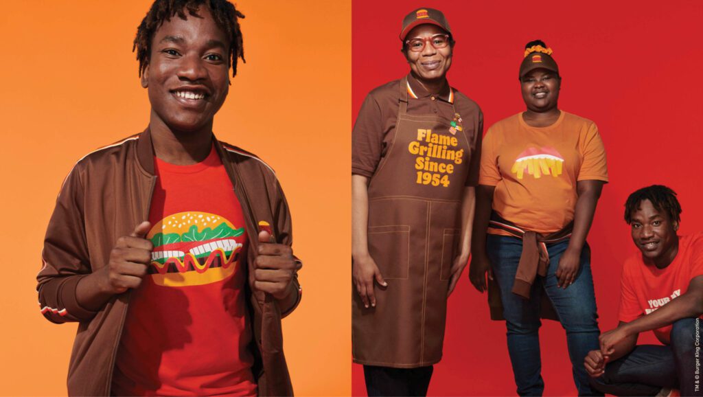
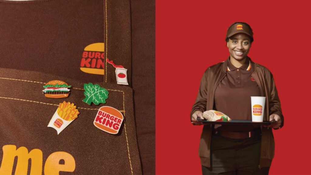
First up, redesigned uniforms for staff that will use a deep brown as their base color. This will be paired with the new logo and trim in red, orange, and white.
The dark colors and the tones used in the employee attire feels a bit old and dark to me. Yes, the colors certainly consist of the brand colors, and the style does provide a nostalgic vibe, but I think they went a bit too far down the retro road. For some reason, I’m instantly transported to the huge brown Arby’s sign prominent in the same fast-food heyday.
There are certain attire pieces that look great; however, I would say that overall, the uniforms for the staff may have been a miss.
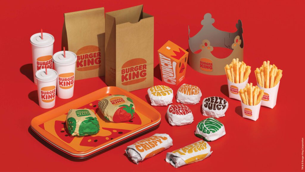
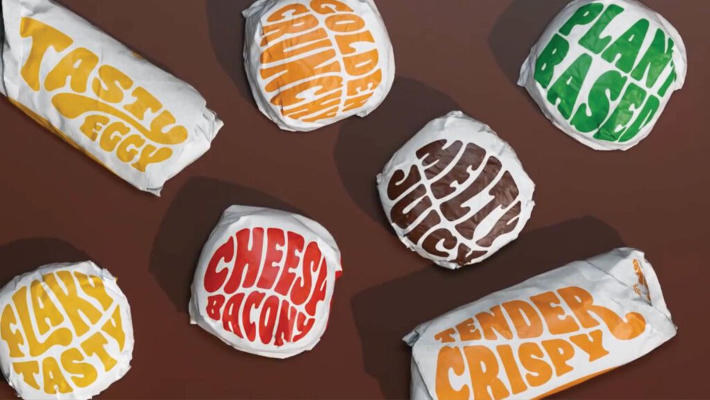
Also included in the brand support is updated food packaging. Each item will be wrapped in paper or placed in packaging emblazoned with the custom font which will include the items' names, but here, the font gets more fluid and playful.
This is interesting, but again, I’m afraid the simplification they spoke of in the logo gets lost here, and the custom font weakens in the impact department.
The custom font face in the logo, when displayed straight and clean, is pulling me in and I’m feeling the ooey gooey goodness, but when they start moving, swooping, and swaying too much, I’m taken back to the days of bell bottoms and hippies. A little too Austin Powers for Burger King.
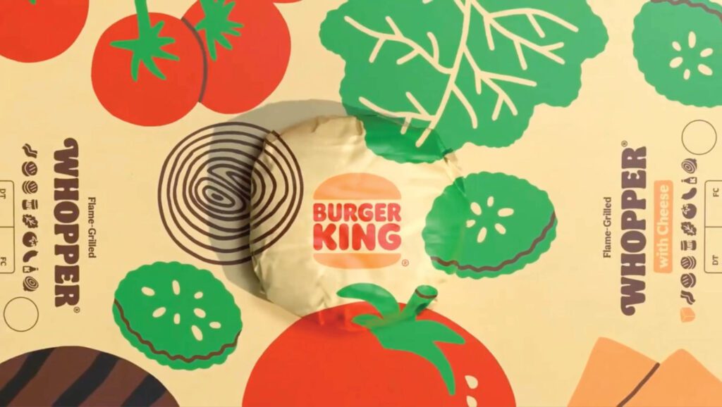
The Burger King rebrand also encompasses various takes on illustrations of ingredients and menu items that are playful and fresh. Illustrations of hands engaging in the Burger King dining experience are also a piece of the brand support pie. At this time, we are seeing these illustrations paired with playful phrases touting the food’s goodness.
Overall, I find the various illustrative styles to be different, one to the next. I’m not finding a sense of consistency in the different illustrations, but each one on their own is respectable.
I believe the brand should have leaned heavily on a very modern, clean illustrative style. This would have provided the fresh and modern touch that the brand may, overtime, need in order to not feel old and dated. Right now, the brand feels fresh and new because it is exactly that. However, time will tell if more modern elements should have been paired with the original retro appeal of the burger brand’s logo and color scheme.
I think it’s too soon to make a judgement call on the brand support illustrations. They have hope, but I’m not sure that there’s a concrete cohesion between their style. Execution of these illustrations across different brand support collateral and across digital channels will be something to pay attention to.
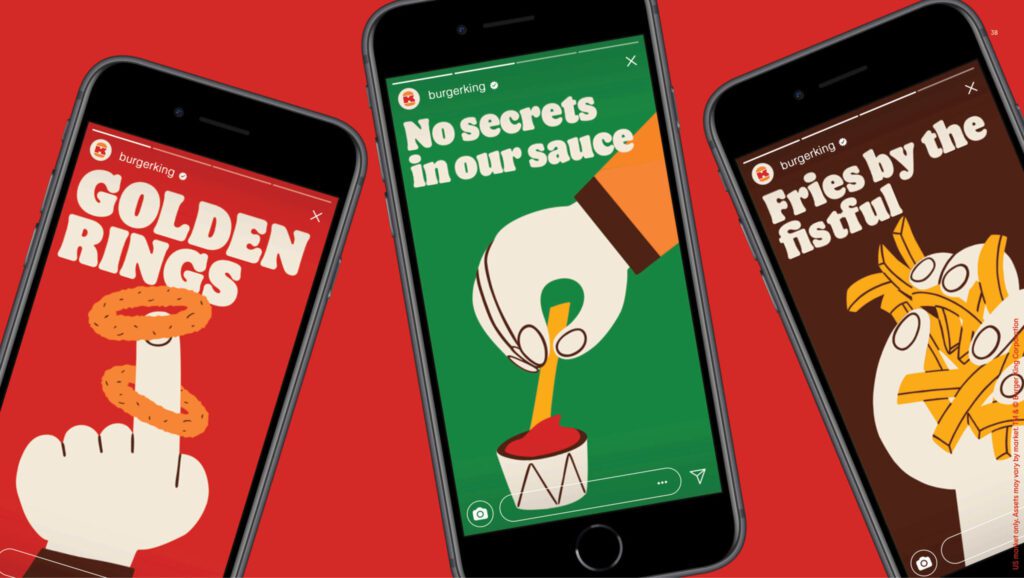
Overall, I’m anxious to see how the marketing and advertising rolls out of this rebrand. I held Burger King’s current advertising in pretty high regard. The bold commercials featuring The King in high-contrast, controversial-type humor drew me in. This redesign is a very sharp turn from that direction, so I’ll be curious to see if it stays, goes, or shifts.
The Environmental Branding
Burger King plans to roll the update out to their physical locations, updating construction and interior design over the next few years.
There’s not too much that they are showing right now, other than two exterior images and one interior image.
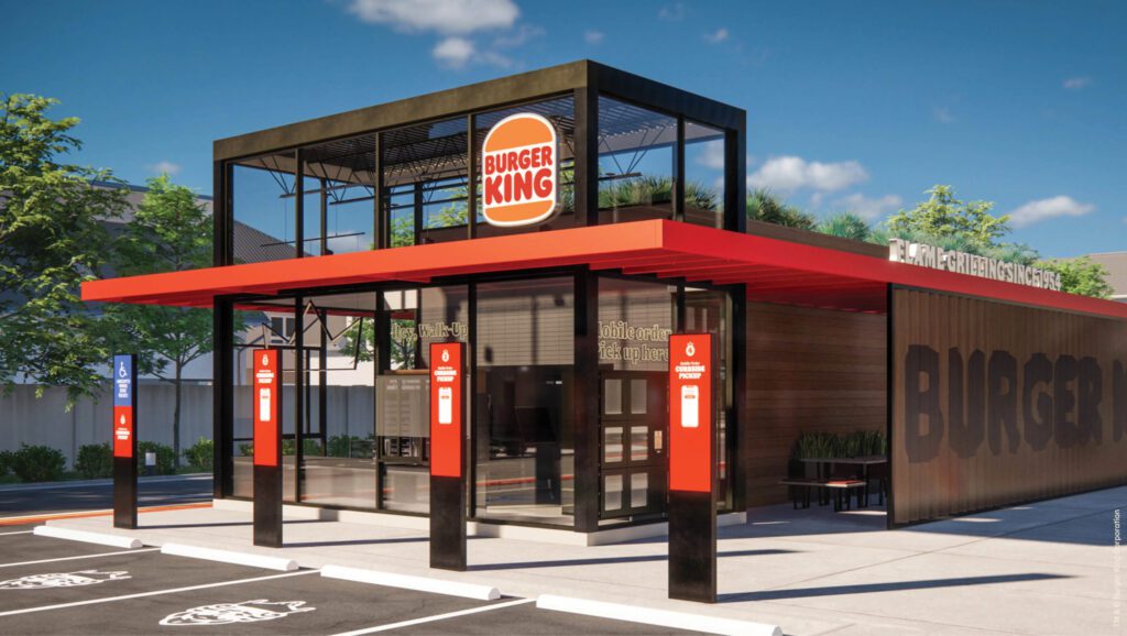
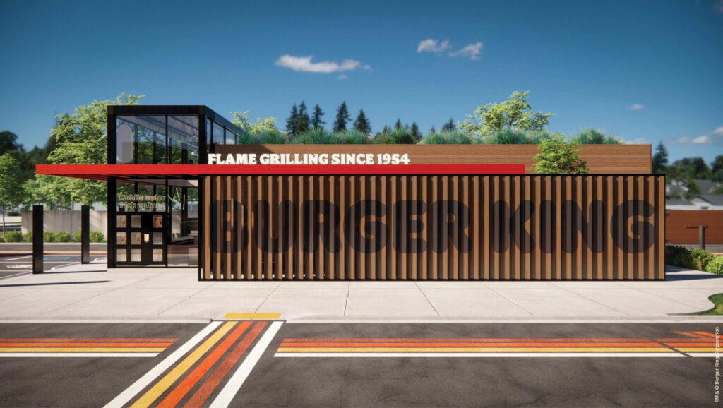
The exterior of the building consists of wood, glass, black metal, a deep orangish red color, and the logo. Overall, it’s undeniably a step up from their existing design and it has a modern, yet retro, throwback look.
It’s emblazoned with the messaging, “Flame Grillin’ Since 1954,” which I believe reinforces the entire direction of the rebranding efforts.
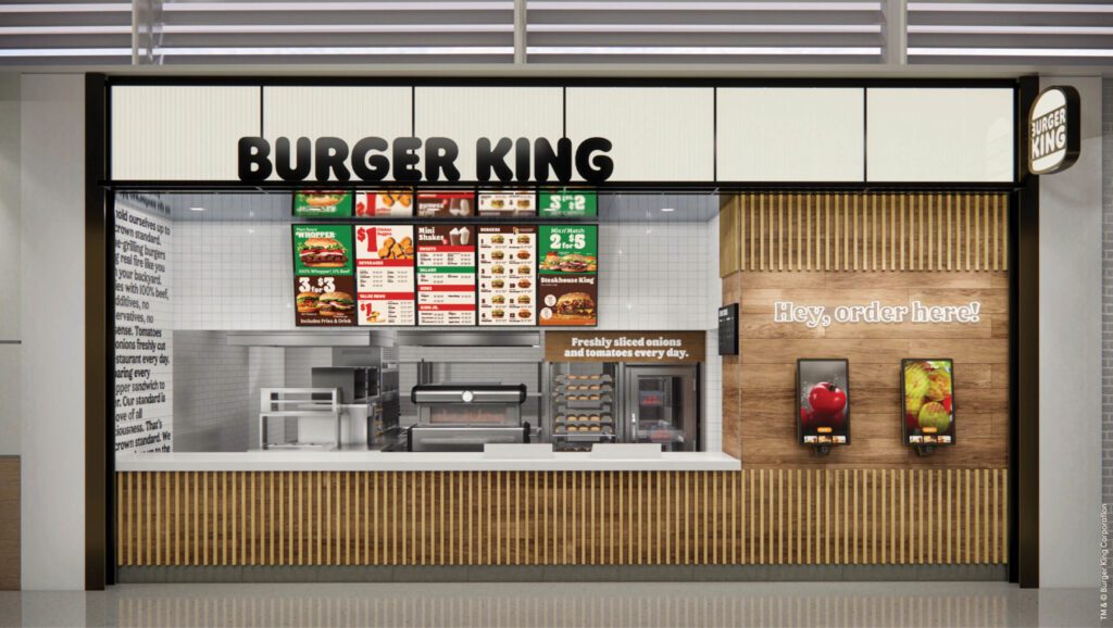
As far as the interior goes, I’ll stay away from that at this point, simply because I can’t visit the updated location physically.
Let’s Get a Whopper
Raphael Abreu, Vice President, Global Head of Design at Burger King said, “Design is one of the most essential tools we have for communicating who we are and what we value, and it plays a vital role in creating desire for our food and maximizing guests’ experience. We wanted to use design to get people to crave our food; its flame-grilling perfection and above all, its taste.”
Abreu understands the value, importance, and power of design and branding for restaurants, and I’m glad to see Burger King bringing their A-game to the table. I think the choice to take Burger King back to its glory days was spot on. Many design elements were very well executed and will have a big impact on the fast-food consumer.
From what I’ve read, one of the main goals of the rebrand was to encourage customers to come back. Right now, Burger King is feeling like an empty nester, but I guarantee, the kids will return for a visit or two.
I’m off to sink my teeth into a juicy whopper, but if you are in need of restaurant branding services, or a restaurant brand refresh, reach out to Nice Branding Agency, the experts in building bold restaurant brands.
If you can’t seem to wrap your head around how a rebrand would go down for your restaurant, start by reading our blog on how a restaurant rebrand goes down, and be sure to follow along on Instagram for inspiration and tips.
