Four Restaurant Interior Design Projects
A restaurant’s physical space has the power to create a transformative experience and link customers to the brand for life. At Nice Branding Agency, our branding team uses restaurant interior design to create restaurant experiences that fully immerse the customer in the brand through compelling visuals and messaging.
What is Environmental Branding, Exactly?
Environmental branding is the practice of bringing a brand to life within the walls of a physical space. This often referred to as restaurant interior design. This includes the design of the interior and exterior, including the selection of lighting, flooring, wall finishes, wall installations, furniture, fixtures, and hardware. Restaurant interior design makes the brand tangible and real. And it allows for the development of a strategic customer journey that influences a person’s perception of your restaurant, even before tasting the food.
Today, we’re rounding up four of our favorite restaurant interior design projects. In this roundup, we’re showing you exactly how restaurant interior design plays a role in a customer’s experience.
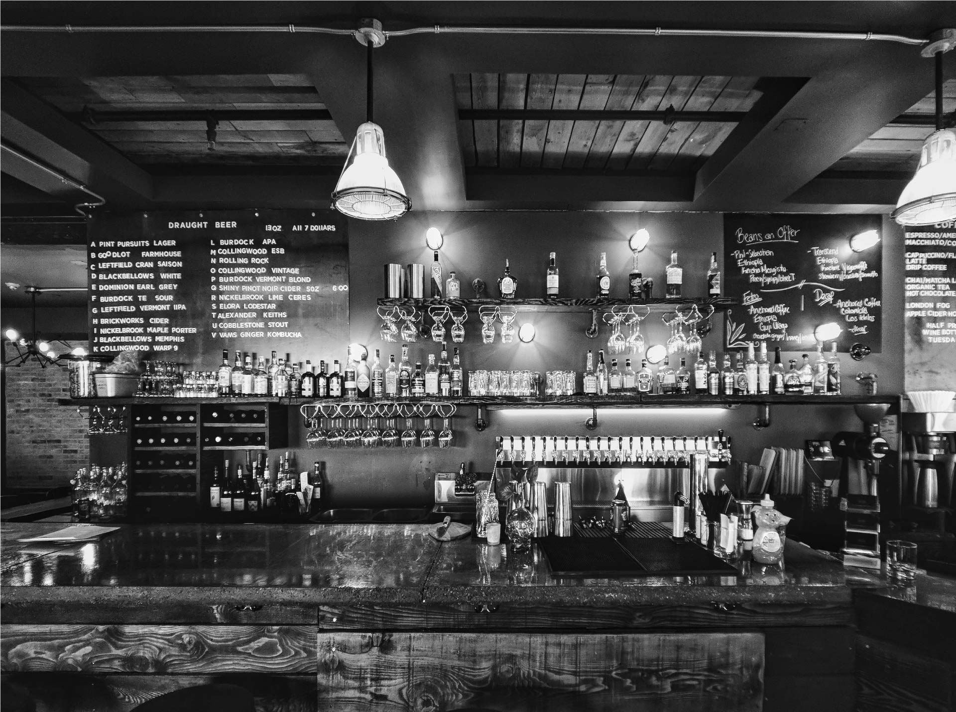
Restaurant Interior Design Project: Gyro Republic
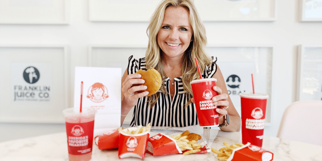
Our team created a restaurant brand for a street-food-inspired, halal-style Gyro restaurant in the great state of Texas. We were charged with naming the restaurant, creating a visual direction, a logo design, a website design, and a menu design. We also developed restaurant materials, including a take-out bag design and cup design, as well as merchandise design including staff T-shirts.
However, the most impactful part of the project was the restaurant interior branding. In alignment with the brand’s overall visual direction, an interior branding plan was devised to ensure that the look and feel of the brand was present in every customer touchpoint.
We started with the restaurant floor plan and seating layout. This was provided to us by the architect. Here, we developed a plan that indicated selections for lighting, flooring, seating, tables, wall art, wall color and texture, tile, floor graphics, and more. Our scope of work was to curate or create every single element that a customer would encounter as they journeyed through the front-of-house.
For Gyro Republic, our goal was to create an environment that would communicate the brand’s narrative, which was centered around their concept of street food for the people and the power to choose. It was a republic, after all. So, the overall design was tailored to appeal to a wide demographic but with an emphasis on a millennial target.
We started by selecting concrete floors as a base for the design. This application would allow us the ability to use hand-painted graphics to direct the customer journey. Too many quick-service restaurants neglect the customer journey and end up underwhelming and confusing people as soon as they walk through the doors.
Next, we selected seating and tables for the restaurant. The seating selections played a huge role in covertly communicating brand messaging. Chairs were varied in both color and style. The seating all aligned with the brand’s aesthetic and colors. However, the variety within these bounds conveyed a person’s power to choose their seat. And more subtly, the varying styles and colors communicated the differences in the people themselves who would exist inside the republic.
To provide a foundation for consistency amid the variety of chairs, wooden tables were selected for the entire space. Along one wall, custom booth seating was designed to maximize space within the narrow footprint. The design dictated that the riser at the foot of the booth seating would be decorated with a focal tile that would mirror the tile at the point of purchase.
The walls provided a canvas for conveying brand messaging in an obvious and uber-visible manner. We chose to implement custom art on both sides of the restaurant. On the left wall, near the entry, we designed a large-scale mural with the brand phrase “Make Gyros Not War.” This phrase aligned with the overall concept and delivered a pretty impactful statement to those entering the space.
In this mural, neon lights outlined the words. An illustrated hand holding up two fingers to show off a peace sign took a prominent position, and the logo icon was present within the design as well. This mural was placed strategically to capture attention, even from the parking lot. Additionally, it was designed to be somewhat of a “selfie-wall” and would allow customers to snap a photo from wherever they sat in the dining room.
Directly across the dining room, we designed typographic posters featuring key phrases. These messages were set on top of black-and-white imagery depicting traditional street food. Brand colors were overlaid atop the imagery to unite the art under the overall visual direction.
Further into the restaurant, another custom mural design greeted customers as they approached the point of purchase. This mural was created for the space where customers would wait to place their orders. The hand-illustrated piece conveyed drawings and brand messaging, including, “fight for clean ingredients;” “made with love, not MSG;” “globally-inspired;” and more. The placement of this mural was intentional, as it was important to communicate certain differentiators in a place where people would be stalled and able to read and digest the messaging.
To further define the customer journey, industrial, powder-coated piping was implemented to divide the line and create a path for customers to follow. Additionally, the point-of-purchase counter was made into a focal point with the use of custom tile on the riser. From the front door, any customer could easily make out the journey, and where it would end at the point of purchase.
Digital menu boards were designed to hang above the ordering area. The digital nature of the boards aligned with the expectations of the target market and the modern aesthetic of the space. Additionally, they would allow the restaurant operators to make quick swaps to the menu items and pricing as needed.
For the wall behind the ordering area and point of purchase, we selected a white subway tile with custom blue grout. This blue grouted tile would transition to a yellow subway tile with grey grout for the right wall in the dining room. This delineation between the dining room and the prep and purchase area was distinct yet consistent.
In the bathrooms, we continued the quest for impact and consistency. Brand colors were implemented for the walls and doors, while fixtures and finishes were selected to align with the overall brand direction.
Finally, a lighting plan was created. Absolutely no customer touchpoint is to be overlooked in restaurant interior branding. Surprisingly, lighting is often left for last or overlooked altogether. We harnessed the power of lighting to create a plan that would help create distinct spaces within the restaurant. Starburst flush mount lighting would line the ordering area, while modern linear pendants would illuminate the dining room.
Taken as a whole, the restaurant interior design of Gyro Republic is immensely compelling. The thoughtful design and consistent, cohesive application of the brand throughout the space makes the restaurant extremely “Instagrammable.” Additionally, the space is an extension of the brand story in a manner that conveys the restaurant’s position in the market, its ethos, and its key differentiators to each and every person that enters.
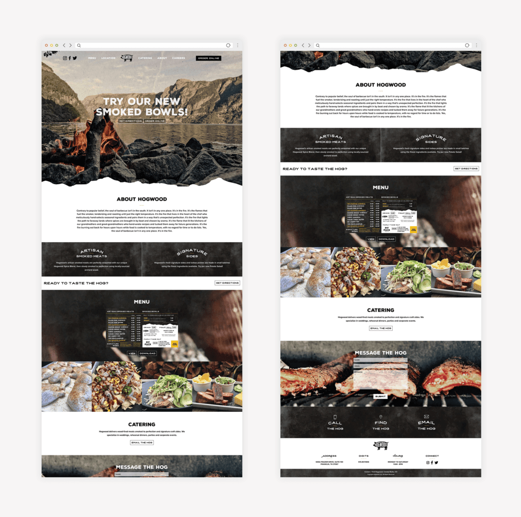
Restaurant Interior Design Project: Hogwood

Like Gyro Republic, our branding team created the entire Hogwood brand. However, for this project, our clients came to us with a name in hand. Hogwood had been operating as a catering company out of Crested Butte, Colorado, for some time and was now entering the restaurant scene with its first brick-and-mortar.
The restaurant would be located in Franklin, Tennessee, just outside of Nashville. Franklin is home to Nice Branding Agency, so this project was close to our hearts (and our office).
We started by creating a visual direction for the brand. The overall aesthetic would be steeped in rustic mountain vibes to pay homage to Hogwood’s roots. However, an industrial aspect was introduced to differentiate the design, and a pop of modern marigold was included extremely sparingly to provide contrast and light.
Additionally, our restaurant interior design agency created a revised logo for the brand, as well as a menu design and website design. We also designed custom take-out bags, custom cup designs, spice packaging, gift cards, and selected staff attire for the restaurant.
The restaurant interior design for this project was undoubtedly one of the most meaningful portions of the project. The space we created for Hogwood in Franklin conveys the brand at every turn. During the discovery phase for this project, we learned that while the restaurant originated in Crested Butte, the concept was globally inspired.
The founder/chef was well-traveled and sourced his spices from a myriad of far-off places. He tasted food from the far corners of the globe and started his barbecue business to bring those flavors back to people in his hometown. Thus, Hogwood’s recipes were founded on generations of knowledge and then enhanced by applying the chef’s own techniques, local ingredients, and global flavors. The food is truly remarkable and not aligned with any one region of barbecue.
Additionally, Hogwood’s award-winning meat is smoked over fire to temperature, not time. This ensures that the meat is supple and tender, and that the process is never rushed in the name of profits.
When we tied it all together, we learned that Hogwood was really fueled by the fire: the fire that lit the kitchens of grandmothers, the fire that illuminated the way for spice ships long ago, and the fire that tenderizes the meat to perfection.
We realized that the soul of barbecue wasn’t in the South. It wasn’t in any one place. The soul of barbecue was in the fire. This became a key brand message, and it was woven throughout the restaurant’s interior to connect people with the brand.
We started by selecting a mix of concrete flooring and focal tile to align with the brand’s aesthetic and direct the customer journey. The focal tile inlay was placed at the counter where customers could see their food being prepared. The inlay was custom-designed to say, “It’s in the fire.” This would encourage the connection between hand-pulled meats and internationally inspired, locally sourced sides, and the fire that is the soul of barbecue.
Additionally, the walls reinforced the message. Just ahead of the customer’s journey through the point-of-purchase and food-prep stations, a large wall installation displayed the brand story. This story spelled out the impact of the fire on the food and conveyed the brand’s differentiators. Below this brand story installation, we placed a custom-designed and fabricated wood storage structure. The placement of these elements really ties together the power of the fire.
Tables throughout the space were constructed of rough-hewn wood atop industrial-style metal legs. Chairs were metal and also industrial in style. The use of metal, and specifically rough, industrial-style metal, was intentional. It mirrored the look and feel of the smoker which was prominently displayed behind the food-prep area. Additionally, the rough nature of the wood tabletops aligned well with the stacks of apple-orchard wood stacked up, ready to be placed into the smoker.
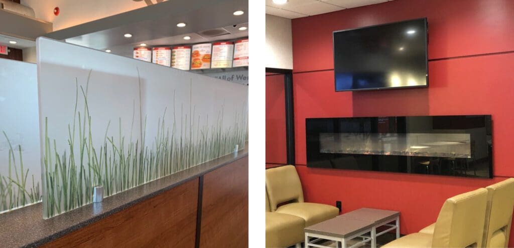
The walls within the restaurant were utilized to further convey the message and immerse the customer in a carefully crafted dining experience. Overall, the walls were white-painted brick or drywall painted in black to provide a canvas for the interior branding. Upon entry, guests were greeted with a large-scale application of the logo design before turning to approach the point-of-purchase. Here, they would see menu boards hanging from industrial chains.
As the customer continued through the journey, they would see a wall-to-wall mural depicting a mountainous region on the left. Turning the corner, the mural continued over the drink station; and here the image was one of smoke-tipped flames rising up. This paid homage to Hogwood’s beginnings and provided imagery that would transport the viewer to a different place. Additionally, the imagery here was replicated on the website and other brand support to create a connection for the customer.


Bathrooms, and the journey to and from them, are an important element of interior branding. We selected black paint for the hallway to the restrooms and designed a custom-gallery wall for the space. Square images were created and curated to convey brand messaging and to again pay homage to Hogwood’s beginnings. These images were mounted on handmade wooden clipboards. Upon entering the restrooms, guests would be surprised and delighted with black-and-white buffalo check wallpaper, industrial fixtures, pops of marigold, and clean subway tile.
Finally, our team created a lighting plan for the restaurant. Our selections for lighting were based on the architect’s provisions in terms of where lights would be needed within the space. We proposed custom lighting that would align with the rustic nature of the brand. The lights were crafted from rough wooden beams with bare-bulbed lights hanging from wrapped black cords. The fixtures provided ample light while also contributing to the completely custom look and feel of the space. Additional fixtures throughout the space would include matte-black gooseneck lighting, marigold-yellow sconces, and caged-light pendants. The mix of light fixtures would bring dimension to the space and help segment the room.
The patio was adorned with additional wood storage, black metal tables and chairs, and bright yellow patio umbrellas.
The resulting design was one that has attracted the attention of locals and local celebrities. The restaurant is frequented by nationally acclaimed musicians, including Mike Weaver of Big Daddy Weave and country music star Chase Rice. Plus, the Nice girls get over there about once every week for the pulled pork and hand-poured mac and cheese.
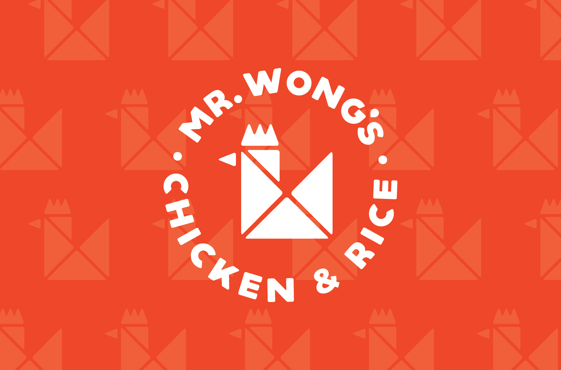
Restaurant Interior Design Project: Mr. Wong's Chicken and Rice
Mr. Wong’s Chicken and Rice was originally Original Chicken ‘N Rice. As part of the restaurant rebrand, our team worked to rename the restaurant, provide a new logo design, menu design, website design, and more.
The name Mr. Wong’s Chicken and Rice was selected to highlight the hard work of the founder, Mr. Wong, in creating and growing the restaurant. The restaurant’s target is families, and the family aspect of the restaurant was one we wanted to trumpet.
We started with visual direction. Here, we proposed a brand that would primarily consist of a warm red, bright yellow, and pure black. White accents would be used as needed throughout the brand. Additionally, wood and metal would be introduced through the interior. The overall look and feel was one that was casual and approachable, and not too trendy. The idea was to create a concept that was modern but not one that was full of cheeky phrases or symbols that might be misinterpreted by the customers. Industrial elements would come into play against bold, rough typography.
This restaurant occupied a small footprint, and we would need to maximize seating for both individuals who might be grabbing a quick bite and families who wanted to dine together.
In this restaurant, like the two above, a concrete floor was proposed. Custom floor graphics would bring the brand design elements to life and help guide the customer up to the counter to order.
Our restaurant interior design team proposed a mix of seating to accommodate the various customer needs. On one wall, we selected a set of custom-designed wooden booths. At the window, we proposed counter seating with industrial-style yellow stools. And, on the other side of the restaurant, we proposed wooden high-top tables and stools. This would provide a modular component that would allow guests to sit alone or combine tables for larger parties.
On the walls, white subway tile would be installed from the floor to about halfway up the wall. The subway tile would be easy to clean, and aligned with the overall look and feel of the brand.
On one wall, a hand-drawn illustrated timeline would run from the front of the store to the point-of-purchase. The timeline told the story of Mr. Wong and his journey as he immigrated to the United States and opened his first restaurant. The timeline followed this journey all the way up to present day, ending with the rebrand of the restaurant to Mr. Wong’s Chicken and Rice.
Across the dining room, the other wall featured food imagery and brand messaging. Menu boards were printed on PVC and framed to hang above the point-of-purchase. Lighting throughout the space would consist of caged-light pendants; flush-mount bulbs; and sleek, industrial ceiling fans.

There was one bathroom within the space and it was small. But, since the door would open directly to the dining room, it was key to have a clean design within the rest of the space. Our design team selected subway tile and modern fixtures for the bathroom to align with the overall look and feel of the restaurant.
The new restaurant interior design has been implemented to replace an existing location. It looks great and provides the restaurant with an outlet to not only serve their food, but also to tell their story.
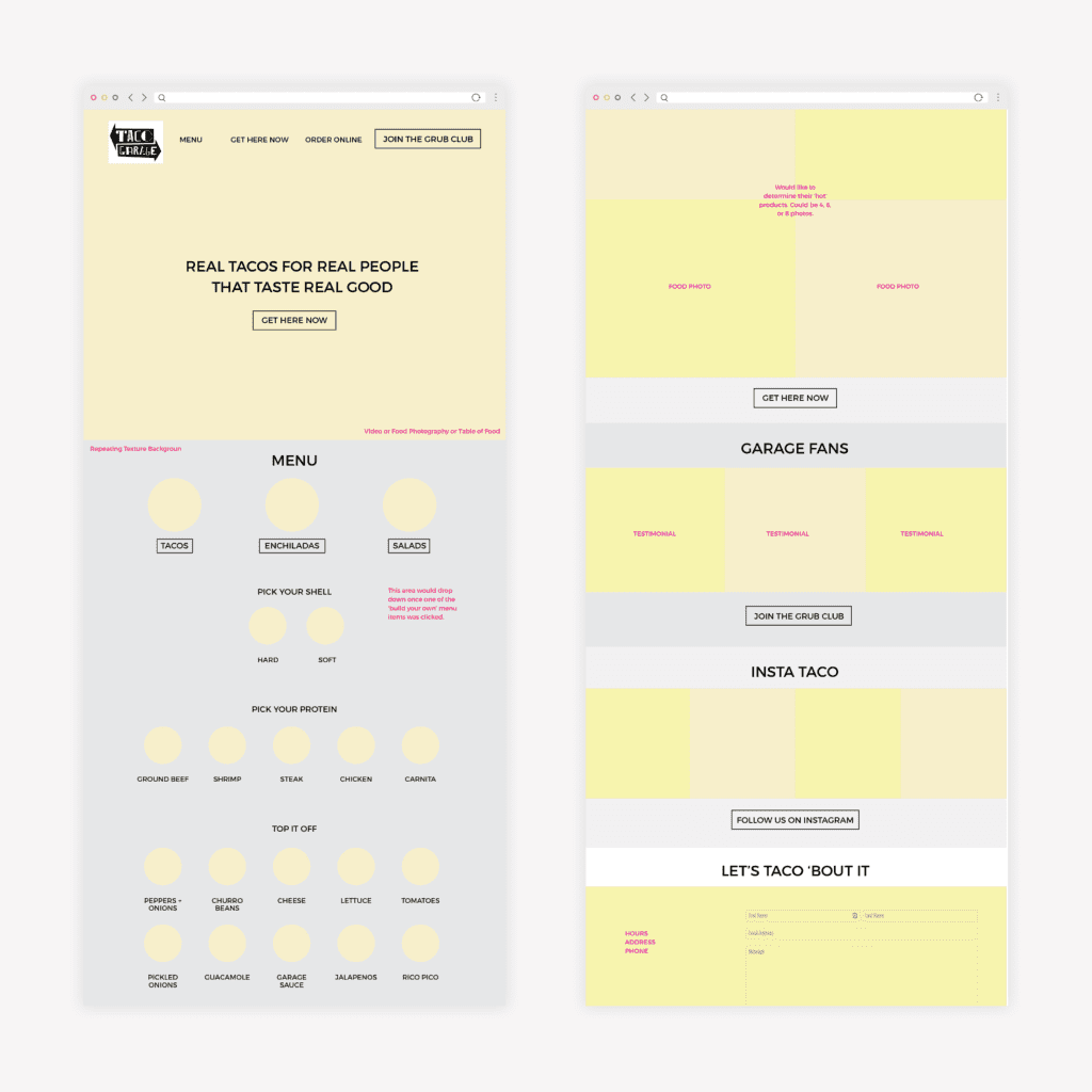
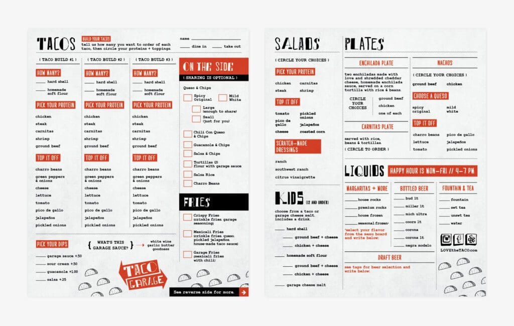
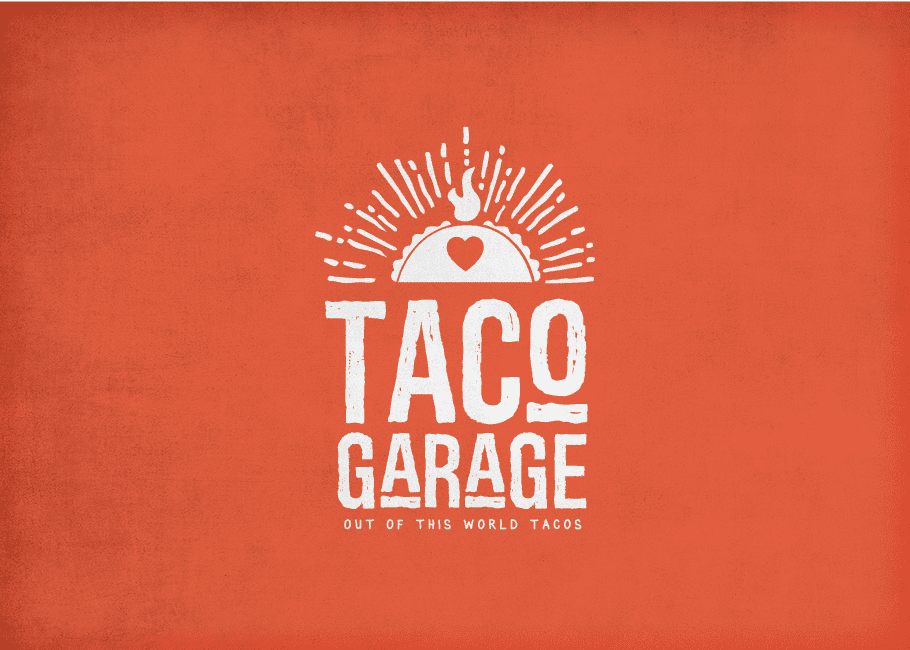
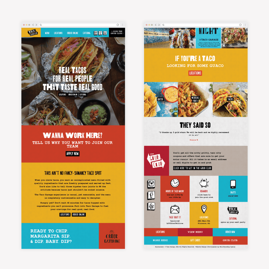
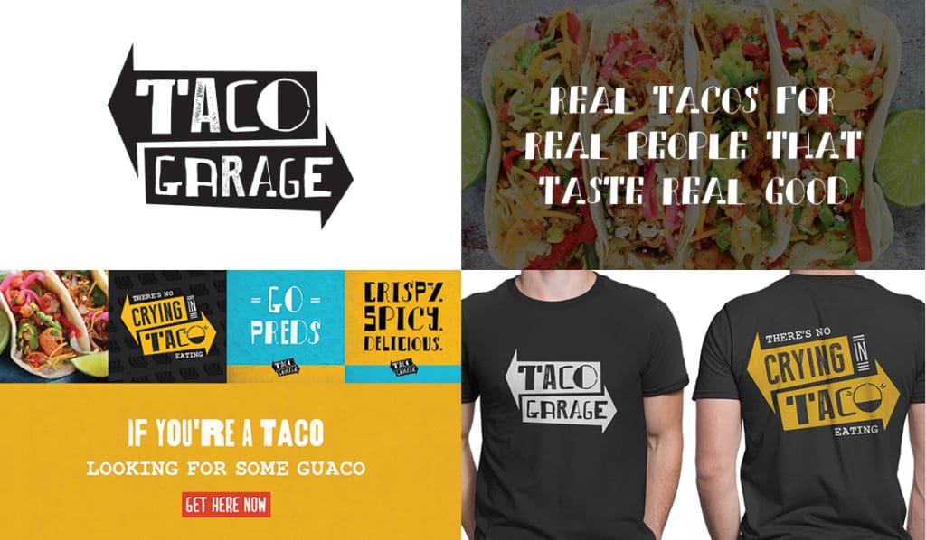
Taco Garage Restaurant Interior Design
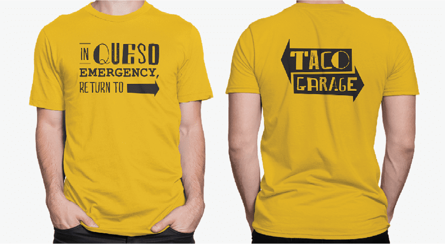
Our restaurant branding experts created a brand for Taco Garage that included a restaurant logo design, strategic menu design, restaurant website design and development, and the design for all other restaurant materials.
As construction got underway, we also developed an interior design plan. We started by outlining customer journey. Next, we moved into the design to ensure maximum customer impact.
We created a grungy, garage vibe by incorporating concrete floors with custom floor graphics to guide customers. We also included rough bricked walls to align with the industrial feel of the brand, and adorned the walls with neon lit signs and wall graphics that communicated the brand voice.
The restaurant prides itself on being down-to-earth and relatable, so we selected simple tables and chairs. The register—an opportune place to communicate brand messaging—was designed to be a focal point.
Custom wall graphics were painted on a variety of textures to communicate with the customer in a fun way. These murals were then featured on social media and meaningfully placed on various brand support pieces.

Overall, the interior design strengthened the restaurant brand and connected with the customer.
Restaurant Environmental Branding by Nice Branding Agency
Our process for environmental branding, or restaurant interior design, is one that is proven time and time again. Our team takes a brand-first approach to restaurant interiors, and we put storytelling on par with interior design. This method truly creates a lasting connection with customers in a manner that interior design alone may miss.
If you’re interested in learning more about Nice Branding Agency or restaurant environmental branding, give us a call. We’d love to talk shop. To see more of our work, follow along on Instagram.


