project details

CLIENT

Taco Garage

Taco Garage is an Alabama restaurant born in Tennessee and conceived by two business people with a passion for the restaurant industry. Our clients approached us with the concept for a taco joint, and we were retained by their team to create the brand from start to finish. The clear brand direction we were able to create for Taco Garage, was inspired by the client's desire for their brand to be felt by each and every customer in their restaurant through all touch points.

RESTAURANT BRANDING AGENCY KICKOFF

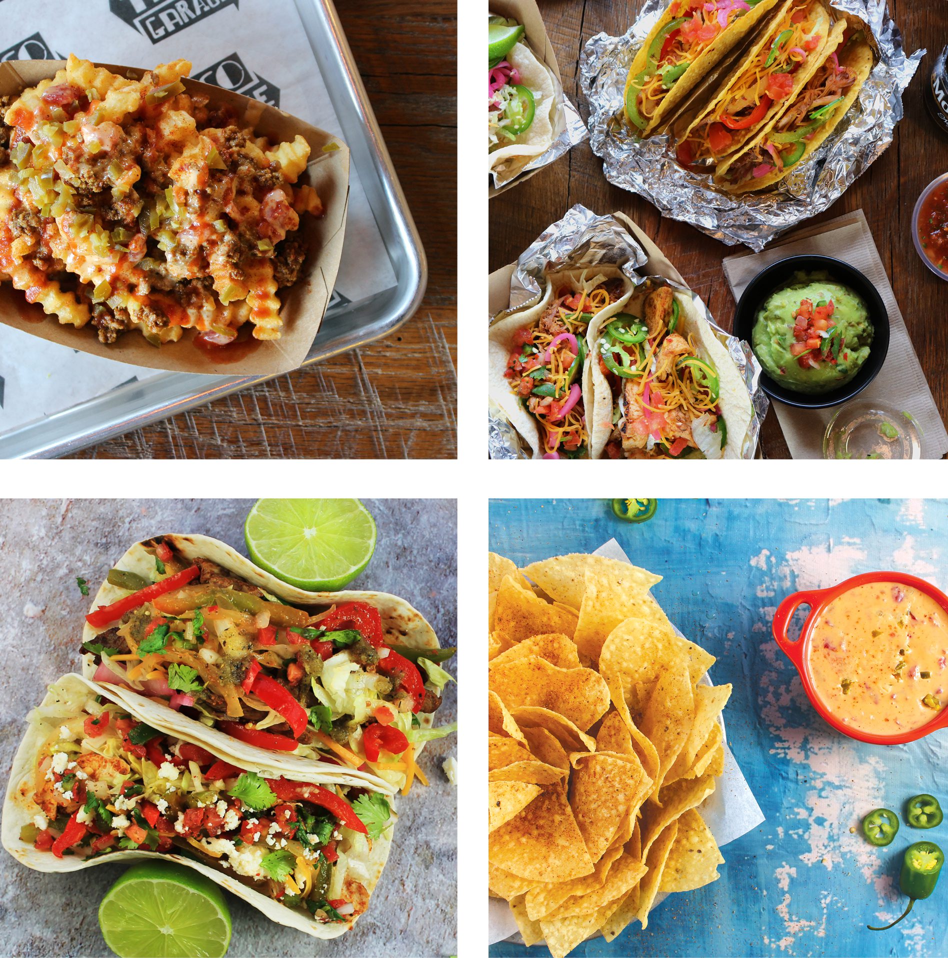
When Cindy and Rick Story contacted us wanting to work on a new dining concept with a restaurant branding agency, we jumped at the chance to develop something from scratch in Murfreesboro, a city so close to Nashville (and our office!), that really appreciates good food. 

Our client started their venture by getting the Nice Branding Agency team on board to sharpen their ideas into a clear and cohesive direction for the new brand. They knew it would take tons of brainpower to create a concept special enough to stand out among all the restaurants in the area. And so, they chose Nice Branding Agency as their restaurant branding agency and handed over the entire project so we could do our thing.

BRAND DIRECTION

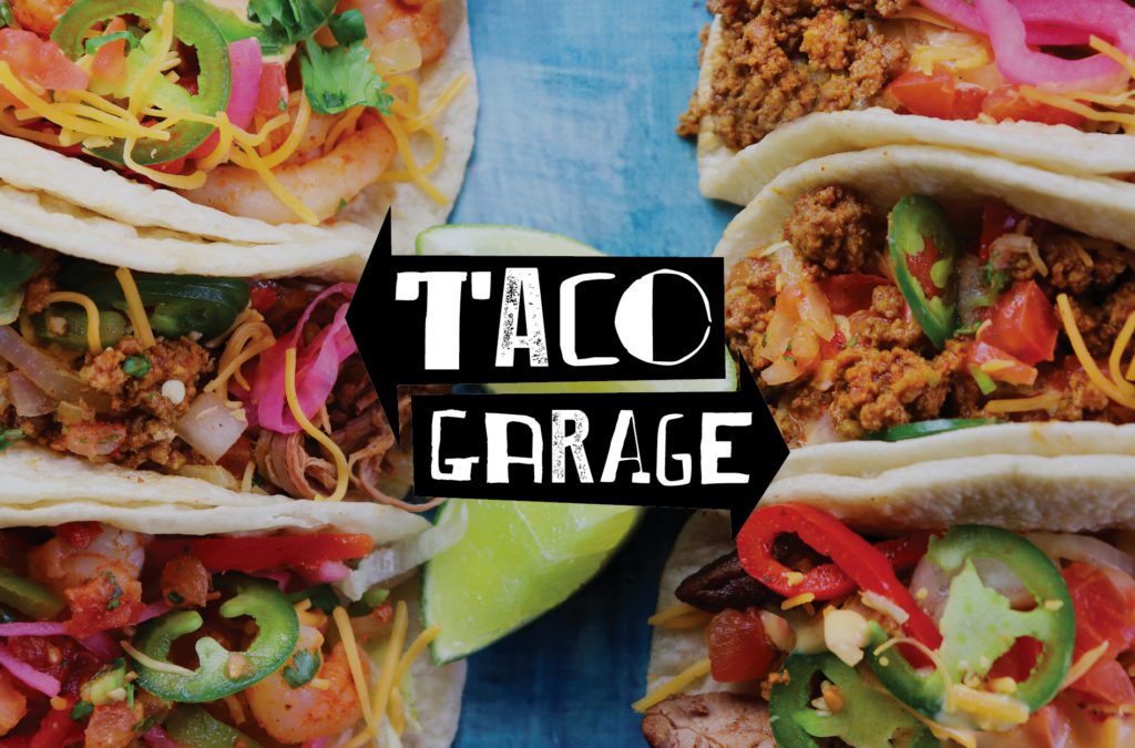
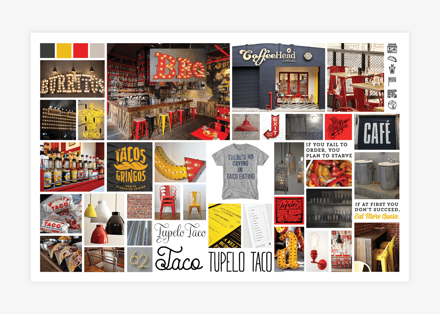
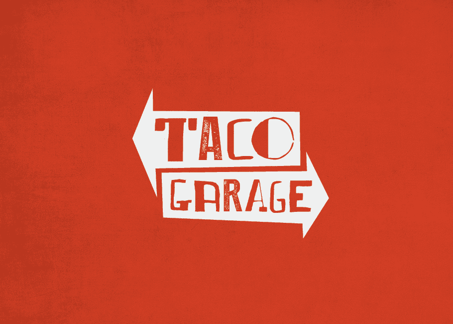
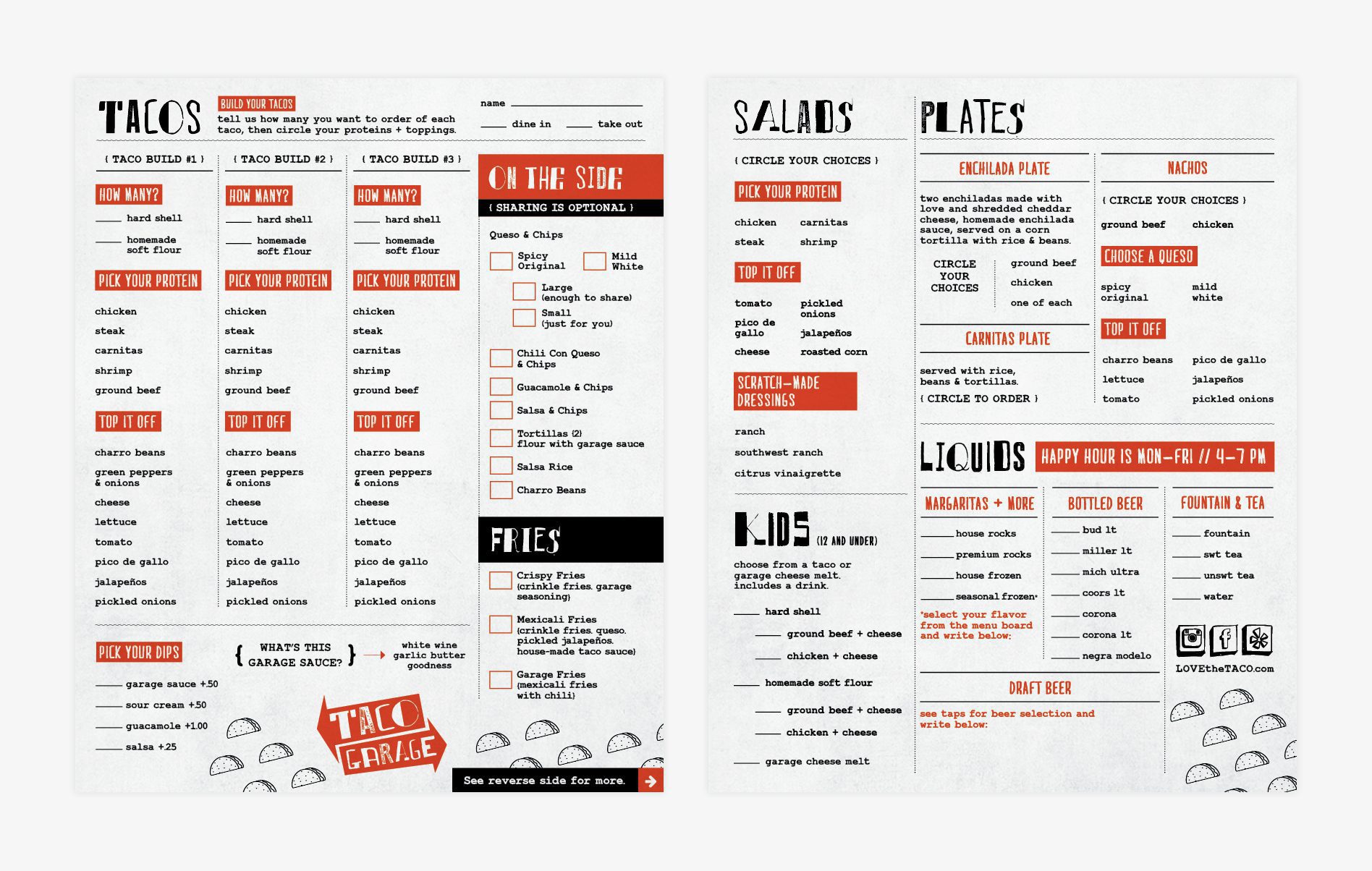
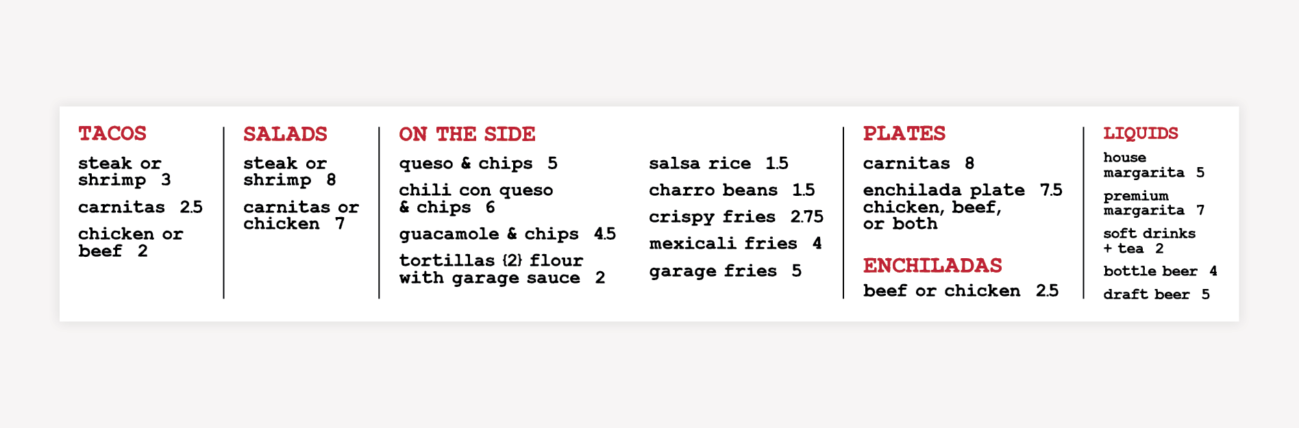
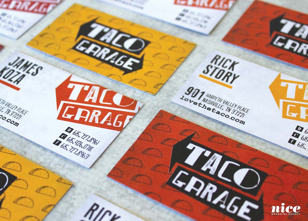
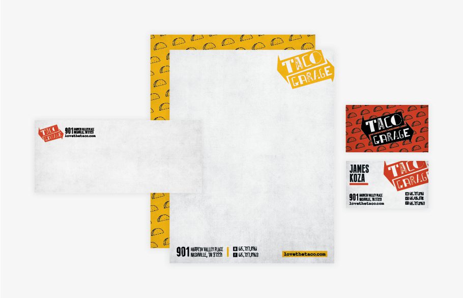
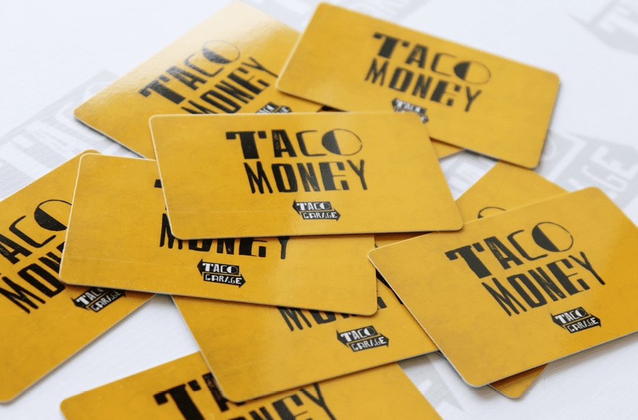
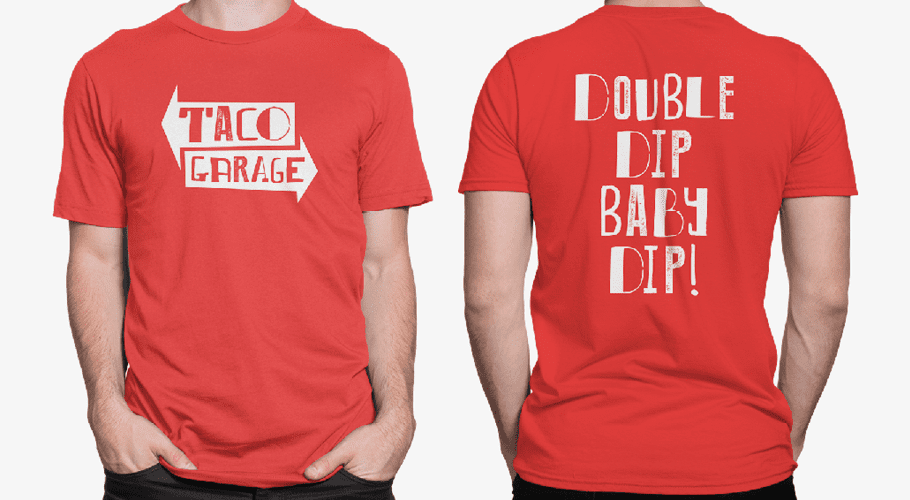
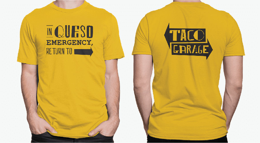
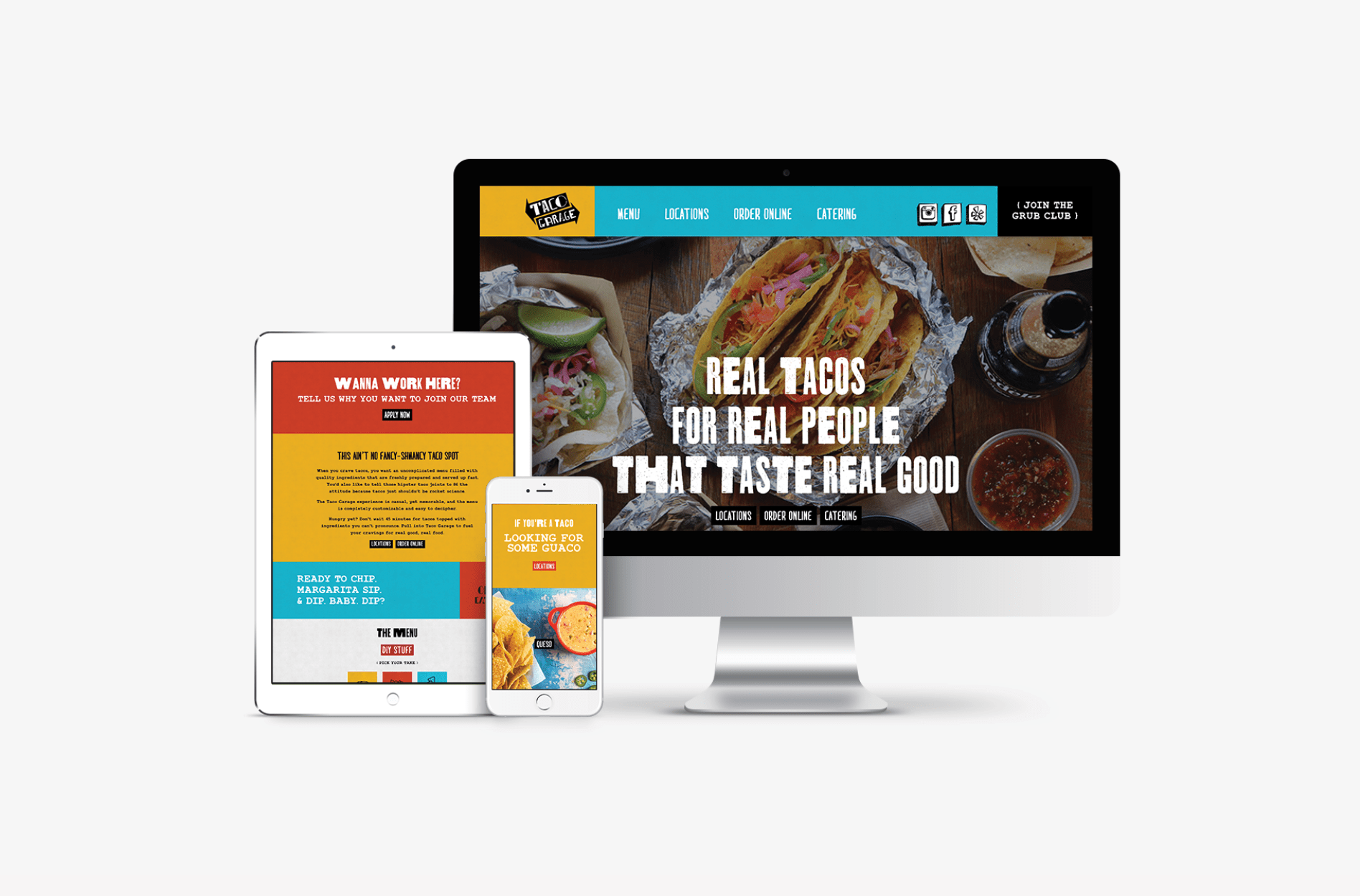
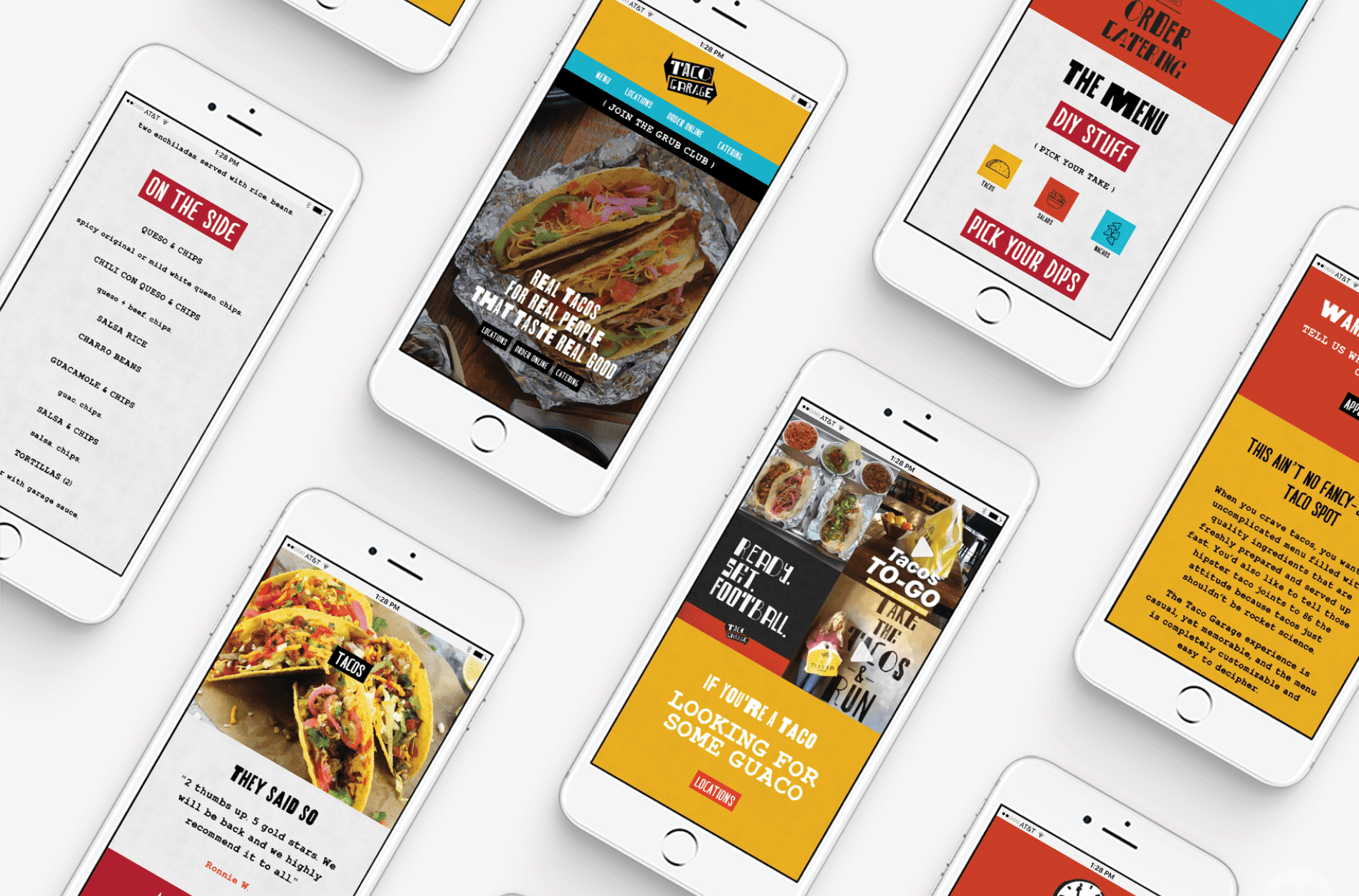
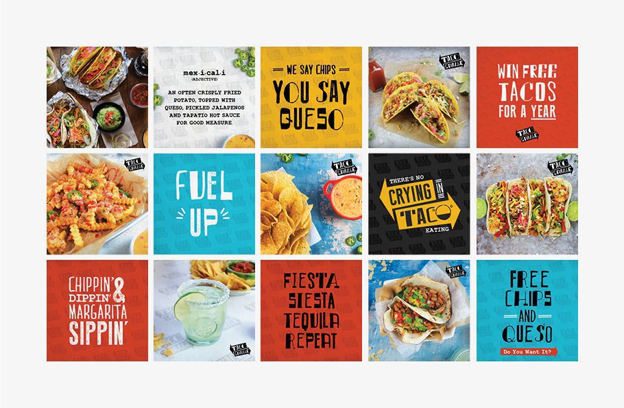
Phase one of the restaurant branding process was the creation of the visual direction. Our restaurant branding agency creates brand boards to narrow down visual brand direction with a client. We created three brand boards for Cindy and Rick: Taco Diner, Taco USA, and Taco Garage. Spoiler alert: they chose the Taco Garage board, and they liked it so much they kept the name.

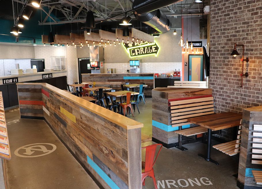
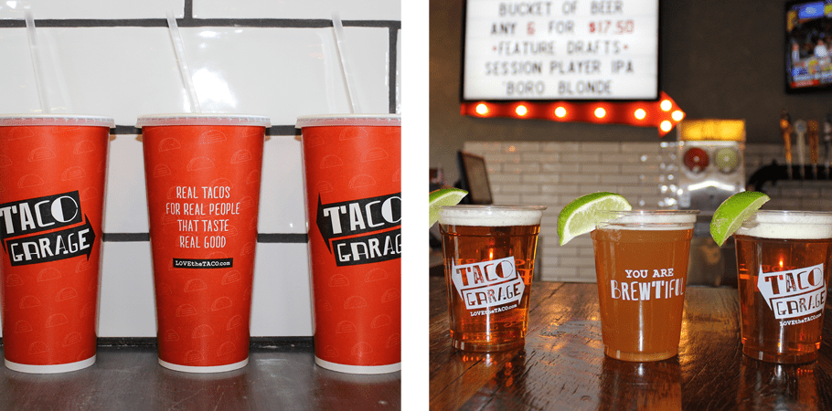
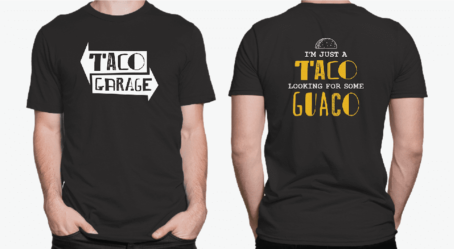
The visual direction shown in the brand board selected took on a grungy garage feel, while bringing in custom-marquee signage and neon lighting to draw interest and illuminate an otherwise dark aesthetic. Garage doors were shown to bring some literal appeal to the concept and a variety of fonts were incorporated to create a homegrown effect. Brand colors would be warm versions of bright, primary reds and yellows. And the color would be grounded with a muted grey and off-black.

It was with the presentation of this brand board that Taco Garage was born.

RESTAURANT LOGO DESIGN DIRECTION MEETING

With a name and a vibe nailed down, we were able to start working on a grungy, bold logo for Taco Garage. We began by drafting a couple of ideas. We needed a really solid logo that would be a strong mark for the brand, and versatile enough that we could put it on everything. After all, we had an entire garage full of tacos to brand. The concepts that we decided to present included ideas centered on the grungy garage vibe of the brand.

FINALIZATION OF CONCEPTUALIZATION

The concepts were presented to our design leadership team for finalization. The leaders provided input and polished the ideas before assigning the team to develop them digitally. Here, our Director of Design and Creative Director assessed the options to ensure that all logos aligned as a natural extension of the selected visual direction. They also reviewed the concepts to confirm that we would be presenting enough variety to the client for selection. Any further ideas proposed by the design leaders would be implemented into the logo design phase of the project.

LOGO DESIGN

Our design team set to work pairing fonts, selecting colors, and creating icons to represent Taco Garage. This process included bringing the sketched concepts to life in a manner that will be both timeless and modern. Additionally, we take into account where the logo will appear most often. For this project, we worked to develop restaurant logo options that would stand out in a sea of competitors, while also conveying that the concept is in fact, a restaurant. So, basically, we worked to create something that looked like a restaurant logo, but didn’t look like all the restaurant logos.

THREE LOGO OPTIONS

We digitally developed three logo options. The first option included big, bold arrows to represent the directional signage within a garage or auto body shop. The restaurant name was spelled out using a selection of grungy, imperfect typefaces, collaged together to form a one-of-a-kind logotype. This option had tons of character and looked as if it was hand painted onto the arrows.

The second option we created was based on a burning love for tacos that so many people in the area live by. The font selections once again included grungy, hand-painted styles. The icon was created to immortalize the taco. The tagline, “Out of this World Tacos,” was incorporated to further tell the story.

The final option we digitally developed included a funky, blocky font with a taco tipping the top of the O.

PRESENTATION AND SELECTION

Upon presentation, our client selected the first option, and had no changes to the logo we presented. They loved the simplicity of the design, and could envision how we would weave the irregular font and the directional signage throughout the brand.

LOGO FINALIZATION

The chosen mark went back to our Director of Design for finalization. Here, each letter in the logo was examined and perfected, and exact colors were selected in CMYK, PMS, RGB, and hex codes. Yes, even for black, there’s an exact color.

Logo guidelines were created for the client that included proper logo usage, fonts, and color codes. Along with the logo guidelines, we supplied the client with their logo files. Logo files were provided in black, white, and full color in JPEG, PNG, EPS, and PDF.

SITEMAP PRESENTATION

Early on in the restaurant branding project, we created a sitemap for the website. Here, we outlined the pages needed for the website. For Taco Garage, we opted to start with a single page scrolling site. The website would house external links to online ordering and google maps, and would include a simple menu, editable in the backend of WordPress.

WEBSITE HOSTING

We also presented our hosting package, which is an optional add-on to our website design and development project. Our clients would own their website after the build was complete, however, they had the option to have us host and maintain the website on a regular basis.

Our hosting service includes the fastest page load speeds in the industry, as well as daily backups and monthly maintenance and monitoring. Taco Garage chose to have us host and maintain the website. This would make for a simply launch and a secure site. The Taco team chose to have us host the website at the completion of the build, and this made for an efficient launch day.

RESTAURANT INTERIOR BRANDING

At this stage, we began work on the interior branding. For Taco Garage to be the hit we knew it could be, we needed to design the brand to be felt by every customer who experienced the space.

A great space designed to communicate a clear brand direction is the key to making a restaurant a memorable experience for the customer. That positive association between the customer and the restaurant is what makes people fall in love with a restaurant brand and keeps them coming back again and again.

To make that happen, we started with the floor plan. Then we addressed flooring, lighting, furniture, hardware, wall color and textures, fixtures and environmental graphic design and every other thing a customer could see when they come to get tacos at the Garage. Every cup, lightbulb and napkin container ran through the approval of our team.

The Taco Garage brand oozed out of the design in the grungy, industrial textures, graphic signage, and lights we selected. Taco Garage needed the vibe of a garage, and the simple design that would echo their mission as a restaurant: to keep things uncomplicated.

We selected concrete floors and custom-designed floor art to guide customers through their taco journey from the door, to the order counter, drink station and seating.  A marquee sign floats above the checkout counter both as an “Instagrammable” focal point with a very garage vibe and a functional informational sign to display drink specials.

Throughout the space, we implemented large environmental graphics, signs and wall installations to show off the cheeky brand voice of Taco Garage. “Take the Tacos & Run,” one wall reads. Another says “Life Liberty and the Pursuit of Tacos.” Neon signs on brick, old school marquee signage and industrial installations bring warm light into the walls and emphasize the casual feel of Taco Garage.

Industrial tables and chairs were a no-brainer for the garage; no fancy-schmancy tablecloths needed here.

With that all set, we moved into the graphic design for their print materials while Taco Garage came to life during construction.

MENU + MENU BOARD DESIGN

For Taco Garage, we created a cool, DIY order system that aligned with the no-nonsense aesthetic. The Taco Garage menu system is tangible and interactive, using color blocking and sections to guide the user experience. Old-school golf pencils and rip off sheets allow customers to go to town penciling in their taco order on the order pads that line the point of purchase area.

Creating a super efficient, easy to read menu design was important for not only communicating the brand message (Keep. It. Simple.) but also for helping customers figure out where to start when they order.

The menu board design was uber-simple as well. Reading left to right, the menu board system prioritized the tacos and encouraged the add-on of side items.

BUSINESS CARD

The business card design we created for Taco Garage implemented varying brand colors over a taco pattern and a simple application of the logo. The reverse of the cards was populated with the contact information for each team member in a manner that aligned with the overall brand aesthetic.

The cards were printed on a nice, uncoated stock to contribute to the uncomplicated feel of the brand.

STATIONERY PACKAGE

The business cards were complemented with a complete suite of stationery, including a letterhead, envelope, and notecard. The letterhead sported the taco pattern on the reverse, which introduced an unexpected custom element to an otherwise unglamorous method of communication.

While these details could be overlooked, our restaurant branding agency understands that it is the smallest details that create consistency throughout the collateral that lend to a completely branded experience. It’s this experience that makes a business stand out from the rest.

FOOD PHOTOGRAPHY

Next up we needed photos of all the Taco Garage specialties. It didn’t take a lot of effort to make their food look good, but professional lighting and branded props made these photos nice enough to use everywhere.

Our team started with planning. We created a mood board that would serve as the inspiration for the shoot. This board aligned with the brand’s visual direction, but it catered specifically to the manner in which the food would be staged.

With the plan in place, we got to work prop shopping. We assembled a set of props and backdrops that would allow us to bring the mood board to life during the shoot.

There is no aspect of a food photography that we leave to chance. All is precisely planned. In addition to the props, we also shopped for grocery items that we could use to style the photos with uber-fresh ingredients.

Just like the rest of the brand, we needed the photos to be real simple and real good. Good food photography should make you hungry, so we made sure our set-ups were enticing and on-brand. Great food photography lasts as long as your menu does, so Taco Garage will be able to use these photos to further their brand reach and enrich their social for years.

RESTAURANT MATERIALS

Aside from the environment and the menus, the restaurant materials are a major tangible asset that are touched and interacted with by the customer.

Typically, our team works to design to-go cups, take-out bags, and staff attire.

Picking the Taco Garage employee uniform was easy for this restaurant branding agency when you consider their brand. What’s simpler than a tee shirt? We designed shirts for the Taco Garage employees that would broadcast the brand in a cool, wearable way.

The cups were created to house witty remarks about the brand that would be memorable and “Instagrammable” and once again, we brought in the varying brand colors.

WEBSITE WIREFRAME

With most of the main brand elements in place, we shifted our attention to the website. The Taco Garage website needed to be informative and full of calls to action to get customers to either come in the door or order online. User Experience on various screen sizes was really important to us, knowing users would be visiting the Taco Garage website often on mobile. Additionally, we worked to structure the site so that there would be a focus on getting viewers to the goals: ordering online, finding the restaurant, or viewing the menu. Icons would be developed for the menu items, so that the user could simply scroll down and see what was offered at a glance.

WEBSITE DESIGN

The website is a really great way to communicate a lot of information about the brand voice to each customer, so we filled it with branded, pro-taco messages. We scored a sweet domain for Taco Garage and loaded it up with a fully designed and developed site. Go ahead, check it out. We’ll wait. Lovethetaco.com.

The website user interface was populated with bold colors, hand-drawn illustrations, food images, and textured backgrounds. All of the details convey to the user the feeling of the brand, and what they can expect when they walk through the doors at Taco Garage.

WEBSITE DEVELOPMENT

With the website design and the website wireframe approved by our client, we brought the design to life online. The website was custom-built on WordPress. This CMS provides the client with easy access to the back end to update key content. Once the website was built and had been tested by our team on a temporary link, we then sent the link to our client for review. They were able to see their brand new website live and in living color before we migrated it to their domain.

WEBSITE LAUNCH

Once approved, the website was launched on the lovethetaco.com domain, and final testing was performed to ensure that everything was in working order.

RESTAURANT BRANDING PROJECT CLOSEOUT

To closeout the restaurant branding portion of the project, our team provided the print-ready PDF files for all printed collateral, as well as the logo files via a shared folder. Additionally, we remained aboard to consult through the build of the interior of the restaurant.

ADD ON: RESTAURANT BRANDING AGENCY CONSULTING AND MARKETING

Cindy and Rick also wanted us to be their on-going marketing agency (score!) so we consulted with them on their POS Systems, recommended a loyalty system and worked out an option for customers to add their email addresses and phone numbers for future email and text message marketing. We established a direction for servicewear and dictated how food should be presented to the client.

To gain momentum for the Taco Garage Grand Opening, Nice Branding Agency started establishing a social media presence and following in the Murfreesboro area, and has since kept up online brand engagement with social media management and regular live content.

The clear brand direction we were able to create for Taco Garage, combined with the client’s desire to have a food, brand and operations all in sync made this project a huge success. Months of work towards creating a compelling, effective concept was key to starting something new. If you have a great restaurant concept that you need to brand, we’re your girls – contact us today and let’s get this party started!

If you’ve got a garage in need of some tacos—err branding—give us a beep, beep. We’re ready to drive your restaurant branding project to Success Avenue.

where do i sign?

ready to brand your restaurant?